Comic of the Week: Dungeons and Dragons - A Darkened Wish #1, another excellent comic based on the RPG

Dungeons & Dragons: A Darkened Wish #1 is out now.

By d. emerson eddy — For some time now IDW has been producing entertaining Dungeons & Dragons comics, with some of the most recent stories following an adventuring party made-up of many pre existing characters from the video games. These books have been largely written by Jim Zub, and the most recent was a hilarious and fitting crossover with Rick and Morty. This new mini-series promises new characters and a new beginning on the Sword Coast of Faern. I suppose it's fitting to set it within the Forgotten Realms campaign setting, since there's a lot of world-building already accomplished, allowing the creators a lot of toys and rules to play with, including some new favorites like kenku, a race of crow-like avians that can mimic the sounds of others.

After starting in the middle of a chaotic battle, B. Dave Walters, Tess Fowler, Jay Fotos, and Tom B. Long flashback to introduce us to a group of adventurers through the point of view of a young wizard, Helene, and her friends as they leave their hometown for the promise of adventure with the White Sails mercenary company. We get some interesting characters in the twins, Karrin and Kerrin, the kenku, Solivigant, and the mysterious dragonborn, Rayonde. Through misadventure following a trip to a tavern, we definitely get the impression that Helene and her friends, new and old, are a bit out of their depth, but still capable at this early stage. Contrasting the formation of the party versus the battle in the present is compelling, hooking us well into trying to figure out what's going on and what happened to move the characters to this point. It's a great set-up for the story and characters, also giving that anticipation for what happens next that you often tend to feel when playing D&D.

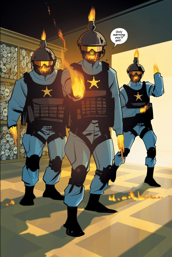
What elevates the story even further is the gorgeous artwork from Tess Fowler and Jay Fotos. Fowler is a master of fantasy art, from her work on Rat Queens through to her artwork featuring the characters from Critical Role. She expertly captures and presents unique and captivating designs for human and non-human fantasy characters, giving an immense level of detail when it comes to populating and filling this fantasy world. Just the opening splash page alone gives us a breadth of different and unique attacking forces of Morayans and it only gets more fascinating from there as we're guided through our main cast and finally getting to Mintarn.

Jay Fotos enhances the line art with a rich colorful palette, well-fitting the fantasy setting, with some very nice effects when it comes to depicting magic. The action scenes, in particular, like the opening battle and an early fight with a pack of wolves, show a very nice variety to how Fowler and Fotos are working together to create some visually interesting sequences. Tom B. Long also nicely embellishes the story with some banner-like headers for sequence starts that adds to the feel of the fantasy world.

Overall, I've been impressed with this first issue from Walters, Fowler, Fotos, and Long. It has some richly developed characters and an intriguing hook to see what happens to the party, all with some beautiful artwork.

Dungeons & Dragons: A Darkened Wish #1
Writer:
B. Dave Walters
Artist: Tess Fowler
Colorist: Jay Fotos
Letterer: Tom B. Long
Publisher: IDW
Price: $3.99

Check out more of d. emerson eddy’s Comic of the Week feature on our Lists Page.

d. emerson eddy is a student and writer of things. He fell in love with comics during Moore, Bissette, & Totleben's run on Swamp Thing and it has been a torrid affair ever since. His madness typically manifests itself on Twitter @93418.

Meet the Publisher: Talking Mad Cave Studios with CEO/CCO Mark London

By Bo Stewart, Harrison Stewart, and Zack Quaintance — There are an increasing number of startup and independent publishers in comics. So many, in fact, that it can sometimes be hard to keep up with all the great books they’re putting out. Vault Comics, TKO Studios, AfterShock Comics, Ahoy…the list goes on and on. To that end, today we’re launching a new feature called Meet the Publisher.

The concept behind Meet the Publisher is a simple one: we give you a resource to learn more about the publisher, the publisher’s comics, what the company seeks to bring to the industry, and more. This first edition is focused on Miami-based Mad Cave Studios. Below, you’ll find an interview with the rising publisher’s CEO/CCO Mark London. It’s the first of a series of three pieces on the site today, with links for the others below as well. Oh, and practically as I was typing this another new publisher just announced its presence on the market. See? Tough to keep up…

Now let’s get to our interview with Mark!

Check out our other Mad Cave Studios features!

Q&A with Mad Cave CEO/CCO Mark London

Mad Cave Studios CEO/CCO Mark London.

Q: So, let’s start with the basics...who are you folks, where are you from, and how long have you been making comics?

Mad Cave Studios is an independent publisher based in Miami, Florida. We’ve been hard at work since 2014, focused on creating unique, visually-stunning comics across multiple genres that captivate a wide audience. We want our #CaveDwellers not to passively read our comics, but enjoy taking a deep, introspective journey with our characters, environments, and themes. Yes, it may be profound, but it is who we are. You see, the company’s name, Mad Cave Studios, stems from the fact that we harness madness to create uniquely compelling and diverse comic books. We strive to produce quality books, so the reader can expect the best possible products.

Q: What inspired you to start making and publishing your own comics?

For me, it’s all about storytelling. I grew up in the ’80s, a helluva time to be exposed to all sorts of media: Comics, video games, movies, animation, literature; all great platforms for storytelling in their own way. I devoured everything I could get my hands on, but comics have always been dear to me. There is something about sequential art that really connects with me and mesmerizes me at the same time. To some, they are just pictures divided into grids, into panels, into pages, but for me, they’re so much more. So, I guess it was just a matter of time before I put my fascination with storytelling to good use and I chose comics as the medium.

Q: If you had to give an elevator pitch for your brand, how would you describe the comics that Mad Cave makes?

Mad Cave delivers fun, action-packed comics across a variety of genres. It’s Mad Cave’s obsession. World building stories. The hero's journey. Feel good comics. Those are the kinds of stories that I read, saw or interacted with when I was growing up and wanted to write my own versions of, the Mad Cave way.

Q: A somewhat sizable (or at least vocal) segment of our audience consists of aspiring comics writers, and I’m sure they’d like me to ask if Mad Cave has plans to eventually publish work by other writers….

Not at the moment, unfortunately. There are certain stories we are planning to tell in the immediate future. But that could change soon, who knows.

Q: Tell us a little bit about the talent search you recently ran…

Mad Cave’s initial releases of comics are written by me. Since we were starting a publishing /content building company and the writer is also the CEO, things tend to get a little crazy. If you look at Valiant’s inception back in the ’90s, Jim Shooter was writing those books. The Image founders were all writing and drawing their own books, Joe Pruett did the same thing for AfterShock with one of their launch titles (B.E.K.), Pizzolo at Black Mask…I could go on and on. So, since we are past that brutal first phase, and the company has grown substantially, it was a no brainer to acknowledge that we needed more hands on board. Hence the talent search. I’m happy to report that it was a success and we have some very talented artists and writers joining the ranks. I can't wait to show the world all of the new and interesting titles they’ve been working on, but all I can say is that the books, as well as the talent themselves, have heart, they are full of passion, and they are a blast to read.

Q: Can you describe the journey of starting out in comics publishing?

Brutal. It's like eating glass haha. Some might say that there is no right or wrong way to make comics, but in reality, there is. And there are the rules you painfully learn as you go through the learning process.  So, yeah, too many missteps to talk about in this interview, but that’s how you get better at something, right? I’m a firm believer that you learn more from your mistakes than from your achievements. Of course, the idea is to improve on those mistakes and never make them again. And if they do happen, just keep pushing forward and never look back.

Q: How difficult is it these days to get the attention of folks who read creator-owned comics and what have you found most useful in doing that?

Word of mouth is critical for the success of your book. You have to go to conventions in order to spread the word, to speak with as many retailers as possible so you can get your books into their stores and therefore reach fans. Have a website and join the different social media channels, so that you can engage with people who want to make comics or enjoy reading them.

Q: Where should an interested reader start if they’re interested in getting into Mad Cave’s comics?

The best way is at www.madavestudios.com and on social media including Facebook on Facebook.com/MadCaveStudios and @MadCaveStudios on Instagram and Twitter.

As far as where you should start reading, Battlecats was our launch title and it is coming back for a second volume in May. There is also cyberpunk, noir thriller,  Midnight Task Force. We also have Knights of the Golden Sun, a book that has really done well for us. That story is the original tale of good versus evil. Angels and demons. And our newest series, Honor and Curse, follows a young shinobi haunted by the spirits of his past.

Q: What advice do you have for someone interested in publishing comics, or really just getting into the industry?

Make sure that you love it. Pay attention to the whole industry, not just the comics. Learn the comics craft inside out. Practice as much as you can. Write, show it to friends and family, accept the good, the bad, and the ugly. Then rinse and repeat. There is no middle ground with comics and the learning curve is very steep. Like my wife likes to keep reminding me: “This is not a sprint, it's a marathon.” So keep pushing forward no matter what and if you stick through it long enough, then you have a shot. And never forget why you started making comics in the first place.  

Q: What does the immediate future hold for Mad Cave?

Comics, comics, and more comics. We are content builders and we have an aggressive strategy for the next three years that we strongly believe will benefit fans of all genres. Mad stories with mad twists are coming your way from writers and artists that love the medium, love the industry, and are giving it their best so that fans everywhere can have the best time reading comics.

Bo Stewart grinds for the Man by day so he can create comics by night. He is the lesser half of the Stewart Brothers writing team and can be found on Twitter and Instagram @stewart_bros

Harrison Stewart is an aspiring human being whose goals include solving the mathematical equation for love. Follow him on Twitter for more writing stuff.

Zack Quaintance is a tech reporter by day and freelance writer by night/weekend. He Tweets compulsively about storytelling and comics as BatmansBookcase.

The Saga Re-Read: Saga #33 is an Upsher and Doff journalism procedural

Saga #33 first debuted on Jan. 27, 2016.

By Zack Quaintance — Hey hey, friends! Here we are back again with the Saga Re-Read, which if I’m being honest is one of my favorite features on the site, albeit not one of the more popular. And I get it! Following this takes a lot of time and also a lot of tolerance for my personal reaction to this comic. Still! I’ve had so much fun doing it, that once we wrap up Saga in 20 weeks or so, we’re going to start another comic!

And I’ve already taken to Twitter a couple times to solicit suggestions for what that comic should be. No final decisions have been made as of yet, but I should not that it is very likely to be another creator-owned Image Comics title from roughly the same era. Books like Wicked + Divine or East of West have been bandied about, and I will say that I find both of those to be very intriguing suggestions. I just haven’t finalized my pick as of yet.

But enough talk of other comics! Let’s get on to Saga, specifically to issue #33...

Saga #33

Here it is, the official preview text for Saga #33, which was first released back on January 27, 2016...as cold a day in this world as there ever was (I don’t really remember, to be honest, and I was living in Austin then which meant less than 50 degrees would quality). Let’s get right to it…

Upsher and Doff are back on the case.

Hey! My guys are back. I’ve made no secret in these pieces that I really really like these characters. I went to journalism school, spent several years doing real news writing for newspapers, and still work as a staff writer for a trade journal today—I have a soft spot for the chase the story at all costs journalists type of character, even if I’m skeptical about any continuing to exist in the real world today.  

The Cover: This cover is a simple one, which is a trend I’ve noticed in this most recent arc, and I don’t mean that in a bad way. My favorite Saga covers are generally those that start with a simple, relatable concept and extrapolate it just a bit to the point it finds a new space that’s both poignant and weird. This one is basically just two reporters going to work, hand in hand...except underwater. It doesn’t quite hit the rarefied satirical air that some of the later media commentary covers in this series do, but it’s nice to look at and a great glimpse into this chapter’s story all the same.

The First Page: This is a solid first page on a broader story level, reminding us in one fast and good-looking stroke of who Upsher and Doff are and what their function is within this story. I should note, however, that having worked in a number of newsrooms, I found a photographer staring at a developing photo and saying out loud Goddamn did I luck into a golden triangle here...to be absolutely absurd. I like that Vaughan was going that extra mile to show that he has a nuanced understanding of how photography and photojournalism works, but it’s like having a chef say, Holy hell did I salt this brisket to the ideal taste level...if someone said complimented themselves on the basics of their job aloud like this in real life, you might wonder if they were having a stroke. Nit-picky esoteric professional qualms aside though, I think this is a solid starter for the reasons I mentioned at the start.

The Summary: The story opens with Upsher rushing into the dark room and disrupting Doff, so as to break the news that The Brand—who dosed them with something that would kill them if they ever broke the Marko-Alana story—was dead, thereby freeing them from their professional constriction. After some really well-done office hi-jinx about meal reimbursement and frequent flyer miles, our intrepid duo is off in search of the galaxy’s biggest story again. They pick up right where they left off, following a (valid) lead that Alana is working on the Open Circuit...I’d say this lead is years old by now, but chances are this is all happening during the time jump.

We learn that Upsher has not stopped investigating this story, to the point that he found a lovelorn classified ad that Ginny (remember Hazel’s dance instructor?) had placed in a paper for Marko to find. As with all things Ginny-Marko, it’s unclear whether she’s interested in him or simply concerned about the well-being of him and Hazel. They go to Ginny’s house, where they find her surprisingly gruff and brawny husband, and this hilarious line when they cold call her at the door, Oh, you must be here about the trampoline. Ginny doles out a bunch of almost-truths, and the journalists are off to chase them.

The trail takes them to an icy meteorite on which they find—The Will! Who has packed on quite a few pounds since the last time we’ve seen him. The Will wounds Doff in the shoulder, reveals that he knows who they are and all about his sister’s past interactions with them, and ultimately takes the pair prisoner.  

The Subtext: This issue is absolutely loaded with media, to the point it’s almost a paean to print media. The golden triangle line aside, there are some great subtle touches in here...including the way Upsher has done his work, the editor pouring coffee and grumbling about reimbursement for travel, all the way down to how Ginny sought to find out about Marko with a paper classified ad. I know newspapers are a going concern of Vaughan’s (see Paper Girls, which would have launched a few months before the release of this issue), and it’s nice to see him play out that interest here in a future setting, seemingly making an argument that society (even a sci-fi one set among the extended cosmos) is always better with newspapers.

There’s even a bit of philosophical banter about the well-being of one’s subjects versus the way the larger world would be served by breaking a story, which in my experience is a conversation at the heart of every last decision made in journalism (or at least it should be). I also particularly enjoyed the confrontation late in the issue between The Will and Upsher and Doff, in which they get ennobled about their profession and he cops to being out only for himself and his own motives. It’s a nice way to get at something I also firmly believe about the profession: the overwhelming and vast majority of reporters (especially in today’s diminished market) are mostly doing this damn job because they think it’ll make a difference (and if they get a little money or some validation along the way, even better).

The Art: This story is essentially a journalism procedural, which let’s face it, is a pretty boring sort of narrative (I know, I’ve lived it), but Fiona Staples does a great job finding interesting visual touches to include between scenes of slow investigation. All of that leads up to a little bit of a scuffle at the end and a really interesting (and telling) reveal about The Will’s physical state.

The Foreshadowing: There really isn’t too much here, although I suppose you can make the case that because the entire issue is centered on Upsher and Doff, the creators are tipping their hand a bit that these two are going to be a continued and important part of the story moving forward.

Join us next week as we officially hit the only 20 issues to go mark—ahhhhhh!

Saga #33
Writer:
Brian K. Vaughan
Artist: Fiona Staples
Letterer: Fonografiks
Publisher: Image Comics

Check out previous installments of our Saga Re-Read.

Zack Quaintance is a tech reporter by day and freelance writer by night/weekend. He Tweets compulsively about storytelling and comics as BatmansBookcase.

The Best Detective Comics #1000 Variants (and Why They’re Cool)

By Zack Quaintance — The release of Detective Comics #1000 is upon us (coming next Wednesday). It’s a landmark issue (obviously), and, as such, it gets the whole giant wave of variants treatment. There hasn’t been as much ballyhoo (that’s right ballyhoo) around this one as there was for Action Comics #1000 last year. I attribute that to a phenomenon called hey, didn’t we just do this? As well as to Superman being a less tragic and more celebratory figure in general.

But I digress, we’re here to talk about variant covers! Specifically, we’re here to ogle our favorites from next week’s releases as well as share a few quick words about why we find the best Detective Comics #1000 variants so great, great enough to potentially drop an extra $9.99 (plus shipping on many cases) to add them to our collections alongside the standard cover (I clearly have OCD...at least about that).

With all that said, let’s take a look at our 10 favorites! In no particular order...

The Best Detective Comics #1000 Variants

Brian Bolland - Forbidden Planet Detective Comics #1000 Variant

Brian Bolland is one of the best cover artists of all-time, with notable runs such as Geoff Johns’ The Flash. Here on this Detective Comics variant, Bolland leans into something that has made Batman one of the longest-tenured and most-popular characters in all of American fiction: his rogue’s gallery. Bolland renders them all in his clean and colorful style here, putting the nonplussed Dark Knight himself right at the center. Fantastic stuff.

You can get it now through Forbidden Planet.

Michael Cho - Detective Comics #1000 1950s Variant

As with the Action Comics #1000 release, Detective Comics is getting a themed variant for each of its eight decades of life. Our favorite of the bunch (and the only one to make this list) is Michael Cho’s 1950s cover, which embraces the way that decade (with its prurient anti comic book campaigning) forced creators to move away from violence and into wackiness. Cho captures it well.

Patrick Gleason - Newbury Comics Detective Comics #1000 Variant

As noted at this time last year, Gleason drew one of our favorite Action Comics #1000 variants...and now he’s back with a similar piece for Batman. Indeed, this cover mirrors his last one, substituting Batman, his wards and his pooch for Superman, his wife, child and pooch. Add to that Gleason being one of our favorite artists in all of comics, and you get another really memorable piece.

You can get it now through Newbury Comics.

Nicola Scott - Kings Comics Detective Comics #1000 Variant

Another familiar cover would be Nicola Scott’s Detective Comics #1000 variant, which like Gleason’s mirrors the work she did last year for Action Comics #1000. What Scott has done has drawn the various iterations of Batman’s look throughout the years, all lined up chronologically as if they were in the same room together. It’s a great concept and (as always) her execution is flawless. Now here’s hoping the Wonder Woman cover she’s teased in the same format one day becomes a reality…

You can get it now through Kings Comics.

Kaare Andrews - Third Eye Comics Detective Comics #1000 Variant

Kaare Andrews has the third (and final) Detective Comics #1000 variant that stands as a callback to a piece done last year for Action Comics #1000. Whereas the Andrews cover last year was Lois and Clark kissing amid the clouds of a sunset sky, this version features a corresponding moment of intimacy between Batman and Catwoman, in all their sado-fatastacistic (sorry) glory. Phew.

You can get it now through Third Eye Comics.

Alex Ross - Detective Comics #1000 Variant

When it comes to photorealistic renderings of comicbook characters and scenes, no one is better than Alex Ross. No one. What he’s done for his Detective Comics #1000 variant cover is an homage to the Batman’s first appearance way back in Detective Comics #27. The result is gorgeous. Unfortunately, the cover has sold out via Alex Ross’ website, but you can still signup for a waiting list (not sure how that works) by clicking here.

Stanley ‘Artgerm’ Lau - Retro Detective Comics #1000 Variant

Batman and his passionate fandom just wouldn’t be the same without Catwoman, Poison Ivy, or Harley Quinn. As such, this list isn’t complete without a selection honoring their contributions. We’ve gone with this retro Detective Comics #1000 variant by Artgerm, and just look at how fantastic it is. Like the Alex Ross cover, sadly, this one is also sold out. But you can check out other options (including a different modern rendering of this same concept) on Artgerm’s website by clicking here.

Bill Sienkiewicz - Detective Comics #1000 Variant

Another key facet of Batman’s character has been his outsider status as a frightening creature to the night, a figure of vengeance that appeals to the deeply human suspicion that it sometimes takes harsh actions to defend against those who would harm us (incidentally, this is maybe where I point out that I’m personally more of a Superman guy myself…). Sienkiewicz cover is perhaps the best and purest interpretation of Batman as a scary defender lurking in the night over the shoulders of criminals.

You can order it now by clicking here.

Zack Quaintance is a tech reporter by day and freelance writer by night/weekend. He Tweets compulsively about storytelling and comics as BatmansBookcase.

TRADE RATING: Torso - A True Crime Graphic Novel by Brian Michael Bendis and Marc Andreyko

The latest edition of Torso: A True Crime Story is available now.

By Hussein Wasiti — I’m not terribly familiar with Brian Michael Bendis’ creator-owned work. I’ve read most of what he’s done under his new Jinxworld imprint since moving to DC, so my foray into this re-printed edition of Torso is my first exposure to Bendis’ and collaborator Marc Andreyko’s early work. My major takeaway from this book was that this felt very consistent with not only his indie books, but with his superhero romps too. The style of dialogue and the occasional bold storytelling choices in this comic are still very much present in his output today at DC.

Torso delves into a basically unexplored period of the prohibition cop Elliot Ness’ life. Ness was the man who, along with his team of Untouchables, took down Al Capone, the famous Chicago gangster. Following this massive and famous victory, he moves to Cleveland for a new position as the safety director of that city. It’s definitely an antiquated position by today’s standards, and there is an undertone of futility to this job since Cleveland at the time was notoriously corrupt, with a lax police force and an equally ineffective mayor who limited Ness’ actions as safety director. In this environment a serial killer stalks the streets of the city Ness has come to protect, preying on innocent victims—decapitating and dismembering them—leaving only a torso for the authorities to find (thus the name).

The plot here is a fairly traditional affair, since we’ve all seen these kinds of stories before. A character is connected to a crime, in this case the Torso Killer is actively sending Ness postcards throughout the comic, and any attempt at catching the killer is undermined by either corruption or an incompetent bureaucratic system. What makes this particular story come to life, however, are the interesting and wide ranging historical details, which I’m not going to spoil here. Ness makes interesting choices over the course of the narrative and the reveal in the supplemental material that this was indeed all true was quite mind-blowing. Many of these historical details come across very well in Bendis’ artwork, which I’ll be discussing in great depth later.

It’s hard to talk about Elliot Ness without mentioning Brian De Palma’s 1987 film The Untouchables, arguably the most famous work about Ness’ life and one that provides a backbone for this story. Ness’ takedown of Al Capone acts as a specter hanging over Torso’s narrative; he’s frequently poked and prodded about his method of victory, which was busting Capone on tax evasion. This informs a lot of Ness’ arc throughout the comic: does he deserve the praise he’s received? Is he really the hero the public thinks he is?

Ness’ focus on taking down the Torso Killer stems from resultant insecurities, and his separate marriage issues stoke the flame of frustration he’s experiencing while working for the city. The outcome of this entire story is the perfect encapsulation of Ness’ character, in that he was too focused on what was in front of him instead of paying attention to the things that mattered, like his wife or his campaign to rid Cleveland of corruption. This is all so deftly handled by Bendis and Andreyko, whose depiction of side characters keeps the story from being an overly dark affair. Walter Myrlo and Sam Simon are the two detectives on the case, and their friendship is more or less the heart of this story. Their conversations together are trademark Bendis dialogue—snappy and witty—which works very well here.

The artwork by Bendis himself, however, is what really made this book stand out to me. Bendis handled every aspect of the art, from the pencils to the lettering. With Bendis in total control of the way the story unfolds, there are some impressively unconventional pages to be found here. Most of the time he operates with a basic double page structure, but he goes on to leave much of the top half of the right page completely dark while the final series of panels on the left page continues onto the next. One page early in the comic operated like this, and I found that to be such a bold and inventive way of highlighting tension and drama. This style of page layout achieves an intensive focus on the moment.

I mentioned earlier that the historical detail of the story lent itself to this art, and I attribute this to Bendis including real, historical images in the comic. City blocks to shantytowns to crime scene photos are all interwoven, another bold choice that cemented the realism on display. In filmic terms I’d consider it to be “cinema verité,” French for “real,” or “truthful” cinema. This technique also felt reminiscent of what famed comics artist Jack Kirby did with photo collages later in his life. The first few pages of the comic feature these images, and at first brush I found it to be a bit bizarre, but as I encountered them more I began to appreciate them.

Bendis also employs a lot of shadows, half-shrouding characters in ink. Bendis lettered the comic himself too, which was maybe my least favourite aspect of the book, or at least something I questioned while reading. I’m not an aficionado on lettering and what I know is primarily based on the standard of today’s lettering techniques. Overall, the lettering seemed thick and clunky. Bendis uses long and wide tracks to connect balloons, the size of which was rarely consistent. The placement of the balloons could have been better too, since there are some pages with absolutely insane layouts where I really needed the lettering to guide me through the sequence. Instead I was confused and sometimes read pages in odd orders. These issues were few and far between, however, and for the most part I was a fan of the general unevenness since it contributed to the indie aesthetic of the book.

Whether or not you’re familiar with the story of Elliot Ness, I’d recommend Torso wholeheartedly. The edition I read is part of a new line of republished Jinxworld material by Bendis, and I’m excited to read more of his early work. Bendis and Andreyko provide a full and real glimpse into the fascinating life of Ness here and into the brutal history of Depression-era Cleveland. The way the team told this story is both inventive and unique. Pair this some weekend afternoon with a viewing of De Palma’s The Untouchables and you’ve got yourself one strange prohibition era double feature.

Torso: A True Crime Graphic Novel
Writers:
Brian Michael Bendis and Marc Andreyko
Artist: Brian Michael Bendis
Publisher: DC - Jinxworld
Release Date: Feb. 19, 2019

Check out more collected comics reviews on Trade Rating!

Hussein Wasiti is a history undergraduate with an intense passion for comics. You can find his weekly writings over at comicsthegathering.com, and periodically on Weird Science. He is on Twitter as bullthesis, and he lives in Toronto with his hordes of comics.

REVIEW: Guardians of the Galaxy #3, balancing character with the grandiose

Guardians of the Galaxy #3 is out 3/20/2019.

By Zack Quaintance — With the third issue in their run of Guardians of the Galaxy, writer Donny Cates, artist Geoff Shaw, colorist Marte Garcia, and letterer Cory Petit have come pretty close to cementing this as my second favorite comic at Marvel (Immortal Hulk being first, and Thor being the main contender for second). As I noted in my review of Guardians of the Galaxy #1, this comic felt like an extension of two recent comics I’d enjoyed quite a bit, both of which were by Cates and Shaw. The first was their absolutely fantastic Thanos Wins story, and the second was their earlier creator-owned collaboration, God Country.

That first issue of Guardians of the Galaxy had all the outsized cosmic moralizing that had built such a rewarding emotional foundation for God Country, along with the same bombastic pacing and unflinching overturning of the status quo from Thanos. I loved it. I also liked Guardians of the Galaxy #2 quite a bit, albeit for different reasons. The second chapter of this book felt like a stepback, a quieter issue aimed at fostering relationships between the members of the all new all different Guardians team. It came as a surprise to me following the tone set by the debut, but it was a great read nonetheless.

In Guardians of the Galaxy #3, the creative team seems to have struck an absolutely perfect balance between those two tones and approaches. The epic plotting and rapid pace of revelation is there, especially as it applies to the larger galactical happenings not taking place on Peter Quill’s ship, The Ryder. We see Thanos scarred brother StarFox grappling with his own new status quo (and some familial baggage) in the wake of his more famous and more feared brothers death, and we see Hela sowing death and discord among Annihilus and his minions, in a segment that gives Shaw and Garcia a chance to really impress with their linework and colors, respectively. Most interestingly, though, we see the newly-dubbed Dark Guardians (see the end of last issue) on the hunt for the whereabouts of Gamora, chasing Richard Rider Nova at a breakneck speed across the cosmos.

Then when we snap back to the ship, Cates picks up right where he left off last issue building team dynamics and giving our protagonists and authentic and believable sense of urgency for their mission. They are the good guys and—while obviously imperfect and in some cases (Peter) massively reluctant—they are going to spend this run guarding the damned galaxy. That’s all just good comic book-ing, generally speaking. What really makes this run feel compelling to me is the idea of a new Thanos rising. In the hands of a lesser writer, I’d be relatively ambivalent to this development, withholding judgement to see what they do with what’s mostly a solid idea. Cates, however, has proven himself to be a master of surprise twists during his short-time at Marvel, generally landing bits of misdirection that feel organic, earned, and impossible to predict. There’s every reason to believe he’ll do the same, which in addition to the stellar storytelling is all the reason I need to have this book near the top of my stack every month.  

Overall: This third chapter of our story blends the grandiosity from the debut issue with the character-driven storytelling of the second to elevate this run to absolute must-read status. One of the best books at Marvel this side of Immortal Hulk, Guardians of the Galaxy is a must-read. 9.5/10

Guardians of the Galaxy #3
Writer:
Donny Cates
Artist: Geoff Shaw
Colorist: Marte Gracia
Letterer: VC’s Cory Petit
Publisher: Marvel Comics
Price: $3.99

Read our reviews of Guardians of the Galaxy #1 and Guardians of the Galaxy #2!

For more comic book reviews, check out our review archives.

Zack Quaintance is a tech reporter by day and freelance writer by night/weekend. He Tweets compulsively about storytelling and comics as BatmansBookcase.

REVIEW: Monstress #21 is the best issue yet of one of comics’ top series

Monstress #21 is out 3/20/2019.

By Zack Quaintance — Since it first launched in the fall of 2015, Monstress has established itself as one of the best and most interesting things happening in American monthly comics. The book’s debut issue—Monstress #1—was a fully-realized and extended affair that seemed to promise complex thematic interests and vast storytelling potential. It delivered to us an angry and compelling protagonist, a world in which nearly everything works against her, and a hybrid of science-fiction/fantasy/mythological potpourri rendered in exquisite detail by Sana Takeda.

Monstress #1 played like an action movie, a revenge story in which the oppressed discovers a deep and violent power within her and wields it in the service of violent and angry survival. It could have maybe been a one-shot and still left a major impression. It, of course, wasn’t, and the story went on to plunge protagonist Maika Halfwolf into a traditional fantasy journey, replete with challenges, new friends that might also be enemies, triumphs, setbacks, revelations, and more.

The book has been a powerhouse ever since, going on to win industry-wide recognition at this past year’s Eisner Awards held at San Diego Comic Con. What I, for one, didn’t realize when I watched it finally get part of its due was that this comic was yet to peak, that the narrative was, perhaps, just then preparing to ramp up into its endgame and take readers to a more dramatic, entertaining and immersive place than any of its nearly 20 issues had in the past. What we get in Monstress #21, essentially, is a clear statement that we as an audience—to be a bit crass—haven’t seen shit yet.

Simply put, this most recent issue of Monstress is absolutely packed with graphic sequential storytelling goodness. It starts on the first page with a steamy dream-like sequence in a decadent bed chamber that segues into a frenemy’s machinations against our hero. It’s a tantalizing scene in more ways than one that seems to promise future interesting complications. From there I could single out any number of other scenes to praise and describe, but instead I’ll focus on some of the broader strokes that make this issue feel so packed and consequential.

From the start of this story Maika’s relationship to her deceased mother has loomed large, influencing her actions as well as the world around her. What we get in this chapter now is the arrival of her other parent, her father, whom she doubts and questions from the start. The man is steeped in shades of gray, which serves the plot and the character’s feelings toward him quite well. He works to exert control over her while acting crass and a bit removed throughout. Writer Marjorie Liu absolutely nails this sequence, writing some of the best dialogue in comics all year, dialogue that hints at a well of complexity behind all that’s happening.

The comic then bounces to the grandiose, giving Takeda the chance to render a vast force making preparations for way, as well as a host of new characters that show up fully-formed, at once giving Maika an opportunity to learn more about her father and his forces, while also laying down a swaggering display of her own knowledge and power. I am absolutely in awe of the narrative structure of this comic, the way it packs so many high quality and disparate beats into these 20 or so pages. It’s really stunning stuff, a nice reminder of why we read monthly comics.   

Overall: One of the best issues of Monstress yet, this is the type of comic that at once reminds why you fell in love with this series while also stoking excitement for events that are to come. Just fantastic work all around. 9.8/10

Monstress #21
Writer:
Marjorie Liu
Artist: Sana Takeda
Letterer: Rus Wooton
Publisher: Image Comics
Price: $3.99

For more comic book reviews, check out our review archives.

Zack Quaintance is a tech reporter by day and freelance writer by night/weekend. He Tweets compulsively about storytelling and comics asBatmansBookcase.

REVIEW: Criminal #3, a comic for people really into comics

Criminal #3 is out 3/20/2019.

By Zack Quaintance — This new run of Criminal is, without question, a comics fan’s comic. The book’s writer, Ed Brubaker, was recently on John Siuntres Word Balloon podcast discussing how part of his goal with it is to create a series that begs to be read monthly. Through three issues, Brubaker and long-time collaborator artist Sean Phillips have certainly done that. Criminal #1 was a tour de force in graphic serial storytelling, with an extended length that enabled the team to tell a rewarding and complete story, while at the same time seeding ideas for subsequent issues to follow up.

Criminal #2 subsequently saw an abrupt shift to a different time and a different set of characters than the first issue (though the protagonist should be well familiar to readers of previous volumes of this anthology comic). Criminal #3 is now the second part of an arc started in the preceding issue. This structure for the trio of opening issues firmly bucks the recent trend throughout comics of writing distinct four-five-six-issue arcs that are perfectly suited to be compiled in a trade paperback. Bucking that trend does exactly what Brubaker discussed on that podcast: it gives comics buyers a pressing reason to pick up the book each month. I know I have been.

The second reason that Criminal #3 firmly entrenches this book as a comics fan’s comic is that it occupies the same thematic ground as Criminal #2. In this two-part arc, a surly and deeply unpleasant veteran/semi-legendary comicbook artist is bent on recovering some artwork he tells his apprentice has wrongly been taken from him. There are twists, to be sure, and I won’t go into them here, but I will say that there are a plentiful number of nods to industry insiders, long-time fans, and comicbook historians. It all adds up to an immersive and quisi meta reading experience.

This issue is also a bold one. Brubaker and Phillips have an all-time great writer-artist alchemy, and they’ve had it for years. They don’t rock that boat here by trying anything structurally experimental or thematically edgy. What they do, however, is take a read of the current comics landscape and come back with somewhat of a defiant statement within the context of an expertly-told and very organic story. What I mean is that like all of us who way way waaaay into the world of comics, they’ve been hearing the gloom and doom of mercurial sales numbers and voices predicting the end of everything from paper comics to the direct market to superhero stories that span eight continuous decades.

They’ve clearly heard it all, and rather than writing an opinion column or going on a podcast—things we’ve seen and heard veteran creators, retailers and industry watchers do ad nauseum—they have an actual story stand as a refutation. Hell, at one point the curmudgeonly artist who’s seen it all even comes out and says Comics have been dying since 1954, kid...don’t let that stop you...  

Hearing that reassurance related to the medium I love in the context of a story that shows what it’s capable of had a different and much more poignant impact on me. It seemed to be encouraging, not only for me as a review/aspiring creator, but for the continuing existence of stories of any type in the face of a changing economic reality. It seemed to say that the security in exchange for stories has never been a given, has never been an easy thing to achieve, and yet art has been made anway. If you want to do this, do it. The rest will figure itself out, for better or worse.

Overall: Criminal #3, like the rest of Brubaker and Phillips’ latest series, is a real comics fan’s comic, filled with insider touches and meta commentary, all encased within the duo’s all-time great creative chemistry. This book is a must-read, every damn month. 9.6/10

Criminal #3
Writer:
Ed Brubaker
Artist: Sean Phillips
Colorist: Jacob Phillips
Publisher: Image Comics
Price: $3.99

Get a refresher on the other volumes of Criminal!

For more comic book reviews, check out our review archives.

Zack Quaintance is a tech reporter by day and freelance writer by night/weekend. He Tweets compulsively about storytelling and comics as BatmansBookcase.  

REVIEW: Lazarus Risen #1, same fantastic comic, new deeper format

Lazarus Risen #1 is out 3/20/2019.

By Zack Quaintance — I really don’t think it’s possible to heap enough praise atop writer Greg Rucka and artist Michael Lark’s immersive dystopian near-future comic epic, Lazarus. I recently re-read the entire series, and once I got about mid-way through the second volume, I almost literally could not put it down. The world is so well-built, the characters compelling and complex, the dilemmas they face suspenseful. All in all, this is one of the smartest and most compulsively readable comics on the market, a must-read for any fan of the medium.

To date, there have been 28 issues of Lazarus in the main series, plus a six-issue auxiliary series titled Lazarus: X+66, which fills in the gaps of side characters and the story’s broader world over the course of a 12-month period. All told, that’s about 34 incredible issues of content, plus some other supplemental material with more information that help support a Lazarus RPG. This is all a means of saying that even though Lazarus: Risen #1 is a a new #1 issue, it’s set in a thoroughly explored world during what seems like not-quite the midway point of a long story.

The reason this issue gets the new #1 treatment is that the book is back with a new format: quarterly releases that clock in at an extended length. Let me start this review (three paragraphs in, streamlined I am not) by noting that the story, artwork, plot, and characters are just as strong as ever. The quality in Lazarus never wavers, not even a little bit. Rucka and Lark are a skilled and veteran team that have worked together for years, and it shows. This is the most fully-formed comic on the market—bar none—and as a result it often feels like the creative team is a conduit for the truth of this plot. Nothing is ever contrived, not even a bit, and Lazarus Risen #1 is no exception. It’s as compulsive readable and utterly immersive as all that’s come before it.

So, what then of the new format? Surely, it must have changed something. I suppose it did. Rucka and Lark being such a veteran creative team means each issue of Lazarus to date has tread that rarefied ground in which the individual chapters feel both episodic and part of a larger narrative. Each issue has story beats and damn near close to a three-act structure. Extending the length allows the team to pace the story just a tiny bit differently, opening up a few pages for quieter and more subtle character work and plotting. Rucka points this out in publication, but in this issue that means we get a very telling moment between Bethany Carlyle and and her husband. It’s the type of scene that maybe didn’t fit into any of the tighter issues of the past.

This issue hums along, and Lazarus remains the type of comic you start, blink, and realize you’ve devoured...before going back to pour over every page again. Few comics feel as real as this one, and Lazarus Risen #1 does a number of interesting things with the ongoing plot and characters, moving pieces into place that speak of a larger coming battle, at home and with the forces abroad. It’s not really a jumping on point for new readers—indeed, the previous five volumes at minimum are necessary here—before for those who have followed this journey in recent time or come to it lately, this comic is everything they could hope for from a return.   

Overall: Lazarus Risen #1 with its new extended format feels like a natural evolution of one of the best comics on the market today. At this point, the world is so well-realized and the plot so compelling, nothing is lost with a longer wait and much is gained with more space for additional complexity. 9.8/10

Lazarus Risen #1
Writer:
Greg Rucka
Artist: Michael Lark w/Tyler Boss
Colorist: Santi Arcas
Letterer: Simon Bowland
Publisher: Image Comics
Price: $7.99

Get caught up on the book with our Lazarus Retrospective!

For more comic book reviews, check out our review archives.

Zack Quaintance is a tech reporter by day and freelance writer by night/weekend. He Tweets compulsively about storytelling and comics as BatmansBookcase.

Comic of the Week: The Life and Death of Toyo Harada #1

By d. emerson eddy — Since Valiant Entertainment was acquired fully by DMG last year, the comics have been undergoing a bit of a change. Movement, change, and progress had been one of the themes that outgoing Editor-in-Chief Warren Simons instilled in the publisher since it began operation in 2012, but there's been a bit of uncertainty with Valiant's future direction as editorial has switched about. This current “Breakthrough” initiative appears to be a melting pot of old and new ideas. Outside of Punk Mambo, the series seem to be taking the next steps in a number of ongoing narratives, like Ninjak's story in Killers, the future of 4002 AD in Fallen World, and Toyo Harada's next stage of trying to save the world from itself in this series, The Life and Death of Toyo Harada.

After guiding us through the spark of creation in the universe and a tour of some of Toyo Harada's history from birth through his genesis as a psiot, Joshua Dysart picks up on threads from Imperium and X-O Manowar, as if there's not been a missed beat in the past almost three years. The explosion of cast members, motivations, and such may seem a bit overwhelming to new readers, but, personally, I think it adds a bit of a feeling of chaos and confusion that helps add atmosphere to the story. I've read those previous stories, and though they do give more context to who the characters are, what Harada's motivation has been, and why exactly that debris ring is out there, it doesn't necessarily inform anything for the story that isn't present here in this script. Everything you really need to enjoy it is already here. Toyo Harada sees himself largely as a savior of mankind, who will do anything to essentially save it from itself, redistributing knowledge and power to ensure equality and survival, and those ideas are fascinating.

The story is beautifully brought to life by Mico Suayan, Cafu, and Andrew Dalhouse, with Suayan handling the flashbacks, Cafu the modern sequences, and Dalhouse providing colors atop. The opening spread of creation, from darkness to the spark of light and formation of stars and galaxies is breathtaking. The beauty of the artwork helps ground us through the existential narration. And adds an extra layer of horror when we see Hiroshima at ground level.

Overall, The Life and Death of Toyo Harada #1 gives us a bit more insight into one of Valiant's major players, raising an important question of what kind of monster do you possibly have to become in order to save mankind and what kind of monster you would have to be in order to stop him. It's an interesting moral quandary that Dysart, Cafu, Suayan, Dalhouse, and Sharpe set us down the road toward.

The Life and Death of Toyo Harada #1
Writer:
Joshua Dysart
Artists: Cafu & Mico Suayan
Colorist: Andrew Dalhouse
Letterer: Dave Sharpe
Publisher: Valiant
Price: $4.99

Check out more of d. emerson eddy’s Comic of the Week feature on our Lists Page.

d. emerson eddy is a student and writer of things. He fell in love with comics during Moore, Bissette, & Totleben's run on Swamp Thing and it has been a torrid affair ever since. His madness typically manifests itself on Twitter @93418.

REVIEW: Ascender #1 is a fascinating realignment of the world from Descender

Ascender #1 is slated for release 4/24/2019.

By Zack Quaintance — Ascender #1 is an odd comic, in that it feels like both a vague continuation of a previous story (Descender, to be exact), and a wholly new beginning that’s not beholden to anything that’s come before. I don’t mean any of that as a criticism. To the contrary, I think it’s all to the book’s credit. Allow me to explain...in the current market, it’s not at all uncommon for books to cease for a few months, giving the trade time to come out and the artist a time buffer with which to get ahead. Sometimes, these books come back following time jumps or new status quos or major cliffhangers.

What we get in Ascender, however, is a total aesthetic realignment. Whereas Descender (which wrapped up with Descender #32 in July) was a hard sci-fi book with a focus on robotics and an almost-believable bend, Ascender is a foray into dragons and magic and all things fantasy. It’s still firmly within the genre fiction category, but in many ways its gone to the complete other side of the spectrum, trading its science for whimsy.

And the effect is a freeing one! At least as it applies to series artist Dustin Nguyen, who in this book is drawing his 33rd issue within the Descender/Ascender world. Nguyen’s artwork in Descender was forlorn and moody set of visuals, using its dull watercolor palette to often blur the lines between where reality ended and the existential fever dream began. His visuals—as much as Jeff Lemire’s plotting—often begged the question about where the robotic intelligence stopped and where the human soul began. It was a highly philosophical story stowed within the trappings of a space opera, one as likely to ask what makes an individual distinct as it was to throw a robot with drills for hands into a coliseum fight for its survival.   

Ascender #1 doesn’t really pick up on the question of humanity versus simulated humanity that so thoroughly drove the previous volume of this story, at least it doesn’t seem to yet. That’s not to say it will never return to that issue. There are certainly hints of it. First and foremost though, what’s happening in this new world (10 years past the events of the previous story) is a technological purge driven by monsters and magic. There are new powers, new villains, new status quos. I won’t go into them—this is an advanced review and we’re nothing here if not wary of spoilers—but I will again return to the idea of freedom. Both Lemire’s script and Nguyen’s visual execution feel liberated, and that’s a very good thing for our story.

If I had to guess, I’d wager this ends up being a story of extremes and balance. With Descender, a case was maybe made against extreme reliance upon robots and AI and the trappings of technology. It’s still very early—in the interest of symmetry, I’m guessing Ascender may also run for #32 issues)—but I could see this book as a warning against turning entirely away from tech to embrace folklore, mythology, and ideas rooted in the sensational. I’m just guessing, but there’s maybe a larger point there—shifting the genre within this story has opened a wide range of new possibilities.  

Overall: As Descender was to hard sci-fi, Ascender is to high fantasy, although traces of the past story remain. Most importantly, though, this realignment seems to have instilled writer Jeff Lemire and artist Dustin Nguyen with a new sense of creative freedom, and I’m excited to see what they do with it. 8.5/10

Ascender #1
Writer:
Jeff Lemire
Artist:
Dustin Nguyen
Letterer: Steve Wands
Publisher: Image Comics
Price: $3.99
Release Date: April 24, 2019

For more comic book reviews, check out our review archives.

Zack Quaintance is a tech reporter by day and freelance writer by night/weekend. He Tweets compulsively about storytelling and comics as BatmansBookcase.

Top Comics to Buy for March 20, 2019 - Lazarus, Criminal, Wild Storm, and more

By Zack Quaintance — Someone pinch me, I must be dreaming...this week’s comics seem like they were precisely custom-tailored to my tastes. Indeed, many of the books that I gush about on the regular (which is admittedly a long wish) have new issues coming this week. That includes a long-awaited return of Greg Rucka and Michael Lark’s Lazarus Risen, the steady drumbeat of horrifying excellence that is Immortal Hulk, and top-tier creator-owned books from Image, be it Monstress or Criminal.

There’s a lot of my old favorites among the Top Comics to Buy for March 20. There are also some notable new books arriving too. I’m thinking specifically here of Dark Red #1 from AfterShock Comics (a rapidly rising indie publisher) and Invisible Kingdom #1 from Dark Horse. The latter is a trippy visual tour de force laced with complex ideas about everything from commerce to religion (see our Invisible Kingdom #1 review) while the former follows a vampire who works at a rural gas station in Trump’s red state America (see our Dark Red #1 review too). It’s all good stuff.

So, without further adieu, on to this week’s comics!

Top Comics to Buy for March 20, 2019

*PICK OF THE WEEK*
Lazarus Risen #1
(read our review!)
Writer:
Greg Rucka
Artist: Michael Lark w/Tyler Boss
Colorist: Santi Arcas
Letterer: Simon Bowland
Publisher: Image Comics
Price: $7.99
NEW STORY ARC! "FRACTURE I," Part One LAZARUS returns in an all-new prestige format! New series, new story arc, new size, and a new quarterly schedule!
Introducing a new ongoing LAZARUS series-at 64 pages, perfect bound, LAZARUS: RISEN continues the story of Forever and the Carlyle Family... featuring an oversized, 44-page story by Eisner winners GREG RUCKA and MICHAEL LARK, an all-new short story exploring the larger world of LAZARUS by Eisner-nominated writer LILAH STURGES, an all-new supplement to the Modern Age: World of Lazarus Roleplaying Game by Green Ronin, original design artifacts and art supplements, and more! Two years have passed since the Carlyle Family was betrayed in battle, and the Conclave War encroaches on every side. As a new era dawns, Johanna Carlyle goes on the attack to ensure the survival of her Family, relying on the loyalty and support of the Carlyle Lazarus-her sister, Forever-remaining at her side. And while their united front may be enough to turn the tide, the cracks are beginning to show…
Why It’s Cool: Lazarus is one of the best creator-owned comics of the modern era. It’s complex, suspenseful, immersive, and compulsively readable. Now, the book is transitioning to a prestige quarterly format, which means fewer issues per year but just as much content (hopefully). In this first issue back, the comic hasn’t lost a step at all. In fact, I’d argue that it’s actually better than it used to be in monthly installments. Rucka and Lark are veteran creators who make compressed comics that are rewarding to read both in installments and trade. As such, this book hits certain story beats within each issue. Having the extra pages of the quarterly format allows them to do much more, like a TV show expanding from 30 minutes to an hour. It’s really something, and this series gets my full recommendation. Simply put, if you love comics you really ought to be reading Lazarus.
Read our Lazarus Retrospective!

Criminal #3 (read our review!)
Writer:
Ed Brubaker
Artist: Sean Phillips
Colorist: Jacob Phillips
Publisher: Image Comics
Price: $3.99
"THE LONGEST WEEKEND," Part Two-Jacob's weekend taking care of his old mentor takes a turn for the worse.  As always, CRIMINAL contains back page art and articles only found in the single issues.
Why It’s Cool: In this new volume of Criminal, you can practically feel writer Ed Brubaker and Sean Phillips fighting to change the narrative that monthly comics are dead. They do so in a couple of ways in this issue. First of all, they wrap up an incredible two-part story that they started last month, making it so it fits into the larger arc of this comic while also standing on its own as a satisfying bit of graphic sequential storytelling. Second, they make it a meta story in the best way, one steeped in comics history and culture that literally reminds the reader that comics have been dying since 1954. In the hands of lesser creators, this could feel preachy, forced, or even self-indulgent. But a master team like Brubaker and Phillips pulls it off flawlessly.
Read about Criminal’s previous volumes!

Immortal Hulk #15
Writer:
Al Ewing
Artist: Joe Bennett
Colorist: Paul Mounts
Letterer: Cory Petit
Publisher: Marvel Comics
Price: $3.99
Dr. Leonard Samson is a gamma mutate and part-time superhero who recently came back from the dead. He's been wanting to discuss that with an old patient of his... But he's not here to see Bruce Banner. Take a seat on the couch, IMMORTAL HULK. It's going to be quite a session.
Why It’s Cool: Phew, that last issue of Immortal Hulk was a doozy. But, really, I could probably say that after every issue of Immortal Hulk. This is, simply put, Marvel’s best comic in years. The concept and creative team from the start have been sound, but you can say that about a lot of Marvel’s books. What really sets Immortal Hulk apart is that it hasn’t ceeded any quality in the service of deadlines or events or anything. It’s been as unmovable in that regard as the Hulk himself. At the same time, it’s pushed into increasingly new and horrifying plot territories, keeping the feeling of unpredictable storytelling tension that powered its earliest issues. One way the story has done that is withholding much of the Hulk’s ample supporting cast before bringing them in slowly one by one. This issue looks to be the one in which Doc Sampson enters the fray. So, hurray for that. One last note: I only read this book after dark and strongly suggest you do the same.

Monstress #21
Writer:
Marjorie Liu
Artist: Sana Takeda
Letterer: Rus Wooton
Publisher: Image Comics
Price: $3.99
It's a turning point in Maika's life when she comes face-to-face with a stranger from her deep past.
Why It’s Cool: Love! War! Family! It’s all here in the latest issue of what has fast-become the most grandiose arc of Monstress to date, which is really saying something when you think back to the opener. Monstress #21 really has an overload of the things that make a single installment of a long-running story pop: new revelations, new characters, the promise of action to come soon, a clear push toward the climax, and a set of artwork as varied as it is stunning. I’m constantly impressed with the work Sana Takeda has done with this book, yet I’ve rarely seen her hit such a versatile range of visuals as she does in this issue, be it the adorable renderings of Maika as a child to the intricate character and equipment designs we get in the modern day. Writer Marjorie Liu also writes some of the best and pithiest dialogue for her heroine yet, bantering as she does with a key figure in her life (no spoilers). From start to finish, just a stunning issue.

The Wild Storm #21
Writer:
Warren Ellis
Artist: Jon Davis-Hunt
Colorist: Steve Buccellato
Letterer: Simon Bowland
Publisher: DC Comics - WildStorm
Price: $3.99
The experimental subjects code-named Apollo and Midnighter have broken cover. Combat-optimized superhumans are now loose on the Earth.
Why It’s Cool: Last month’s The Wild Storm #20 was the best issue of this series to date. After 19 issues of slow burn, the creators finally unleashed Apollo and The Midnighter, giving nearly the entire issue to a prolonged action sequence followed by a bit of romance. Was it fan service? Perhaps a little, but it was earned and also executed in the best possible way. This issue brings the focus back to some of the other characters, but make no mistake—the march to the assembling of The Authority continues, and oh what a thing that will be when it happens. There’s only three issues left. Two years ago I’d have guaranteed that this was building into the launch of a new The Authority comic, but with DC scaling back publishing plans under its new corporate owners, I’m inclined to estimate these three issues will be the last we see of these characters for some time. But, hell if I’m not going to savor every page of it. With a writer like Warren Ellis collaborating with an artist like Jon Davis-Hunt, this comic is just too good.

Top New #1 Comics

  • Dark Red #1 (read our review!)

  • Dungeons and Dragons: A Darkened Wish #1

  • Invisible Kingdom #1 (read our review!)

  • Life and Death of Toyo Harada #1

  • Monstrous European Getaway #1

  • Rise #1

  • Spider-Man: City at War #1

  • Spider-Man: Life Story #1

Others Receiving Votes

  • Aquaman #46

  • Archie #703

  • Avengers #17

  • Batman #67

  • Bitter Root #5

  • Black Badge #8

  • Electric Warriors #5

  • Friendly Neighborhood Spider-Man #4

  • Guardians of the Galaxy #3

  • Justice League #20

  • Middlewest #5

  • Naomi #3

  • Stronghold #2

  • Thor #11

  • Uncanny X-Men #14

Check back to the site later this week for reviews of Lazarus Risen #1, Criminal #3, and more!

See our past top comics to buy here, and check our our reviews archive here.

Zack Quaintance is a tech reporter by day and freelance writer by night/weekend. He Tweets compulsively about storytelling and comics as BatmansBookcase.

TRADE RATING: Out of the Blue expertly captures the British spirit during WWII

Out of the Blue, Volume 1 is out 3/27/2019.

By Jarred A. Luján — Out of the Blue Volume 1, the second original graphic novel from AfterShock Comics,  is the co-creation of famed war story writer Garth Ennis and the incredibly talented artist Keith Burns. It marks a reunion for the duo, which last team on another WWII aviation story called Johnny Red. Out of the Blue follows protagonist Jamie McKenzie towards the end of World War II, as he performs bombing runs on German supply lines in the worst possible plane with the worst possible commanding officer.

The story has so much to unpack, but I want to jump into the artwork first. Burns is a member of the RAF Guild of Aviation Artists, a group that describes itself as the globally-recognized premier society for the promotion of aviation art. Burns is a testament to that statement. It almost feels like planes were designed for this man to draw them. The opening page of the book—a De Havilland Mosquito Fighter-Bomber flying over the remnants of a burning German ship—is in and of itself an amazing piece, and it sets the tone for the book. The battle sequences in this story are also more than just big and explosive; they’re dramatic and intense. Burns styles these pages in a way that showcases what a feat of machinery these little planes are, also capturing the depth and destruction of warfare. It’s all thrilling to look at, and this art alone could sell me on the book.

This story has one of my favorite casts of characters from any Ennis book in a while. Joseph Ranjaram, an Indian soldier in the British military, is the calm and eloquent balance to another character, Jamie. Jamie, in his own right, is a fun character, but it becomes clear early in the story that Jamie…well, Jamie is sort of an unlucky guy. His constant stumbles bridge upon heartbreaking turn after turn, which, ironically enough, is what introduces him to Joseph in the first place. Jamie getting partnered with Joseph is meant to be a punishment due to his race, and I loved that touch. Any WWII book that doesn’t shy away from the ugly shadow of racism, particularly and openly cast by Broome here, is one that adds an immersive edge of realism to its work. It should come as no surprise that Ennis, a man who happily introduces the harsh realities of war on the regular, is willing to address that unflinchingly as well.

Now, bear with me as I give a brief history lesson, one that I promise is relevant to this book. For those who maybe missed a history class or two, England suffered a pretty brutal time in WWII. From the May 1940 evacuation of Dunkirk to the intense bombing that occurred from July to October 1940, times were rather dark for the country during the war. Now, one of the things that I love about this time period in particular is the war propaganda that came out of it. I know, that seems like a particularly dorky thing to find interesting, but the differences in experiences of the war come out so clearly in the way nations represented it to their own countries. For example, American propaganda is vengeful, it’s angry. Reasonably so, something like Pearl Harbor is certain to bring out those feelings in a nation. England’s went another way, though. While there were certainly feelings of anger and frustration and vengeance, much of England’s propaganda was hopeful, because for quite some time it seemed like the end was nigh for Britain. There’s been plenty of time spent dissecting Churchill’s “We Shall Fight on the Beaches” speech, given at the beginning of the intensive bombing, but it captures so well the British approach to their situation: Don’t lose hope, fight on.

That spirit is so wonderfully captured in this story. It’s a story of Jamie, who can’t seem to do a damn thing right at times, and who is given every reason to give up but refuses to do so.

He just seems to find himself in the plane, in the midst of battle, fighting for something worth fighting for. The book feels lighter than some of Ennis’ prior work, and I say that as someone who loved Punisher: Born and Sara (which I also reviewed), but that lightness is perfect for this story. It has dark edges, to be sure, including racism and Broome’s nastier intentions later in the book, but you can see the central vein of hope throughout Jamie’s story. The last few pages of this book are so great and so beautiful, and they capture the theme so well that I spent a very long time soaking them in.

If there is one thing I find frustrating about the book, it’s that the release is split in half. Volume 1 isn’t a cohesive story, it’s part of a much larger story that will obviously conclude in Volume 2. Yet, it feels like we’re really just kicking off by the time we get to the end. It feels a little disappointing that we can’t dive into it next month, like a monthly serial, or continue going through it, like a regular graphic novel. That’s a minor thing, and maybe that being my biggest issue is only another indicator of how much I enjoyed reading this.

Ennis and Burns make fantastic comics together.

Out of the Blue Vol. 1 (of 2)
Writer:
Garth Ennis
Artist: Keith Burns
Colors: Jason Wordie
Letterer: Rob Steen
Publisher: AfterShock Comics
Price: $19.99
Release Date: March 27, 2019

Read more graphic novel reviews with Trade Rating.

Jarred A. Luján makes comics, studies existential philosophy, and listens to hip-hop too loudly. For bad jokes and dog pictures, you can follow him on Twitter.

The Saga Re-Read: Saga #32 gives us more Marko and Alana

Saga #32 first debuted on 12/23/2015.

By Zack Quaintance — They’re back! After an issue without the story’s central couple, Saga #32 is almost all Marko and Alana, with a brief Prince Robot IV chaser at the very end. It’s also one of the better issues in terms of capturing the beauty of their dynamic, of being romantic in the way that only stories about long-term relationships can. Oh, plus there’s a heist!

Maybe it’s because we’re now firmly into the stretch of issues that I actively remember reading as they came out, but I find myself thinking of this arc as the one in which Saga as we’ve known it in recent years really hit its stride, really found a comfortable cruising altitude. The relationships are mature, we know our central characters, and Fiona Staples artwork has become nothing short of absolutely phenomenal. It’s a beautiful thing, and for may the hundredth time I’m finding myself really grateful to be undertaking this re-read project. I will also, it should be noted, be sad once it’s over...although I may jump right into Paper Girls at that point.

Anyway, onto the other parts of this feature!

Saga #32

Here it is, the official preview text for Saga #32, which was first released back on December 23, 2015, on one of those really fun new comic book days that happen during the height of the holiday shopping season and (hopefully) don’t inconvenience the staff at shops all that much…

Marko and Alana learn something.

Welp, once again we know pretty much nothing. Although, I suppose after an issue of not seeing them at all, we do find out here that we will in fact be getting a storied centered on Marko and Alana, who were reunited in Saga #30...before being separated from Hazel by a DRAMATIC TIME JUMP in Saga #31. Let’s do the thing and take a look at the individual elements.

The Cover: This marks two in a row that I’ve really liked. Again, the composition and colors here are pretty fantastic, as is the casual romance with the even more casual fantasy/sci-fi touches, the wins on Alana and the sword/shield on Marko...it’s all very cool.

The First Page: Hey hey! For the first time in six or seven issues, we get one of (what I consider to be) the trademark sensational Saga opening pages, this one being Alana accosted and choked by a disguised Marko who’s (presumably) pretending to be holding her hostage. As we learn shortly, they’re actually running a scam and working to fool a security guard. It’s a nice way for the book to let us know that during the DRAMATIC TIME JUMP, Marko and Alana have become a cohesive team once again, as cohesive as they were before, anyway.

The Summary: The story opens with Marko and Alana trying to lie there way past a security guard in a building where there is information about where Hazel is being kept, before that goes sideways and they knock him out instead. They’re in the midst of a full-blown heist. As they go about executing it, they hash out what happened between them in a way that almost feels organic and not intended to mostly remind the audience about stuff.

They eventually get caught, and it looks pretty much as bad as it could get for Marko and Alana. That is, until a missile appears in the air. Security flees before we see that the “missile” is actually the family’s spaceship/treehouse. The excitement of it all pulls them into coitus, and they decide afterward that they’re going to need (presumably) Prince Robot IV for the next phase of the plan, which involves a rescue operation on the Wings homeworld of Landfall. The issue ends with Ghus and a surly Prince Robot IV seeing their ship approach.

The Subtext: I don’t know if this counts as subtext or not, but I found this to be a very romantic issue, at least as it pertains to the conversation between Marko and Alana as they perpetrate the heist. Brian K. Vaughan’s writing here does a wonderful job of teasing out the dynamic between them, showing how complementary they are to each other, and, ultimately, why their love really truly works. We see Marko being his overzealous self when it comes to making a mense about throwing a bag of groceries at Alana, and we see her admitting her own culpability in the frayed relations between them. We see Marko’s peacefulness and practicality paying off as Alana’s spontaneous risky thinking teases him out of his uptight shell. It’s all really sweet, and one of the best recent examples in any fiction of what it feels like to be in a happy marriage (which I maintain is part of the reason this book works so well, because it so often perfectly captures both the very good and the sometimes bad of marriage, or long-term romantic entanglements).

The Art: There wasn’t all that much of a unifying thread to be found in the artwork this week, so instead I just pulled together some of my favorite segments and panels. Gallery is below...

The Foreshadowing: There are maybe a handful of minor and inconsequential instances of foreshadowing dotted here and there in this issue, but I think far and away the most interesting is when Prince Robot IV correctly tells Ghus that everyone who gets tangled up with Marko and Alana finds themselves dead eventually, essentially predicting part of his own storyline as well as that of many of the other side characters, too. It’s also funny in how Ghus very lightly sticks up for them.

Join us next week as we get within striking distance of the 20-issues-to-go mark!

Saga #32
Writer:
Brian K. Vaughan
Artist: Fiona Staples
Letterer: Fonografiks
Publisher: Image Comics

Check out past installments of our Saga Re-Read.

Zack Quaintance is a tech reporter by day and freelance writer by night/weekend. He Tweets compulsively about storytelling and comics as BatmansBookcase.

A Lazarus Retrospective: Family Above All

Lazarus Risen #1—the launch of the series new, quarterly super-sized format—is out 3/20/2019.

Lazarus Risen #1—the launch of the series new, quarterly super-sized format—is out 3/20/2019.

By Taylor Pechter — What family truly means can be complicated. Is it just the people that are closest to you? Or is it something greater? It’s a complex question, and in many ways the answer is a core focus of Image Comics’ soon-to-return series, Lazarus. Written by Greg Rucka, illustrated by Michael Lark (with inking assists from Tyler Boss), and colored by Santi Arcas, the world of Lazarus is one rooted in dystopia. After an economic collapse and a war that led to an event known as the Macau Accords, the globe has been sectioned off into regions run by certain wealthy and powerful families. Each family has a specially engineered being called a Lazarus, which acts as both a liaison and the leader of its military force. Forever Carlyle is the Carlyle family Lazarus. This comic is her story.

Who is Forever Carlyle?

Staring in the year X+64 (which means 64 years after the Macau Accords divided the planet), we are introduced to Forever. In this introductory scene, she is shot, killed and subsequently self-revived. She is being monitored from afar by her family members Johanna, James, and Bethany Carlyle, who watch everything from her actions to her vitals.

As James goes over her trauma report, the audience slowly becomes familiar with the unforgiving world of the series. This is a world where the ruling families are in constant conflict over land, where they preside too over civilians separated into a quasi-caste system. The civilians who work directly for the families are their Serfs. Everyone else is Waste, treated as second class. Occasionally, they have a chance to be Lifted to become Serfs. It’s all very frightening.

In the story of Lazarus, the two factions spearheading the conflict are the Carlyle Bloc and the Hock Coalition. Caryle rules most of the Western United States while Hock oversees the Eastern regions. Both of them have allies in conflict across the world. Forever is the pride of the Carlyle Family. She is the commander of their elite strike force called the Daggers. However, Forever gets a mysterious message in the middle of the night that sows seeds of doubt about her role in the family.

The message reads “He is not your father. This is not your family.” As Forever ponders her place in the world, Hock and his allies start to move on Carlyle territory while Carlyle moves on Hock. This conflict comes to a head at the Conclave, driving the plot forward.

The Conclave that Rules the World

Not all of Forever Carlyle’s battles in Lazarus are physical.

The Conclave is a meeting of the families where they discuss terms regarding territory, and—if worse comes to worse—war plans. The meeting takes place on Triton 1, the floating base of the Armitage family, who is officially neutral in the ongoing conflict but has heavy ties to Carlyle. As tensions rise, Forever confronts her brother, Jonah. Jonah was kidnapped by the Hock’s while planning treason to his family. This is the first betrayal that Forever is subjected to and it won’t be the last as she helps Jonah escape custody. She is then thrust into a fight with Sonja Bittner, Lazarus of the Bittner Family, which is then a member of the Hock Coalition. Forever fights to prove her family’s innocence. She prevails in the contest but her father and patriarch of the family, Malcolm Carlyle, is subsequently poisoned and left in a coma. Little does Forever know, Malcolm has been secretly training a younger version of her to possibly be a replacement should she falter.

As the Conclave War rages on, the forces of Carlyle, Hock, and their allied families are in all-out conflict. In the middle of this, Forever’s crisis of conscience reaches its zenith. Not only has Jonah’s betrayal hit her hard, she also starts to forgo her normal regimen of medication, which keeps her stamina in top condition and also allows her family to control her. This does not go over well with her sisters Johanna and Bethany. Johanna breaks and tells the truth to Forever, about her development and her potential replacement, thinking it would build trust with her again. It has an opposite effect.

Forever denounces Johanna, not only for her personal actions, but for the overall way the family has treated her. Forever has been betrayed by the people she holds closest to her. It is then she sets out with her allies on a final push. Along with the forces of Morray and Bittner, they start a Lazarus hunt, targeting first the Rausling family in Central Europe.

The Conclave War

The gritty, photo-realistic artwork in Lazarus makes for one of the most immersive reading experiences in comics.

After a decisive victory over the Rausling Lazarus, Sonja Bittner along with Forever and the Morray Lazarus Joaquim (who is romantically engaged with Forever), set their sights on the most dangerous and secretive Lazarus of them all, the Vassalovka Lazarus, simply known as the Zmey, or the Dragon. As the name implies, Vassalovka’s seat of power is in Russia, and they remain a question mark until at last entering the war against Caryle and its allies. The fight against the Vassalovka Lazarus is brutal, with yet another betrayal, with Forever’s paramour Joaquim being forced to turn on her by the chemical control maintained over him by his family.

Meanwhile, after his escape from the Conclave, Jonah Caryle washes up in the Danish town of Agger in disputed Bittner territory. It is there where he creates a new life and eventually falls in love with a local and have a baby. However, a tragic event cuts that relationship short as we move into the Fracture storyline in the upcoming Lazarus: Risen #1, which is due out next week (stay tuned for our review!).

With Lazarus, Greg Rucka weaves a tale of intrigue that is predicated on the concept of family. Forever is a woman trying to find her place. Who she really is as a person is tested not only through her psychological inwardness but also her interactions, not only with her immediate family, but also their allies and enemies. Joining Rucka is his collaborator from his classic work for DC Comics, Gotham Central, Michael Lark. Lark adds a layer of reality with his rough and textured style. The pages are perfectly paneled, whether they are dynamic action scenes or emotional character beats. Adding hues is colorist Santi Arcas whose colors are mood driven, including  moody blues, stingy greens, warm oranges, abrasive reds, or even drab tans and browns.

All together, these creators have made a lived-in world that has both its light and dark sides. Overall, Lazarus is an achievement in world building and storytelling with a deeply thought out setting and relatable characters with resonant themes. As a parting gift, I leave you with the Carlyle family motto: Oderint Dum Metuant...which means, Let them hate, so long as they fear.

Read more of Taylor’s writing on our comics analysis page.

Taylor Pechter is a passionate comic book fan and nerd. Find him on Twitter@TheInspecter.

An Interview with the Creators of Image’s Newest Hit Comic, Little Bird

Little Bird #1 is available now.

By Zack Quaintance — Little Bird #1 was published yesterday by Image Comics, marking the debut of one of the most imaginative and madcap new series I’ve come across in some time. As I wrote in my Little Bird #1 review, this is a great first issue comic made with a high level of craftsmanship. Simply put, it’s not to be missed.

I liked it so much, in fact, that I was compelled to learn more about the book’s creators. So, I reached out to writer Darcy Van Poelgeest and artist Ian Bertram to literally ask them who exactly are you people and how did you come together to make something so damn good? They were gracious enough to answer that silly question (along with several others). Their answers are below.

Let’s check it out...

Q: Thank you both so much for your time. I read (and loved) Little Bird #1, and I’m excited to learn more about you and your process. Can I start by asking for those who are unfamiliar...who exactly are you people and how did you come together to make something so damn good? 

DVP: I’m a writer and filmmaker and Little Bird is my first trek into the comics-verse. Ian is by far more interesting than I am so I’ll probably just leave it at that. As far how we met; I sort of want to spin something more interesting than the truth here and tell you that Ian and I met on a dating site or something but the truth is I saw his work online and emailed him. After a few extended conversations and a script it was on.

Ian: What can I say about the one and only Darcy Van Peolgeest. He’s a genius. He’s a gentleman. He’s a warrior and truth teller. He’s pure. He. Is. Batman.

And we met when Darcy reached out to me about 5 years ago with the first concept for Little Bird. We just inspired each other and went from there. It’s been a great trip.

Q: I was blown away by the sheer amount of story packed into this debut comic. I did my best in our review to tell the audience why they should read this book, but before we get into other questions about process, what's the pitch for Little Bird #1 you might give to someone wondering whether they should check it out?

DVP: LITTLE BIRD follows a young resistance fighter who battles against an oppressive American Empire while searching for her own identity. A story about a girl who’s been born into a war she can’t quite understand and her journey to end the war and find out who and what she really is. As long as you’re not easily offended - I’m pretty sure most everyone can find a window into this story or just kick back and enjoy the insanity that we’ve created.

Ian: First off, thank you for such an excellent review. One of the things Darcy and I wanted to do was drop the reader into a fully formed world with just a compass. No map. Why are there insane surreal monsters lurking in the basement of this sci-fi prison? What are their monstrous stories? Darcy and I have our ideas about who they are, but it’s so much more fun to let the reader craft their stories. It’s showing the tip of iceberg. Underneath the waves is a vast Lovecraftian shape dropping away from sight and into the ice deep. 

Q: One of the things I really loved about Little Bird was the interesting pastiche of thematic interests, ranging from nationalism to religion to incarceration to man vs. nature...I could keep going. And I think the same can be said of the aesthetic. Yet it all coheres so nicely. With that in mind, what was the collaborative process like and how communicative were you during the writing/illustrating of this book?

DVP: I think the collaboration between Ian and myself is really at the heart of this whole thing, and we’ve discussed this quite a bit. Coming from film my approach was to have everyone as involved as possible. Not to hand off a script and have it continue down an assembly line but to have the script be a living document from where we all worked. That included getting notes and ideas from Ian to add back into the script or just letting him do his thing on certain scenes. I prefer to discuss as much of it as possible because as a director that’s where I was most comfortable - walking through the scene, seeing how Ian felt about it while getting his ideas and working them in so that he’s adding his own voice in there as a storyteller. This extends to the whole team. Everyone was encouraged to have a voice in this. As far as all the thematic interests... I have a very busy mind.

Ian: Agreed. This really was a true collaboration. We felt like we could try anything, which really opened everything up. Nothing was sacred and nothing was profane. We found our characters and world together. Ha, we really spoiled each other, and there is no going back.

Q: Darcy, as I understand it this is your first comic. How did the creative process for you differ from working in film? 

DVP: Well as I suggested in the last question, it didn’t differ too much in terms of a creative approach. I think in the first issue I tried to do bit more of what I thought it meant to “make a comic” but by the second issue I was able to throw that away a bit (with a lot of encouragement from Ian) and just started working in a way I was more comfortable. That gave Ian more freedom to bring his voice into it as well. Comics are a more intimate format. There’s a creative freedom in working with a small team like this but at the same time being able to achieve something story-wise that would call for a large budget in a film. It was a very freeing experience.

Q: Little Bird #1’s story felt really compressed in a good way to me, a way that’s unique to comics. With only five chapters to work within, how did you both decide what to pack into this first installment, in terms of what to reveal and what to leave for later in the story?

DVP: There’s a lot of comics that would have broken that up into two issues but, and this is maybe a strange thing to say, comics are fucking expensive and we wanted everyone to just get a ton of bang for their buck. It was also important to spend enough time with Little Bird in that first issue so that people become invested in the character. I read a lot of first issues where even though I like a lot of what’s going on; in terms of how the story has been set up, but I don’t give shit about the character so I don’t bother picking up the next one.

And when it comes to deciding what makes it in and what doesn’t… I leave a lot out at times. I’d rather the reader have questions than answers they don’t need. Anyway, I’m rambling. Quick, Ian - say something smart!

Ian: Darcy blew me away by how he was able to pace this book. I would base my pages on his script, and then he would look at the pages I turned in and retrofit the script to the pages. I tried to pack as much visual information into these pages as possible. I wanted to overload readers, and then give them a space to breath. But Darcy brought this to a whole new level. He writes beautifully and the reader knows they are in good hands. Hands that will guide them through a strange and violent world with care.

Q: Ian, I was absolutely floored by the sheer imagination in the artwork, from the clothing to the genetic enhancements we see on some of the characters. I could cite some visual inspirations I thought I saw, but I’d rather just come out and ask: what were some of the works that inspired you in creating Little Bird?

Ian: Thank you! One thing that I did with Little Bird was avoid comics as forms of inspiration. I wanted to have Little Bird be an opportunity to delve into the subconscious and pull out whatever was the most striking. I know there are near infinite numbers of influences floating around down there (every first kiss, every secret, every lie, every death, every dream, every fear, all wrapped in flesh and tentacles and tree bark). I just wanted to see what strange brew would be brought back to the surface. As a general rule anything that made me uncomfortable had to be included. 

Q: Darcy, I guess I’ll ask the same question of you...this is an almost aggressively original world and story, as a writer, were you thinking of any narratives—fictional or otherwise—while scripting this book?  

DVP: I really wasn’t thinking of any existing work unless it was Ian’s. I studied his work and I wrote for him. I treated it as though I work for him and my job is to deliver something to him that inspires him to do great work.


Q: For readers like me who have already finished and loved the first issue, can you tell us anything about what we should expect as Little Bird continues?

DVP: Expect some really gorgeous storytelling from Ian. Expect something vaguely familiar that arrives from a uniquely personal place.

Ian: We definitely keep up the pace as the book goes on. It’s a full tilt ride. Also we really cement the weird physics of the world. Which allows us to experiment with setting and narrative in cool ways.

Q: This comic felt like a bit of a statement for you both within comics, announcing your arrival to broader audiences. I think it’s going to be huge, and, because comics is such a forward-looking medium, I’m already wondering what your ideal follow up projects would be if you had your pick. Anything in mind?

DVP: I’m working on another dream project. I think we tried something interesting with Little Bird and my only goal now is to just push that further. Learn from this experience and make something even more honest, and more fun the next time around. I’m just exploring right now and I’m as curious as anyone to see where it all goes.

Ian: Thank you! I really hope people enjoy reading it as much as we enjoyed making it. Without saying too much there is something next for Darcy and I.

Q: Finally, this is a five-issue miniseries but the world in the first issue seems so vast. What are the chances that this story might extend beyond these first five issues?

DVP: Zack, honestly – we need to speak again when the series is finished!

Ian: Ha, Agreed!

Little Bird #1 is available now from Image Comics.

Zack Quaintance is a tech reporter by day and freelance writer by night/weekend. He Tweets compulsively about storytelling and comics as BatmansBookcase.

REVIEW: Age of Conan - Belit, Queen of the Black Coast #1

Belit, Queen of the Black Coast #1 is due out 3/13/2019.

By Zack Quaintance — I was into this book from the moment Marvel unveiled the creative team. I’ve written a lot on here about how much I enjoy Tini Howard’s work, be it in creator-owned series like Euthanauts or work-for-hire gigs like the recent Captain America Annual. So, having Howard’s name on a book—even for a franchise like Conan that, to be perfectly frank, I have a baseline of disinterest in—makes me pay attention. With this new Age of Conan: Belit, Queen of the Black Coast miniseries, however, it was artist Kate Niemcyzk’s name that pushed my interest to the next level.

Niemczyk, to my mind, is a really underrated visual storyteller, bringing clean linework, a pleasant density of visual gags and other touches, and ability to handle complex concepts as they apply to page composition. I’ve enjoyed her style quite a bit on past work, especially Marvel’s Mockingbird comic from a few years back (talk about underrated). With this Belit book, I was curious to see how artwork so clean and energetic would apply to the inherent savagery of the Conan the Barbarian world.

Indeed, of the three titles to launch in this line so far, this comic is the least photorealistic and most cartoony, which is not a bad thing. It really serves the main character well: a young girl whose father’s past sins cause him to be beaten and marooned on a sandbar right in front of her. There is an innocence and idealism at the start of this tale that both the writer and artist (colored here by the absolutely essential Jason Keith) convey perfectly...right up to the point where the plot forces Belit to take action in a way that loses a bit of her innocence with sacrificing any of her determination or power.

Following this action (you’ll have to read to learn the exact nature), the artwork seems to shift ever so slightly, especially the colors, taking our story to a bit darker place as the action on the page accelerates to accompany the journey. This is not a dark comic though, even with some of the early travails the protagonist goes through. It’s actually probably the ray of light in the new Conan line.

What emerges through the course of this debut issue is a picture of a series that aspires to be a pure high seas adventure in bygone times, one with a strong (and young) female protagonist. This is a fun read for season comics fans, but, more importantly, I think it’s a comic that once collected has a real potential to extend the Conan line to younger readers. It strikes a balance between immersive realism and out-sized fantasy that I think the best comics of the All New, All Different Marvel relaunch also found a few years back. It’s tricky ground to tread, and I’m excited to follow this series from start to finish as the creators pull it off.

Overall: The most vibrant and kinetic book of the new Conan the Barbarian line, Belit, Queen of the Black Coast #1 does a great job creating high stakes that feel serious while also building a tone perfect for pirate adventure. 8.5/10

Age of Conan: Belit, Queen of the Black Coast #1 (of 5)
Writer:
Tini Howard
Artist: Kate Niemczyk
Colorist: Jason Keith
Letterer: VC’s Travis Lanham
Publisher: Marvel Comics
Price: $3.99

For more comic book reviews, check out our review archives.

Zack Quaintance is a tech reporter by day and freelance writer by night/weekend. He Tweets compulsively about storytelling and comics asBatmansBookcase.

REVIEW: The Magnificent Ms. Marvel #1 hints at new mythos for Kamala Khan’s story

The Magnificent Ms. Marvel #1 is out 3/13/2019.

By Zack Quaintance — For the first time in the character’s young life, Kamala Khan’s Ms. Marvel has a new writer. Indeed, since the new Ms. Marvel’s solo series launched back in February 14, writer G. Willow Wilson has been a constant in her adventures. Under Wilson’s creative guidance, Ms. Marvel has run for nearly five years and many issues, earning critical acclaim and racking up tons of sales, especially in the bookstore and book fair market with young readers.

I’ve been there all the way, because to my mind Kamala Khan is the purest update on the concept of the teen superhero first pioneered by Stan Lee and Steve Ditko in Amazing Fantasy #15 with the creation of Peter Parker, essentially the first kid superhero that wasn’t a sidekick, or at least the first that captivated fans and became successful (the Billy Batson Captain Marvel/Shazam! aside). Kamala Khan’s adventures as Ms. Marvel to me in the Wilson era always felt like the first millennial superhero, essentially written for us and by us with a nuanced understanding of the world we lived in and the challenges we faced.

In his first issue as Ms. Marvel’s new writer, Saladin Ahmed essentially commits to maintaining that status for Kamala while at the same time building in an evolved sense of scale, mythos and grandiosity. This issue has an interesting framing structure, in which a pair of alien beings—identified only as being from another world somewhere in the far future—are discussing Kamala, with a little girl in bed listening as a father tells her stories of the Destined One. What Ahmed does right from the start of this new book—facilitated with detailed and vibrant artwork from the team of artist Minkyu Jung, inker Juan Vlasco, and colorist Ian Herring—is give Kamala and increased sense of relevance, not just to the folks near her in Jersey City but to the entire world, potentially even the entire galaxy.

As millennials begin to inherit the world in the wake of mass baby boomer retirement, it’s a fitting development for this now five-year-old arc. Kamala will, of course, remain young in the comics (these heroes always should and do) even as her position within the broader zeitgeist ages, and Ahmed understands this as well. Even as she becomes the Destined One to some folks far away and well in the future, her exploits at home remain mostly driven by her interpersonal relationships with her parents and best friends.   

In the end, what we get from The Magnificent Ms. Marvel #1 is a new run that feels both familiar and novel. The interactions between Kamala and her parents feel as if they’ve been culled directly from Wilson’s now-ended run, while the framing device is Ahmed signaling an intent to also try something wholly new. It is, as far as I’m concerned, exactly what this character needed as she ages a little and presumably takes another step toward her inevitable destiny as a character in big budget Marvel Studios filmed. It’s no coincidence this book is coming out now, just days after Carol Danvers and Captain Marvel stormed the box office.

Overall: The Magnificent Ms. Marvel #1 is a new run that feels both familiar and novel. The interactions between Kamala and her parents feel as if they’ve been culled directly from Wilson’s now-ended run, while the framing device is Ahmed signaling an intent to also try something wholly new. 9.0/10

The Magnificent Ms. Marvel #1
Writer:
Saladin Ahmed
Artist: Minkyu Jung
Inker: Juan Vlasco
Colorist: Ian Herring
Letterer: VC’s Joe Caramagna
Publisher: Marvel Comics
Price: $3.99

For more comic book reviews, check out our review archives.

Zack Quaintance is a tech reporter by day and freelance writer by night/weekend. He Tweets compulsively about storytelling and comics as BatmansBookcase.

REVIEW: Calamity Kate #1 is one smooth debut

Calamity Kate #1 is out 3/13/2019.

By Zack Quaintance — Calamity Kate #1—from Magdalene Visaggio, Corin Howell, Valentina Pinto, and Zakk Saam—has a fantastic first page. You’ll see it should you decide to read this comic (which, I think you should), and you may have already seen it in previews, but I still want to take a moment to talk about how much I liked it here. The creative team does an excellent job pulling the audience’s gaze down through a set of five page-spanning horizontal panels, each one of which unveils a new detail about the titular heroine, Calamity Kate.

It gets the always tricky business of info dumping out of the way in a quick burst, in a way that doesn’t bog down its narrative once it gets going while still telling us most everything we need to know about our character, where she’s at now, and what she seems to want out of life. We learn she’s leaving alone, she’s been eating takeout, her dark apartment is covered in posters of monsters, she was married, she’s been divorced, she has swords, she has a leather jacket. Then at the very bottom, we get her mind state: I’m not dead, far from it.

By page three she’s jumping, teeth gritted and sword drawn at a giant monster, we know pretty much everything we need to be oriented as an audience, and the only reasonable reaction becomes, hell yes, let’s do this!

The intro was perhaps what stood out to me most, but the rest of the comic goes on to be great too. Between this book and Morning in America, writer Magdalene Visaggio continues to make a strong case that she’s one of the best (and most complex) dialogue writers in comics right now. When her characters talk to each other, there’s always a sense that what’s being communicated is a great deal more than what’s being literally said. You can feel strains in friendships, complex histories, and tiny agendas. It makes for well-realized characters and tons of additive interactions.

And it’s not always about the interactions. Sometimes the lines crackle with interesting juxtapositions (this one jumped out at me, I packed up, left my job, left my apartment, and drove west in an old continental and started hunting monsters). Another bit of very solid writing here is how the emphasis of the plot stays on Kate’s emotions. The opening was about her loneliness, first and foremost, with the book (wisely) waiting a bit longer to establish that she’s a famous monster hunter in a world where monsters have become a too-common disaster, not unlike wild fires or mass shootings. It’s a bold move, and it pays off excellently, grounding a genre story in the feelings of real people (my favorite).

Corin Howell, the artist for the series, is also having an ascendent year as a creator, having drawn other notable books like Girl in the Bay and Dark Red. On Calamity Kate, Howell is joined by colorist Valentina Pinto, and the result is what in my opinion is her best artwork yet. The lines are clean and sharp as all get out, and the visuals oscillate seamlessly from anguished quiet moments of honesty to a woman combating scaly drooling creatures with a katana. It all slows super well, and the flourishes really pop, driving the action and big emotional beats in equal parts.

Overall: A really well-done first issue, Calamity Kate is a tight and well-told story with a solid concept and great characters. Come for the famous monster-hunter living in Encino premise, but stay for the quiet look at honesty, friendship, and feeling alone. 9.0/10

Calamity Kate #1
Writer:
Magdalene Visaggio
Artist:
Corin Howell
Colorist: Valentina Pinto
Letterer: Zakk Saam
Publisher: Dark Horse Comics
Price: $3.99

For more comic book reviews, check out our review archives.

Zack Quaintance is a tech reporter by day and freelance writer by night/weekend. He Tweets compulsively about storytelling and comics as BatmansBookcase.

REVIEW: Assassin Nation #1 has a character named F*ck Tarkington

Assassin Nation #1 is due out 3/13/2019.

By Zack Quaintance — If you skipped the headline of this piece for some reason, please read it now and report back, because I think it tells you a lot. Assassin Nation #1 is a new comic by writer Kyle Starks, artist Erica Henderson, and letterer Deron Bennett. And, yes, it stars a character named F*ck Tarkington.

It’s a simple bit (and diving into here is definitely not going to win me any awards as a critic of high art, which whatever), but it really sums up the tone of this book. Assassin Nation is clever and self-aware and willing to pretty much anything to entertain. Like the characters in its pages working as hit men, it’s locked in on its target: creating a great experience for the reader. And it certainly does that. This is one of those comics you start reading and then come out on the other end however many minutes later surprised that such a fun, immersive story has a last page.  

So yes, I really liked it, which is maybe not that big of a surprise, given that I’ve been a fan of most all of Kyle Starks’ earlier work, from Sex Castle to Rock Candy Mountain to his recent collaboration with Chris Schweizer, Mars Attacks. And when this book was first announced as having artist Erica Henderson (award-winning illustrator of Marvel’s Unbeatable Squirrel Girl), I clonked myself on the head for not noticing how well their sensibilities might fit together earlier (that’s right, clonked).

The premise of this book is excellently simple: the head of the second biggest crime family around and a former assassin known as Chekhov’s Gun (because when you see him you know someone’s going to get shot) is now being targeted for assassination. So what does he do? Hires a whole bunch of other assassins to protect him. Hi-jinx (and chingos of gun battles) ensue. The whole affair is handle with such a deft and entertaining sensibility. One of the first pages in this comic, for example, is a reference of all the assassins (including Tarkington, F*ck) and a power ranking, I guess of their deadliness. I like that kind of stuff, and find it to be a wonderful example of something that works best in the graphic sequential medium.

The whole book is just loaded with great one-liners, terrific visual gags, and kinetic action. I’m hesitant to go into specifics any further, because there are surprises and I’d hate to let the air out of any more specific jokes. Basically, this comic gets a strong recommendation from me, and you should all check it out.

Overall: Like the characters in its pages working as hit men, Assassin Nation #1 is locked in on its target: showing its audience a great time. This is one of those comics you start reading before suddenly finding yourself surprised that it had to end. 9.5/10

Assassin Nation #1
Writer:
Kyle Starks
Artist: Erica Henderson
Letterer: Deron Bennett
Publisher: Image Comics
Price: $3.99

For more comic book reviews, check out our review archives.

Zack Quaintance is a tech reporter by day and freelance writer by night/weekend. He Tweets compulsively about storytelling and comics as BatmansBookcase.