ADVANCED REVIEW: Could the vampire comic Dark Red #1 have the smartest things to say about a divided America?

Dark Red #1 is out 3/20/2019.

By Zack Quaintance — Dark Red—perhaps because of its name—is somewhat being billed as a political comic, a vampire thrown into the middle of rural Trump America, and to some extent, it’s definitely that. It starts off with the hero of this story working the all-night shift in a gas station. Chip is getting close to quitting time, which is high stakes for him seeing as he has to get home by sun up. This is (of course) complicated by a couple of drunks, rowdy truck drivers, one who rants like a right wing troll on Twitter and another who wets himself and forces Chip to clean it up.

Our story is off to the races from there, focusing heavily on Chip, his lifestyle, and the misery of living in a dying small town. The worst case scenario for a comic like this is that it becomes an exercise in one-sided, look how dumb and small and hateful and problematic these people are, a narrative that makes a good number of its characters part of some us vs. them cultural conflict. Dark Red gets close at times but doesn’t entirely do that.

Aside from the one truck driver at the start, the handful of characters we do see in this first issue are well-realized people motivated by simple things: the manager who wants the job done, the other truck driver who is embarrassed he couldn’t get to the bathroom in time, the woman who has a rare disease that makes her generate too much blood, thereby putting her at risk for clots and making her a great friend for a vampire. As a result, the central conflict of this comic is not so much us vs. them (a narrative you can find plenty of places these days, often well-executed and poignant), as it is man vs. the place he’s stuck living. That’s a really important distinction.

There’s a lot of setup that has to be done in this first issue, and so we only get a hint of it. It is, however, tantalizing. It occurred to me while reading this comic that we haven’t really had a defining story of what it feels like to be a good person from small town America, at least not since things like the changing economy, globalization, and the opioid crisis rendered those places thoroughly desolate and hardscrabble. Most great books, films, comics, songs...you name it...that take on the big city vs. small town divide are from other eras, casting it as a question of excitement vs. boredom, a matter of mostly deliberate choice. Sometimes it has to do with opportunity, but these days that whole conflict has perhaps evolved into something more severe, becoming a question of survival.

And what better hero to have for a story about survival than a schlubby vampire who works in a convenience store, lives in a trailer, and needs human blood to get by? Okay, maybe there is a better character than that, but this is comics, a medium built upon genre extremes, and in that context, I can’t really think of one better. Chip the truck stop vampire is a guy who lives in rural America because the city is too much for him, too intimidating, and he has a passable thing figured out here. There’s some real potential in that. Writer Tim Seely, artist Corin Howell, and letterer Marshall Dillon have hit on a concept that might just use vampires to deliver thought-provoking nuance (I know how that sounds but stick with me…).

In Dark Red #1, they work hard to set that up amid the normal debut issue trappings, the interesting opening and enticing cliffhanger. The real success of the book, obviously, will hinge on what they do later on via the execution. I don’t envy the inherent challenge this concept invites. It’s audacious, to be sure, but fortune favors the bold, in creativity as in many things in life, and from the start, a comic about a vampire in deep red America has been a pretty bold undertaking.

Overall: Dark Red #1 delivers a bold concept and a promising setup. It’s not as political of a comic as its title or cover suggests, with a subtlety of concern likely to be welcome to some readers. I’ll stick with it, because if a vampire comic ends up having the smartest things to say about American in 2019, there’s no way I’m missing that. 8.0/10

Dark Red #1
Writer:
Tim Seely
Artist: Corin Howell
Letterer: Marshall Dillon
Publisher: AfterShock Comics
Price: $3.99
Release Date: March 20, 2019

For more comic book reviews, check out our review archives.

Zack Quaintance is a tech reporter by day and freelance writer by night/weekend. He Tweets compulsively about storytelling and comics as BatmansBookcase.


Comic of the Week: Meet the Skrulls #1

Meet the Skrulls #1 is out as of 3/6/2019.

By d. emerson emmy — I'm a sucker for spy infiltration thrillers. I love the feeling of an unexpected reveal of a character right under your nose being something other than what was shown previously. When you find out that the character than you loved is really working for the bad guys. Meet the Skrulls isn't exactly that, we already know that they're infiltrators. We're let in on the secret from the onset, much more like The Americans, which is kind of how this has been marketed to us, but this first issue still works well as the set-up for a spy thriller.

Across the backdrop of a program, Project Blossom, being implemented that is designed to ferret out and identify Skrulls across the globe, Robbie Thompson, Niko Henrichon, Laurent Grossat, and Travis Lanham introduce us to the Warners, a family of Skrulls infiltrating different levels of society in order to perpetuate their survival. Although they're definitely a foreign invading force, I think it's interesting that their approach isn't necessarily an unsympathetic one. Due to the defeat in Secret Invasion and beyond, there seems to have been a collapse in Skrull society. They're less trying to take over and more fighting for survival.

Don't get me wrong, though, they're still thoroughly evil. As the Elders point out that one member of the family is giving them concerns and require her to be dealt with, adding another complication on top of the family's regular mission, but Thompson does a great job of building these characters and making us at least sympathize for their situation. And the actions through their individual missions are quite compelling.

Henrichon, with color assists from Grossat, bring the story to life nicely. I'd probably buy just about anything Henrichon is illustrating, his work is always beautiful, but he seems particularly suited to this mix of real life espionage and the absurdity of shapeshifters. Combined with a rich colour palette, the artwork works well to make you feel comfortable in reality, but still off-putting enough with the reveal of the Skrulls themselves that you always feel like something is not quite right. That uneasiness, almost like the sensation of uncanny valley, just elevates the overall feel and tone of the story.

Also enhancing the overall feel for the story is the lettering from Lanham. There's a nice variety of word balloon and narration box styles and fonts, from the creepy singing of the agent murdering Skrulls to the shaky differently coloured balloons of the Skrulls in their own form, that adds to the experience. I really quite like the approach to the Skrull balloons because it subconsciously reinforces their ability to change shape and the idea that they're alien.

Overall, this is an excellent debut. Thompson, Henrichon, Grossat, and Lanham deliver an opening chapter into this thriller that effectively presents an interesting core cast of characters in the family, sets up their own individual foibles and missions, and provides a broader context for their mission that acts well as a hook to see what happens next.

Meet the Skrulls #1
Writer:
Robbie Thompson
Artist: Niko Henrichon
Color Assistant: Laurent Grossat
Letterer: VC's Travis Lanham
Publisher: Marvel
Price: $3.99

Check out more of d. emerson eddy’s Comic of the Week feature on our Lists Page.

d. emerson eddy is a student and writer of things. He fell in love with comics during Moore, Bissette, & Totleben's run on Swamp Thing and it has been a torrid affair ever since. His madness typically manifests itself on Twitter @93418.

Top Comics to Buy for March 13, 2019 - Catwoman, House Amok, Little Bird, and more

By Zack Quaintance — Phew, I just flew home from SXSW and boy are my arms exhausted! Kidding. That was incredibly lame and also I’m still physically at SXSW for one more day, but, you know, you can use the Internet from anywhere, so let nothing get in the way of our comics recommendations. How are the comics this week? Well, we’ve got a good mix of solid beginnings and exciting endings.

In the finale column, we have Cover and House Amok, which regular readers will likely recognize as two of our favorites around these part, with the former being an intimate and gorgeous meta take on the industry and the latter an unnerving dive into shared familial psychosis. Most notably in the debuts column we have Little Bird, which is quite possibly poised to be the best new comic of the year (stay tuned for an interview with the book’s creators later this week). So there, stage set for another great week.

Now, let’s take a look at the comics!

Top Comics to Buy for March 13, 2019

*PICK OF THE WEEK*
Little Bird #1 (
read our full review!)
Writer:
Darcy Van Poelgeest
Artist: Ian Bertram
Colorist: Matt Hollingsworth
Letterer: Aditya Bidikar
Publisher: Image Comics
Price: $3.99
MINISERIES PREMIERE!
Director/screenwriter DARCY VAN POELGEEST boasts a long list of awards and accolades for his storytelling prowess and brings the same writing finesse to IAN BERTRAM's breathtakingly detailed artwork in the gorgeous, hyper-detailed miniseries LITTLE BIRD.
Why It’s Cool: Is it enough to just say that this debut issue absolutely rules and these creators are destined to be stars? Because that’s first and foremost why this book is cool, but if you need more (and still haven’t read our Little Bird #1 review), I can also go on to tell you that this is a new #1 that absolutely brims with electric story, as ambitious as it is tense and beautiful, this is as imaginative as a comic as we’ve seen all year. It’s very very good, and you’ll want to get a copy now before it sells out and starts going for major bucks on eBay.

Catwoman #9
Writer:
Ram V.
Artist: John Timms
Letterer: Josh Reed
Publisher: DC Comics
Price: $3.99
When crooks break into the pawn shop where Catwoman has set up her secret headquarters, they make off with a personal item that she has to get back. The trail of loot leads her to the Broker, the man who moves all illicit merchandise in Villa Hermosa. Now, Catwoman could just walk in and ask for her property back, but that's never been Catwoman's style. Instead, she's going to pull off a heist that will teach her foe a lesson, making sure the Broker never crosses the Cat ever again. This special one-off issue is written by acclaimed writer Ram V. (BATMAN: SECRET FILES) and artist John Timms (HARLEY QUINN).
Why It’s Cool: We’ve been calling this run of Catwoman underrated for weeks, and we’d like to reiterate that again here before moving on to discussing this individual issue. Catwoman #9 is essentially a break issue for the normal creative team of Joelle Jones (singular...although she’s been spelled lately by Elena Casagrande and Fernando Blanco), presumably so she can write and draw forthcoming issues. What’s nice is DC has brought in rising star writer Ram V., fresh off a fantastic Batman one shot story in the recent Secret Files one-shot. Ram V. is a favorite of ours from his creator-owned work, and this one-off issue is a great example of why. Highly recommended!

House Amok #5
Writer:
Christopher Sebela
Artist: Shawn McManus
Letterer: Neil Uyetake
Publisher: IDW - Black Crown
Price: $3.99
Read our review of House Amok #1
Ten-year-old twin Dylan Sandifer is now in the driver's seat of more than the converted old school bus her family called home for a summer murder spree. Will she turn on her family and the sacred bond between twins and break free from the shared madness? Conspiracy theories, organ thieves, and secret histories collide in the explosive final issue!
Why It’s Cool: This second wave of IDW - Black Crown titles—Euthanauts, Lodger, and House Amok—can do no wrong, as far as we’re concerned. They’ve all been consistently excellent while also bringing something new to the imprint. In the case of House Amok, that something has been nuanced and complex psychological drama, centered on an actual affliction that has to do with shared psychosis...and then filtered back by a little girl protagonist who breaks free and recognizes something is wrong. It’s a lot, and it’s all written and drawn to nigh-perfection by Christopher Sebela and Shawn McManus, respectively. This issue marks the House Amok finale, and we are as delighted as we are scared to find out what it holds.  

Livewire #4
Writer:
Vita Ayala
Artists: Raul Allen with Patricia Martin
Letterer: Saida Temofonte
Publisher: Valiant Comics
Price: $3.99
Read our review of Livewire #3!
Once, Livewire dreamed of devoting herself to the betterment of humankind. Now, her most steadfastly held ideals are about to be tested like never before as she struggles to stay alive in the clutches of a fearsome new foe! But who is the mysterious psiot mercenary hunting her...and more importantly, who do they work for?
Why It’s Cool: The summary text really nails it when it says, Livewire’s “most steadfastly held ideals are about to be tested like never before as she struggles to stay alive…”...which could really be a tagline for this entire run to date. Last summer during Valiant’s Harbinger Wars 2 event, protagonist Livewire took some drastic (and violent) measures to protect those close to her, and now this creative team is hellbent on simultaneously making her earn redemption while not backing down from the injustices that forced her hand in the slightest. It’s a tour de force in powerful storytelling, and it’s making Livewire one of our favorite superhero comics, month in and month out.

Superman #9
Writer:
Brian Michael Bendis
Artists: Ivan Reis, Brandon Peterson
Inker: Joe Prado
Colorist: Alex Sinclair
Letterer: Josh Reed
Publisher: DC Comics
Price: $3.99
The secrets of the house of El are revealed as the Unity Saga continues! Traveling through space, young Jon Kent has faced everything the universe could throw at him, but after an accident sends him and his grandfather Jor-El across dimensions, the new Superboy comes face to face with a terrifyingly evil version of his own father: Ultraman and his horrible version of the Justice League, the Crime Syndicate! Find out what happened to Superman's father and how Jon made it back home from this strange and crime-ridden alternate world.
Why It’s Cool: There is just no upper limit on the grandiosity of this run. In fact, the regular creative team of Brian Bendis and Ivan Reis have been upping the scale of this ongoing Unity Saga every issue, introducing more (and more bonkers) ideas into the plot, be it an out-of-his-mind Jor-El, a newly-powerful (and controversially older) Jon Kent, or the evil alternate reality Justice League known as the Crime Syndicate. They’re all coming together here as we get more of the backstory about what transpired in deep space between the three of them. This outsized Superman comic is a nice compliment to the more character-heavy and grounded Action Comics, another current favorite around these parts.

Top New #1 Comics

  • Age of Conan: Belit #1

  • Age of X-Man: Apocalypse and the X-Tracts #1

  • Assassin Nation #1

  • Batman Who Laughs: Grim Knight #1

  • Magnificent Ms. Marvel #1

  • Uncanny X-Men: Winters End #1

Others Receiving Votes

  • Age of X-Man: Marvelous X-Men #2

  • Amazing Spider-Man #17

  • By Night #9

  • Cover #6

  • Hawkman #10

  • Laguardia #4

  • Long Con #7

  • Murder Falcon #6

  • Oblivion Song #13

  • Prodigy #4

  • Shuri #6

  • Supergirl #28

  • Tony Stark: Iron Man #9

  • Wonder Twins #2

  • Wonder Woman #66

Check back to the site later this week for reviews of Assassin Nation #1 (which has a character named F*ck Tarkington), House Amok #5, Magnificent Ms. Marvel #1, and more!

See our past top comics to buy here, and check our our reviews archive here.

Zack Quaintance is a tech reporter by day and freelance writer by night/weekend. He Tweets compulsively about storytelling and comics as BatmansBookcase.

Best Comics of February 2019: Thor #10, The Wild Storm #20, and more

By Zack Quaintance — Holy cow, the debate over the final selections for the Best Comics of February 2019 got pretty heated within the committee (of one), raging for what felt like days. Some of our usual superhero favorites—Action Comics/Superman, Immortal Hulk, etc.—have maybe hit places in their runs where we take them just a tiny bit for granted. By the same token though, some of our other favorite long-form superhero narratives are hitting some pretty resonant emotional crescendos (see The Wild Storm, see Thor). But more on that below.

Let me just use this second paragraph of an intro most people scroll right past to address an ongoing narrative that comics are bad now and the industry is dying: stop it. I could go into the business (which is something that myself and roughly 99.9 percent of readers as well as most creators know absolutely squat about), but that’s been done ad nauseam. So instead I’ll point out how little we as fans of stories know about the economics that make them feasible, and wonder (not for the first time) why we waste mental energy on something we don’t understand.

Why did I waste such a long paragraph on it? Who knows! Onto the comics...

Shout Outs

The level of melancholic beauty Die #3 achieves is absurd. It’s just a beautifully-told graphic sequential story that uses the comic’s fantasy setting to tell a tale about WWI that speaks on a deeper level to the creation of the genre by J.R.R. Tolkien. It juuuuust missed this month’s top 5.

I’ll say this about Teen Titans #27: I can’t believe this, but I’ve found myself increasingly interested in the current run on this book by Adam Glass and Bernard Chang. Both creators are wildly exceeding my expectations at the moment.

Also surprising was The Terrifics #13. I’d left this book for dead somewhere around The Terrifics #7. The artists were inconsistent, and the initiative it led—the New Age of DC Heroes—died out of the gate. Yet, the creators have quietly put together one of DC’s best comics, ricocheting around the multiverse and hitting big emotional beats through Plastic Man and his son,. Read this!  

One more superhero surprise, and we’ll continue! Uncanny X-Men #11 caught me off guard. I didn’t like the bloated (and frankly lazy) X-Men: Disassembled that re-launched Uncanny X-Men. This comic, however, was the opposite of that: compressed and consequential, it now feels like a new era for the X-Men has started. I’m (cautiously) in.

I still maintain, however, that the best X-Men comic on the market is Livewire #3. Free of the bonds of corporate comics, it can up the stakes for its title character the ways the Big 2 can’t, and the creative team on this book is doing so monthly in such brilliant ways. Read this!

Another book I love for its mix of commentary with a sense of anything can happen is Vault Comics’ Wasted Space. We fortunately got both Wasted Space #6 and Wasted Space #7 this month, and I’m happy to say this comic remains amazing.Staying on the Vault Comics train, These Savage Shores #3 really stood out to me this month, so much so that I almost considered adding a sixth slot to our top 5 (but then, is it really a top 5 still?). Gorgeous and literary, These Savage Shores is a must-read.

This next comic on our list is here because it’s become underrated, which is maybe an odd thing to say about something written by Robert Kirkman of The Walking Dead. Oblivion Song #12, however, was a very good comic with an ending cliffhanger that seems likely to extend our story for years to come. I’m in on it.

Ice Cream Man #10 returned the best horror story in comics to its core concept a bit this month while pushing the background (foreground now?) narrative to new places. This is a must-read creator-owned book if ever there was one.

I really struggled with the last of our customary 10 shoutouts, so let me just note that this final spot could have gone to any of the following: Action Comics #1008, The Green Lantern #4, Guardians of the Galaxy #2, Hot Lunch Special #5, Naomi #2, the entire Batman/Flash crossover, Magic Order #6, or Tony Stark: Iron Man #8.

Best Comics of February 2019

5. Mars Attacks #5
Writer:
Kyle Starks
Artist: Chris Schweizer
Colorist: Liz Trice Schweizer
Publisher: Dynamite Comics

There’s just something about a perfectly-told five-issue miniseries that makes it in many ways the idea way to do a comicbook story. If you don’t know what I’m talking about when I say that, I’d highly recommend checking out Kyle Starks and Chris Schweizer’s Mars Attacks. This could be the most emotionally-honest and overall satisfying contained comicbook story I’ve read in years.

It’s also wickedly funny, combining as it does a heartrending father-son survival story with the trademark mostly-irreverent humor that has made Starks such a fun creator to follow through past works such as Sex Castle or Rock Candy Mountain. I didn’t really know anything about the Mars Attacks franchise coming into this and mostly still don’t care, but this book is well worth reading.

4. Archie 1941 #5
Writers:
Brian Augustyn & Mark Waid
Artist: Peter Krause (read our interview!)
Colorist: Kelly Fitzpatrick
Letterer: Jack Morelli
Publisher: Archie Comics

As friend of the site the great Will Nevin pointed out on Twitter as I was praising the bejeezus out of this book, the world could use more period comics in general, please. If those comics are anywhere near as good as this one, I’m all for it. In recent years, Archie Comics has experimented quite a bit with its classic characters, doing so in alternate reality scenarios and genres such as horror.

In the context of that experimentation, Archie 1945 comes across as a prestige title, a more dramatic and emotionally-taut story with the same sensibilities and dynamics that have helped the Riverdale gang endure for years. Our committee (of one) has picked Archie 1945 for a spot on this month’s list as a merit award for the entire series as a whole. It’s incredibly deserving, and I sincerely recommend picking it all up now in trade. I’m planning to for my bookshelf.

3. Criminal #2
Writer:
Ed Brubaker
Artist: Sean Phillips
Colorist: Jacob Phillips
Publisher: Image Comics

Our committee (of one) doesn’t often like to put comics this close to the debut of a run in our list, but Criminal #2 is more of a fresh vignette in a long-running story than it is an entirely new comic. This is, of course, now Criminal Vol. 8, and as good as the debut issue of this one was, the follow-up was even better.

This was, simply put, an incredibly well-done comic for people who love to read comics. It’s essentially set at San Diego Comic Con, following as it does an older celebrated artist who has turned to less savory ways of making money (see the title, please) and his former protege who gets swept up into whatever it is the aforementioned artist is tangled up in now. It’s a tense and well-told story (it’s Brubaker and Phillips, would you expect any less), and it works well both as a stand-alone issue and as a continuation of events in Criminal #1. Highly recommended.  

2. The Wild Storm #20
Writer:
Warren Ellis
Artist: Jon Davis-Hunt
Colorist: Steve Buccelatto
Letterer: Simon Bowland
Publisher: DC Comics

The Wild Storm #20 is, in a word, @%$#-ing epic. Okay, that was two words, or, rather, one word and that weird set of characters people use to denote cussing (like you don’t know what I was trying to say). Anyway, our committee (of one) has loved The Wild Storm since it began, featuring as it does such a deliberate and smart narrative. This issue has a bit of that for the first two pages, and then it moves into all action.

What it also does is return one of the best couples in all of comics to our monthly pages: Midnighter and Apollo, appearing here in their most recent depictions. It’s incredibly satisfying, and it makes you realize just how great of a veteran writer Warren Ellis is and has been for a while (if you hadn’t already). He gives us big, fan-service moments within the context of a really smart long-form narrative. I think the biggest compliment I can pay this book is that issues like this one are what make me continue to love superhero comics.

1. Thor #10 (read our full review)
Writer:
Jason Aaron
Artist: Mike del Mundo
Colorists: Mike del Mundo & Marco D'Alfonso
Letterer: Joe Sabino
Publisher: Marvel

Speaking of long-form, there is no better (nor longer) story in superhero comics right now than Jason Aaron’s Thor, which has been literally happening for something wild like six years (probably longer). He’s done compact story arcs, big events, and largely contained stories. Thor #10 is maybe all of those things, or a little bit of each, anyway.

It definitely fits into the larger story arc right now, of everyone in the Thor world preparing for the upcoming War of the Realms, which is as big an event as Marvel has had in recent years (which is really saying something). Meanwhile, it’s also a largely self-contained story about a father (Odin) and a son (Thor), kept from being emotionally honest because of toxic masculinity...and the world is all the worse for it. I have a strong suspicion this comic will also end up on my Best Individual Issues of 2019 list. So stay tuned for that in 10 months, ahem.

Check out our monthly lists, plus all of our Best of 2018 coverage, here.

Zack Quaintance is a tech reporter by day and freelance writer by night/weekend. He Tweets compulsively about storytelling and comics as BatmansBookcase.

The Saga Re-Read: Saga #31 and the DRAMATIC time jump

Saga #31 was first released on 11/25/2015.

By Zack Quaintance — Well folks, here we are on the back half of the Saga Re-Read Project, examining an issue that features the series’ second (and so far most recent) DRAMATIC time jump. I’m going to take this as a brief and rare occasion to discuss the current ongoing Saga hiatus. After Saga #54 came out, the creators quickly announced that the book would be going on a one-year minimum break, maybe waiting until we all that fateful comic in our hands so as not to tip a major and devastating plot development.

That book came out on July 25 of last year, meaning we’re a scant 4 and half months plus change from the minimum amount of time before it resumes. Rumors have flown suggesting there would be a time jump (I tend to agree), and that the break might be much longer (I’m not sure and am maybe preparing for that so as to not be disappointed. Anyway, it all makes me think about what we’ve gotten from the book so far, which is in my opinion 54 of the best and most coherent issues of any one comic, ever. It’s a wonderful thing, so let’s enjoy the remaining 20 so weeks of re-reading and savoring and discussing this series!

Onward!

Saga #31

Here it is, the official preview text for Saga #31, which was first released back on November 25, 2015, which seems like only yesterday to me. Hey, waitaminute, what if there was a time jump in my own life and I’m just now figuring it out?! Best not to think about it (because it’s dumb), and move on...

After a dramatic time jump, the three-time Eisner Award winner for Best Continuing Series finally returns, as Hazel begins the most exciting adventure of her life...kindergarten!

Wow! That’s downright descriptive relative to other Saga preview text, although I guess a good portion of it was spent celebrating the team’s well-earned Eisner Award accolades. We do, however, learn that going into this issue there has been a dramatic time jup and now Hazel is in kindergarten. Wait, didn’t we see all that on the last page of Saga #30? We did! No matter, let’s look at the individual elements in play here.

The Cover: A very cool Saga cover, one that also clues us in on what we can expect from the upcoming plot, which is maybe a little rarer in Saga than it is in most series. I really like the use of perspective in this image, using the high walls as both a means of showing how small and inconsequential the teacher and Hazel really are (juxtaposed as well against a literal map of the galaxy), and letting us know that Hazel’s current situation is that of a prisoner. It’s all quite striking.

The First Page: One of the cuter Saga openings, and it somehow doesn’t even feature Ghus! Joking aside, I really like this four panel grid as a first page, working in an intriguing way to just straight up clue us in on what’s been going on with an aged-forward Hazel. This is all business that could have felt like an information dump (stories always run that risk following a time jump), but it doesn’t. It’s smooth and welcome all around. It also reminds us—as this book is wont to do at all times—that war and violence are always always always horrific.  

The Summary: The story opens with a few pages of Hazel just being a regular kid in a kindergarten…which is monitored by armed guards. We then flashback to the exact logistics of how Hazel was captured and by whom—the same Robot Kingdom guards who were pursuing Marko and IV, turns out. This is convenient, because as Last Revolution fighter Lexis points out, Drones don’t negotiate, so they can’t use Hazel as a bargaining chip, which means her captors don’t understand what she really is.

Klara, Hazel’s paternal grandmother, concocts a story upon capture that they were in a prison camp, and as a result, Hazel, Klara, and Lexis are sent to detention center for non-combatants, run by the coalition, which are—we remember—the side of the wings. Some shenanigans from ghost nanny Izabel means Hazel doesn’t get a proper medical examination, and her captors are none the wiser about her hybrid status. The majority of the issue takes place in the detention center, which is also where we meet Petrichor, who becomes integral to the plot moving forward.

The major plot point in this issue involves Hazel revealing to her kindergarten teacher that she’s a daughter of the two sides of the conflict...which then causes the teacher to fall and hit her head (quite honestly, I don’t recall whether she was fine, although I think we see more of her).

The Subtext: There’s quite a bit of subtext in this issue about identity, mostly bore out in the scenes of Hazel revealing her wings and Petrichor, a trans-woman, taking a shower, which results in Hazel asking questions about identity. Maybe I’m projecting, but I think the underlying subtext of it all is that antiquated feelings about individual identity are something that can be manipulated to further the goals of power structures. In our society, that often results in political pandering and polarization, and that’s what it seems to do on the page. Case in point, the scene where the Wings guard insinuates that Klara and Hazel are not human because of their species identities and again later when in a nearly symmetrical scene, Petrichor points out that some of her own species didn’t see her as human and she was expelled from the army.

The Art: Saga #31 is less visually-dense than the preceding issue, which had a whole lot of plot. There are three full-page splashes in this one, one of violence and the other two of nude or semi-nude bodies. I haven’t identified any sort of clear trend to which issues have more splash pages or why. I do, however, think all three of those in this issue work well.

The Foreshadowing: It’s pretty spare in this issue, which mostly works to fill us in on some things we’ve missed during the time jump. Hazel does note briefly that Lexis becomes protective of her over the years, but it’s unclear whether that means during the space we missed out on due to the time jump, or in later plot to come. My hunch (and vague recollection) is that Lexis does not end up being all that important of a figure moving forward.

Join us next week as we DRAMATIC time jump an entire month to look at Saga #32!

Saga #31
Writer:
Brian K. Vaughan
Artist: Fiona Staples
Letterer: Fonografiks
Publisher: Image Comics

Check out past installments of our Saga Re-Read.

Zack Quaintance is a tech reporter by day and freelance writer by night/weekend. He Tweets compulsively about storytelling and comics as BatmansBookcase.

Comics Anatomy: Pushing Boundaries in Captain Marvel #1

By Harry Kassen — Hello everyone and welcome back to Comics Anatomy. As you know, Captain Marvel is coming to the big screen today, so I thought it’d be fun to do a special Captain Marvel article going over some of the craft elements at play in January’s Captain Marvel #1, written by Kelly Thompson with art by Carmen Carnero, colors by Tamra Bonvillain, and letters by Clayton Cowles. While establishing a new status quo for Carol—then abruptly throwing that out—this issue also does some more subtle things with craft that enhance the reading experience. I’m going to talk about one of them here today.

What jumped out to me when I read it is the use of special panel borders to signify something about the action in that panel or in panels around it. A great example of this is in the fight scene at the beginning of the book. There is a two-page splash that shows Captain Marvel and Spider-Woman fighting a giant monster.

This spread can be looked at as four panels, the first panel with the thick black outline showing Carol, the large panel that spreads across the pages is the second, the third is the panel to the right with the double border that shows the monster crashing into the building, and the fourth is the one on the far right with the double border showing Carol floating in the air. The thing I want to address is the phenomenon of the double panel border, but this page is a little trickier to understand without first looking at some other examples, so let’s shelve it for now and look at a different one.

Let’s look next at the two page spread near the end of the book that shows Nuclear Man attacking the four Avengers in that scene.

Like the last one, this one can be broken into four panels, though the first two are the ones that matter for our purposes. The first panel is another with a double border, showing Captain America lifting Nuclear Man. The second is the larger panel that shows Nuclear Man attacking the Avengers and launching them across the page. The double border around the first panel serves as a signal that something big is going to shift from that panel to the next. On one side of the border Cap is picking up a defeated Nuclear man, but on the other side of the border Nuclear Man has turned the tables on the Avengers and has gained the upper hand.

On a later page in this same fight the double border pops up again. The page where the Avengers are attempting to follow Carol through Nuclear Man’s portal has three double border panels showing individual Avengers and a large panel showing them being thrown back from the portal.

In both of these examples, the double border serves as an indicator that something is about to change or that something inside the panel is different than in the rest of the page. In the Nuclear Man spread, the double border panel shows the Avengers as winning the fight, then immediately on the other side of that border, in the next panel, the Avengers are losing to Nuclear Man.

In addition, there’s a shift from a vertical, relatively confined panel to a widescreen and very expansive panel. There’s a clear difference between the two and the double border signals that that change is coming.

Likewise in the page with the Avengers and the portal, the border serves to mark a clear shift in action and format.

The three double bordered panels show the three Avengers moving toward the portal but the rest of the splash shows them being thrown back. On a technical level, the three Avengers panels are diagonal and show left-right movement, but the portal panel is vertical and shows right-left movement. Once again, the double border is what signals this shift.

Which brings us back to the first example.

On this page, there are two double bordered panels. In the main spread, there is a large monster getting punched in the face by Captain Marvel. In the first double bordered panel, this monster is crashing into a building in the background. Lastly, in the second double bordered panel, Carol is hovering over the defeated monster. As with before, each of these panels is a distinct moment of the fight. On the level of story, the punch is the beginning of this interaction, the monster crashing into the building is the middle, and then the monster laying defeated on the ground while Carol hovers over it is the end. Looking at the technique, we can see that the first panel shows Carol moving and the monster being moved by her. This panel is the full two page spread and is horizontal. The next panel, which is tilted slightly, shows the monster moving. Carol isn’t in it. Lastly, the final panel shows Carol and the monster, both still. This panel is larger than the last and tilted even more. The double border serves to signal these differences once again.

This goes to show that the creative team of a comic have control over all the elements of the page’s composition. What counts as the art and storytelling isn’t just limited to the contents of the panels but also the way they’re shaped and how they’re framed. The architecture of a comic is important for developing the book’s visual language and guiding how the reader experiences the story, and Captain Marvel #1 is a great example of how to use this power well.

Captain Marvel #1
Writer:
Kelly Thompson
Artist: Carmen Carnero
Colorist: Tamra Bonvillain
Letterer: Clayton Cowles
Publisher: Marvel Comics

Check out Comics Anatomy: Velvet’s Perfect Page!

Harry Kassen is a college student and avid comic book reader. When he’s not doing schoolwork or reading comics, he’s probably sleeping. Catch his thoughts on comics, food, and other things on Twitter @leekassen.

Age of X-Man Round-Up: Life is not as marvelous as it seems

By Allison Senecal —  I’ve been *dramatic wheeze* deathly ill this week, so y’all are about to get what is likely a very buzzword-heavy Age of X-Man round-up this month. There are twice as many issues to cover in this one too, so brevity is key. All but one of the event’s miniseries have now launched, and we have a lot of great set-up (great, folks) but no deeper action happening just yet. Uncanny X-Men, on the other hand, is rolling along, already getting meaty. Hope everyone stuck with it after the first over-sized issue following Disassembled, because this run is quickly looking like a winner.

As a refresher: these monthly round-ups serve as both reviews and as actual honest-to-god recaps! So you, yes you, don’t have to read absolutely everything if you don’t want to, or maybe you’ll just be titillated enough to try a new series. Either way.

Lights! Camera! Glob!

Previously on Age of X-Man

Age of X-Man: NextGen #1
Writer:
Ed Brisson
Artist: Marcus To
Colorist: Jason Keith
Letterer: VC’s Clayton Cowles
Released: 2/13/2019
Key Characters: Glob, Anole, Pixie, Armor, Shark Girl, Rockslide

The crux of it? Glob gets bullied for writing X-Men fan fiction, and readers will instantly get the feeling that he remembers more about the pre-AOXM world than he lets on. The young mutants’ study session is interrupted by a house fire, which they rush to fight. Armor catches Blob mind-wiping Bling, who was seemingly attending a revolutionaries’ meeting at the house with Anole, who tells Armor not to tell anyone he was there. The issues ends with Armor confronting Glob with what she’s witnessed and him assaulting her, shouting “This is the only way I can show you the truth.”

The team here gives us a really great world-building first issue. I find “classroom world-building” a little lazy in prose, but it works better in comics, and even more so here. Some teacher narration guides us from major to major so we get a good feel for the ways in which the Summers Institute readies students for the “real world”. In typical first issue fashion for these minis, the utopian setting is normalized before its layers are pulled back, revealing that &%$# just isn’t quite right.

Age of X-Man: Amazing Nightcrawler #1
Writer:
Seanan McGuire
Artist: Juan Frigeri
Colorist: Dono Sánchez-Almara
Letterer: VC’s Travis Lanham
Released: 2/20/2019
Key Characters: Nightcrawler, Meggan, Stepford Cuckoos, Magma

The opener here is an action scene from one of Nightcrawler’s horror flicks (in this reality, he’s the world’s most famous actor), which ends with him and leading lady Meggan popping a power dampener onto the film’s antagonist and having her whisked away for reeducation (eek!). Normal behind-the-scenes hijinks ensue, with brief appearances from Kurt’s trainer, Magma, and agents, the Cuckoos. Kurt and Meggan attend a charity dinner where some folks are overheard disparaging the Cuckoos for showing off their family ties. After the dinner, Meggan kisses Kurt and they retire together. *eyebrow waggle*

Same as the other AOXM #1’s, we get a typical day-in-the-life setup, this time with a Hollywood flair. Some unsettling bits are tossed in to make us whisper-scream “what the…” and we’re left with a good hook for the next issue. McGuire is a great writer choice for Kurt, and the art team is spot-on for the needed Hollywood sleekness. I love the designs for Magma and the Cuckoos. Super sharp.

Age of X-Man: X-Tremists #1
Writer:
Leah Williams
Penciler: Georges Jeanty
Inker: Roberto Poggi
Colorist: Jim Charalampidis
Letterer: VC’s Clayton Cowles
Released: 2/27/2019
Key Characters: Psylocke, Jubilee, Northstar, Iceman, Blob, Moneta (new character)

This mini has been pitched heavily (by both fans and Williams, bless) as “horny utopia cops” and that’s….yeah. We open on a scene of frivolous normalcy, with Bobby and Jubilee trying to bake “thank you” cookies for the X-Men.  Sexy Blob interrupts everyone to deliver their newest mission, a couple on their third violation of the guiding principles. Grumpy Team Dad Northstar waits in the Vanagon and reads. After a chase and struggle, the couple is iced (thanks, Bobby!) but not before the woman lets slip that she’s pregnant. Oh no! What’re a few horny, and seemingly moral, cops to do?

I have to think this set-up is purposely at odds with their fairly militaristic guest appearances in Alpha and Nextgen. I guess if you’re gonna write about Age of X-Man’s cops, you gotta make them likeable. The main “oh no” factor here is the presence of weird little slur-slinging neo-Nazi Moneta, a mutant to whom we’re just being fully introduced, but want to know more about. Come for Rahzzah’s sexy redesigns, stay for Williams’ deft dialogue skills, including heavy-handed-humor-because-AVOIDANCE Bobby.

Age of X-Man: Prisoner X #1
Writer:
Vita Ayala
Artist: German Peralta
Colorist: Mike Spicer
Letterer: VC’S Joe Sabino
Released: 3/6/2019
Key Characters: Bishop, Beast, Forge, Polaris, Honey Badger, Dani Moonstar

Following the events from Age of X-Man Alpha, Bishop finds himself in mutant utopia...prison! It’s called the Danger Room, because of course it is, and Forge is the warden, because of course he is. Throughout the issue Bishop is plagued by visions of the real world, and via a series of (mostly nasty) interactions with fellow inmates, he comes to find out that Polaris is as well. Jacked up Beast makes several unfriendly appearances, getting upset with Bishop because he won’t leave Gabby (under his protection) alone. Gabby is a little &$#% in this universe and I still love her so much. After Beast attacks Bishop, the prison is put on lockdown, with prisoners confined to their cells, and Bishop receives a note. The dream is REAL. The reality FALSE. Get out!

It’s no secret I’m a huge fan of Ayala and Peralta (and now Spicer coloring him!) and this was my most anticipated mini going into AOXM. It doesn’t disappoint, even if this is largely another set-up issue in the vein of the other #1’s. If you weren’t familiar with Bishop pre-AOXM, after the events of Alpha and this issue, you’re at least by now rooting for him thanks to the groundwork laid by these creative teams. Of the miniseries so far, I think Bishop makes for the most straightforwardly compelling protagonist. Guess we’ll see how he fares!

Meanwhile on Uncanny X-Men

Uncanny X-Men #12 & #13
Writer:
Matthew Rosenberg
Artist: Salvador Larroca
Colorist: Rachelle Rosenberg & Guru-eFX
Letterer: VC’s Joe Caramagna
Released: 2/20/2019 & 3/6/2019
Key Characters: Magik, Dani Moonstar, Karma, Wolfsbane, Havok, Cyclops, Wolverine, Multiple Man, Strong Guy

Phew. Ok. #12 starts with Scott and Logan breaking into a O.N.E. (remember Colonel Callahan from Dead Souls and Astonishing?) facility. Of course, it goes sideways immediately and they end up fighting some new-fangled Sentinels, which turn out to have *gasp* some of the Transmode-infected New Mutants powering them. Looks like O.N.E have been experimenting on mutants this whole time. The now bolstered team heads inside to free Magik, Wolfsbane, and some Multiple Man dupes, and it’s revealed that Havok’s been used as an energy source for the whole facility since we’ve seen him last. He’s freed but one of the dupes explodes, and Strong Guy seemingly dies while shielding some of his teammates from the blast. After Cyclops stops her from taking revenge, Magik portals them all to safety.

In issue #13 we find out the X-Men are now operating out of the back of a bar owned by one of Logan’s mutant-friendly acquaintances. Cyclops presents the newly formed team with a list of targets, problems he wants to clear up to remind the world what the X-Men are all about. First target? Dark Beast. At his purported location the team instead finds an army of cyborg Multiple Man dupes, and the real Jamie Madrox who absorbs a dying dupe to find out Dark Beast’s actual location. The team tracks him down, a fight ensues (Magik quickly ends it), and they capture him. Back at their hideout, they catch footage of the Mutant Liberation Front on a tv… *ominous music*

I just really love that this series is keeping the action moving while still giving us fantastic character work. Old-school Scott and Logan bickering. Summers brothers emotions. Great carryover from New Mutants: Dead Souls on Illyana and her struggles with being what she sees as a competent team leader. We also see Strong Guy’s redemption arc from previous X-series (most recently Dead Souls) come to a (again, seeming) close with his sacrifice in #12. The scene there between him and Illyana is heartbreaking. I do hope we get more from the other New Mutants in coming issues and they don’t just get lost on the sidelines, but no other real complaints from me on this run. Even Larroca’s art isn’t losing me!

Next Time on Age of X-Man

Age of X-Man: Marvelous X-Men #2
Release Date:
3/13/2019
How do you deal with a problem like.... peaceful Apocalypse?

Age of X-Man: Apocalypse & the X-Tracts #1
Release Date:
3/13/2019
Let’s get this show on the road!

Age of X-Man: NextGen #2
Release Date:
3/20/2019
What did Blob do to Armor?? Is Anole ok? Will the teachers find out some of the students share a secret?

Age of X-Man: Amazing Nightcrawler #2
Release Date:
3/20/2019
Will Kurt and Meggan be found-out? Will the Cuckoos be ok?

Age of X-Men: X-Tremists #2
Release Date:
3/27/2019
What will our squad of friendly neighborhood watchmen decide to do with a pregnant mutant?

Check out last month’s inaugural Age of X-Man Round-Up here!

Allison buys books professionally and comics unprofessionally. You can find her chaotic neutral Twitter feed at @maliciousglee.

REVIEW: In Tom King's Batman #66, a major new artist rises

Batman #66 is due out 3/6/2019.

By Zack Quaintance — The ongoing Knightmares story arc—which picks up here after a two-issue interlude that doubles as a Heroes in Crisis tie-in and a crossover with The Flash—is a tough one to review, at least on a monthly basis. The main trouble is that it’s really hard to contextualize the literal nightmare torture state our hero is trapped within without knowing what the payoff will be. We’re even lacking some basic info here, like who’s doing this to him (we can maybe safely assume it’s his father from the Flashpoint timeline), how long he’s been trapped, and, perhaps most importantly, why?

This all makes it a bit tricky to gauge whether this story is working on a larger narrative level. With that in mind, I think it has to then be evaluated on the past merits of this run written by Tom King, as well as on whether it provides an entertaining individual reading experience. Let’s start with the latter: I think this issue most certainly does entertain.

This issue is entertaining for two main reasons, and we’ll start with the first one since I have a bit less to say about. This is the most we’ve seen writer Tom King portraying Catwoman since Batman #50 ended with her leaving Bruce at the altar/on a rooftop, worried as she was that a content Batman would be bad for the world and for Gotham. This issue sees the as-of-late underutilized Question interrogating her about the Bat-Cat relationship and, in a broader sense, her wedding decision.

If there’s one thing King has excelled at throughout this run it’s writing big Bat-Cat moments (with Batman Annual #2 standing out as the pinnacle of this run to date, with the possible exception of the Cold Days arc, which could be the best multi-part Batman story of the past decade). I for one have always found Catwoman the more interesting and less explored member of the pairing, and what this issue does (even if it’s not real real) is give us her more interesting perspective as she drags out a sultry cigarette like a character in a Golden Age Hollywood movie. It’s a great premise.

What makes this issue really pop, so to speak, is the artwork. Jorge Fornes is a superstar artist waiting to happen, and, more precisely, a perfect fit for illustrating noir stories within the extant DC world. He doesn’t quite fit with the publisher’s house style, but he’s squarely within the lineage of the sorts of cartoonist they like to tap when they deviate from the photorealistic, think Shawn Martinbrough’s Detective Comics run with Greg Rucka, or Phil Hester and Ande Parks work on Green Arrow with Kevin Smith and later Brad Meltzer.

It’s the type of Bruce Timm-esque cartooning that really accentuates the classic designs of the characters, we get so many glorious scenes of it here, bet it Catwoman tangling upside down in front of a diamond from a wire, or The Question leaning in with intensity splayed all over his (or her) expressionless facade. It’s truly special work, and if Fornes hasn’t already been tapped for more noir DC Universe cartooning, well that’s a missed opportunity.

The last point I want to make is that in the context of the longer run, this faux reality Knightmares run asks readers for a pretty sizeable leap of faith, and I think that’s just fine. It’s the kind of ask the writer and his collaborators have earned after 66 issues, all but three of which I’ve liked (The Gift) and most of which I’ve absolutely loved. It’s an experimental take on Batman, compared to traditional depictions, and this is nothing if not an experimental arc. I say let them tell the story, give them the benefit of the doubt, and let’s talk again in six months.

Overall: Jorge Fornes steals the show in this issue as Tom King’s experimental dream-state arc of one-shots resumes. In addition to Fornes drawing some of the best noir DC scenes in recent memory, we get King exploring the Bat-Cat relationship yet again. This story might not be actually happening, but the quality with which it’s being told is 100 percent real. 9.0/10
Batman #66
Writer:
Tom King
Artist: Jorge Fornes
Colorist: Dave Stewart
Letterer: Clayton Cowles
Publisher: DC Comics
Price: $3.99

For more comic book reviews, check out our review archives.

Zack Quaintance is a tech reporter by day and freelance writer by night/weekend. He Tweets compulsively about storytelling and comics as BatmansBookcase.

REVIEW: Die #4, a high point for a classic in the making

Die #4 is out 3/6/2019.

Die #4 is out 3/6/2019.

By Zack Quaintance — Well folks, it happened. Die landed an issue that knocked me out, blew me away, floored me, thrilled me, you name it. Whatever cliche you want to go with for being impressed, that’s how I felt about Die #4. That’s not to say I didn’t like the previous issues. Hell, I gave very high marks to both Die #1 and Die #2, going so far as to write full reviews about them (which is something I generally only do for debut issues, prominent Big 2 titles, and creator-owned books I really like). In addition, the book is basically always one of our 5 Top Comics to Buy selections, and Die #1 was one of our best new comics the month it debuted.

So yes, I like Die quite a bit. I liked the dark tone it struck from the start, a tone I’ve long thought has been lacking from the wave of popcorn nostalgia-driven lookbacks at role playing games from the ‘80s. I liked how the real villain of this story seemed likely to become the lives we lived after being teens as well as the lessons we didn’t learn, and I loved how the book harkened back to Tolkien with its third issue, portraying the horrors of WWI he is likely to have experienced en route to creating this whole damn genre.

So, with all that praise heaped upon it, how then did Die #4 exceed my expectations even further to knock me out, floor me, thrill me...again, pick your cliche? This is maybe a cardinal sin as a reviewer, but I’m going to have to say I’m not quite sure. My best theory, however, is that through the first three issues, I become much more familiar with the backstories and desires of the lead characters, enough that in this issue when we get complicated stories for basically all of them, I found myself as thoroughly invested as I do in much longer running creator-owned books like Monstress, Saga, or Die writer Kieron Gillen’s The Wicked + The Divine.

My other theory is that the creators themselves become more comfortable with the world, premise, and characters here, so much so that they were able to shift in this fourth issue to another gear. I certainly think Stephanie Hans’ stunning artwork achieves of level of clarity in this issue among the top tier of graphic sequential storytelling being done right now. Hans leaves us with a number of incredibly memorable visuals, starting at the very beginning with what is so far the book’s best cover. From there the list expands rapildy, with my personal favorite artwork including the establishing shot of the glass city, the characters being celebrated in its streets, wounded Isabelle in conversation with deities in the temple, the stories within the stories, and the list goes on. The year is young, but I think this issue is so far its most gorgeous fantasy book (although, I suppose Isola #6 may take issue with that).

As far as the story, Die #4 is the type of comic that’s told so well it seems like it must have been easy to write, like it all came together by some divine magic into one complete whole. This is a massive feat with an ensemble cast, one that the aforementioned best issues of Wic + Div have accomplished as have some of the best story arcs of B.P.R.D. Those are classic comics, to be sure, and if Die continues to put out out issues like this in the coming years, it will be right in the conversation with them.

Overall: Die #4 is a high-mark for a young series that has classic written all over it. This is the best type of new comic, one that tells a long story comprised of several disparate and wholly memorable chapters. Make space up there with Saga and Monstress, Die is quickly becoming one of Image’s best. 9.6/10

Die #4
Writer:
Kieron Gillen
Artist: Stephanie Hans
Letterer: Clayton Cowles
Publisher: Image Comics
Price: $3.99

For more comic book reviews, check out our review archives.

Zack Quaintance is a tech reporter by day and freelance writer by night/weekend. He Tweets compulsively about storytelling and comics as BatmansBookcase.

REVIEW: Astro Hustle #1 is a colorful and sexy space opera romp

Astro Hustle #1 is out 3/6/2019.

By Zack Quaintance — Astro Hustle #1 from writer Jai Nitz, artist Tom Reilly, colorist Ursula Decay, letterer Crank!, and publisher Dark Horse Comics is the latest entry in already-crowded science fiction comicbook market. It’s a cosmic story, rather than the sort of sci-fi that hems closer to near-future or body horror or any other number of relatively more feasible concept. Within the broader segment of space-faring sci-fi comics, it’s more of the madcap variety, versus something more realistic, like, say Relay, a favorite of ours around these parts.

What’s perhaps most noticeable about this comic from the cover art on is the lush and vibrant color-palette deployed by Ursula Decay over Tom Reilly’s linework. This series is only four issues, so it may be around long enough to carve out this title, but if I had to guess, I’d say there’s a somewhat significant change that among its sci-fi comic breathern, Astro Hustle #1 could come to be known as the colorful one, at least as it pertains to the artwork.

The story is perhaps another matter. The sense of humor and the pacing of the action are both perhaps more like Wasted Space (another major sci-fi comic favorite of this website’s) than anything else on the shelves, although Astro Hustle lacks the philosophical bend of that book. One of the more distinctive story interests in Astro Hustle is a definite and apparent interest in being sexy, although Lion Forge’s Infinity 8 probably lays a more direct claim to the title of sexiest sci-fi modern sci-fi book (jeez, there are a lot of sci-fi comics!). Indeed, right on the first page this comic has major shot of booty and one lover summoning another (both of them scantily clad) to bed. It doesn’t work out well for them, but it does set a bit of a tone.

The final quality that works to set Astro Hustle apart somewhat from the horde of sci-fi competition is a 17th or 18th century aesthetic, distinct and shinier than the one to be found in the soon-to-conclude Cemetary Beach (seriously, there are a ton of sci-fi comics these days...and all the ones we’ve named here have launched within the past 12 months!). I thought the character and vessel designs in this book were among the top-tier most imaginative, so much so that I intend to finish the rest of this series based on the merits of the visuals alone. They’re interesting and eclectic, and I really don’t think I can get enough of them.

Anyway, so those are the elements I found (relatively) unique to Astro Hustle. The question for a review then becomes, how well do they all come together? And, perhaps more importantly, is this comic worth picking up amid the sea of other science fiction titles vying for consumer dollars and the all-important free reading time? For the first question, the seemingly-disparate elements at work in Astro Hustle do cohere nicely. Nitz’s script is confident in the way it calls for them all to exist in the same world together—the pirates and space lovers and oppressive robots—portraying it all in a way that never once begs a question about whether they can or should all exist. It’s effective.

As for the second question, well, I think it depends. I’ll be reading the entirety of this series (to be above aboard, I’ve read Astro Hustle #2 and Astro Hustle #3, and the series keeps improving), and I have no issue recommending it in full to someone looking for a fairly uncomplicated space opera romp. The introduction to the book’s protagonist is a little less than ideal (it comes almost halfway through the first issue), but once you get yourself oriented within this world, it’s hard not to find it charming.  

Overall: Astro Hustle #1 is yet another solid entry in an already-crowded sci-fi comics market. Colorful and kinetic and even a little bit sexy, this book should offer a great time to folks in search of a relatively uncomplicated space opera romp. 8.0/10

Astro Hustle #1
Writer:
Jai Nitz
Artist: Tom Reilly
Colorist: Ursula Decay
Letterer: Crank!
Publisher: Dark Horse Comics
Price: $3.99

For more comic book reviews, check out our review archives.

Zack Quaintance is a tech reporter by day and freelance writer by night/weekend. He Tweets compulsively about storytelling and comics as BatmansBookcase.

REVIEW: Morning in America #1 marks the start of a compelling new teen adventure

Morning in America #1 is out 3/6/2019.

By Zack Quaintance — Morning in America #1, simply put, is a comic about what it feels like to be a teen. It focuses on a group of friends, who are maybe only tenuously interested in spending time with each other. The dialogue in this comic is exceedingly well-written, seeing its characters bickering often throughout, doing so in a way unique to high school, a time when we’re maybe not yet sure what type of person we’d like to be around just yet.

The end result is book with four strong and distinct characters who all feel real, which goes a long way to making the larger plot engrossing. Speaking of the larger plot, there’s also a mystery at work here—it’s 1983 in smalltown Ohio, kids are disappearing, and a new factory has opened up without seeming to provide jobs to anybody. Still, for me the real highlight was the way creators Magdalene Visaggio and Claudia Aguirre gave their young characters so much room to think and brood and breath.   

What also added to the authenticity of the story was the way the characters moved throughout the world. Morning in America #1 never fell prey to that common coming-of-age issue wherein the teens are overly precocious, knowing everything or exerting so much control over situations that it starts to take an audience out of the story. Part of why the four characters at this story’s heart feel so real is that they are surrounded by consequential situations that rely (at least in part) on the actions of the adults in their worlds. Parents bicker about jobs, questions at school go answered, and when the protagonist of the story gets in trouble, the intervening mother and officer tasked with handling it seem more exasperated than concerned. It all rang rather true to my own experiences back in high school, feeling both under-respected and under-cared for.

In terms of the artwork, Claudia Aguirre’s lines are detailed and interesting, augmented by an interesting color palette that displays an impressive tonal versatility. There are pastels for sunsets and brighter colors for actions. What I found most interesting, however, was the book’s first page, which was maybe a flash-forward, showing one of our characters (I think) running from a monster as neon colors disrupted drabber tones that had set over the little city. It’s so attention-grabbing it could potentially function on its own as a poster. I really dug it.

Morning in America #1 is, in the end, a patient comic that sparks an interesting mystery, using its excellent character work in the service of a story that feels compelling and real. I’m not sure what it’s larger thematic interests are. There are hints of globalization affecting industrial smalltown America, although that seems at odds with the 1983 time period just a little bit. Basically, we know we have a group of teens who maybe don’t get along all that well and definitely have troubled behavioral records, and we know we have a monster-mystery unfolding (plus maybe aliens?). It’ll be interesting to see how and to what ends this story brings it all together.

Overall: Morning in America #1 is a rare coming-of-age comic that excels at realistic character work. A compelling start to an interesting mystery, this book is definitely one for teen adventure fans to follow. 8.0/10

Morning in America #1
Writer:
Magdalene Visaggio
Artist: Claudia Aguirre
Letterer: Zakk Saam
Publisher: Oni Press
Price: $3.99

For more comic book reviews, check out our review archives.

Zack Quaintance is a tech reporter by day and freelance writer by night/weekend. He Tweets compulsively about storytelling and comics as BatmansBookcase

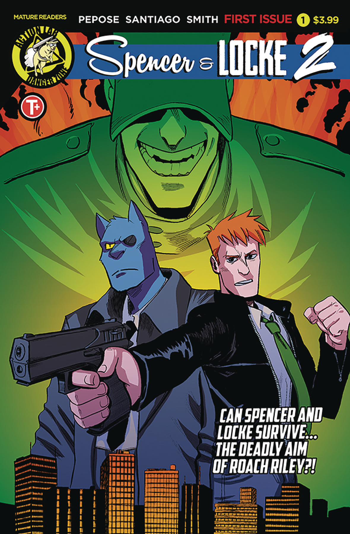
ADVANCED REVIEW: Spencer and Locke, Vol. 2 #1, the return of a book that just keeps getting better

Spencer & Locke, Vol. 2 #1 is out 4/24/2019.

Spencer & Locke, Vol. 2 #1 is out 4/24/2019.

By Zack Quaintance — I’ve been going on about this via Twitter as of late, but the Calvin and Hobbes meets Sin City homage/mash-up Spencer and Locke is, quite simply, a must-read comic, especially for someone like me who bought the Watterson collections at book fairs in fourth grade and spent class time sneak-reading them under my desk. What Spencer and Locke does is imagine Calvin as an adult, still seeing his stuffed tiger (panther here) now as a hard-boiled police detective. That panther, it turns out, has been used all along to cope with trauma.

In Spencer and Locke, Vol. 1 writer David Pepose with artists Jorge Santiago, Jr. and Jasen Smith crafts a compelling and gritty noir mystery while simultaneously deconstructing pretty much every character from the classic Calvin and Hobbes strips. It’s an audacious idea, one that could have come off as ill-advised if the creative team had not executed pretty much everything so perfectly, enfusing the whole ordeal with a massive amount of heart by giving the Calvin character a young daughter of this own (I basically crumbled everytime she interacted with the imaginary panther).

With all this in mind, it would have been easy for the creative team—which has returned here entirely intact—to go back to the Calvin and Hobbes homage well. The book likely has an audience that can’t get enough of it, and so the choice could have been made to go through it all again, this time with just a new case. Pepose, Santiago, and Smith, however, start Spencer and Locke, Vol. 2 #1 by pointing the story in a faithful-yet-new direction: homaging another classic strip, Beetle Bailey.

I’ll talk more about the individual merits of this issue in a moment. First, I’d like to just praise this decision, not only for how it functions in smoothly transitioning to a new story and a new arc, but also for how it opens an entire expanded universe for use in future Spencer and Locke stories, basically enabling the book to draw from nearly 100 years of famed newspaper comic strip characters. Previews for the next issue already seem to indicate a coming send up of Scott Adams and Dilbert, and basically all I’m saying is now we might get a rabid Snoopy cast as a pitbull in the service of a criminal Charlie Brown—just imagine.

So, yes, major points to this comic for that decision. It should be noted too though that Spencer and Locke Vol. 2 #1 is on its own merits an excellent comic, much as the previous installments of this story have all been. Santiago Jr. and Smith continue to impress with their shifting aesthetics. Whereas in the first book the duo bounced seamlessly between Watterson and Frank Miller homages, this new issue requires them to also mimic Beetle Bailey, and with an assist from letterer Colin Bell, it fits right in with the rest of the story.   

Pepose’s script tries some new things as well. What I found perhaps most interesting was the way Spencer (who is the Hobbes analog here) started to become more aggressive, more feral in the way Locke pictured him. Pepose seems to be using that depiction of the imaginary panther to clue readers in on Locke’s fraying mental state. Like the expanded use of comic strip characters, an increased emotional range for the panther seems to expand the plethora of storytelling techniques available to this comic in a vast and welcomed way.

Sometimes a book like Spencer and Locke strikes fire and struggles moving forward to replicate that same energy. That’s not the case here. Fans of the first series—a group I count myself firmly among—can rest easy, this comic has gotten even better.  

Overall: Spencer & Locke, Vol. 2 #1 is the best kind of sequel, one that stays faithful to the core concept while expanding the world in new and exciting ways. The emotional core, the fond homages to classic newspaper strips, the noir mystery—it’s all back and even better here. 9.2/10

Spencer & Locke, Vol. 2 #1
Writer:
David Pepose
Artist: Jorge Santiago, Jr.
Colorist: Jasen Smith
Letterer: Colin Bell
Publisher: Action Lab
Price: $3.99
Release Date: April 24, 2019

Check out Harry Kassen’s recent interview with the creators!

For more comic book reviews, check out our review archives.

Zack Quaintance is a tech reporter by day and freelance writer by night/weekend. He Tweets compulsively about storytelling and comics as BatmansBookcase.

Comic of the Week: KINO #14 is ‘a shining star for the Catalyst Prime line’

Catalyst Prime: Kino #14 is out 2/27/2019.

By d. emerson eddy — KINO began its life in the Catalyst Prime universe under Joe Casey, Jefte Palo, Todd Klein, and Chris Sotomayor. It was always something unique, a series ostensibly about Alistair Meath, one of the astronauts caught in space in the “Event” that sparked this rise of super-powered individuals within a new shared universe. It spent its time split between an espionage story of trying to find Meath's body and in a simulation patterned after old school comics superheroics that was trying to influence Meath's mind and outlook on life. It was very good, something different that played with comics conventions and told a nicely layered story. I highly recommend checking out those first two collections.

Then Alex Paknadel, Diego Galindo, Adam Guzowski, and Jim Campbell came along and turned the series on its ear with issue #10. Basically that issue gave us an “Anatomy Lesson”, guiding us through the implication that everything we knew was wrong, upending Meath's life, and pointing us in an entirely different direction.

Often times I find that this sort of thing doesn't work in the long term, since it tends to alienate the hardcore fans and generally once the initial shock has worn off, the change becomes somewhat boring. That hasn't even been remotely the case here, as the revelations and integration with what came before just get more interesting. It's more that this entire arc has been the true “Anatomy Lesson” and not just that first issue of the new creative team's run. Because Paknadel, Galindo, Guzowski, and Campbell have taken the elements of espionage, political oversight, not knowing what's reality and what's a simulation, and the simulation itself and continued to develop the situation of two Meaths to a very satisfying conclusion. While we were led to believe that everything was wrong to begin with, maybe it wasn't?

This final issue of the story arc is a fairly bombastic fight between the two Meaths, but one of the things that Paknadel has been weaving into the story from the beginning is manipulation. That still comes through in the explanation for what happened and the “true” Meath's victory and plans going forward, leaving a compelling thread to see where this goes in name of queen and country.

The artwork from Galindo and Guzowski is wonderful, stepping up to the task of presenting this final battle on two fronts; the normal ordinary London and one of brightly coloured vintage comics. Jim Campbell, too, deftly changes approach to lettering during these shifts to the superhero simulation, adding in thought balloons and a more visceral, scratchy approach to sound effects. I love the attention to detail that goes into the presentation of the old school comics style, immersing the reader in that world to great effect.

Overall, KINO has been a shining star for the Catalyst Prime line and Paknadel, Galindo, Guzowski, and Campbell continue to make it glow. It's a very unique take on the spy thriller by way of the superhero, revelling in the style and substance of vintage superhero comics, while telling a thoroughly modern interpretation, rife with suspicion, confusion, and shades of grey. Everything may not always be as it seems in this comic, but what is unquestionable is that this story is well worth your time.

KINO #14
Writer:
Alex Paknadel
Artist: Diego Galindo
Colourist: Adam Guzowski
Letterer: Jim Campbell
Publisher: Lion Forge / Catalyst Prime
Price: $3.99

Check out more of d. emerson eddy’s Comic of the Week feature on our Lists Page.

d. emerson eddy is a student and writer of things. He fell in love with comics during Moore, Bissette, & Totleben's run on Swamp Thing and it has been a torrid affair ever since. His madness typically manifests itself on Twitter @93418.

Top Comics to Buy for March 6, 2019 - Die #4, The Green Lantern #5, and more

By Zack Quaintance — At the risk of sounding repetitive, this first Wednesday of the month has really morphed into a monstrosity of great new comics. So much so that I’ve once again extended our usual top five picks to six. Hey, more content’s a good thing, right? Anyway, I could have also easily extended it to seven or eight or nine. It really pained me to cut great titles for this upcoming Wednesday like Doomsday Clock #9, Immortal Hulk #14, and Justice League #19.

But I figure pretty close to most everyone has their mind made up about those comics at this point, so why not shed some light on lesser-known books that are still in their early stages? I’m thinking specifically here of the creator-owned comic Self/Made, which continues to shock me with the high quality of both the its stories and ideas. It’s really turning into something special, the type of book I find myself reading toward the top of the stack each week and coming away shocked at where the story seems to be headed.

Anyway, on to the comics!

Top Comics to Buy for March 6, 2019

*PICK OF THE WEEK*
Die #4 (
read our full review!)
Writer:
Kieron Gillen
Artist: Stephanie Hans
Letterer: Clayton Cowles
Publisher: Image Comics
Price: $3.99
"FANTASY HEARTBREAKER," Part Four-Our heroes reach the civilization of Glass Town and do what heroes have always done upon reaching civilization. As in, go to the pub. As it's DIE, you can guess people don't exactly get happy drunk.
Why It’s Cool: We’ll have a more detailed and thoughtful review of this comic later this week, but let me just say here that this is the best issue yet of a series that has been fantastic from its start. This is the smoothest and most immersive issue of Die so far, which I attribute to the previous three issues having done such great work toward familiarizing us with these well-realized characters. With so much of that work behind the story now, the creators are free in this comic to really hit some deep (and troublesome in the best way) emotional beats. Don’t miss this issue; don’t miss this book.

Age of X-Man: Prisoner X #1 (of 5)
Writer:
Vita Ayala
Artist: German Peralta
Colorist: Mike Spicer
Publisher: Marvel Comics
Price: $3.99
ENTER THE AGE OF X-MAN!
In the Age of X-Man, when you break the law, you aren't sent to just any prison. You're sent to the Danger Room...a penitentiary filled with the roughest and meanest mutants that don't fit into X-Man's utopia. They each have a reason for being there. And they're all ready to kill each other.  But that's about to change, because the newest prisoner just arrived...Lucas Bishop!
Why It’s Cool: It’s a great combination of concept, creators, and character, with those respectively being the well-conceived and intricate Age of X-Man alternate universe, writer Vita Ayala (one of our favorite rising stars within the industry), and Bishop, always an underrated (if convoluted) X-Man. Seriously, Ayala has just been doing fantastic work lately, be it their superhero book for Valiant Livewire, the creator-owned Submerged, or the installment of the recent Marvel Knights mini-series that focused on T’Challa. These have all just been stunning comics, and we’re expecting nothing less from the Prisoner X miniseries, which follows Bishop into the underbelly of what is shaping up to be an Orwellian faux-utopia of an alternate universe.

Green Arrow #50
Writers:
Collin Kelly & Jackson Lanzing
Artist: Javier Fernandez
Colorist: John Kalisz
Letterer: Andworld Design
Publisher: DC Comics
Price: $4.99
Spinning out of the events of JUSTICE LEAGUE: NO JUSTICE and HEROES IN CRISIS! When a black ops organization discovers Green Arrow's long-held secret-a mysterious weapon in the form of a box, given to him by the Justice League-they'll deploy their top undercover agent: Black Canary! On opposite sides of this festering secret, Green Arrow and Black Canary will clash as only two lovers can-by aiming straight for the heart! A mystery six months in the making, the box that can destroy the Justice League will be opened...and the Emerald Archer's world will be forever changed. This extra-sized anniversary issue of Green Arrow's life isn't just ending...it's burning to the ground!
Why It’s Cool: This if the finale of one of the quintessential Rebirth books, and it’s also what is quite possibly the last book headlined by the Emerald Archer that we’re likely to get in sometime, what with DC Comics very public intent to keep its publishing line at the slightly reduced level we’ve seen in recent months. The writing team of Kelly and Lanzing are perhaps the best choice for this job too. As I believe Kelly outlined fairly recently online, the duo had a fairly elaborate plan for a 50 issue run that would get to the core of one my personal favorite characters. We’re obviously not getting that, but look for them to give us a truly epic send off that packs in as much action and as many of their ideas from that outline as is feasible. Savor it, too, I know I will. Also, we’ll (sort of) get an answer to the question from No Justice, the natural one that came up when J’onn gave Ollie a box he said was capable of stopping the entire league...

The Green Lantern #5
Writer:
Grant Morrison
Artist: Liam Sharp
Colorist: Steve Oliff
Letterer: Tom Orzechowski
Publisher: DC Comics
Price: $3.99
"Blackstar at Zenith!" Hal Jordan has abandoned the Green Lantern Corps to join the Blackstars! But to do so, he'll need to convince their leader, Countess Belzebeth, and pass an initiation test. Which means he must survive a series of trials on the vampire planet Vorr, whose entire population wants to feast upon him! It's cosmic goth at its bloodiest...with a cliffhanger that's even bloodier!
Why It’s Cool: This run has been fantastic from start to finish, and this issue keeps it going. As promised by the creative team before the book even launched, The Green Lantern has been a series of quisi self-contained space cop procedurals. This issue builds on all that has come before while telling yet another compelling story built upon some of the key qualities and continuity bits that define Green Lantern. Also, as anyone who follows artist Liam Sharp will surely attest, the detail and imagination in the artwork he’s previewed for this comic has just been astounding, somehow even better than the tremendous heights he’s reached in earlier chapters. Think about it too long, and it will blow your mind as thoroughly as Morrison and Sharp seem hell-bent on doing.

Self/Made #4
Writer:
Mathew Groom
Artist: Eduardo Ferigato
Colorist: Marcelo Costa
Color Flats:
Mariana Cali
Letterer: A Larger World Studios’ Troy Peteri
Publisher: Image Comics
Price: $3.99
"THE 'TA-DA' MOMENT": Amala has made it to our world-and she is distinctly unimpressed. What's a girl with a new robot body and some pent-up rage to do? Paint the town red.
Why It’s Cool: Simply put, because this is the best comic I’ve read in I don’t know how long that rushes head first at the central questions of life itself. That’s maybe being a little dramatic, but this really has quickly turned into a story with a lot to say about creation. In this issue, we also get some really clever interplay between characters that’s analogous to that between child and parents, plus a tour de force visual journey through a near-future version of Sydney, Australia, along with the now-standard breakneck plotting that’s come to define the book. This is yet another major surprise from Image Comics in the past year or so that more readers should be talking about. I get that you might not be familiar with these creators, but you’re doing yourself a disservice by sleeping on this book.

Top New #1 Comics

Others Receiving Votes

  • A Walk Through Hell #8

  • Batman #66 (read our full review!)

  • Blossoms 666 #2

  • Cemetary Beach #7

  • Doomsday Clock #9

  • The Dreaming #7

  • Eclipse #13

  • Giant Days #48

  • Immortal Hulk #14

  • Justice League #19

  • Killmonger #5

  • Paper Girls #26

  • Red Sonja #2

  • Uncanny X-Men #13

  • Vindication #2

  • Young Justice #3


Check back to the site later this week for reviews of Astro Hustle #1, Batman #66, Uncanny X-Men #13, and more!

See our past top comics to buy here, and check our our reviews archive here.

Zack Quaintance is a tech reporter by day and freelance writer by night/weekend. He Tweets compulsively about storytelling and comics as BatmansBookcase.

The Saga Re-Read #30: Saga #30 is an action-packed story arc finale

Saga #30 was first released on 7/8/2015.

By Zack Quaintance — The end of the most recent story arc is upon us, and so is the shift into what I’ve come to think of as the more recent issues of Saga, those essentially published after the book went from big-time comics hit to somewhere closer to broader cultural touchstone (although it still needs the inevitable TV/film adaptation to go all the way), and this finale is a good one.

I’ve written about this elsewhere during our Saga Re-Read project, but I’ve found this arc to be more unpleasant than those that came before it. This is, presumably, by design. The book was maybe running the risk of turning into a series of madcap adventures that the core family continues to escape mostly unscathed. This arc changes that, using temporary separations in a way that emphasizes the stakes for those are basically as high as they would be when dealing with injury or death. Just...different. Anyway, what we get with this finale is a packed adventure story with tons of consequences. It is, in a word, good.

Let’s take a look!

Saga #30

Here it is, the official preview text for Saga #30, which was first released back on July 8, 2015. This issue has a special significance for me, because it was after this one that I decided to make the crazy jump from Saga trade waiter to Saga monthly reader, which then opened to door to buying a whole slew of creator-owned comics monthly and ultimately starting this website. Ah, the follies of financial irresponsibility. Onward!...

Sooner or later, everything dies.

Sigh. A preview that is both mysterious and terrifying, meaning that the only way to figure out even part of what it’s talking about is to read the damn comic. In other words, I supposed this morbid vaguery has done its job…

The Cover: This is without question my favorite cover from this arc, featuring as it does a clearly alien flower atop an ample splattering of blood. It gets to two of my favorite facets of Saga—the imagination and the backdrop of shattering relatable tragedy. I also think the color choices on the leaves provide a nice (if subtle) contrast to the deep crimson of the blood splayed over the ground. Great stuff.

The First Page: Yet another divided first page, this one used well to show us Marko and his current plight (with a dash of foreshadowing...but more on that in the foreshadowing section). The shot start on the planet where Marko has crashed, zooms in, and then zooms in again to show him splayed and wounded in the snow. It’s as intriguing a set of images as an establishing first page for a long-running story can offer, and it’s made even more powerful by Hazel’s narration, which suggests her father might be hurt worse than we think.

The Summary: Marko, Prince Robot IV, and Ghus crash land, with Ghus staying to tend to an injured IV while Marko storms off to find his family. Speaking of his family, Alana, Klara, and conflicted murderous kidnapper Dengo (who gets humanized here) fight their way free from the Last Revolution. Things...do not go well for the Last Revolution, but the survivors of manage to abscond with Klara, Hazel, and a spaceship without much fuel. Once they do, Alana turns to kill Dengo and is stopped by Marko. The reunion, of course, is quite satisfying.  

As they struggle over whether to hurt a now-vulnerable Dengo, Prince Robot IV shows up and wastes him immediately as recourse for Dengo did to his own wife, quickly turning to enjoy his own reunion with his son. Elsewhere, Sophie, Gwendylon, and Lying Cat sneak The Will from a hospital (off page), and administer the antidote to him, waking him from a years-long incapacitation. The Will is devastated to learn that his sister died in the service of waking him. Finally, this arc ends with a shot of Hazel presumably interned in some kind of jail/kindergarten. Intriguing.

The Subtext: This is one of those issues where the plot mostly crowds out any potential subtext. What room there is for reading between lines is also mostly devoted to foreshadowing events to come. Still, there is the continued beating of the all violence is bad drum that has in many ways been the foundation of the commentary in this series. Any sort of broader familial subtext here is lacking.

The Art: There are a lot of panels in this issue of Saga, at least relative to some of the other recent issues. I didn’t expressly count, but it’s quite possible the only splash page in the entire issue is the final cliffhanger. As such, Fiona Staples is asked to pack a lot of intricate action into several busy pages...and she unsurprisingly pulls it off with ease. See below...

The Foreshadowing: There’s a good deal of foreshadowing in this comic, from the first page hinting that Hazel will lose Marko, to Hazel telling us later that she would spend a great deal of time separated from her own family. As noted in the subtext section, Hazel’s narration also hints that problems have always and will continue to stem from Marko and Alana struggling to limit their own use of force, as does her narration when The Will awakes from his coma: Nobody knew exactly what kind of nightmare had been awakened that evening...but in time, my parents would find out.

All in all, this is a pretty telling issue, at least in retrospect upon re-read. The first time through, the action made it hard to focus on anything past what happens next! It should also be noted that IV wasting Dengo for killing his lover as Dengo begs for mercy is an eerie parallel to something that happens to IV much later...

Join us next time for the start of a brand-new arc, the one that began after Fiona Staples went off and helped Mark Waid re-launch that new Archie line, which as far as I know are the only other comic interiors she’s drawn since starting Saga...

Saga #30
Writer: Brian K. Vaughan
Artist: Fiona Staples
Letterer: Fonografiks
Publisher: Image Comics

Check out past installments of our Saga Re-Read.

Zack Quaintance is a tech reporter by day and freelance writer by night/weekend. He Tweets compulsively about storytelling and comics as BatmansBookcase.

Creator Journal: Jeffrey Brown

This piece is the second of a monthly series giving nascent creators a chance to share and document part of their artistic journeys. We’ll be following four individuals—writers, artists, writers/artists—and spotlighting each on a rotating basis throughout 2019. Future installments will take more of a traditional journal format, giving creators a space to share thoughts and comics. For the intro, however, we’ll get to know each participant better through a question and answer.

With all that in mind, we’ll cede the space now to our second creator, Jeffrey Brown, a writer/artist from Live Oak, Fla., which is located in the northern part of the state between Tallahassee and Jacksonville. Jeffrey is as passionate and hard-working of comic writer/artist as there is. Check back the last Friday of next month for a look at our next participant!

Writer/artist Jeffrey Brown

Q: Tell us as much as you'd like to share about yourself...where are you from? How old are you? What is your life as an artist like?

A: Hello, my name is Jeffrey Brown (not to be confused with that other Jeffrey Brown), and I live in a Live Oak, Fla. My life as an artist thus far has been getting up in the afternoon or evening, sketching stories for my comics in my notebook, writing a rough outline of a plot, and when it’s good to go...pencil, ink, and color a page a day :). I take breaks in between projects to read my favorite books, chill out on Twitter, watch movies, and listen to my favorite podcasts.

Q: What are your aspirations for making comics and what is your biggest motivation to get there?

A: My aspirations for making comics are simply to be a storyteller. I want to make the kind of comics I like  to read. The thing that really gets me excited about making comics is that I have the freedom to let my imagination run wild. My goal as a cartoonist is to write and draw comics that will be timeless years from now. That’s really what motivates me. I want to leave a legacy behind with my work.

Q: Where do you see yourself right now in terms of your career trajectory?

A: My career is still a work in progress. Hopefully, I see myself making a decent living as a cartoonist some day, maybe getting the opportunity to work on interesting projects with talented writers in comics. I also want to one day work in animation, but my goal right now in life is to be recognized and valued for my talents as a young cartoonist. I want to keep putting weird and interesting stories into the world through my comics.

Q: What are some of your short term goals and what are some of your longer term goals for 2019?

A: To be honest, my short term goals for 2019 is to just build steady sales of my art and comics. I’d also like to Get my comics and art published in various publications. I want to make an income through making my art. I’m really thankful for the little victories I have had thus far but I am hungry for more. One day, I’d also like to win awards.

unnamed.png

Q: How much time each week do you spend working on comics and what do you spend that time doing?

A: A typical week for me making comics is something like this: on Monday I will write out a short outline of the plot, starting with the style of writing, and then I draw thumbnails in my sketchbook as my first draft. If I like what I scribbled out, I then get to work on my PC and sketch out from my thumbnails the sequential pages from my story (lately my stories have been like 16 pages), and then after doing rough sketch layouts I proceed to ink a page a day. If it’s a comic in color, I usually do that last after inking and lettering. I try to spend at least 2 to 3 hours on a page inking and coloring. I do take breaks in between, and I spend that time on twitter, listening to podcasts, playing retro games and watching movies.

Q: What are some of the biggest challenges--both logistically and emotionally--when it comes to making comics in your life?

A: I’m currently working from home, which is a both fun and a challenge. The fun part is right now I get to focus on my work and just create. The challenge is that right now I don’t have enough money to go out and travel. Ever since I got sick recently and lost my job at a BBQ restaurant, I decided to stop waiting for the right time to pursue my passion for creating comics. I decided to go for it. Right now I feel good about myself and what I am doing. Work that day job for two years was emotionally exhausting for me. It was a rough two years for me (lol). Right now, I feel like I’m emotionally in a better place. Right now, I enjoy spending my time pouring my heart and soul into making comics. I enjoy putting pen to paper and having fun and sharing that with the world. Doing this truly brings me joy.

Q: Finally, tell us about the piece you've shared here today…

A: I’m currently working on the fourth issue of my mini comic, The Misadventures of Izanami Grey. It’s about a brilliant scientist who has empathic vampire powers that occasionally turn her into a mutant Were-Bat monster. In this issue Izanami and her boyfriend Kieron are on a mission to rescue the president. They must find him alive and bring him back to the states to be prosecuted for his many human rights violations. Chief among his many crimes was denying humanitarian aid to the people of the fictional island nation of Gene-Verte, who now have the president and are also about to put him on trial to punish him for his grievous crimes against them. I can’t say any more, so please buy a copy of my comic to check it out for yourself over at Gumroad:

You can buy The Misadventures of Izanami Grey through the following links:

You can follow Jeffrey Brown on Twitter at @tsujigo and you can read last month’s Creator Journal feature here!

Check back next month to meet the third of four creators participating in this series!

Best New Comics February 2019 - Daredevil, Red Sonja, and Wonder Twins

By Zack Quaintance — One fun thing about comics from year-to-year is that we really don’t have an accurate idea of what the next 12 months will bring in early weeks. We can see as far out as the solicits allow (which is currently May), but anticipating what new books will come in the months that follow is at best a lightly informed guessing game. At this time last year we knew scant details about some of 2018’s defining releases, from Benids’ work on Superman to Marvel’s entire slate of new books: Captain America, Immortal Hulk, Venom, you name it.

That’s all to say that these new series that have launched in January and now in February, are just the tip of 2019’s forthcoming new comics. There are, without question, GIGANTIC releases that will shift and reshape the comics landscape yet to be unveiled. All that said, I’m still impressed with the number of quality releases we’ve gotten in 2019 so far. Marvel’s return to broader quality continues this month with Daredevil while DC’s Wonder Comics imprint continues to be a welcome new tone for the 80-some-year-old publisher.

It’s all very exciting, and so let’s not dilly dally any further. Onto the books!

Quick Hits

Let’s start with the most imaginative and welcoming new take on a long-standing property in year’s Michel Fiffe’s G.I. Joe: Sierra Muerte #1. This book makes setting capital I Important, with the titular Sierra Muerte area disrupting the old fight between Joes and Cobras. I for one love it.

Another book in which setting is vital (this time it being a dystopian future) is High Level #1 from writer Rob Sheridan and artist Barnaby Bagenda. This is the best of the Vertigo: Rebirth books so far, and with Second Coming off to another publisher, it seems poised to stay that way.

Meanwhile staying at DC, Female Furies #1 is a book I’m kind of surprised to not hear more folks talking about. It really extrapolates Darkseid’s all-consuming universal darkness in a way that’s relevant and specific to our times.

Speaking of relevant things to say about our current tumultuous times, Vindication #1 was a complex and realistic take on race-based injustices within law enforcement. This is a fair book setting out to take an unflinching look at how shades of gray can creep into these situations, or at least at how perception can alter behavior. This is a very smart comic. Read our Vindication #1 review!

The new book that left the greatest impression on me last month, though, was Girl in the Bay #1, a haunting tail of family and murder and the concerns of the young in a bygone era. There is a long tradition of horror-tinged innocence lost stories in American fiction that this book seems poised to fit right into.

One of the most consistent publishers in all of comics, Valiant, had a rare month in which it launched not one but two new books, those being Forgotten Queen #1 and Incursion #1, the former featuring a brand new character and the latter using established characters in the service of a new idea. Both debuts were strong and I’m excited to see where the larger stories go.

Last but certainly not least are a trio of the new X-Men miniseries, showrun by Zac Thompson and Lonnie Nadler, that I’m considering in my head to be Age of Apocolypse 2.0 (side note: there were four, but I wasn’t all that interested in the Nightcrawler one). The books I want to shout out here are: Age of X-Man: Marvelous X-Men #1, Age of X-Man: NextGen #1, Age of X-Man: X-Tremists #1. Contributing writer Allison Senecal will have more on each next week in her monthly Age of X-Man Round-Up, but I’d like to praise these books for the thoughtfulness of the alternate world they inhabit as well as the variety in the way they’re examining a flawed utopia. They all bring something different and welcome to a fascinating overall picture of the world. Kudos to the creative teams.

Top 5 Best New Comics February 2019

Daredevil #1 (Read out full review of Daredevil #1!)
Writer:
Chip Zdarsky
Artist: Marco Checchetto
Colorist: Sunny Gho
Letterer: VC’s Clayton Cowles
Publisher: Marvel Comics

The transition to a brand new Daredevil creative team (which is what we got this month) is a long-standing and noteworthy event in comics, be it from Frank Miller to Annie Nocenti, Kevin Smith to Brian Michael Bendis, Mark Waid and Chris Samnee to Charles Soule, and so on. There’s just something about Daredevil—the Catholic guilt? the simultaneous aversion to/embrace of violence? the background that saw him become a hero because he already was one?—that consistently gives creators the fertile ground they need to do career best work.

I’m expecting no less, quite frankly, from Chip Zdarsky and Marco Checchetto, and I’m also happy to say that I was encouraged by this opening chapter. In it, there are few flashy gimmicks, just solid comicbook storytelling and writerly impulse to put the protagonist up against great possible odds, thereby showing we the audience what our guy is made of. It’s an understated and appropriate debut for an often-understated character, and I highly recommend it.  

Punks Not Dead: London Calling #1 (Read our review!)
Writer:
David Barnett
Artist: Martin Simmonds w/flatting be Dee Cunniffe
Publisher: IDW - Black Crown

I was going to try and write this segment in a British accent filled with punk lingo...but I decided to save us all the indignity of that, banishing it instead to the deepest reaches of my mind where it will never be thought of again or uttered aloud. Anyway, Punks Not Dead: London Calling #1 is essentially the first issue of this book’s second season. It’s also my favorite issue of Punks Not Dead to date.

I loved the concept of this book from the time it launched last year—an angsty, lonely, and flailing kid gets linked to the ghost of Sid Vicious, annnnnd hi-jinx—but what I like about this new series is that the central duo now have a really well-built quest to go on. They are at once being chased by authorities while pursuing the true identity of the main character’s father. It’s such a solidly-written hero’s journey kind of deal. When paired with the book’s already-excellent premise, you get a really exciting new comic.   

Red Sonja #1.jpg

Red Sonja #1
Writer:
Mark Russell
Artist: Mirko Colak
Colorist: Dearbhla Kelly
Letterer: Hassan Otsmane-Elhaou
Publisher: Dynamite Comics

It’s a Mark Russell double whammy this week, with first Red Sonja #1 and later on Wonder Twins #1. Obviously, Russell is one of my favorite writers, but I think he did outstanding work on both of the new series he launched in February. I’ve never read a Red Sonja book, and, really, I’m not one to read comics simply because I love a character. In fact, at this point I’ve aggressively become one of those readers who reminds you that I never do that, preferring instead to follow the creative team.

So, what then did I find in this issue as someone brand new to Red Sonja but familiar with pretty much all of writer Mark Russell’s comicbook work? I found quite a bit to like. Russell, joined here by collaborators Mirko Colak and Dearbhla Kelly, does a great job orienting readers like myself to this world, before then applying his wry satirical storytelling sensibilities. It’s a smart and savage read, and I know Russell fans (and probably also Red Sonja fans) have a lot to look forward to here.

Stronghold #1 (Read our full review of Stronghold #1!)
Writer:
Phil Hester
Artist: Ryan Kelly
Colorist: Dee Cunniffe
Letterer: Simon Bowland
Publisher: AfterShock Comics

Stronghold is a new book from one of my favorite indie publishers, AfterShock Comics, and it’s about a man who maybe has the power to break the universe but doesn’t have any inkling he’s significant. He’s an insurance salesman in St. Louis, for pete’s sake. Meanwhile, a secret society/cult (take your pick) is monitoring him daily to ensure he never finds out the truth of his existence. That’s the status quo we find upon entering the book. The plot begins when a young woman who interacts with him daily (and was raised in the secret society/cult) falls in love with him. Hi-jinx ensue.

This is a really well-formed comicbook produced by a talented and veteran creative team. It has a high level of ideas and themes one might expect to find in a full-blown novel rather than a graphic sequential story. Most importantly, though, I found the execution in this first issue to be absolutely flawless. Every scene is perfectly paced and enthralling. The POV is chosen well throughout, and it all adds up to a new comic series I’d recommend to pretty much any reader.

Wonder Twins #1
Writer:
Mark Russell
Artist: Stephen Byrne
Letterer: Dave Sharpe
Publisher: DC Comics - Wonder Comics
I don’t play favorites with this Best New Comics monthly piece, but—between you and me, shhh—this one was probably my favorite new book. It recasts the Wonder Twins from the old Super Friends show (and probably other things?) as alien new kids in a new earth high school, where they suffer the same bouts of hubris and insecurity I know I did. Humiliation and triumph and searching for ones place ensue, all set with a superheroic backdrop.

I’m not generally a fan of loquacious meta humor comics, your Deadpools and Harley Quinns, and while this is a funny book, it’s not really kin to any of that. It’s sensibility is smarter and quieter, more like Russell’s The Flintstones. It also has a big heart. So often, joke superhero comics fall back on making their heroes look dumb or madcap. This book is respectful and humanizing of the Wonder Twins, and it gives the creative team a much broader emotional canvas to work with. Well done, everyone involved.

Check out more of our many monthly lists here.

Zack Quaintance is a tech reporter by day and freelance writer by night/weekend. He Tweets compulsively about storytelling and comics as BatmansBookcase.

Thirsty Thursdays February 2019: A Thirsty Valentine’s Day

By Allison Senecal — Welcome to a special and somewhat oversized Valentine’s edition of Thirsty Thursday! It’s not all smoochin’, but there sure is a lot of it. And now, without further adieu, let’s get to this month’s very special look at a certain intense type of comicbook art.

Enjoy!

Artist: Matteo Buffagni
Colorist:
Federico Blee
Asgardians of the Galaxy #6:
Angela/Sera shippers have been waiting 84 years for this reunion and were rewarded with a kiss as soon as the two shared page-time again. Happy Valentine’s Day indeed!
💦💦💦💦💦 out of 5

Forget about guarding the galaxy, who’s going to guard my heart?

Penciler: Carlos Villa
Inker: Juan Vlasco
Colorist:
Carlos Lopez
Flashback Art: Gerardo Sandoval
Shatterstar #5 –
What? You wouldn’t reach through time and space to rescue your sad, hot, stabby boyfriend? Very seriously going to miss the team of Villa, Sandoval, Vlasco, and Lopez on this, but hey they get to do some Uncanny this summer...
💦💦💦💦💦 out of 5

Call me a romantic, but I think it’s sweet when one goes to the trouble to “reach out across the universe and find your unique signature.”

Artist: Marco Checchetto
Colorist:
Sunny Gho
Daredevil #1
– HOW DO YOU EVEN pick  a single panel from this %$#&ing comic? Matt gets to spend some quality time in bed with his three favorite things: Catholic guilt, batons, and a lot of blood. Elektra would approve.  
💔💦💔💦💔 out of 5
Read our review of Daredevil #1!

Is that your Catholic guilt, or are you just happy to see me?

Penciler: Paco Medina
Inker: Juan Vlasco
Colorist:
Jesus Aburtov
Avengers: No Road Home #2 –
In peak Hawkeye fashion, Clint spent Valentine’s Day in a hospital bed, scruffy and sad. And crying! Hell, I’ll fight the Hulk myself.
💔💦💔💦💔 out of 5

Can someone get me the heart rate monitor next? I think Clint just stole mine.

Artist: Sana Takeda
Monstress #20 –
Liu and Takeda know how to summon me from the void. Arranged lesbian wedding? A bowl of sacramental blood? Now drink it and KISS!
💦💦💦💦💦 out of 5

Once again, my favorite thing is Monstress.

Artist: Geoff Shaw
Colorist:
Marte Garcia
Guardians of the Galaxy #2 –
Come for the Thanos mystery, stay for the soft girlfriends content with Phyla and Heather. On a later page, they’re grumpy and wearing comfy PJs. It’s the best.
💦💦💦💦 out of 5
Also, check out our Guardians of the Galaxy #2 review!

And apparently there’s something going on with Thanos in this book too?

Artist: Mattia De Iulis
Jessica Jones: Purple Daughter #2 –
Back in October, I said Emma would automatically make this list every time she made an appearance, and in the spirit of journalistic integrity (and De Iulis’s Emma Frost being a stunner), voila! The Black King, darling.
💦💦💦💦💦 out of 5
Also, check out Jessica Jones, Comic of the Week!

And long may she reign.

Artist: Jon Davis-Hunt
Colorist:
Steve Buccelatto
Wild Storm #20 -
MIDNIGHTER AND APOLLO ARE 100% BACK, BABY. And in such style. 💦💦💦💦 out of 5

I can’t remember the last time this lovely couple has looked so good.

Artist: Amilcar Pinna
Colorist:
Ulises Arreola
Forgotten Queen #1-
I love when my tastes are so specifically catered to, as they were here. A charmingly foul-mouthed millennia-old personification of conflict? Is this for me? I would die for Vexana, and I’m sure she’d let me.
💦💦💦💦💦 out of 5

Clearly, Valiant has not forgotten about my tastes.

Artist: Gang Hyuk Lim
West Coast Avengers #8 -
More kissin’! This time courtesy of America and Ramone! Love that Gang Hyuk Lim is coming onto this title for a few issues. Everyone (even tired slobbery Kate) comes across dynamic, hot, and incredibly fun.
💦💦💦💦💦 out of 5

Sure, this art is thirsty, but it’s a really fun kind of thirsty.

I also have to shout-out the Stephanie Hans cover for the 2nd printing of Die, which kept me awake several nights this month….

I am 100 percent going to die from lack of sleep due to this cover.

Hope you’re looking forward to March aka my birthday month aka the Month of Bêlit.

Check out The Thirstiest Comics of January.

Allison buys books professionally and comics unprofessionally. You can find her chaotic neutral Twitter feed at @maliciousglee.

REVIEW: Vault Comics’ Wasted Space #7 makes smooth transition into ongoing monthly comic

Wasted Space #7 is out 2/27/2019.

By Zack Quaintance — I’ve been reviewing Wasted Space since the series started in April of last year, and I’ve loved this book from the start. As I wrote in our Top Comics to Buy for February 27, 2019 feature this week, this is the best original space opera in all of comics today. You can read more detailed and nuanced thoughts over on our Reviews Page, but to sum it up, I think this is a versatile and smart comic, one as capable of making jokes about sex robots as it is asking profound questions about religion and power structures.

This is all a means of establishing why I was so excited when late last year publisher Vault Comics announced that the book would be its first proper ongoing series, extending past the always-difficult 20 issue mark. Now, I’m not always one to clamor for more, more, more from creatives, believing as I do that inspiration is a flighty and special commodity, and that writers, artists, etc. shouldn’t mine topical areas that have long gone dry. Wasted Space, however, has brimmed from its inception with almost too many ideas, too many hilarious exchanges, exciting conflicts, and just straight up space operetic adventures.

In Wasted Space #7, the value of transitioning from a finite story to a longer ongoing series for a book like this becomes clear: writer Michael Moreci is able to dedicate more space to the excellent characters he’s been building for half a dozen issues, giving us a chance to get to know them a little bit better. This is—make no mistake—an exciting issue, in which several major plot developments (especially for Dust and Molly) come to a head and push our characters into new directions. But there are also several scenes I think are only possible in the context of a longer-form story

And they’re some of my favorite scenes in this issue. I’m thinking specifically here of the opening, in which Billy and Molly have one of the series trademark philosophical conversations in a cosmic convenience store (rendered with great detail and better colors by the art duo of Hayden Sherman and Jason Wordie). Billy leans back and pours blue space slurpee directly into his mouth as Molly essentially satirizes social media, landing the Wasted Space culture commentary line of the issue with: I have been to the social stacks though. You have terrible people saying terrible things, then you have so-called good people assuming everyone who doesn’t share their exact principles is a total monster. And all it leads to is everyone screaming and no one listening. As usual, this is great stuff.

So yes, while not every comic is best-served by long-form serial narrative, Wasted Space certainly is, quickly making the most of the format and giving us more than enough value for the price of admission. One last note...the editorial team is already buzzing about how good Wasted Space #8 is, so I for one am circling my (non-existent and entirely theoretical) calendar for its due date, March 27.

Overall: Wasted Space #7 is another great example of this books strengths: operatic space adventure blended with philosophical discourse about modern society, all filtered through Hayden Sherman and Jason Wordie’s fantastic artwork. This remains one of the best comics today. 9.5/10

Wasted Space #7
Writer:
Michael Moreci
Artist: Hayden Sherman
Colorist: Jason Wordie
Letterer: Jim Campbell
Publisher: Vault Comics
Price: $3.99

For more comic book reviews, check out our review archives.

Zack Quaintance is a tech reporter by day and freelance writer by night/weekend. He Tweets compulsively about storytelling and comics as BatmansBookcase.


REVIEW: Ice Cream Man #10, one step back and two steps toward that other dimension

Ice Cream Man #10 is out 2/27/2019.

By Zack Quaintance — There was bound to be a bit of a slowing down after the revelations of Ice Cream Man #9, a comic that (cliche alert!) took everything you thought you knew about this series and flipped it on its head. Ice Cream Man #10 had the difficult task ahead of it of returning the audience back ever so slightly to the core concept of this series, while still building on the mind-bending preceding chapter.

For those who may have missed it, Ice Cream Man #9 put the titular white-clad ice cream man in the foreground along with the black clad hero figure who’s been chasing him (and who he murdered in Ice Cream Man #8, but that’s a whole other thing…), and it put them front and center in what is presumably a different planet...or a different dimension...or our same planet during a mythological time of gods when fate was still undecided...or all three? As you can see, the whole thing was very Stephen King’s Dark Tower.

The effect it had on the audience was all very impressive, reorienting our understanding of the connective tissue between the preceding eight issues. Ice Cream Man #10 doles out, hmm, let’s say a half scoop of more context around that, while instead returning to the horror-tinged vignettes that have run throughout this series. This was a great choice, reminding us that while, yes there is some sort of potentially cosmic epic of gods and spirits raging behind the mundane everyday facade of the world, possibly spilling over at times to inflict great pain and suffering upon the normals (normals like us), the real important stuff here has been that everyday facade all along.

Now, I won’t front like I have any idea whatsoever what may or may not happen in the final three issues of this series. C’mon—I know my limits, but I think making it just as much about the individuals we’ve seen brutalized, tormented, and in rare instances left to grow old and happy as it is about whoever these elemental forces are? Well, I think that’s a very good flavor, indeed (jesus, sorry about that, it’s late and I clearly should have written this earlier…).

In more practical matters, it should perhaps be noted that the vast majority of this issue was written in Spanish. I can read Spanish myself at maybe a third grade level, somewhere in that vicinity, and I didn’t struggle with comprehension at any point, not even for a moment. If you have even a cursory handle on the language, you’ll glide seamlessly through it. Even if you don’t, though, you’ll be just fine. If you really need to know every last word, Google Translate has gotten amazingly proficient lately (seriously, it’s one of the best inventions of our modern era and like nobody talks about it...we can instantly translate like anything!). This entire issue is set on the border, and writer W. Maxwell Prince approaches it with the attention to immersive detail that has powered this entire series.

The venue shift really works well for this story and this comic, given that to date everything took place in an idyllic (on the surface, anyway) suburb. Essentially, it fits with the expanded scope of the story as established by last issue. If this is going to be a tale of deep and massive forces, it needs to effect all of space and time, and that’s what we start to get in Ice Cream Man #10. Meanwhile, Martin Morazzo’s artwork continues to impress with colors by Chris O’Halloran, and as usual, the letterer, in this case Good Old Neon (yes, you read that right), is the unsung hero of the creative team.

Overall: One step back and two steps in some potentially cosmic direction nobody saw coming, Ice Cream Man #10 nudges the series back toward its core concept—horror vignettes—while still pushing forward the overarching narrative. This is one of the best comics today, and we should all be grateful for it. 9.4/10

Ice Cream Man #10
Writer:
W. Maxwell Prince
Artist: Martin Morazzo
Colorist: Chris O’Halloran
Letterer: Good Old Neon
Publisher: Image Comics
Price: $3.99

For more comic book reviews, check out our review archives.

Zack Quaintance is a tech reporter by day and freelance writer by night/weekend. He Tweets compulsively about storytelling and comics as BatmansBookcase.