Happy Birthday, Daredevil

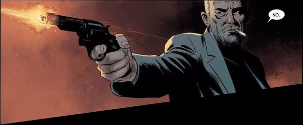
Daredevil, the rare character who gained powers after deciding to perform a heroic act.

Daredevil, the rare character who gained powers after deciding to perform a heroic act.

By Andrew Scott — What makes a hero? It’s a simple question with a complex string of not-so-simple answers. If one’s actions are what determines one’s character, though—as F. Scott Fitzgerald posited— then how can we best understand true heroism within the confines of the superhero genre?

The Fantastic Four, Spider-Man, and even Captain America were just in the right place at the right time (or wrong place/wrong time, depending on your perspective). Reed Richards and crew were, let’s face it, kind of dumb to fly into space only to be belted with cosmic rays. Spider-Man was bitten by a radioactive spider during a school trip. Captain America just happened to be rejected as 4F while an Army scientist with kooky ideas was nearby and recruited him into the secret Super Soldier program.

“Matthew Murdock was a hero before he gained his superpowers…”

“Matthew Murdock was a hero before he gained his superpowers…”

The Flash? Freak accident. Superman? Sure, his Kansas family raised him right, but the power of our yellow sun pulses within every one of his Kyptonian cells, whether he likes it or not. Batman’s parents were killed, and his actions are informed by that tragedy, but it’s still something that happened to him.

Mutants are, like Lady Gaga, just born that way. They have no choice. All of those gods and goddesses—well, divinity has its privileges, I guess. And forget anyone who possesses some kind of object that grants them special powers, whether it's an amulet, a ring, whatever.

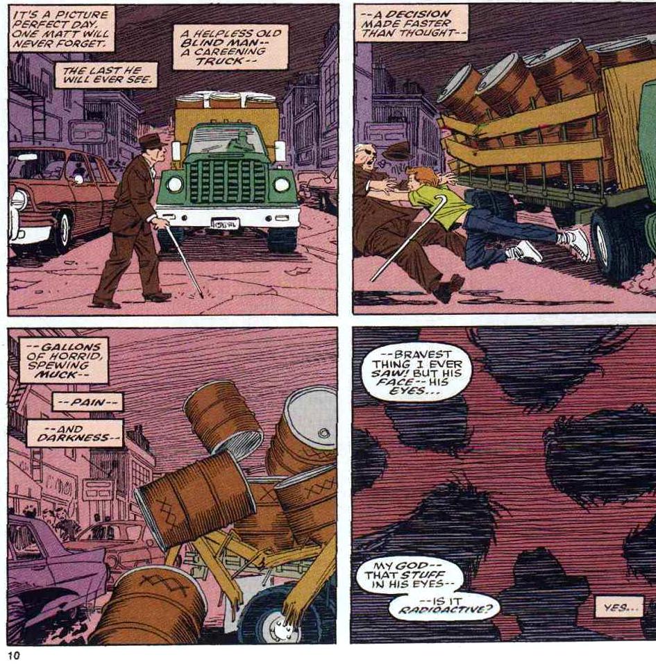
But Daredevil? Matthew Murdock was a hero before he gained his superpowers because he chose to perform a heroic act. He pushed a blind man out of the way of an oncoming vehicle that was carrying radioactive material. The toxic goo blinded him and enhanced his other senses. But his actions made him a hero first.

Happy birthday, Daredevil.

Check out Andrew Scott’s recent interview with artist Peter Krause, and check back to the site Wednesday for a review of this week’s new Daredevil #1.

Andrew Scott is the author of Naked Summer: Stories. He has written for dozens of outlets. He lives in Indianapolis. You can find him on Twitter: @_AndrewScott.

Comic of the Week: Action Comics #1007 is a must-read chapter in the Bendis Superman run

Action Comics #1007 came out 1/30/2019.

By d. emerson eddy — Last year, Brian Michael Bendis walked across the aisle in terms of Big Two comics publishers. After nearly two decades of shaping the Marvel Universe, he hung up his Spider-tights and donned a pair of red underoos at DC. It was a pretty big deal, probably one of the biggest exclusivity changes we've seen in the past 10 years. Some people cheered, some jeered, some waited patiently to see what would occur. I shrugged, because I wasn't reading any DC Comics at the time of the announcement and wouldn't again until recently. I just knew I was going to miss Bendis' writing on Jessica Jones and Defenders.

Fast forward to late last year, when the temptation for The Sandman Universe and Jinxworld titles became too great. I started with those titles, before giving the broader DC Universe a chance again. Although I may have some trepidation at some bleaker corners of their publishing, I feel like Brian Michael Bendis has become like a shining light for them, a light in the darkness. With the Superman titles, Wonder Comics, and Jinxworld, I feel like he's been rejuvenated. Some of his familiar writing quirks are still there, but not to excess. The dialogue tics and decompressed storytelling approaches are present, but not at the point where they feel overboard. And Cover and Pearl (with the inimitable David Mack and Michael Gaydos respectively) feel like some of the freshest, most inventive work that he's written in years, possibly ever.

It could be the excitement of playing in a new sandbox, but that joy, wonder, and freshness carries over into the Bendis-penned Superman titles as well. People may argue about Superman itself, but I feel like he's nailing Action Comics month in and month out. Action Comics #1007 begins “Leviathan Rises” (or “Leviathan Rising” if you go by the cover) that promises to unearth secrets of the DC Universe, and this is a promising start. There have been hints of things going on since #1001, but this issue starts with a bang when it comes to someone targeting other shadowy organizations. It's a decent hook, but what particularly puts the story over the top here is a personal moment between Lois Lane and her father. I won't spoil it, but it's a conversation that will have huge ramifications and is something that you probably don't want to miss.

Steve Epting joins the series to provide the line art for this arc, a perfect choice. Shadowy conspiracy and espionage-tinged stories are his forte, and he shines here. Despite the brightness of Superman's world, he brings a tinge of darkness from the corners in the attacks on the other secret societies and black ops organizations. Those attacks are also beautifully enhanced by the explosion effects provided by Brad Anderson. It's nice to see the contrast between Superman's bright, bold colors and the darkness of an organization like Kobra as well. I'd also go back to the conversation between Lois and her father, wherein Epting and Anderson play it out like a spy meeting her handler for the first time in years in its composition and coloring, adding a nice tension to the entire scene. And Josh Reed serves as the backbone again for the series with his lettering. There's a quite nice effect with the “Faith to Kali Yuga!” chants.

Overall, Bendis, Epting, Anderson, and Reed provide a good jumping-on point here with Action Comics #1007. Although it does build on what's come before, it's not absolutely necessary to have read since the run started with #1001, giving you more than enough to be hooked by this issue alone. The mystery of the attacks and the character work pretty much make this unmissable if you're a Superman fan. It's also laying some of the groundwork for the future of the DC Universe. I'd suggest getting in now.

Action Comics #1007
Writer:
Brian Michael Bendis
Artist: Steve Epting
Colorist: Brad Anderson
Letterer: Josh Reed
Publisher: DC Comics
Price: $3.99

d. emerson eddy is a student and writer of things. He fell in love with comics during Moore, Bissette, & Totleben's run on Swamp Thing and it has been a torrid affair ever since. His madness typically manifests itself on Twitter @93418.

Top Comics to Buy for February 6, 2019

By Zack Quaintance — This is pretty much a perfect week for new comics, featuring as it does the launch of multiple exciting new #1 series (the bright shiny new toy to the long-time comics fan) as well as the return of some of the best books on the market right now, including a new arc for Wasted Space and the conclusion of the phenomenal Archie 1941. Plus, books like Die continue to establish themselves as wonderful new comics.

There is, simply put, a lot going on this week, and so here we are as always with a brief guide: Top Comics to buy for February 6, 2019. As is standard protocol, we’ve selected our top 5 (plus a pick of the week), listed the most-exciting new #1 issues, and thrown-in for good measures the others that received votes. The top 5 are more heavily weighted toward books that have already established them, but rest assured, you can’t go wrong this week checking out anything from Female Furies to G.I. Joe: Sierra Muerte. Just choose wisely, there are a ton of stellar comics to pick from.

And now, on to the actual comics!

Top Comics to Buy for February 6, 2019

Archie 1941 #5.jpg

*PICK OF THE WEEK*
Archie 1941 #5
Writers:
Brian Augustyn & Mark Waid
Artist: Peter Krause
Colorist: Kelly Fitzpatrick
Letterer: Jack Morelli
Publisher: Archie Comics
Price: $3.99
Archie Andrews-MIA and presumed dead! His friends and family-devastated! Don't miss out on the conclusion of this headline-making comic event!
Why It’s Cool: It’s a young year, but this is easily a front-runner for the best single issue of 2019 at this point. This entire series—which re-imagines Archie set in 1941 (incidentally the year he was created) during WWII—has been something truly special. With a different sort of fandom than superhero comics but no less an iconic history, Archie Comics as a publisher is generally freer to use its characters for alternate takes, or at least such has been the case in recent years. While the horror comics and Life With Archie have all been interesting, this is the prestige picture in the bunch, a comic with impeccable historical research, a deep emotional core, and unbelievable artwork courtesy of Peter Krause. This is not to be missed.

Die #3.jpg

Die #3
Writer:
Kieron Gillen
Artist: Stephanie Hans
Letterer: Clayton Cowles
Publisher: Image Comics
Price: $3.99
"FANTASY HEARTBREAKER," Part Three: One of the saddest comics in Kieron's career. One of Stephanie's prettiest. Clayton's lettering, of course, remains impeccable.
Why It’s Cool: As we wrote in our reviews of Die #1 and Die #2, this comic is one of the most-exciting new creator-owned books in some years, combining as it does the recent trend of teen D&D nostalgia with the dark lessons of life's hard-lived. Well, this third issue to the book feels like a bit of a thematic pivot. Fantasy has always been inherent to this title (the basic premise is that years ago six friends went into a realized fantasy realm via a role-playing game and only five came out—and now those five have been pulled back in), and this comic looks at some of the real-life inspiration for fantasy as we know it: WWI, which Lord of the Rings progenitor J.R.R. Tolkien himself was a veteran of. Essentially, this is a gorgeous and sadly poetic comic that draws a shattering parallel between fantasy games and stories we enjoy, and the real-life strife that helped to create them.

Justice League #17
Writer:
Scott Snyder
Artist: Jim Cheung
Inkers: Cheung with Mark Morales and Walden Wong
Colorist: Tomeu Morey
Letterer: Tom Napolitano
Publisher: DC Comics
Price: $3.99
After the disastrous events of the Justice League Annual, Martian Manhunter decides to take matters into his own hands and negotiate a peace with Legion of Doom leader Lex Luthor. Traveling to a distant moon, the two enemies face their intertwined pasts in a showdown for the fate of the Multiverse. However, before either of them can lay claim to the power of the Source Wall once and for all, an unexpected threat forces them to unite...or risk death at the ends of the cosmos.
Why It’s Cool: Last week’s Justice League Annual #1 was my favorite issue of the Snyder/Tynion/Cheung/Jimenez Justice League era to date, but it won’t reign long—this one is even better. Since No Justice ended, my favorite element to this complex and grandiose run has been the idea of Martian Manhunter and Lex Luthor essentially captaining their opposing teams in a conflict of ideology wherein both thinks they are doing what’s best to save the multiverse or at least the Earth. This story takes that concept to another level. I won’t go into how, but it’s a sight to behold. Highly recommend this.

These Savage Shores #3
Writer:
Ram V.
Artist: Sumit Kumar
Colorist: Vittorio Astone
Letterer: Aditya Bidikar
Publisher: Vault Comics
Price: $3.99
The stench of war clings to the air as Hyder Ali of Mysore comes calling for the levy. Good men and demons alike are set to march, even as lovers part with the promise of a safe return. But in these troubling times the promise of a hunt brings the devil himself to this faraway coast. Along These Savage Shores where blood begets blood and dawn-light shimmers over a land soaked in betrayal.
Why It’s Cool: Way way too many disparate properties these days are getting compared to Game of Thrones. In fact, I feel like it’s become reductive pop culture short-hand for something I like that’s slightly beyond average scope. But! Try as I might, I can’t help but describe this third excellent issue of These Savage Shores as feeling in scope a bit like Game of Thrones. It just has so many of the elements: large-scale political machinations, alliance building, betrayals, and seemingly inconsequential deaths having ripple effects that seemed destined to have retribution due. These Savage Shores also remains a gorgeous comic, as lush with its artwork as it is lyrical in its dialogue and narrative prose. If you’re not reading this comic, I don’t know what to tell you at this point.

Wasted Space #6
Writer:
Michael Moreci
Artist: Hayden Sherman
Colorist: Jason Wordie
Letterer: Jim Campbell
Publisher: Vault Comics
Price: $3.99
Now officially an ongoing! The whole fam damily is back! Billy visits a crooked politician. Dust and Fury make sweet bot-love in unsanitary locations. A ghost haunts Molly's visions of Rex. And Legion pets a dog. The galaxy is still totally borked, but maybe together they can un-bork it... oh, probably not.
Why It’s Cool: One of my absolute favorite comics of 2018 is back, and it’s at the same high (sorry) level it was when we last saw it. This issue has all the hallmarks of this series: the humor, the high-minded philosophical contemplations, the subtextual commentary on the modern world, and the ever-looming threat of even more space nukes that might destroy the world. It is, in other words, a very very good comic. We’ll have a review of this book later in the week, but know now that each and every one of you should be reading this.

Top New #1 Comics

  • Battlestar Galactica: Twilight Command #1

  • Daredevil #1

  • Female Furies #1

  • G.I. Joe: Sierra Muerte #1

  • Girl in the Bay #1

  • Gunhawks One-Shot

  • Man and Superman 100-Page Super-Spectacular #1

  • Oberon #1

  • Red Sonja #1

  • Vindication #1

Others Receiving Votes

  • Age of X-Man: Marvelous X-Men #1

  • Archie #702

  • Avengers #14

  • Batman #64

  • Conan the Barbarian #3

  • Deathstroke #40

  • Dreaming #6

  • Giant Days #47

  • The Green Lantern #4

  • Immortal Hulk #14

  • Killmonger #4

  • Prodigy #3

  • Self/Made #3

  • Tony Stark: Iron Man #8

  • Wrong Earth #6

See our past top comics to buy here, and check our our reviews archive here.

Zack Quaintance is a tech reporter by day and freelance writer by night/weekend. He Tweets compulsively about storytelling and comics as BatmansBookcase.

Creator Journal: The Stewart Bros. Studio

This piece is the first of a monthly series giving nascent creators a chance to share and document part of their artistic journeys on our site. We’ll be following four individualswriters, artists, writers/artistsfeaturing each on a rotating basis throughout 2019. Future installments will take more of a traditional journal format, giving creators a space to share thoughts and comics. For the intro, however, we’ll get to know each better with a question and answer.

With all that in mind, we’ll cede the space now to our first creators, Bo and Harrison Stewart, brothers from North Carolina who make up Stewart Bros. Studios. Regular contributors to our website, The Stewart Bros. are hard-working comic book writers. Check back the last Friday of next month for a look at our next participant!

From left to right, Bo Stewart, Mitch Gerads, and Harrison Stewart at Hampton CC.

From left to right, Bo Stewart, Mitch Gerads, and Harrison Stewart at Hampton CC.

Q: So let’s start with what are your aspirations for making comics and what is your biggest motivation to get there?

A: Being partners came as a natural extension of being brothers. We’ve always told each other stories. It’s how we communicate and make ourselves understood. It’s as central to our relationship as anything. Over time, we realized that some of these stories (read: the ones that weren’t Star Wars fan-fic) weren’t half bad. And with the right artist, the worlds that had only existed in our minds could be made real and true for others, as real as they’ve always been for us.    

Our motivation is simple: we write comics we want to read. And, perhaps more importantly, we want to make comics we think will resonate with people, but that aren’t currently available in the wider industry.    

Q: Where do you see yourselves at in your career trajectory?

A: We’re focused on building a resume. Anytime you tell someone you’re a writer, you get the same response: “What’ve you written?” You’ll note the question isn’t about being published, but the only way to convey serious intent is with a body of work—proof of concept. This is the part of our career where rubber meets the road.

Networking is also a huge priority. But the fun thing about comics is that networking doesn’t have to be as cold and calculating as in other industries. It’s more like making friends. If you like someone’s work, say so! Being honest and polite takes you much farther than treating people as a means to an end. And eventually, you’ll find yourself with a solid group of peers and collaborators that will give you that extra push on the days you need it (thank goodness for Dave LeNoir).

From Witch Hunt by The Stewart Bros. and Caroline Autopsy.

From Witch Hunt by The Stewart Bros. and Caroline Autopsy.

>>CLICK HERE to read The Stewart Bros. comic, The Witch Hunt!<<

Q: What are some of your short term goals and what are some of your longer term goals for 2019?

A: Short term goal would be putting out our first full-length comic, i.e. 20+ pages. We’ve mostly dabbled in shorter comics, so graduating to a complete OGN would be a huge step forward. The project in question focuses on King Tut. We’re collaborating with artist J Paul Schiek, who nails the vibe we are looking for. We’re really excited to get it in people’s hands.  

Long term, we’re aiming to have a table this year at one of our local cons. Eastin DeVerna, a fellow creator and friend, was kind enough to let us help man his table so we could get a feel for it—an experience we highly recommend to anyone looking to break in. We also have a few additional mini-series we’re looking to get off the ground (possibly through Kickstarter), so stay tuned for updates on those!

Also, “Straw Man.”

From Witch Hunt by The Stewart Bros. and Caroline Autopsy.

From Witch Hunt by The Stewart Bros. and Caroline Autopsy.

Q: One of the most valuable pieces of advice I've ever gotten is there's no harm in not knowing things, as long you know what you don't know. With that in mind, what are some areas of improvement you're currently targeting within comics?

A: Unlike other media like TV or movies, which require large production teams, sequential art is inherently intimate. The only required positions are writer, penciler, inker, colorist and letterer, oftentimes casting creators in multiple roles. The small team mentality is wonderfully liberating, as it leaves only a few degrees of separation between you and a finished product. But as a writer (particularly one who doesn’t double as artist), you can sometimes forget this isn’t a solo act.

Using the art as a genuine means of storytelling and not just pictures to go along with your words can be challenging. Most creative writing classes focus entirely on words. Instruction about how to write for pictures isn’t that common place. So, reintroducing that extra element can feel jarring, as if you’re now supposed to ignore what you’ve been taught. But there is hope: listen to your artist. Trust that when they tell you your words aren’t needed in a given panel, they do so to improve the finished piece, not to take away from your work. We have by no means mastered the art of listening, but it’s an area where we are actively seeking to grow.

From Witch Hunt by The Stewart Bros. and Caroline Autopsy.

From Witch Hunt by The Stewart Bros. and Caroline Autopsy.

Q: Can you talk a little bit about your time management process in terms of working on comics?

A: Um… pass?

No, but time management is probably the hardest part. There’s no perfect solution for how to best use time, which is your most precious asset. But one thing we always try to keep in mind is this: does your action get you closer to your end goal in some way? That doesn’t mean you always have to be working. Even reading a bad comic can be productive if you’re taking time to notice the pitfalls you should avoid. It’s simply a matter of framing your leisure time within the larger structure of where you want to be.

Q: Finally, tell us about the piece you've shared here today…

A: First thing’s first: the fabulous art you see is by Caroline Autopsy. You’ll want to keep an eye on her. We met at a convention and swapped social media after discussing how much we liked her style. And when we saw that she was open for commissions, we started a script. This was our first time writing with a specific artist in mind, and, trust us, it makes a world of difference. It’s much easier to graft words to images when you have a solid idea of what they might look like.

>>CLICK HERE to read The Stewart Bros. comic, The Witch Hunt!<<

As for the piece itself, this was a blast to make. We wanted a simple message that could be slipped into a comedic frame.The news itself (which is rife with comedy these days) provided our answer, or at least the question: does a witch hunt necessarily preclude the existence of witches? With that, we were off to the races.

We’ve been asked how political the piece was intended to be. But in our view, that depends entirely on the reader. The term “witch hunt” existed long before current events and will probably be here long after. The underlying theme we wished to convey was simply a warning against allowing good intentions to blind oneself to clear and present danger. With that in mind, we hope you enjoy this little ditty from us, Caroline and our excellent letterer, Matthew Gallman!     

You can find more of The Stewart Bros. work here! And you can follow them on Twitter at @stewart_bros.

Check back next month to meet the second of four creators participating in this series!

The Saga Re-Read: Saga #26, to fight or not to fight?

Saga #26 was originally released 3/4/2015.

By Zack Quaintance — Saga #26 is almost—but not quite—one of those comics that seemed bent on making its readers mentally decide what they would do in a given situation...would they accost the man robbing the convenience store or fade into the back and hope he doesn’t notice them? Would they fight the dragon monsters trying to eat them or listen to the little girl suggesting they should talk? Would they stab the TV-headed terrorist in the neck with the shiv or join his anti-establishment revolution?

Okay, so maybe these aren’t all relatable within the context of our everyday lives (and I’ll go into what I think they mean later), but there is a shared question to them all: would you use violence or try to find another way? This isn’t a novel question within the context of the series. Hell, in some ways this is a war book, meaning would you fight is the question all along, but this issue embraces the episodic format and uses that question to show readers more about each character. This, I must admit, is yet another little bit of craft I didn’t notice my first time through.

Now on to the rest of it...

Saga #26

Here it is, the official preview text for Saga #26, which was first released alllllll the way back on March 4, 2015, which means I would have still been living in Austin, Texas and gearing up for South by Southwest, which is that city’s Mardi Gras. Ah, memories....

Gwendolyn's quest takes an interesting turn.

Well, hot damn! After not getting much (or really any, excepting the last issue) of Gwendolyn and The Will in the last arc, this new one is a veritable bonanza of continuing their story. I’m there for it. I like them well-enough and love (as regular readers well know) Lying Cat as a narrative device. Anyway, onward to the individual elements!

The Cover: Another busy cover with a lot going on, and I hadn’t even recovered from the hella busy cover for Saga #25 yet! But yes, this cover is packed. The main thing is, of course, Gwendolyn using a wooden staff to prop open some lizard beast’s mouth as it tries to eat both her and Sophie. I kind of like Lying Cat looming over and side eye-ing the whole deal, but, overall, this isn’t one of the more memorable Saga covers for me.

The First Page: Whoa whoa whoa! Another first page split into panels. Memory is a funny thing, like a boat filled with holes plugged by assumptions. For my part, I guess I’d assumed that the entirety of the series was all one-panel splash pages openers. I certainly think now that the series will get back to it at some point, but can you really trust me after that last confession? Probably not. Anyway, this one is a bit of a trope: Marko shopping in a convenience store in the middle of a robbery—something that happens to a strong majority of fictional characters but never to anyone I’ve ever met in real life. This does that always-interesting Saga thing of directly juxtaposing the fantastical and alien with familiar activities or imagery from real life.

What would you do?

The Surface: Marko goes on to break up that robbery in a fit of violent rage (more on that in foreshadowing). Marko’s not the only one who has to face down a tense situation. Alana, Marko’s mom, and Hazel are all still hostages of Dengo as the Revolution arrives, while Gwendolyn, The Brand, Sophie, and Lying Cat are on the brink of being eaten by a bunch of dragon mares (as they search for a bull dragon to get The Will medicine he needs).

The Subtext: The metaphor here has much to do with the way raising children means you spend time with odd adults you might otherwise never met. It’s not the most subtle point, though, given that Hazel’s own narration basically comes out and says that, as it is often wont to do with this series’ subtext. In a larger ideological sense, the subtext in Saga #26 has to do with perspective. Meaning, from one perspective the Revolution might look like freedom fighters, but from another terrorists. With the media manipulation we’ve dealt with so thoroughly in recent years, this is a topic that should resonate as much (if not more) today than it did when this comic was new almost four (!!) years ago now. There’s also a question raised that I think about a lot, which is does combating powerful opponents justify extreme tactics? Like the best fiction, the book leaves the answer largely to the reader’s interpretation.

There’s other, more prominent, subtext here as well that serves as a double commentary on gender roles, toxic masculinity, and the way violence begets violence. The majority of the male characters in this story have often resorted to violence. Marko does so again to solve his robbery problem, Prince Robot IV is a very violent character tormented by visions of his now-dead wife, who Dengo (yet another male character) is torn with guilt over murdering. Our central female protagonists, meanwhile, solve their problems with diplomacy...eventually. Lending this issue that commentary (although Gwendolyn and Alana were both leaning toward committing violent acts when something else got in the way).

The Art: Like last issue, there aren’t any jaw-dropping splashes or massive holy sh%t visuals, but this is another dense script that asks Staples to often fit in panels that could have been a splash...and she does so seamlessly. Below you can find an example of a couple pages that really tickled the part of my brain reserved for absorbing stories (weird)...

This whole sequence had enough action for multiple splash pages.

The Foreshadowing: Jeez, forgive me for not being all that careful of a reader, but I hadn’t realized just how many times we saw Marko give in to a fit of uncontrolled violent rage that starts out being maybe a bit justified and then ends with him going way over the line. This issue certainly has some of that, with Marko assuming a pose that almost directly mirrors the one we saw him take in Saga’s most recent issue. He even goes into a bit of a fugue here before we see him put his foot down about no killing (more of that comes later too). Oof. I’m getting busted up all over again...

Saga #26
Writer:
Brian K. Vaughan
Artist: Fiona Staples
Letterer: Fonografiks
Publisher: Image Comics

Check out past installments of our Saga Re-Read.

Zack Quaintance is a tech reporter by day and freelance writer by night/weekend. He Tweets compulsively about storytelling and comics as BatmansBookcase.

Best New Comics January 2019 - Naomi, Guardians, and Young Justice

By Zack Quaintance — Regular readers will know this is the column wherein we look at the best new comics from January 2019, specifically one-shots and new #1 issues. They may also notice that I’ve cheated this month, selecting six comics for my usual top 5. First of all, I set the rule so I’m kind of like, oh well. Second, I expanded that section this month so that it wouldn’t be pretty much all Big 2 superhero comics, and I don’t think that’s ever a bad thing.

The good problem that I had this month was that both Marvel and DC launched a pair of super high-quality comics that I couldn’t leave out of my top five, with Guardians of the Galaxy and Invaders coming from Marvel, and Naomi and Young Justice from the Distinguished Competition. So yes, it was a great start to the year for fans of superhero storytelling. In fact, I may write a full piece about this sometime soon, but I think we’re in one of those rare periods where both of those publishers are putting out generally stellar work. But that’s a topic for another time.

Today, let’s get on with our look at the best new comics of January 2019!

Quick Hits

As d. emerson eddy noted in his Comic of the Week feature, Buffy the Vampire Slayer #1 is accessible and entertaining even to readers who may not have seen the old show...a group that embarrassingly includes me. That said, I thought this book was fantastic.

Another TV-based book I thought was fantastic? Adventure Time: Marcy and Simon #1 by Olivia Olson and Slimm Fabert. I’m a huge Adventure Time fan, and thought this book—which is set after the TV show ends—more than did the source material justice.

Let’s keep the transitions rolling and note that another book that more than did its source material justice was the new Conan the Barbarian #1, from Marvel, which was also a Comic of the Week pick this month.    

A little less exciting (at least for me) was Marvel Comics Presents #1. I still like this format—prestige creators telling short, one-off stories about the Marvel Universe—but other than the fantastic Namor story, this first installment was pretty average.  

Friendly Neighborhood Spider-Man #1.jpg

There were a couple nominative #1 issues this month with the Uncanny X-Men and Justice League annuals. The former was a character-driven story that minimized the weirdness of Cyclops coming back, and the latter a grandiose space opera epic that clarified some points about what’s happening in Justice League and why.

Another great Big 2 #1 was Friendly Neighborhood Spider-Man, which got even better with its second issue. Full review of the debut here.

Another comic I wrote a full review of was Oliver #1 by Gary Whitta and Darick Robertson. It’s a post-apocalyptic story with only a loose connection to Oliver Twist. I recommend it.

And one more review comic, Wyrd #1! You can read my full thoughts via the link, but this is a book that has all the hallmarks of the start of a special run.

Finally, I liked Barbarella / Dejah Thoris #1 well enough, but I overall recommend paying attention because the series’ writer, Leah Williams, is on the rise and it’ll be interesting to see how earlier work like this compares to later stuff.

Top 5 Best New Comics January 2019

Criminal #1.jpg

Criminal #1
Writer:
Ed Brubaker
Penciler: Sean Phillips
Colorist: Jacob Phillips
Publisher: Image Comics
Price: $3.99
Read our full review of Criminal #1!

Ho man, what have we as contemporary comics fan done to deserve a team as talented as Ed Brubaker and Sean Phillips (joined here with colors by his son Jacob Phillips)? Seriously, the comics these guys make are almost too good. I read Criminal #1, which was an over-sized issue, with such an intense focus that I don’t think I liked up once until I was entirely through out. It’s that immersive.

Contributing writer Bo Stewart really summed up why it works so well in his review, but I’ll just reiterate again in brief: these are two masters of the craft working in tandem with a level of alchemy that is perhaps unprecedented. Do yourself a favor and read this comic.

Guardians of the Galaxy #1.jpg

Guardians of the Galaxy #1
Writer:
Donny Cates
Artist: Geoff Shaw
Colorist: Marte Gracia
Letterer: VC’s Cory Petit
Publisher: Marvel Comics
Price: $4.99
Read our full review of Guardians of the Galaxy #1!

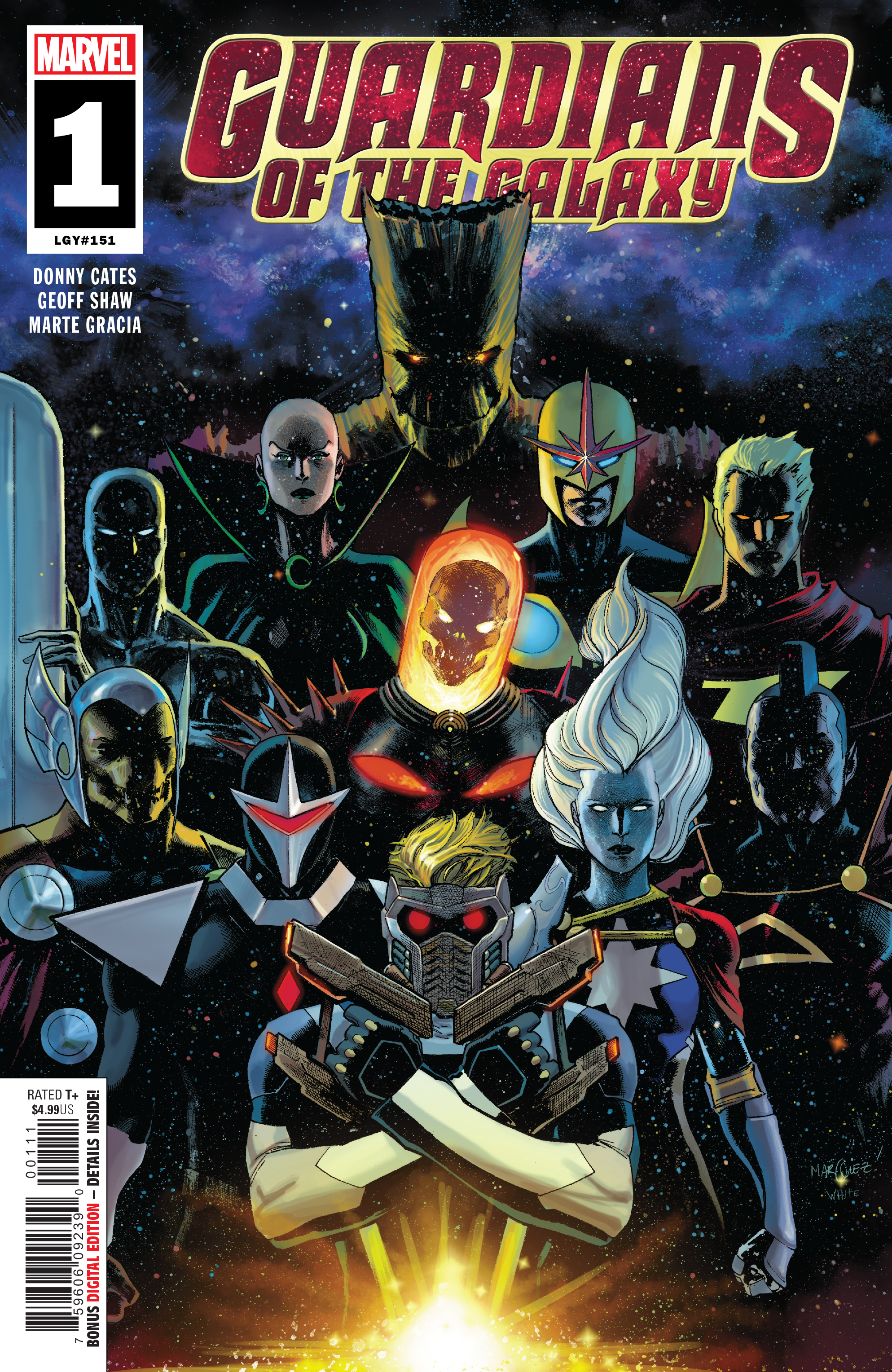
As regular readers of the site may be aware, Donny Cates and Geoff Shaw’s Thanos Wins was one of our top comics of 2018, and now it’s essentially being continued in Guardians of the Galaxy. Of all the writers at Marvel—even the long-tenured vets—Cates arguably writes the best new #1 issues, and this one is no exception. It establishes a killer premise, gleefully speeds through it in grandiose fashion, and leaves the reader fondly looking for the release date of the second issue.  

As with Criminal, we also ran a full review that elaborates in greater depth on this comic, so I will again keep it brief and just note that I’m not even all that big a fan of Guardians of the Galaxy, and yet the continuation of this series just became one of my most-highly anticipated comics of 2019. So, yeah.

Invaders #1.jpg

Invaders #1
Writer:
Chip Zdarsky
Artists: Carlos Magno with Butch Guice
Colorist: Alex Guimaraes
Letterer: VC’s Travis Lanham
Publisher: Marvel Comics
Price: $4.99

I’ve always liked Invaders more as a concept—the team of Golden Age Marvel characters that fought for the allies in WWII—more than I have in modern execution. Their stories have always felt like nostalgic throwbacks, inherently dated. This new comic, however, essentially flies in the face of that, with a first issue that seems to promise an exploration of the old times that will take us to modern places that are new.

How, you may wonder, does it do that? Well, if you’re so curious you really ought to read the actual comic, which, believe me, is very good. Chip Zdarsky is Marvel’s most nuanced writer. He may not write the flashiest stories (ahem, Donny Cates) or the best long-form narratives (Jason Aaron), but he’s the most likely writer in the Marvel stable to surprise and to land big emotional moments. This issue, which ends with a cliffhanger rooted in the past, gives every indication Invaders will be well worth readers’ time.

Naomi #1
Writers:
Brian Michael Bendis & David F. Walker
Artist: Jamal Campbell
Letterer: Josh Reed
Publisher: DC Comics
Price: $3.99

We don’t play favorites in this section, but, truth be told, Naomi #1 just might be our favorite new comic of the month. It takes a new approach to DC Comics most iconic heroes in a few ways. It takes us to a new town we’ve never seen (a hip, semi-rural enclave in Oregon), it gives us a young girl we don’t know (yet), and it dives deep into her point of view, how she sees Superman and what as an adoptee herself she sees to relate to, as well as why.

There’s a mystery that seems destined to end with Naomi growing into a superhero, maybe even a Kryptonian or Superman analog herself, but moreover, there’s just a really solid human story here. Whereas Marvel has basically an entire universe of everymen and everwomen, that has never been DC’s strength. Naomi is looking to fix that, and I for one am hella excited to see where this comic is headed. Oh, and Jamal Campbell’s artwork is absolutely stunning.

Peter+Cannon+Thunderbolt+#1.jpg

Peter Cannon: Thunderbolt #1
Writer:
Kieron Gillen
Artist: Casper Wijngaard
Colorist: Mary Safro
Letterer: Hassan Otsmane-Elhaou
Publisher: Dynamie
Price: $3.99
Read our full review of Peter Cannon: Thunderbolt #1!

Wowzer, did this comic catch me by surprise! I—embarrassingly—had no familiarity with Peter Cannon: Thunderbolt as a property. I did not realize he was one of the original characters from Charleston Comics that the Watchmen characters were later based on, and I certainly didn’t know the rights had gone up for grabs and become property of Dynamite. That said, I love what Kieron Gillen and Casper Wijngaard seemed to be engaged in after this first issue.

You know the drill—more thoughts in our review—but this has a last page that all Watchmen fans will be interested to read. It could ultimately end up being a very nice counterpoint to Doomsday Clock.  

Young Justice #1.jpg

Young Justice #1
Writer:
Brian Michael Bendis
Artist: Patrick Gleason
Colorist: Alejandro Sanchez
Letterer: DC Lettering
Publisher: DC Comics
Price: $4.99

The Brian Michael Bendis-curated Wonder Comics imprint has arrived, and it is...well, wonderful. Young Justice #1 was the inaugural issue for the new imprint, and if this is the tone these books are looking to strike, well done. It’s fast, funny, and bent on being very tongue-and-cheek with DC continuity. It’s exactly the sort of in-universe lighter imprint DC needs, what with the other parts of the line seeming to perpetually bend back toward dark and gritty.

The most interesting thing about this individual story though, is the way it plays with continuity. It seems to know that readers have questions about the current status quos of characters like Impulse, Connor Kent, and Cassie Sandsmark, which by extension plays to more questions about what from the New 52 counted and what is wiped away. This is the central mystery the comic is built around, and it’s a really intriguing one, to be sure.

Check out more of our many monthly lists here.

Zack Quaintance is a tech reporter by day and freelance writer by night/weekend. He Tweets compulsively about storytelling and comics as BatmansBookcase.

Thirsty Thursdays January 2019: A Thirsty New Year

By Allison Senecal — Superhero comic art has evolved at a really impressive rate in recent years...so much so that sometimes it can be a lot to handle. First there’s excitement, obviously, but then that excitement turns into something else...which is why each month we’re running our Thirsty Thursday rankings, a new and different way to look at our favorite comic art. Welcome to a sporadic examination of (as the kids say) the month’s thirstiest comics.

Enjoy!

Artist: Mahmud Asrar       
Colorist: Matt Wilson
Conan the Barbarian #1 - I came into 2019 praying that the new Conan line from Marvel would deliver the goods every month, and so far it’s batting a thousand. It’s sexyyyyyyyyyyy. Here’s hoping Asrar and Wilson get to give us their take on Bêlit before they’re done. 💦💦💦💦💦 out of 5

Conan, what is best in life?

Conan, what is best in life?

Artist: German García
Colorist: Addison Duke
Barbarella/Dejah Thoris #1 - It’s been weeks and I still can’t shut up about how gorgeous and charming this damn opening issue was. García and Duke’s Dejah Thoris is the best iteration of the character I’ve ever seen, and they aced Barb’s whole vibe as well. The ideal blend of cute and sexy, with pitch perfect banter from Williams that I assume will only get better in future issues. 💦💦💦💦💦 out of 5

I hope someone brought water to this team-up because a thirst warning is in full effect!

Artists: Carlos Magno and Butch Guice
Colorist: Alex Guimarães
Invaders #1 - NAMOR! So much Namor! And Steve in a military jacket! NAMOR IN A SUIT! Bet y’all didn’t think Invaders could be a sleeper thirst series of 2019, but this art team is here to prove you wrong. 💦💦💦💦 out of 5

This guy on the left?…SAME.

Artist: Iban Coello
Colorist: Andres Mossa
Man Without Fear #3 - Tough to pick one issue of this series to highlight, and the whole thing was a Sad Matt™ thirst trap, but Coello and Mossa served up the saddest, sweatiest Matt so #3 it is. 💦💦💦💦💦 out of 5

Oh my dear dear Sad Matt™…so sad, so sweaty.

Artist: Juann Cabal
Colorist: Nathan Woodard
Friendly Neighborhood Spider-Man #2 - I know this series is about SPIDER-MAN, but Johnny Storm is babysitting in this issue! I don’t even like kids, but every time Johnny is adorable with them I feel that cynical void inside me whisper “oh %$#&”. 💦💦💦💦 out of 5

I think we all need a lot of things, Johnny.

Artist: Sana Takeda
Monstress #19 - A new crossbow wife???! I keep thinking Sana Takeda is done giving me MORE women with the best designs to swoon over but...Yafaela! 💦💦💦💦💦 out of 5

Is this a type? Can this be a type? I think this is my type…

Artist: Ramon Rosanas
Colorist: Tríona Farrell
Age of X-Man Alpha #1 - Rosanas and Farrell absolutely killed it on this. The character designs (largely courtesy of Mike Hawthorne) are all super swoony and it took me about 40 minutes to read because I kept lingering on every page. I’m sure you’ll be hearing more about Nightcrawler, the X-Tremists squad, and Prisoner X here at some point (okay, many points). 💦💦💦💦💦 out of 5

Clearly, this is the thirstiest timeline.

Artist: Adam Kubert
Colorist: Frank Martin
Captain America #7 - *drags hand down face* Steven Grant Rogers. I just want to thank everyone from the bottom of my heart for the cute sweater. That is all. 💦💦💦💦💦 out of 5

The right of people to choose…how hard they totally flip for freaking CAP IN A SWEATER.

The right of people to choose…how hard they totally flip for freaking CAP IN A SWEATER.

Artist: Caspar Wijngaard
Colorist: Mary Safro
Peter Cannon: Thunderbolt #1 - I admit — and maybe this hurts my journalistic integrity in regards to this column about thirsty comics art — this is the first comic in a long time I purchased purely as a thirst read. Gillen knows it!! He compared it to Dream Daddies in a solicit, for God’s sake. I don’t know #$%& about the Thunderbolt property but 1. this was a fantastic first issue, and 2. Peter and Tabu (and Nucleon???!!) are hot. 💦💦💦💦💦 out of 5

I’ll have a glass of that too because this book is seriously thirsty.

I’ll have a glass of that too because this book is seriously thirsty.

Sorry ahead of time for the panel by panel breakdowns of Daredevil #1-2 next month. You may think I’m kidding, but am I?

Check out The Thirstiest Comics of December.

Allison buys books professionally and comics unprofessionally. You can find her chaotic neutral Twitter feed at @maliciousglee.

REVIEW: In Amazing Spider-Man #14, Nick Spencer and Chris Bachalo payoff plots from the first issue

Amazing Spider-Man #14 is out 1/30/2019.

By Zack Quaintance — It is perhaps telling of exactly how old I am that to me Chris Bachalo is an artist that reminds me of how comics used to be, which is a phrase I think everyone uses to describe the time they first got into the hobbie. Simply put, Bachalo was huge when I was a new reader, helping to launch Generation X (the start of which was still a few years before my time), before moving over to help with some of the main X-titles, maybe even drawing Uncanny for a while as Grant Morrison and Frank Quitely did their thing on New X-Men.

Anyway, this is all a means to say that Bachalo is an absolutely perfect fit for a fill-in artist on Nick Spencer’s Amazing Spider-Man run, which is playing out holistically as a series as another example of how comics used to be, at least back in my day. This entire issue—from the art to the narrative construction to the use it makes of continuity—really feels like just a bit of a throwback to a different time, as has this run overall. The clearest example of this is that these Amazing Spider-Man comics are pretty clearly not written for trade compilations, not even a little bit.

You can really see it in this issue, which is 14 issues and six months into the run...and just now playing out pretty minor narrative threads that were dropped loosely into the background of Amazing Spider-Man #1, specifically thinking here of Peter’s offer from Conners. Now, not to sound like that old guy, but this is something that was once commonplace, back when stories weren’t conceived in six-issue bursts that should leave it all on the page lest the market dictate a sudden ending.

And the Connors thing isn’t the only bit in this issue drawn from #1. The conflict with Taskmaster and Black Ant was also seeded way back, possibly in the same scene with The Lizard (though I’d have to go back and verify to be certain). This is all well and good, and I like it because it scratches my long-form narrative itch as a reader. I think it’s an especially good thing for a book like Amazing Spider-Man, that publishes every other week. There really isn’t a need to so clearly define story arcs when the next chapter is generally 13 days away when you finish any given issue. The book should flow from plot to plot, carrying with it remnants as it moves into new territory. That’s certainly what Spencer and his artistic collaborators, whether it’s back in the day Chris Bachalo or regular series linework provider Ryan Ottley.

In terms of an individual read, this is a dense one, with multiple narrators, long conversations, and some pretty strong ideas jockeying for position, be it Aunt May’s disgust at her deceased husband’s sleazy accountant, or The Lizard’s son heartbreakingly wanting to just be a regular kid. There are so many emotional beats in this issue that it fades into a cacophony of feelings at times, making it hard for any one to move to the forefront and land with major resonance.

For me as a reader, that’s a great problem to have, especially for a comic I’m paying $8 a month to keep up with.

Overall: A dense issue of Amazing Spider-Man, packed with bits of continuity, big feelings, and payoffs to plot threads that have been dangling since the first issue. This series continues to have a narrative construction that calls back to times when stories weren’t written for trade, and it’s refreshing. 8.4/10

Amazing Spider-Man #14
Writer:
Nick Spencer
Artist: Chris Bachalo
Letterer: VC’s Joe Caramagna
Publisher: Marvel Comics
Price: $3.99

For more comic book reviews, check out our review archives.

Zack Quaintance is a tech reporter by day and freelance writer by night/weekend. He Tweets compulsively about storytelling and comics as BatmansBookcase.

REVIEW: Ice Cream Man #9 changes everything you knew about this book

Ice Cream Man #9 is out 1/30/2019.

By Zack Quaintance — Whoa. This issue was nuts, in the best way, and I’m going to do my best to not tip into spoiler territory here. However, I make no promises. So, if you really want to avoid any and all chance of spoilers, I encourage you to skip to the Overall section of this review down at the bottom for a spoiler-free word about whether you should buy this comic. If you have read Ice Cream Man #9, well friend, strap in, because this is about to get wild.

Ice Cream Man #9 up-ended my perception about the scope of this comic. It also sent me back through all eight of previous issues looking for clues. And you know what I found? Tons of them, along with a new sense of what this book is accomplishing. As I wrote in my review of Ice Cream Man #8, I thought this series was a commentary on instant gratification of the soul, on giving into easy feelings of fear and anxiety versus doing the difficult self work it takes to be optimistic, contented, happy. And it is that, to extent, but it’s also quite a bit more.

Ice Cream Man is a book telling an overarching story despite on its surface largely appearing to be an anthology series, albeit one with light connective tissue. The spider from the first issue here, a cop we vaguely know there, plus the titular Ice Cream Man and his weird enemy cowboy guy. A closer look, however, reveals that all along there has been a battle raging between two ancient polemic forces, one of malicious chaos and another that just wants folks to know we’re all friends, all connected, all just trying to live our peaceful lives.

To tell that story, writer W. Maxwell Prince, artist Martin Morazzo, colorist Chris O’Halloran, and letterer Good Old Neon have tapped almost every unique quality inherent to the monthly comics medium, ranging from the slow nature of the release schedule (used to draw the focus to the vignettes, rather than the forces in the background) to juke readers on the format of the narrative to the lettering, which is shaded white in boxes for the evil monologues and black fro the good. This comic has been a true work of patient serialized art, and now in Ice Cream Man #9, the creators are pulling what this book is really about from the background to center stage. And, to be crass, this sh** is f***ing epic.

I read this issue twice. The first time intrigued but bewildered. Then I went back and browsed previous issues for every appearance of the Ice Cream man, and I read it again. That time, I was absolutely blown away at what the creative team is doing. With that in mind, it is perhaps fitting and intentional that in Ice Cream Man #9 the old man character in this story tells the black-clad cowboy Caleb, End, beginning. It’s all the same, because Ice Cream Man is a comic built with no distinct start or end point. It’s a fluid story that demands repeat readings to really grasp its nature. At least the first eight issues play that way.

This issue pushed me to look back and also forward, seeding questions with every new reveal as if it were the work of David Lynch, who is a pretty clear influence on this whole deal, what with the idea that below the idyllic surface of life is bugs, as well as the counterpoint—we’re all the same and connected—which is rooted in Lynch’s beloved transcendental meditation and its universal field. But I digress and I’m getting long-winded here anyway, so let’s wrap things up...

Overall: The end of the beginning of the beginning of the end. An absolutely mind-wrecking read that suggests a more grandiose story than initially promised. Get past issues of Ice Cream Man nearby, because the creators have built something complex and subtle that will re-wire your perception of this series. 9.8/10

Ice Cream Man #9
Writer:
W. Maxwell Prince
Artist: Martin Morazzo
Colorist: Chris O’Halloran
Letterer: Good Old Neon
Publisher: Image Comics
Price: $3.99

For more comic book reviews, check out our review archives.

Zack Quaintance is a tech reporter by day and freelance writer by night/weekend. He Tweets compulsively about storytelling and comics as BatmansBookcase.

REVIEW: Wyrd #1 is a pastiche of classic comics atop some new truths

Wyrd #1 is out 1/30/2019.

By Zack Quaintance — Dark Horse Comics’ new original series Wyrd is a pastiche of classic comics ideas used to uncover deep truths about country, contentment, and feeling out of place in a harsh world. Wyrd is a dash of Mignola, a healthy serving of the most twisted Captain America you’ve ever seen, and a foundation of a main character whose attitude has more than a little in common with John Constantine from Hellblazer. But in between all the homage, a unique writer’s perspective shows through.

That writer is Curt Pires, and in this comic he spins some of the best writerly dialogue in recent memory. There are nice turns of phrases throughout, usage of prose that would hold its own in grad school level creative writing workshops (as much as any prose ever does in those cruel things). Two examples stuck in my mind most clearly after reading. And I’ll get to them both, but first a brief summation of our plot.

Our main character is Wyrd, a freelance monster hunter/weird shit handler for the U.S. government. In this first installment, we learn that he’s troubled, maybe even suicidal, before seeing him shipped off overseas to hunt a super soldier out of control. It’s a relatively simple story in setup but not in execution. Within this solid framework, Pires and his artistic collaborators Antonio Fuso and Stefano Simeone do some seriously heavy lifting with mood, aesthetic, and tone.

Fuso and Simeone’s artwork gets pretty gruesome at times. I’m not always one to appreciate a violent comic, but I had no issue with the way harsher visual storytelling was deployed here. In other words, the proceedings never tipped into gratuitous or repulsive. There are in-set panels a plenty showing the damage Wyrd incurs as he fights, but all of them are necessary to establish his regenerative abilities (add Wolverine to our pastiche, btw). Simeone’s colors push the visuals a step further, especially in the flashback scenes that use a duller set of shades without deploying the sepia cliches. Wyrd #1 is by design a grizzly and rough-looking comic, and that’s good, it should be.

The forlorn beauty of this book is in its language. Let’s get to those promised bits of writing that really stand out. The first is the monster at one point telling Wyrd, I can see through you. Transparent. You’re a ghost in a man suit. A black hole covering memory. It makes sense in the plot but one also gets the impression that Pires might just feel that way period and is using this as a chance to express it. It’s these little gold coins that lead readers throughout the comic.

The second is the gorgeous soliloquy at the end about the joy and hope a child represents in the world. It’s a subtle moment. I might even call it understated if it didn’t serve as a coda for everything that came before, and I absolutely loved it. Wyrd’s self-destructive drinking and sarcasm would run the risk of feeling too familiar if it wasn’t bookended with the poignant reason for his discontent. A great decision by the storytellers that sets up a fascinating series moving forward.

Overall: Wyrd #1 is one part deep comics pastiche and one part introspective look at a troubled man, likely at a point in his (too long) life where he’s lost any belief in the systems. This is a solidly-constructed comic that might just grow into something really special. 8.2/10

Wyrd #1
Writer:
Curt Pires
Artist: Antonio Fuso
Colorist: Stefano Simeone
Letterer: Micah Meyers
Publisher: Dark Horse Comics
Price: $3.99

For more comic book reviews, check out our review archives.

Zack Quaintance is a tech reporter by day and freelance writer by night/weekend. He Tweets compulsively about storytelling and comics as BatmansBookcase.

REVIEW: Peter Cannon Thunderbolt #1 is a superhero romp with a provocative end

Peter Cannon: Thunderbolt #1 is out 1/30/2019.

By Zack Quaintance — If you do not follow my instructions precisely, this planet will be dead before the day is out...but the task is not impossible. This is a mission statement for the comic and also a telling look into the personality and capabilities of the the protagonist—Peter Cannon: Thunderbolt. Which is all well and good for a reader like me, who is only vaguely aware that the character has a long history (dating back to 1966, turns out), created by legendary comic book writer/artist Pete Morisi for oddball Charlton Comics. Incidentally, as interested as I am in the history of DC Comics, I did not know the character had ever cropped up there, but he has. I did know he was the inspiration for Watchmen’s Ozymandias, which will come into conversation later, but I digress...

So, what’s up with this new Peter Cannon: Thunderbolt comic book then? Well, it certainly has the right creative team, or at least one that I’d deemed A List. Kieron Gillen is one of the bigger names in monthly comic book writing, having worked on a number of beloved runs at Marvel Comics as well as notable creator-owned books liked The Wicked + The Divine and, most recently, Die (which rules, btw). Providing the art is Casper Wijngaard of the severely under-appreciated creator-owned comic, Limbo, and his work is brought to such vivid life here by colorist Mary Safro.

This is, indeed, a very visual comic book, which sounds odd to say about a medium that’s always very visual, but it’s true: this book brims with gorgeous splash panels, drawn by Wijngaard and Safro. In fact, more than any of Gillen’s other recent new books—his work on Star Wars, Die—it feels like he spends much of this comic trying to get out of the way here, letting the visuals carry readers through the rudimentary stuff, the introductions to the world, the people, the threat it faces, and the way Cannon is almost immediately able to concoct a solution.

Gillen really makes his presence felt at the end, however, when he shows his hand and unveils the conceit of this comic: this book borrows pretty directly from the plot of Watchmen in some really crucial ways. Not to go too far into spoiler territory, but both the reason the threat has come to Earth and the person who sent are essentially right out of the pages of Alan Moore and Dave Gibbons’ seminal comic. This has been a controversial artistic move in the past when done by the property’s actual corporate owners, DC Comics, but I imagine (relatively) small fry dynamite and indie comics good will hoarders like Gillen and Wijngaard will be given the leeway to tell an intriguing story with this concept. Besides, Ozymandias himself was essentially borrowed IP from the original Peter Cannon: Thunderbolt, which sends my mind down an infinite rabbit hole just thinking about it.

Overall: A pithy and entertaining read with some nice throwaway commentary for much of its duration, the real promise and potential of this comic becomes clear in its final pages. For long-time students of comics as well as recent die hards who’ve looked back even a bit, I highly recommend giving this debut issue a shot. 9.2/10

Peter Cannon: Thunderbolt #1
Writer:
Kieron Gillen
Artist: Casper Wijngaard
Colorist: Mary Safro
Letterer: Hassan Otsmane-Elhaou

For more comic book reviews, check out our review archives.

Zack Quaintance is a tech reporter by day and freelance writer by night/weekend. He Tweets compulsively about storytelling and comics as BatmansBookcase.


Top Comics to Buy for January 30, 2019

By Zack Quaintance — Ah! Here we are on the first fifth Wednesday of the year. Jeez, 2019 really wasted no time in giving us one of those to deal with. Luckily though, this fifth Wednesday is a bit atypical. DC Comics didn’t ship any new books for the fourth Wednesday in December, effectively bumping a ton of titles to this one and making it seem a bit less unusual. So, there’s that little nicety.

And, as usual, the other publishers put out plenty of nice titles too! In our Top Comics to Buy for January 30, 2019, we have another diverse group of titles, coming from publishers ranging from the Big 2 to Dynamite to Image. We’re a bit heavier on the superhero stuff than usual, but, also, Ice Cream Man #9 is so totally bonkers that it makes up for any feeling of staid cliche that might arise from the other choices. Seriously.

Enough banter, though! Let’s move onward to this week’s top comics!

Top Comics to Buy for January 30, 2019

*Pick of the Week*
Peter Cannon: Thunderbolt #1
Writer:
Kieron Gillen
Artist: Casper Wijngaard
Colorist: Mary Safro
Letterer: Hassan Otsmane-Elhaou
His level of genius is matched only by his heroics, and in humanity's darkest hour, he's the hero they need the most-alas, poor humanity.  Peter Cannon-the man known as Thunderbolt-is only too happy to leave civilization to face its end. Kieron Gillen (The Wicked + the Divine) teams up with powerhouse artist Caspar Wijngaard (Doctor Aphra) as he returns to the superhero genre with a dark, humorous and relentless love song to the genre. Well, "Love Song" in a Leonard Cohen Love Song kind of way. Peter Cannon, Thunderbolt: saving a world he hates.
Why It’s Cool: We have a review coming tomorrow that will explain the coolest of this book in much greater depth, but, simply put, this is just a great comic. It reads really well, created as it is by major talents like Kieron Gillen, Casper Wijngaard, and Mary Safro. Moreover, the last page reveal sets up an absolutely intriguing premise that I for one cannot wait to see play out. I didn’t really know what to expect from this title going in, even though I like the creative team. Now? Totally hooked.

Action Comics #1007
Writer:
Brian Michael Bendis
Artist: Steve Epting
Colorist: Brad Walker
Letterer: Josh Reed
Publisher: DC Comics
Price: $3.99
The Kobra Cult conspiracy ensnares Daily Planet photographer Jimmy Olsen, drawing the attention of the Man of Steel. But be careful, Superman-there's more lurking in the shadows of Metropolis than just a snake cult.  
Why It’s Cool: In my humble opinion, Brian Michael Bendis’ ongoing Superman saga just keeps getting better. This issue is a whole lot of setup, illustrated brilliantly here by Steve Epting with Brad Walker colors. Bendis continues to use more and more of the Superman mythos to tell this ever-expanding story, which is apparently gearing up for a big-time summer event centered around Leviathan. Ah well, check it out for yourself!

Amazing Spider-Man #14
Writer:
Nick Spencer
Artist: Chris Bachalo
Publisher: Marvel Comics
Price: $3.99
You know what's annoying? Having to save J. Jonah Jameson's life. Sure, he's been on Spidey's side for a little while, but that's after YEARS of him making Spider-Man's life a living heck. I feel like this amount of responsibility should come with even more power. Anyway, who, other than most of New York, would want to punish J. Jonah Jameson?
Why It’s Cool: One of my other major Big 2 superhero pleasures of the moment is the ongoing Amazing Spider-Man run by Nick Spencer, who is joined this time by veteran artist Chris Bachalo. This book just wrapped up a poignant arc in which J. Jonah Jameson seemed to maybe learn something...and now apparently all of New York City is coming for J. Jonah Jameson. I am 100 percent there for this, since I’m yet to dislike an issue in this run.

Ice Cream Man #9
Writer:
W. Maxwell Prince
Artist: Martin Morazzo
Colorist: Chris O’Halloran
Letterer: Good Old Neon
Publisher: Image Comics
Price: $3.99
NEW STORY ARC
"HOPSCOTCH MÉLANGE," Part One
A wild western one-shot which witnesses the way the world once was.
Why It’s Cool: Ice Cream Man has been one killer comic since its start, seemingly dealing in a series of disparate vignettes that share one commonality: the titular Ice Cream Man makes a sinister and brief appearance in each story. Well, now we’re about to learn just a bit more about that (maybe). This marks the start of this book’s first multi-part story arc, and, perhaps unsurprisingly, it’s bonkers as all get out, going full Stephen King’s Dark Tower in the process.

Terrifics #12
Writer:
Jeff Lemire
Artist: Viktor Bogdanovic
Inker: Jonathan Glapion
Colorist: Michael Spicer
Letterer: Tom Napolitano
Publisher: DC Comics
Price: $3.99
The Terrifics disband, but they're going to need to get back together if they're going to save Mr. Terrific from Doc Dread's new team, the Dreadfuls! Plus, Rex Mason takes a huge plunge, Phantom Girl bolts Bgztl and Plastic Man stretches out the family drama with his son Luke, who's struggling with his own super-elastic powers. Will our heroes reunite in time to save Mr. Terrific-from an evil version of themselves?!
Why It’s Cool: Jeff Lemire and his collaborators have somewhat quietly been doing absolutely wonderful work on this little book since its start. That work continues here with The Terrifics #12. Lemire is approaching his end game with just two issues left to go, and here he gives us what for my money is the story currently making the best use of the DC Multiverse. Also, there are some all-time great moments in this comic between Plastic Man and his estranged son. All-time great.

Top New #1 Comics

  • Age of X-Man: Alpha #1

  • Fight Club 3 #1

  • Journey Into Unknown Worlds One-Shot

  • Mysteries of Love in Space #1

  • Wyrd #1

Others Receiving Votes

  • Bone Parish #6

  • Captain America #7

  • Catalyst Prime: Kino #13

  • Crimson Lotus #3

  • Detective Comics #997

  • Exiles #12

  • Flash Annual #2

  • Justice League Annual #1

  • Lone Ranger #4

  • Marvel Knights 20th #6

  • Punisher #7

  • Quantum Age from the World of Black Hammer #6

  • Skyward #10

  • Teen Titans Annual #1

  • Vagrant Queen #6

See our past top comics to buy here, and check our our reviews archive here.

Zack Quaintance is a tech reporter by day and freelance writer by night/weekend. He Tweets compulsively about storytelling and comics as BatmansBookcase.

Comic of the Week: Buffy the Vampire Slayer #1 is a new start with much love for the original

Buffy the Vampire Slayer #1 is out 1/23/2019.

By d. emerson eddy — Into each generation a slayer is born...or reborn as it were. To many my age Joss Whedon's television series, Buffy the Vampire Slayer, Angel, Firefly, even Dollhouse, served as a backbone to our cultural development. Particularly Buffy and Angel since they came first. They informed a lot of our attitudes towards the world, reflected many of our musical tastes and speech patterns, and all around showed a world where it was all right to be the outcast, the fringe, the geeky nerd, because you'd be accepted into a family of like-minded weirdos. And, of course, you'd look fabulous while dusting vamps.

It's been 15 years since Buffy and Angel have been on the air, in that time culture has changed, in some ways evolved, in some ways regressed. In those intervening years, Dark Horse and IDW continued on the legacy of the Whedonverse, sometimes taking it to welcome places, sometimes strange. At times for me it was like checking in with a friend that you've lost touch with and grown apart, but when you see one another you're picking up old conversations like you've not lost a beat. Because the memory remains.

BOOM! Studios' new launch of the series does not continue on from any of the previous comics or television series. Instead, it takes us back to a new interpretation of the beginning, and I'm perfectly okay with this. It feels right to start again, especially when it's being done with as much skill, reverence, respect, and outright love of the source material as it is by Jordie Bellaire, Dan Mora, Raúl Angulo, and Ed Dukeshire. The old, familiar faces of Buffy, Willow, Xander, and Giles are here representing that core configuration. Slightly different than before, but still capturing that same spirit.

With Redlands, Jordie Bellaire has proven that she can write horror and the supernatural very well. With this first issue of Buffy the Vampire Slayer, she transports some of that with the usual vampires and ancient relics and such, but she also shows an ear for the catchy dialogue and banter that was a hallmark of any Whedonverse joint. It's not a copy of Whedon and co.'s dialogue patterns, but like the overall story, it captures the spirit.

Likewise with Dan Mora's gorgeous artwork. His approach to likenesses is interesting, because the characters are recognizably Sarah Michelle Gellar, Allyson Hannigan, et al. yet simplified. He makes the characters his own, such that we don't have any of the common bizarrely over-rendered stars in a comic compared to the supporting and background characters. And equally excels with the action as with the quieter interpersonal moments.

Raúl Angulo's colors perfectly complement Mora's line art, giving the series a somewhat ethereal glow. It reminds me somewhat of the color approach that the “New Riverdale” line from Archie Comics had of mixing some of those classic vibrant comics colours with a bit of a modern haze. It works really well for adding atmosphere to the story.

Ed Dukeshire rounds out the creative team here, performing his usual exemplary job of providing some tight lettering, showing some interesting variation for vampires and the narration.

Overall, this relaunch is very well done. As a longtime follower of Buffy and the Scooby Gang, I think that Bellaire, Mora, Angulo, and Dukeshire have done a very good job at capturing the spirit of the property while also weaving it into a new and compelling story. Even if you've somehow never experienced Buffy the Vampire Slayer before, it introduces well to the cast and the overall premise and tone of this new series. There are also some surprise appearances and a twist in the tale that should have everyone champing at the bit to see the next issue.

Buffy the Vampire Slayer #1
Writer:
Jordie Bellaire
Artist: Dan Mora
Colorist: Raúl Angulo
Letterer: Ed Dukeshire
Publisher: BOOM! Studios
Price: $3.99

Check out past Comic of the Week selections by d. emerson eddy on the list page.

d. emerson eddy is a student and writer of things. He fell in love with comics during Moore, Bissette, & Totleben's run on Swamp Thing and it has been a torrid affair ever since. His madness typically manifests itself on Twitter
@93418.

TRADE RATING: Sara by Garth Ennis and Steve Epting is great start for TKO Studios

Garth Ennis Sara, with art by Steve Epting, is available now via TKO Studios.

By Jarred Luján — TKO Studios recently rolled out their debut line-up, which was essentially headlined by Sara, a story about an all-female Soviet sniper unit fighting against the Nazi invasion of their country. I snatched Sara up pretty quickly because of my familiarity with both the writer and artist. Garth Ennis wrote one of my favorite books of all time, Punisher: Born, Steve Epting drew one of my favorite Captain America stories back in the day, collaborating on it with Ed Brubaker.

Before I dive deeper into the story here, I want to make something clear: the art in Sara is absolutely brilliant. While this book, of course, has its fair share of shootouts and battles and explosions, some of my favorite moments involve Epting’s artwork showing the small expression changes on characters’ faces. Ennis’ script did a fantastic job building up these characters, but it’s Epting’s art that really emphasizes character moments in a way that creates a more engaging reading experience. For those of us who have read comic illustrated by Epting in the past, this comes as little surprise.

Snowy Soviet plains probably do not sound like the best backdrop for a colorist to flex their talents, but Elizabeth Breitweiser does so here. Again, I’m talking mostly about small things, like the rosy cheeks in the midst of the brutal cold. Each moment a sniper bullet tears through a Nazi, the colors create a beautiful contrast of red mist and snow. So many of these pages are littered with black and white tones, yet they still convey much depth in various areas.

So, going into the story itself, it’s probably relevant to note that I have personally lived my entire life surrounded by soldiers. On my mother’s side, I am literally the only male that didn’t enlist (I doubt I’ll ever hear the end of that one, btw.) My family being the way it is meant I grew up with a mixture of war being mythologized and lessons on the darkest aspects of armed conflict from people who had firsthand experience. Growing up, I’d often sit around and watch war movies with my grandfather, or exchange war books with my step-grandfather, who both regularly shared personal anecdote from their times in Korea or Vietnam…sometimes these were funny stories or tales of heroes, and sometimes they were downright terrifying.

This is all a means of noting that war stories tend to draw me in more than they might the average person. Generally, there are two common ways that war stories are told. The first is your basic Good Versus Evil. It’ll usually feature the sacrifice of Good Heroes, who are certain their side is right and just, with a tinge of patriotism painted underneath. The second is about What War Takes Away. These stories feature good people doing evil deeds, corrupted by the nature of warfare. This often means a loss of decency, hope, morality, life, and—almost always—innocence.

That first type of story is typically the most common way that we see depictions of World War II. There are few human conflicts where it’s so clear where each side stands, what each side represents. Sometimes these stories gloss over the wrongdoings of the side they represent, in an effort to represent them well.

With Sara, Ennis has no interest in doing that. Sara, for whom the story is named, is an extremely conflicted character. She kills Nazis, sure, even efficiently, but Sara time and time again reflects on the cruelty of her own nation, the one she’s defending. This theme lends to some of the best character moments in the book, people clinging to the ideal outcomes of this war, and a jaded Sara trying to figure out where she stands in the first place.

This second type of grey morality story is how the greatest war stories are told. Ennis, though, has a reputation for flipping war stories, for creating a third option all his own. That ability is what made his work on Punisher: Born so brilliant: Ennis concocted a story of Frank Castle seemingly losing something, but it isn’t until the final pages that readers learn he has instead brought something back with him. It isn’t loss, it’s converting.

Ennis does more subversion of expectations in Sara. Sara’s comrades are the vehicle for this, rather than the dark captioning system that he used to accomplish it within the narrative of Punisher: Born. The parts of the story set in the past here also help us understand what’s happened to Sara to make her feel so ambivalent about the nation she finds herself serving. We discover that it wasn’t the loss of any one thing for Sara, but rather a gaining of truth. A truth that Sara’s devoted friends are not prepared for.

Sara is a slow burn of a book. The first couple chapters really focus on building the situation around Sara and her team, but ultimately that slow burn becomes an explosive flourish. The ending of this story fires on all cylinders, with Ennis teaching a master class on pacing. Sara, in the end, is a comic that incorporates many aspects of the real war stories my family has shared with me throughout my lifetime. Stories about that include patriotism, heroes, and glory, as well as terror, uncertainty, and doubt. Sara is a rarity in that it blends all of those things organically into a single powerful tale.

Overall, TKO has picked a worthy story from a seasoned creative team to represent the publisher well at its launch.

Sara #1
Writer:
Garth Ennis
Artist: Steve Epting
Colorist: Elizabeth Breitweiser
Letterer: Rob Steen
Publisher: TKO Studios
Price: Digital $13.99, Paperback $17.99, Individual Issues in Collector’s Box $24.99
Get It: Via TKO Studios

Check out more of our thoughts about trade paperback and original graphic novel on our reviews page.

Jarred A. Luján makes comics, studies existential philosophy, and listens to hip-hop too loudly. For bad jokes and dog pictures, you can follow him on Twitter.


The Saga Re-Read: Saga #25 is the most grandiose chapter yet

Saga #25 was first released 2/4/2015.

By Zack Quaintance — Saga #25 is the first issue back from the break, and, apparently, the creators used the time away to conceptualize and execute one of the series’ most grandiose chapters yet. I most certainly did not pick up on this my first time reading through, so consumed was I with what exactly was about to happen next, but it’s pretty evident here.

I’ll go into more detail about this below, but the most notable thing about this issue is that in it, the creators finally crack and give us the broadest view yet at the war that has riven the galaxy and essentially given rise to the events of this story. We get a macro view of it all, one that ranges from showing how the conflict has become unnoticed for most on the homefront to the history of enlistment techniques. It all leads up to a last page that shows us an inevitable reaction to a forever war—political opposition.

Let’s check Saga #25 out!

Saga #25

Here it is, the official preview text for Saga #25, which was first released all the way back on Feb. 4, 2015, with 10 whole days left to buy a copy for your significant other for Valentine’s Day (aw!)...

Saga is back, as is almost the entire cast! And as thanks to retailers and readers for helping our audience continue to grow every new arc, Fiona Staples created an amazing wraparound cover for this action-packed issue, which is still only $2.99, the best deal in comics!

This is the longest Saga preview so far, but in keeping with the established pattern, it tells us absolutely nothing about the plot. It does, however, speak to the idea that the book had become a certified mega-hit at this point, so much so that it staying at $2.99 (which has now ended) was actually a really good deal. Anyway, onto the individual elements...

The Cover: This cover is one of the more epic in scale, a wrap-around featuring action and more characters than any other Saga cover to date. It’s busy by design, which actually sets it aside from most of the other covers in this series while making it more at home among the other sci-fi comics on the rack. It’s not among my favorites, I’ll say that much, but I don’t hate it either. Coming back from one of the book’s breaks, it does a great job reminding us of what’s happening and who are our principal actors.

The First Page: Like the cover, the first page of this issue also stands apart a bit from the rest of the series. It’s black and white, subdued, and split into multiple panels, a stark contrast to the full-page splash of a shocking or fantastical, full-color image that we usually get (a couple of which actually come later in the comic). Conceptually, I like this quite a bit. The visuals are ho-hum, but it works well for the narrative, giving us some historical context for the forever war that has both created and shaped the little family at the center of our story. It’s specific to this space opera, and the next few pages go on to convey universal ideas we’ve seen play out in our own society as it relates to war. We don’t often get broad looks at the conflict here, but when we do, the creators tend to make them count. This is a great example.

This uncharacteristic Saga first page starts our first super broad view of the war at the heart of this series.

The Surface: The first five pages of this issue are the most direct look at the war the series has given us yet, with Hazel the narrator taking the 20,000-foot (or would it bee 20,000-light years?) view of what’s happening, how it’s progressed through time, and how it affects many of the residents of the two central planets. It’s interesting that it took 25 issues to get here, to some extent, but really, the story was so engaging with its hyper focus right from the start, that it had the freedom of leaving the war around the edges. The creators probably could have withheld that five-page explainer further, but they knew they had their audience on the hook. Also, I’d imagine it simply felt like time. Following the expository opener, Saga #25 goes on to bounce between our many sets of characters. Three months have passed, and the surface of this comic has a bit of work to do catching us up to the various status quos.

The Subtext: The subtext in Saga #25 is largely about hierarchy. It’s so prevalent in the opening five-page explainer that it’s basically surface level, but it pops up a couple times later, first when Marko’s mother tells Alana to get it together because they aren’t helpless damsels in distress, and later when Prince Robot IV tells Marko he is forbidden to address him directly, despite their shared plight and mutual objectives. These are all subtle-yet-effective ways to remind us this universe, much like our own, is one built on rigid social pecking orders. It all leads up to the introduction of the Rebellion Revolution...a group of characters I had 100 percent forgotten about.

The Art: Fiona Staples is given a chance early in the book to go full Star Wars, depicting scenes of intergalactic war and outsized alien monsters. And she knocks it out of the park. Fiona Staples is also given a chance to show what it looks like for many denizens of this universe on the homefront. And she also knocks that out of the park. These returns from a hiatus, with their presumably lengthier lead times, are always an absolute visual treat, and this issue is no exception.

The Foreshadowing: A little heartbreak with the foreshadowing here as Hazel lets us know that it would be years before she and Marko are re-united. But hey, at least we know they’re eventually re-united!

Saga #25
Writer:
Brian K. Vaughan
Artist: Fiona Staples
Letterer: Fonografiks
Publisher: Image Comics

Check out past installments of our Saga Re-Read.

Zack Quaintance is a tech reporter by day and freelance writer by night/weekend. He Tweets compulsively about storytelling and comics as
BatmansBookcase.

“Keep Looking Up”: An Interview with Peter Krause

The Millionaires’ Magician is available now via the book’s website.

By Andrew Scott — Not every graphic novel begins with a foreword by a legendary illusionist.

But then, The Millionaires’ Magician bucks many of the norms associated with American comics today. The narrative is autobiographical, except when it’s not (which is nearly every page). The concept belongs to magician Steve Cohen—and readers can buy the book directly from his website—but the story credit goes to another writer. Some readers might find it odd that the credit for Copperfield’s foreword precedes the names of the creators who actually produced the book.

That said, Copperfield does capture the essence of this graphic novel succinctly: “The behind-the-scenes story is as engaging as the magic [Steve Cohen] performs. Like any good fable, it weaves fact with fiction, truth with tall tale, into a memorable read.”

What he means is (spoiler alert) the character of Steve Cohen spends years hiding in Japan and training in the martial arts before returning to New York to save the innocent and exact his revenge. If you don’t know about Steve Cohen, this Q&A is a good primer for understanding the basics of his act and philosophy. In short, his is an old-school magic performance. Sleight of hand. Quick fingers. No explosions or loud music. If you’ve seen him perform—and some of you might remember his appearance on David Letterman’s Late Show—the idea of Cohen-as-superhero has to bring a smile to your face.

But despite this magician’s obvious skill, no amount of trickery can produce a completed graphic novel to pull from a hat. For that kind of magic, he had to turn to the professionals. Keith Champagne gets the story credit, while Bill Tortolini is the letterer and Tara Phillips is the cover artist. But my primary interest in the project is the art by Peter Krause and colorist Jordie Bellaire.

From Daredevil: Road Warrior.

Cohen says he admired Krause’s work in the Daredevil: Road Warrior comic. “I instantly knew that he was the artist for my book,” he says. “I had rejected other artists’ portfolios because their style was too modern. The specific vision I had in mind pointed at the moody styles of Alex Toth and David Mazzucchelli. Peter’s work on Shazam also convinced me that he was the right artist for this project.” Cohen admired colorist Jordie Bellaire’s “textured color work,” as well. Bellaire currently lives in Ireland, so Cohen invited her American parents to attend his show at the Waldorf Astoria New York. “Their endorsement of the show clinched the deal,” Cohen says, “since Jordie ultimately agreed to participate. That was a happy day in the development of this project.”

Peter Krause is a productive artist with a long career who is still under-appreciated, in my opinion, despite that steady work. Irredeemable and Insufferable, both with writer Mark Waid, are certainly worth your attention, and I wouldn’t be surprised if his recently completed Archie 1941 series—for which he again partnered with Waid, as well as co-writer Brian Augustyn—garnered some attention from industry award committees this year.

The Millionaires’ Magician is a great-looking, fun book. I wanted to interview Peter Krause to learn a little more about how he became involved with the project, as well as his approach to making comics in general.

From The Millionaires’ Magician.

How did you end up working on The Millionaires’ Magician? What compelled you about the concept?

PK: Keith Champagne contacted me in the spring of 2015. He had a preliminary outline of the script. I was immediately taken with the visual possibilities of the story—magic, foreign intrigue, and crime. My work has evolved to a more noir-like approach and The Millionaires’ Magician seemed like a perfect fit.

I’d also be able to work on this with no monthly deadlines. That allowed me to do various storyboard projects, as well, and to really perfect the drawing on The Millionaires’ Magician.

After a bit of email communication, everyone agreed to terms and we were off!

Were you familiar with Steve Cohen and his act before this?

PK: I was not. But Steve provided plenty of back story, photo reference, and video of his appearance on Letterman. Steve is an energetic guy, and a huge comics fan. He enjoyed my artwork on Daredevil: Road Warrior. It’s what prompted him to contact me via Keith for TMM.

How long did it take you to complete the story? What’s a typical work day look like for you?

PK: The book is a 100-page graphic novel with a handful of added illustrations. It basically took a year for all the line work. There were a few revisions per Steve’s request and the line drawings were completed by the end of September 2016.

I like to be in the studio in the morning to begin the day. I’ll start around 8:00 a.m. and work until 5:00 p.m.—that’s the ideal. I will get some storyboard work now and then that entails some evening hours. But I don’t do night shifts for comics. I think it’s counterproductive and you pay for it with reduced efficiency the next day.

I’m all digital now, as well. I draw on a first-generation Cintiq. One of these days I’ll update it.

From The Millionaires’ Magician.

Was it your request to have Jordie Bellaire color your work, or was that something the rest of the team already had in place? If she’s not the best colorist in the business, there’s certainly no one who is clearly better.

PK: When we were thinking about colors for TMM, Jordie was at the top of the list. Steve was very familiar with her work and really wanted her for the book. I can’t say I really know Jordie, but we had communicated a few times on Twitter. I was the one who reached out with a great page rate that Steve offered. We were all overjoyed when she agreed to terms.

Before she started enhancing the line drawings with her hues, she sent me an email asking for my coloring preferences. I’d never had that happen before—understandable because comics is generally such a deadline driven monster. I had a couple of suggestions, but at the end I told her I trusted her judgment. Really, who wouldn’t? Her work is so wonderful. It was a career highlight to be colored by Jordie.

You stopped drawing comics for a number of years. What prompted that move? It seems to have coincided with some pretty lean years in the industry after the 90s bubble burst.

PK: Great question. If you get into comics, I think you have to be aware of the history. I saw what had happened to the previous generation of artists that had “aged out” of the industry. I vowed I wouldn’t be completely beholden to comics work. When I left Power of Shazam!—I think that would have been around 1997 or 1998—I began to ask around for other stuff and didn’t get any response. But I had been doing some ad work and storyboard jobs on the side, so that became the focus of my work. Also, my darling wife Lisa was doing fine in the tech world, so things weren’t dire.

Other than a handful of fill-ins for DC, it wasn’t until I started working on Irredeemable for Boom! Studios that I was drawing comics full-time again.

From The Millionaires’ Magician.

The Millionaires’ Magician, Archie 1941, and even Insufferable before that—your work has moved to the next level in recent years. What do you think is the reason for that? Is it because you’re working digitally, inking yourself, or something else?

PK: Thanks for the kind words. If true, I think it has to do with all of what you’ve mentioned.

Working digitally gives you a tremendous amount of flexibility to resize and revise. As long as you don’t go down the rabbit-hole of trying to reach perfection it is also a big timesaver. It eliminates the bad brush and the recalcitrant pen nib.

Also, when I came back into comics I gave myself a pep talk of sorts. I’m much nearer the end of my career than the beginning, and I take the actual drawing more seriously than I did before. Don’t you want to make your next work a bit better than the last? That’s become a mantra for me. Look at the people who do work you admire—not just comic art. There are so many talented artists out there. Keep looking up, keep being inspired. If you do that, I think you’ll be lifted.

The Archie 1941 series is wrapping up. You’re already at work on another “mystery project,” as you like to say to your Twitter followers—this time with writer Ron Marz. What do you want the next few years of your creative/professional life to look like?

The first four issues of Archie 1941 are available now.

PK: Archie 1941 was a pure joy to draw. My goal over the next few years is to do “bucket list” projects, and drawing the Archie gang in my style ended up being one of those. I have had the opportunity to draw both Daredevil and Superman professionally—not to mention Shazam/Captain Marvel—so those are checked off. I’d love to do something in the Hellboy/BPRD universe. I’ve never drawn anything for Dark Horse Comics.

Yes, I am currently drawing a Ron Marz scripted saga. It’s an espionage tale. Shady characters, sordid establishments—love drawing that kind of thing!

I should also note that there is one other unpublished, 54-page graphic novel that I’ve completed. I can’t tell you who wrote it, but it has been lettered by Ed Dukeshire and is currently being colored by Giulia Brusco. It’s a really dark murder/mystery set in southern California during the 1970s-1980s. I think it’s the best thing I’ve drawn, and it should see the light of day sometime this year or next.

Whatever the future holds, I feel blessed. I’ve met many of my comic book heroes, and most people in the comic book world are so supportive. I tell people I’m doing the same thing I was doing when I was ten years old—drawing. I just get paid a bit of money to do it now.

Andrew Scott is the author of Naked Summer: Stories. He has written for dozens of outlets. He lives in Indianapolis. You can find him on Twitter: @_AndrewScott.

Comics Anatomy: Velvet's perfect page

By Harry Kassen — Hello Bookcase readers, I’m Harry Kassen and this is the inaugural Comics Anatomy, a bimonthly look at comics craft and technique. Each installment will center on a particular comic’s use of various elements of comics craft. Most articles will focus on a particular element of a book, but for this first article I thought I’d give a sense of the sorts of topics I’ll be dealing with by explaining the many different things at play in a page of one of my favorite comics: Velvet by Ed Brubaker and Steve Epting.

This is page five of Velvet #3, and it’s one of the best comics pages I’ve ever seen.

Before delving into specific things, let me say that all of the creators on this book are at the top of their games here. Brubaker does a great job crafting a well-paced, intricate spy thriller. Epting’s moody art and clear storytelling make sure that nothing is missed but also create a strong sense of atmosphere and setting. Elizabeth Breitweiser (though I disapprove quite strongly of her association with CG) does a characteristic great job of supporting the moodiness of Epting’s inks. Lastly, Chris Eliopoulos tops all of this off, tying together the various elements with slick, readable lettering. Many comics meet these criteria, though, so why am I writing about this one?

Looking at this page in particular, the real strengths of this book are apparent. This page is eminently readable with the reading order popping off the page. Much of this is due to Eliopoulos’ work in placing the balloons so that they draw your eye to the next image. Taken alone, however, the page still isn’t totally clear. When the lettering is looked at along with the art though, the reading order is unmistakable.

The lettering carries the reading order through the top tier of the page and into the second, but the reading order for the middle tier into and through the bottom tier is dictated by the art.

This makes sense. The storytelling in the top tier of the page leading into the middle tier is mostly done in dialogue. It’s just our two main characters, Velvet and Burke, talking with two thugs. There isn’t much character movement or action until the middle tier. Starting in this panel, though, the action takes over (more on this later) and the storytelling and communication of reading order is all done through the art. Epting shows characters, specifically Burke, moving and doing things with minimal dialogue.

More than just transitioning from dialogue-forward to action-forward storytelling, this panel does something very impressive that requires all elements of the page to work in concert: It gets you to read backwards.

Velvet's Perfect Page Image 5.jpg

What I mean by this is that western readers like me are trained to read from left to right. Even in visual media like comics, we tend to see narrative progress in left-right movement and find reading in reverse to be unnatural. That’s the beauty of this panel. Everything in it works together to pull your eye from right to left across the image.

There’s a lot to look at here, so I’m going to do this in the order you would see it when reading. The first thing you’d see is the transition from panel 3 into panel 4. It’s essential that the reader goes straight from panel 3 into this one at the right side in order to get the full effect, and this is ensured in a few ways. The first and most obvious is that the lettering in the third panel is at the bottom of the panel and the lettering in the fourth is at the top, right below the third.

This takes your eye straight from “Just get on the ship and--” to “No.” without giving you any time to lose track of or question what comes next. The eye just drops down and catches on the balloon. This is highlighted by the fact that the entire upper-right corner of the panel is black, emphasizing the small white oval of the speech balloon. The art and the lettering work in concert here to guide your eye to the exact place it needs to go.

The next part of what makes this panel special is the real magic bit: how it gets you to read it right to left. The most obvious thing is that the gun is a big pull and the bright flash is enough to get your eye, but if that were the case you would jump immediately to the left and not spend time traveling across the panel. The image makes you spend time with it and engage in the process of moving across the page, giving you the feeling that it’s happening now, not that it’s already happened.

Velvet's Perfect Page Image 5.jpg

The art team know that wouldn’t make for interesting reading and take advantage of this opportunity to show you things in process rather than completed actions.

There are a few techniques at play here, all of them coming from Epting and Breitweiser. The first piece is the motion line. This book aims for a pretty realistic visual feel so it minimizes motion lines, sound effects and other, similar devices, but in this panel there’s a motion line from Burke’s jacket on the right to the outstretched arm on the left.

The fact that these are so infrequent makes this one instantly something to pay attention to. It also stands out from the rest of the panel visually because it’s a different color from what’s behind it as it begins and then again as it finishes. Epting/Breitweiser (I don’t know how much of this part each person did, inks for this book are hard to find since it was done digitally) make sure that the motion line is light against the dark cloth of Burke’s shirt and then it shows up again as lighter than the red background. This provides something to latch onto and pulls the eye across the page slowly because it’s still a slightly unnatural process. You almost feel at this point like you’re watching the gun move left. This one element, however, is not enough to cement the reading order.

Another part of this is that the background has been dropped out for this panel. That can have the effect of speeding up the panel but in this case it’s more important to look at what has replaced the background.

As I’ve already mentioned, the top right corner of this panel is black, but the rest of the panel is a red gradient that gets lighter as it goes from right to left. Given that you start in the black region on the right, the natural progression is to follow the gradient left as it gets lighter.

The last notable technique used in this panel is the non-rectangular panel shape. The top border and the two sides stay at right angles like a traditional rectangular panel but the bottom border slopes down as it moves from right to left, making the panel expand in the direction of the action.

This does two things. First, it makes the eye move from the confined right side of the panel over to the wider left side. This reinforces the reading order, getting you to look where you’re supposed to look. The other thing it does is lead the reader into the third tier by pulling the eye down along the panel border. Without that downward slope, neither of those things is as clear.

*This screen cap has been altered in Photoshop to demonstrate what the panel might look like without the downward-sloping border to guide the eye.

This takes us to the third tier, which may be my favorite part of the page. The third tier is made up of one panel showing a man who was just shot on the left, Burke in the middle pointing the gun right, and a man being shot to the right of that.

Velvet's Perfect Page Image 12.jpg

Thinking about it like that, it’s actually a pretty boring moment to draw. If we think of the panel as a frozen moment in time, the moment Epting chose is one that happens after all of the action is already done. Both men have been shot already and there’s nothing else happening. Epting is too good to let the panel be boring though. He sets this panel up to create an engaging, almost cinematic feel and it has everything to do with the way Burke is drawn. Burke is shown in heavy shadow with a solid black line running from the bottom of the panel up to the top. Beyond creating atmosphere, this serves to separate the left half of the panel from the right, essentially making it into two panels, separating the moments. When reading this panel you get to the top left part, see it as a panel where Burke shoots the guy on the left, then you move right, passing Burke’s shadow and see a panel of Burke shooting the guy on the right. The deep shadow separates these two moments so that you can experience them one after the other and see the action as it’s happening rather than all at once. Without that shadow, it’s a bland panel, effective but uninteresting. With it, it’s one of the best panels I’ve ever seen.

*This screen cap has been altered in Photoshop to demonstrate what the panel might look like without the shadow.

And, while that wraps up my breakdown of this page, I’d like to say that this is by no means the only example of good craft in Velvet. I said it before and I’ll say it again: every member of the team turned out career defining (or redefining) work for this book, but if I tried to talk about all of it I’d be here all day. All I can tell you is to read the comic. Thanks for reading Comics Anatomy, and I hope you join me for more analysis of comics craft and technique in two months time.

Velvet
Writer:
Ed Brubaker
Artist: Steve Epting
Colorist: Elizabeth Breitweiser
Letterer: Chris Eliopoulos
Publisher: Image Comics

Harry Kassen is a college student and avid comic book reader. When he’s not doing schoolwork or reading comics, he’s probably sleeping. Catch his thoughts on comics, food, and other things on Twitter @leekassen.

REVIEW: Guardians of the Galaxy by Donny Cates and Geoff Shaw is Marvel’s best new #1 in recent memory

Guardians of the Galaxy #1 is out 1/23/2019.

By Zack Quaintance — There is a special alchemy in (semi-) monthly comics between certain writers and certain artists, a working relationship that takes hold and helps the members of a team feed off each other’s work, rising through the industry and earning new fans together. I could list examples, but you probably have your own favorites in mind as you read this. I know I’m thinking of mine, and rarely have I seen a team entrench itself as quickly among my personal favorites as Donny Cates and Geoff Shaw.

I know they’d worked together previously on The Paybacks (a well-regarded comic that I’ve been meaning to read for a while now but just haven’t...sorry), but my own first exposure to both of them was God Country #1. Released in January 2017, the creator-owned book through Image Comics was a tour de force of good vs. evil, inter-dimensional sword fighting, and Texas braggadocio and swagger. The book found an audience, quickly, setting both of its creators on the path that has lead them to us today, two years later, doing Guardians of the Galaxy #1 for Marvel (in between, they also made one of my personal favorite recent Marvel runs, Thanos WIns).

If ever there were a franchise in need of some new excitement, it’s Guardians of the Galaxy. It’s been a few years since the team had a memorable comics run, owing to some chaos in the Marvel line (they’ve gotten a new E-I-C) and a sort of backseat for the company’s cosmic properties. The Guardians of the Galaxy physical comics have also suffered a bit from being too-specifically tailored to match the lineup in the movie.

Since that film came out in 2014, we’ve basically been getting lineups that feature all the characters from the movie...plus Venom; or all the characters from the movie...plus The Thing, etc. It was a way to try and offer comics fans something new without really deviating to an unfamiliar place for the presumed new fans of the movie, who could be seeking the comic. The result was a book that felt hamstrung by its own status quo, which is never a good thing but is especially bad for cosmic-set comics where exploration, discovery, and literally out-of-this-world surprises are a currency.

Today’s Guardians of the Galaxy #1, however, is just about as good of an injection of new excitement as I can imagine for this team. As we’ve come to expect from the duo, it’s a fantastically-executed comic, one that uses Shaw’s propensity for big moments of chaos and destruction to great effect. Cates is also evolving as a writer here, with nary a sign of the omniscient Texas-voiced narrator that has driven much of his best work. It’s a great thing to see, two young rising creators at the tops of their game relaxing into a story.

The concept for this new run is also strong, in that it grows directly from my personal favorite Cates story, Thanos Wins. It’s very much a Guardians of the Galaxy book (the presence of Peter Quill and Groot sees to that), but the problems the new team seems destined to face stem from the events of the earlier story, creating multiple mysteries (always a good thing) as well as fearsome inter-galactic threats. Simply put, this is the type of streamlining that justifies a Big 2 superhero #1 issue and reboot, and I can’t wait to see where the creators take it.

Overall: The first exciting new chapter for the Guardians in I don’t know how long, Guardians of the Galaxy #1 sees two of Marvel’s best young creators operating with giant ambitions, and they absolutely deliver. This is a big story, one worthy of involving the entire galaxy. 9.5/10

Guardians of the Galaxy #1
Writer:
Donny Cates
Artist: Geoff Shaw
Colorist: Marte Gracia
Letterer: VC’s Cory Petit
Publisher:
Marvel Comics
Price: $4.99

Check out some of other thoughts about this comic from both this week and the past in our reviews archive.

Zack Quaintance is a tech reporter by day and freelance writer by night/weekend. He Tweets compulsively about storytelling and comics as
BatmansBookcase.


REVIEW: Tom King’s Batman #63 enlists Mikal Janin for Bat-Cat wedding redux

Batman #63 is out 1/23/2019.

By Zack Quaintance — There’s a very familiar feeling to the start of Tom King’s Batman #63. Mikel Janin, King’s primary collaborator from July’s infamous Batman #50 Bat-Cat wedding issue, is back providing the artwork. Moreover, what’s actually happening on the page is familiar too. Bruce is on a rooftop in a tuxedo as the sun comes up, just as he was during the wedding, flanked by Alfred and a tipsy officiant. There’s a quick cut to the goodbye letter Catwoman left on his pillow, and then our hero steps to the edge of the building prepared to jump off...we’ve seen all this before.

Before he can go fully over this time, things begin to change. This time Catwoman is there, telling him to wait. This time things are different, better—until they suddenly aren’t. Thus is the premise of Batman #63, the third part of the ongoing Knightmares story arc for this title (and before you protest about spoilers, everything I just described happens on the first page of this very compressed issue, which is an idea we’ll return to a bit later...).   

Knighmares continues to be an arc of unreality. Readers don’t know what’s real and what’s not. The last issue saw Batman battling Professor Pyg, who at the very end removed his mask to reveal himself as Damian Wayne, Bruce’s estranged son and Robin. Essentially, Batman #61 planted the seeds that Batman was trapped in some sort of hallucination via the Bruce Wayne murder kid character (which I’m pretty ambivalent about, but that’s another thing all together…), Batman #62 confirmed it, and now Batman #63 builds on the concept further, doing so by replaying what so far has been the headling moment of Tom King’s Batman run—the wedding.

I won’t go too far into specifics, but this issue uses John Constantine as a mechanism for both tormenting Bruce (telling him this happiness is fleeting) and giving some narrative clarity to the reader. Constantine (whose own reality we are left to wonder about for most of the proceedings) keeps telling Bruce what we pretty much know, that this is all fake and will end badly. This is all setup in the start, and I don’t want to go too far into the plot what happens. What I do want to talk about, however, is whether this issue and this larger arc is good.

Let’s look at where the arc started, or, to be more precise, what it started after. In Batman #60 Alfred is assaulted in the Batcave by Thomas Wayne, Flashpoint Batman, who we knew was in this reality and assisting Bane from the last panel of Batman #50. He also gets the jump on Bruce, leaving us to wonder what happens next. What does happen next? Well, we’re plunged into the fakery of Batman #60. In some ways, this arc is one meant to stall, to keep us wondering what’s up with the Flashpoint Batman without giving us too many answers.

In other ways, it’s meant to give the creators a chance to delve further into the psyche and humanity of Batman, which is what this run has been about from its very first issue. King knows that cliffhanger has fans on the hook, and now he’s basically saying let’s slow down (in entertaining and relevant ways) to look at the emotional effect on our hero. King has done this previously with other lesser-known superhero characters, mainly Mister Miracle and The Vision. Mister Miracle in particular played with perceptions of reality, with a case to be made that any action in any of was happening entirely in Scott Free’s head.

Given the prominence of the character, King doesn’t seem to have (or maybe want) that same luxury with The Bat. As such, he ends up giving us more compress Knightmares (as it were) and tipping his hand sooner. Does it work? I absolutely think it does, and on the whole I enjoyed this issue and its functions within both the longer story arc and run. Basically, a little bit a clarity about what’s actually happen goes a long way, bringing what the writer is trying to do into focus and engendering us with the trust and patience we need to stick with it. This lack of clarity, in my opinion, has hurt portions of a couple of other recent Tom King comics: the ending of Mister Miracle and the beginning of Heroes in Crisis.

Someone like David Lynch might get all the rope in the world to confuse the daylights out of us, but David Lynch is making arthouse cinema. In superhero comics, it’s almost always the case that writers most artful form-bending inclinations are best served by being reduced just a bit in the service of accessibility. It’s like if you were baking a cake—experiment with ingredients all you want, but you’re still going to need the sponge and taste and texture that make what you set out to do recognizable. I think Batman #63 most certainly delivers in that regard.

One last note: I think Tom King’s voice and stylistic flourishes work better with some characters than with others...Constantine is without question a good fit for King, and I’m suddenly intrigued to read more of his work featuring this character, even if it’s just a cameo here or there.

Overall: A little bit of clarity about what’s really happening goes a long way in Batman #63 mixing with the Bat-Cat wedding redux motif to result in the strongest issue of this arc so far. Also, Mikel Janin’s impeccably-clean linework is always welcome on this title. 8.5/10

Batman #63
Writer:
Tom King
Artist: Mikel Janin
Colorist: Jordie Bellaire
Letterer: Clayton Cowles
Publisher: DC Comics
Price: $3.99

For more comic book reviews, check out our review archives.

Zack Quaintance is a tech reporter by day and freelance writer by night/weekend. He Tweets compulsively about storytelling and comics as
BatmansBookcase.

REVIEW: Livewire #2 continues to establish this run as a must-read superhero comic

Livewire #2 is out 1/23/2019.

By Zack Quaintance — A key theme in Livewire #1 was whether one can justify extreme actions just because they have a righteous and worthy cause, and it manifested clearest in an argument toward the end between Amanda (aka Livewire) and Avi, an argument about her actions during the Harbinger Wars 2 event, during which she shut down the entire country’s power grid to stop shady government actors from murdering/abusing Psiots but in the process caused loss of life, resources, and safety.

Writer Vita Ayala’s script for the debut issue played this all out across the tricky philosophical ground the ideas call for, not letting anyone involved off the hook. This gave the series’ debut (and by extension the series moving forward) a dynamic, realistic feel. At one point, Avi even laid it all there, asking Amanda, “‘By any means necessary,’ right?”

More plot went down, and the first issue eventually ended with Amanda in a precarious position, seemingly caught by a squad of elite forces. During the capture, the commandos go out of their way to assure her they are motivated by good sense (she has a massive bounty on her head) and are far from the most extreme folks hunting her. It was a nigh-perfect ending, leaving readers with a sense/fear that Amanda was about to suffer consequences for what she’d done, potentially even in a way that would rattle the surety of her justifications.

Speaking of which...justifications, good intentions, right versus wrong, means versus the end, regret—that first issue had hints of it all, leading to a great hook for a series that already feels both promising and powerful (even if it is steeped in some immediate back continuity from the larger Valiant superhero universe). I, however, read an advanced copy of the issue in either late November or early December, and almost immediately regretted doing so because it meant that I wouldn’t get to resume this story for many weeks. Anyway, here we are now with Livewire #2.

What I found most impressive is the way it naturally evolves from its earlier focus on Livewire’s consequences, to the extreme actors on the other end, essentially putting her in the clutches of those she made her drastic move to save children from. And what do we find once she’s there? An infrastructure of abuse, fear, and weaponized bigotry that is well fortified, it was clearly in motion (although they insist it was not) long before she did what she did.

I don’t want to spoil any of the particulars, but I will note this excellent bit of dialogue, wherein Livewire tells her captors, Things like these are exactly what led me to the shut down. People like you made the fight necessary. It’s 2019, and I think most (if not every last one of us) has felt the need to say some variation of this in the last two or three years, perhaps often.

In a broader sense, this is just an incredibly smart comic. Stories about Valiant’s Psiot characters, is that they’re all built on ideas derivative from X-Men. The best of them (and this early Livewire book is quickly making a case to be among those, up there with Joshua Dysart’s and other writers’ Harbinger and Toyo Harada books) extrapolate the ideas and metaphors from X-Men to more complex and consequential places, places the commercial interests of the larger Marvel franchise often prevent them from going. When someone threatens to negate Livewire’s powers with an experimental surgery, for example, there’s a sense it might actually happen, which just isn’t the case with Nightcrawler, Colossus, or Kitty Pryde, and so on.

I could keep going, but the point is there’s just so much to like about this comic. This is really Valiant superhero stories at its best, smartly written, impeccably illustrated, and done with a sense that anything can happen if it serves the story. I highly recommend getting in on this series.

Some other quick highlights from issue #2: great word play equating false profits with false prophets; the opening fight sequence by Raul Allen and Patricia Martin is absolutely electric; the color work in the cell; and the excellent panel wherein Livewire starts to fight back against impossible adds, the one that stands as an homage to the famous We Can Do It! World War II poster.

Overall: Livewire #2 picks up where the previous installment left off. The creative team here is really building something special, and I can’t emphasize strong enough that fans of superhero fiction should get in on the bottom level. This comic has the potential to be a run talked about for a long while. 9.5/10

Livewire #2
Writer:
Vita Ayala
Artists: Raul Allen and Patricia Martin
Letterer: Saida Temofonte
Publisher: Valiant Entertainment
Price: $3.99

Check out some of other thoughts about this comic from both this week and the past in our reviews archive.

Zack Quaintance is a tech reporter by day and freelance writer by night/weekend. He Tweets compulsively about storytelling and comics as BatmansBookcase.