Comics Anatomy: Velvet's perfect page

By Harry Kassen — Hello Bookcase readers, I’m Harry Kassen and this is the inaugural Comics Anatomy, a bimonthly look at comics craft and technique. Each installment will center on a particular comic’s use of various elements of comics craft. Most articles will focus on a particular element of a book, but for this first article I thought I’d give a sense of the sorts of topics I’ll be dealing with by explaining the many different things at play in a page of one of my favorite comics: Velvet by Ed Brubaker and Steve Epting.

This is page five of Velvet #3, and it’s one of the best comics pages I’ve ever seen.

Before delving into specific things, let me say that all of the creators on this book are at the top of their games here. Brubaker does a great job crafting a well-paced, intricate spy thriller. Epting’s moody art and clear storytelling make sure that nothing is missed but also create a strong sense of atmosphere and setting. Elizabeth Breitweiser (though I disapprove quite strongly of her association with CG) does a characteristic great job of supporting the moodiness of Epting’s inks. Lastly, Chris Eliopoulos tops all of this off, tying together the various elements with slick, readable lettering. Many comics meet these criteria, though, so why am I writing about this one?

Looking at this page in particular, the real strengths of this book are apparent. This page is eminently readable with the reading order popping off the page. Much of this is due to Eliopoulos’ work in placing the balloons so that they draw your eye to the next image. Taken alone, however, the page still isn’t totally clear. When the lettering is looked at along with the art though, the reading order is unmistakable.

The lettering carries the reading order through the top tier of the page and into the second, but the reading order for the middle tier into and through the bottom tier is dictated by the art.

This makes sense. The storytelling in the top tier of the page leading into the middle tier is mostly done in dialogue. It’s just our two main characters, Velvet and Burke, talking with two thugs. There isn’t much character movement or action until the middle tier. Starting in this panel, though, the action takes over (more on this later) and the storytelling and communication of reading order is all done through the art. Epting shows characters, specifically Burke, moving and doing things with minimal dialogue.

More than just transitioning from dialogue-forward to action-forward storytelling, this panel does something very impressive that requires all elements of the page to work in concert: It gets you to read backwards.

Velvet's Perfect Page Image 5.jpg

What I mean by this is that western readers like me are trained to read from left to right. Even in visual media like comics, we tend to see narrative progress in left-right movement and find reading in reverse to be unnatural. That’s the beauty of this panel. Everything in it works together to pull your eye from right to left across the image.

There’s a lot to look at here, so I’m going to do this in the order you would see it when reading. The first thing you’d see is the transition from panel 3 into panel 4. It’s essential that the reader goes straight from panel 3 into this one at the right side in order to get the full effect, and this is ensured in a few ways. The first and most obvious is that the lettering in the third panel is at the bottom of the panel and the lettering in the fourth is at the top, right below the third.

This takes your eye straight from “Just get on the ship and--” to “No.” without giving you any time to lose track of or question what comes next. The eye just drops down and catches on the balloon. This is highlighted by the fact that the entire upper-right corner of the panel is black, emphasizing the small white oval of the speech balloon. The art and the lettering work in concert here to guide your eye to the exact place it needs to go.

The next part of what makes this panel special is the real magic bit: how it gets you to read it right to left. The most obvious thing is that the gun is a big pull and the bright flash is enough to get your eye, but if that were the case you would jump immediately to the left and not spend time traveling across the panel. The image makes you spend time with it and engage in the process of moving across the page, giving you the feeling that it’s happening now, not that it’s already happened.

Velvet's Perfect Page Image 5.jpg

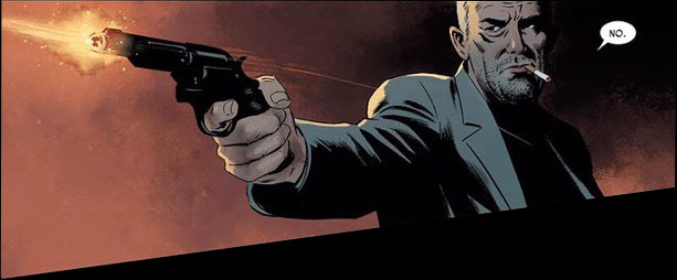
The art team know that wouldn’t make for interesting reading and take advantage of this opportunity to show you things in process rather than completed actions.

There are a few techniques at play here, all of them coming from Epting and Breitweiser. The first piece is the motion line. This book aims for a pretty realistic visual feel so it minimizes motion lines, sound effects and other, similar devices, but in this panel there’s a motion line from Burke’s jacket on the right to the outstretched arm on the left.

The fact that these are so infrequent makes this one instantly something to pay attention to. It also stands out from the rest of the panel visually because it’s a different color from what’s behind it as it begins and then again as it finishes. Epting/Breitweiser (I don’t know how much of this part each person did, inks for this book are hard to find since it was done digitally) make sure that the motion line is light against the dark cloth of Burke’s shirt and then it shows up again as lighter than the red background. This provides something to latch onto and pulls the eye across the page slowly because it’s still a slightly unnatural process. You almost feel at this point like you’re watching the gun move left. This one element, however, is not enough to cement the reading order.

Another part of this is that the background has been dropped out for this panel. That can have the effect of speeding up the panel but in this case it’s more important to look at what has replaced the background.

As I’ve already mentioned, the top right corner of this panel is black, but the rest of the panel is a red gradient that gets lighter as it goes from right to left. Given that you start in the black region on the right, the natural progression is to follow the gradient left as it gets lighter.

The last notable technique used in this panel is the non-rectangular panel shape. The top border and the two sides stay at right angles like a traditional rectangular panel but the bottom border slopes down as it moves from right to left, making the panel expand in the direction of the action.

This does two things. First, it makes the eye move from the confined right side of the panel over to the wider left side. This reinforces the reading order, getting you to look where you’re supposed to look. The other thing it does is lead the reader into the third tier by pulling the eye down along the panel border. Without that downward slope, neither of those things is as clear.

*This screen cap has been altered in Photoshop to demonstrate what the panel might look like without the downward-sloping border to guide the eye.

This takes us to the third tier, which may be my favorite part of the page. The third tier is made up of one panel showing a man who was just shot on the left, Burke in the middle pointing the gun right, and a man being shot to the right of that.

Velvet's Perfect Page Image 12.jpg

Thinking about it like that, it’s actually a pretty boring moment to draw. If we think of the panel as a frozen moment in time, the moment Epting chose is one that happens after all of the action is already done. Both men have been shot already and there’s nothing else happening. Epting is too good to let the panel be boring though. He sets this panel up to create an engaging, almost cinematic feel and it has everything to do with the way Burke is drawn. Burke is shown in heavy shadow with a solid black line running from the bottom of the panel up to the top. Beyond creating atmosphere, this serves to separate the left half of the panel from the right, essentially making it into two panels, separating the moments. When reading this panel you get to the top left part, see it as a panel where Burke shoots the guy on the left, then you move right, passing Burke’s shadow and see a panel of Burke shooting the guy on the right. The deep shadow separates these two moments so that you can experience them one after the other and see the action as it’s happening rather than all at once. Without that shadow, it’s a bland panel, effective but uninteresting. With it, it’s one of the best panels I’ve ever seen.

*This screen cap has been altered in Photoshop to demonstrate what the panel might look like without the shadow.

And, while that wraps up my breakdown of this page, I’d like to say that this is by no means the only example of good craft in Velvet. I said it before and I’ll say it again: every member of the team turned out career defining (or redefining) work for this book, but if I tried to talk about all of it I’d be here all day. All I can tell you is to read the comic. Thanks for reading Comics Anatomy, and I hope you join me for more analysis of comics craft and technique in two months time.

Velvet
Writer:
Ed Brubaker
Artist: Steve Epting
Colorist: Elizabeth Breitweiser
Letterer: Chris Eliopoulos
Publisher: Image Comics

Harry Kassen is a college student and avid comic book reader. When he’s not doing schoolwork or reading comics, he’s probably sleeping. Catch his thoughts on comics, food, and other things on Twitter @leekassen.

Essential Espionage: The Best Spy Comics

By Taylor Pechter — In comics about espionage and spying, the stories usually don’t focus on the political or personal ramifications of the craft, instead dealing in flashier things like action, intrigue, and sex. On rare occasions, however, those more realistic aspects do shine through, creating a grounded look at the world of espionage. The best spy comics find glory in the monotony of the work, using a stronger focus on the real people involved as well as how their escapades affect their lives.

While these books might be rare, they are out there, and today I’d like to look at some of the best spy comics of all time. Now let’s get into the books...

The Best Spy Comics

Queen & Country

Writer Greg Rucka,  a 25-plus years veteran of the industry, wrote Queen & Country from 2001 to 2007 for Oni Press. Queen & Country follows SIS agent Tara Chace, designate Minder Two. and the book is broken into sections that follow separate operations undertaken by the organization. For example, the first story Operation: Broken Ground has Tara in Kosovo on an assassination mission trying to take down a former Russian General turned mob enforcer. She gets the job done, but in response, the Russian mob puts a bounty on her head. However, more important than the operations is Tara herself, and it’s this focus on character that makes Queen & Country so special.

Tara is a headstrong and sarcastic (if a bit in-over-her-head) agent. After the assassination, she is put into therapy. It is here Rucka plays with the psychological aspects of the profession. In therapy, Tara is jittery and untrustworthy of the doctor. As she opens up, however, you really see how important her job is to her, even though it wreaks havoc on her personal life. Another aspect Rucka focuses on is the political ramifications of the craft, whether it’s dealing with the home office (MI5) after a rocket attack or capturing a politician selling secrets to the Russians. Politics take center stage in most of the stories.

This creates intrigue, and Tara and her team of Minders (special agents) have to be sanctioned by C, the head of the service, to go on missions. On these missions there is action, but action scenes are few and far between. What readers see is the real monotony of spy work: tailing, gathering information, and reporting it back to superiors. Within this monotony is where characters shine through their interactions. All of these aspects make Rucka’s creation what I consider to be the quintessential espionage comic.

Sleeper

What happens when you are an agent left in the cold, no one to help you, and you work for a madman trying to take over the world? This is the story of Holden Carver, the lead character of the WildStorm series Sleeper, which is one of the earliest collaborations between the superstar creative team of Ed Brubaker and Sean Phillips.

Sleeper is a tale focused on morality. Holden Carver is an agent for International Operations, the most prominent intelligence agency in the WildStorm Universe. Carver’s mission is to infiltrate a corporation run by former Wildcat-gone-bad TAO (Tactically Augmented Organism). To complicate things, however, John Lynch, former director of IO and Carver’s handler, is stuck in a coma after an assassination attempt and having his file burned. With an expunged record and no help, Carver must find a way to make sure TAO and his men don’t discover his secret while also proving to the agency that he is actually on their side.

It’s through this dichotomy that Brubaker crafts a story of a man who has done despicable things for both sides searching for purpose. Will he be corrupted by sex and violence, or will his humanity shine through? It’s a stark contrast from TAO, who is devoid of morality. In his final confrontation with Holden, TAO exclaims, You want to know the main difference between you and me Holden? You’re like the rest of humanity, you have two people inside. One is the person we see. The other is the person you think you are. It’s a powerful idea and it brings Holden’s arc full circle. This, along with the raw and unrefined art of Sean Phillips, grounds the series in a dark and twisted, yet fantastic world. Sleeper is often overshadowed by Brubaker and Phillips’ later works, but it is one of the definitive superhero noir comics.

Checkmate

Another series penned by Rucka, Checkmate follows the exploits of the eponymous UN sanctioned organization in the wake of Infinite Crisis and the death of its former leader, Maxwell Lord. Checkmate in this story has been restructured via the Rule of Two, which states that for every powered member of the team, there must a non-powered member. Checkmate’s mission is monitoring metahuman activity and defending against metahuman threats.

Like Queen & Country before it, this book focuses heavily on political ramifications, especially when it comes to conflict between Sasha Bordeaux (the Black Queen), and Amanda Waller (the White Queen). Through this, Rucka explores themes of duty versus morality, the price of deception, and new beginnings. At the series’ start, Sasha is more carefree with her actions. During a raid on a Kobra outpost in the Gulf of Aden, she instructs Beatriz Da Costa, also known as Fire (Black King’s Knight) to set the compound ablaze, killing upwards of 50 cult members. Sasha’s own Knight, Jonah McCarthy, dies in the crossfire.

This disregard for human life contrasts with the views of Alan Scott, the White King at the time, who believes they should value human life over mission objectives. This, along with Sasha’s relationship with Mister Terrific (Alan’s Bishop) also gives Waller ammunition to drive her out of the agency. Speaking of Waller, this is her at her most deceptive, which is saying a lot. Throughout the first half of the series she conspires with her Bishop, King Faraday, to throw out the other Royals for violating Checkmate’s charter on the Rule of Two. Amanda’s deception is called out by Sasha and Terrific, and she is later dismissed. It’s all dramatic and well done.

Lastly, there is the hope for new beginnings. At the start of the series characters try to get out from under the shadow of Lord. At the halfway point, following Amana’s dismissal, they become more welcoming of outside help. At the end, after a raid on a Kobra stronghold, much like the beginning they realize the cult is engineering infants into weapons. As Batman confronts Sasha about what happened, Sasha monologues, How do you fight a bad religion? You give it a fresh start. You play the long game. But we can do that. We have time, Checkmate isn’t going anywhere.

Overall, Checkmate was one of DC’s first major modern espionage comics. Sasha Bordeaux was later reintroduced in current continuity by Rucka in his second critically-acclaimed run on Wonder Woman. Here’s to hoping we get a reunion sooner rather than later.

Velvet

Imagine your entire life was taken away by the people you trusted the most. This is the story of Velvet Templeton, secretary and former agent for ARC-7, a top-secret intelligence service. Written by Ed Brubaker, illustrated by Steve Epting, and colored by Elizabeth Breitwieser, Velvet crafts a story that deals with the burden of secrets, spy life versus regular life, and the bitterness of betrayal.

The story starts with the murder of an operative by the name of Jefferson Keller, designated X-14. This sets off a search for the answers Velvet craves, which ultimately ends in her going rogue to find them. With her on the run, the agency has to deal with her and the ongoing investigation of the murder of Keller, plus a possible mole. With this comes the burden of secrets, which is hidden beneath every layer as Velvet uncovers more. Each answer leads to more questions. Not only that, Velvet also has to accept that being a spy has forever changed her life—a life of sulking in the shadows and not trusting anyone, even the ones closest to her.

Last, she has to deal with her entire life being a lie and her closest allies in the agency setting that lie up. Whether it be the death of her husband, a supposed double agent, or the death of Keller, etc. Brubaker’s writing is sharp and at times darkly comical. Epting’s art is gorgeous in its dynamic brutality. Heavy shadows accentuate the lush colors of Breitweiser. Velvet is a brutal and realistic take on espionage that, like Sleeper, is often overlooked in Brubaker’s catalogue.

Grayson

Dick Grayson has been many things: acrobat, boy wonder, caped crusader, team leader, and now, secret agent. This exploration of identity is a key aspect of the 2014 series Grayson. Spinning out of the events of Forever Evil, Grayson is written by Tom King and Tim Seeley with art mainly by Mikel Janín with help from Stephen Mooney, plus colors by Jeromy Cox.

The story focuses on Dick after his supposed death at the hands of Lex Luthor. He is inserted as a double agent into spy organization Spyral as Agent 37. Under Batman’s orders, he is to uncover the organization’s secrets and ultimately dismantle it. Within Spyral, he is partnered with Helena Bettinelli, or Matron, who is the head of the boarding school that is Spyral’s cover. As Dick goes on missions, he discovers Spyral is stockpiling information on the secret identities of League. The heart of the series really shows through in issue 14, wherein Dick returns to Gotham. This story demonstrates how important Dick was to the Bat-family, in all of his interactions. Whether it is conversations with Alfred about Bruce, speeches to Barbara about the love they shared, or reminiscing with Damian about their Batman and Robin days, there’s a focus on the Dick’s core experiences, showing us how he became the character he is today.

Janín and Mooney’s artistic styles contrast, but they are brought together by the expert coloring of Jeromy Cox. Janín’s lines are cleaner, adding a Brosnan Bond-esque tone with high action, while Mooney has more lines and darker shadows. These art styles, along with clever writing, combine to make a fun, exciting, and introspective series that redefined Dick Grayson.

Ultimately, the spy genre is one of the most fertile in comics. Spy books are uniquely able to focus on many different aspects that readers don’t find in normal superhero comics. From the psychological aspects of Queen & Country, the moral ambiguity of Sleeper, the politics of Checkmate, the brutality of Velvet, to the journey of Grayson, these comics craft compelling stories with relatable characters. That is what makes them essential espionage material.

Taylor Pechter is a passionate comic book fan and nerd. Find him on Twitter @TheInspecter.