REVIEW: Fearscape #4, venture deeper into the mind of a failed writer

Fearscape #4 is out 2/13/2019.

By Zack Quaintance — I don’t entirely know what’s up in Fearscape. So, before reading Fearscape #4, I went back and re-read this series from its start, seeing if I’d missed any clues. I came back with a few things, but on the whole, I didn’t develop great theories about what’s happening or why. Certainly not any I’m confident enough to lay out here, dear readers (sorry, I really did read a whole lot of Fearscape today).

Before unpacking my re-read, let me say this is a strong ambitious comic. Artist Andrea Mutti and colorist Vladimir Popov’s designs are top-notch, as is their delineation of the Fearscape from reality. There is (likely intentional) confusion over meaning, but it is always clear when a character is fantastical or real, unless it serves the story to blur lines. Writer Ryan O’Sullivan does impressive work maintaining the insecure pretentious voice of faux-literary luminary, Henry Henery. I’ve tried complex voices like his myself—maintaining a consistent tone for four issues is truly impressive.

Now, on to my re-read. Two ideas stand out in this idea-dense comic. The first is the tearing down of usual story structure. The second is the culpability of readers in stories, ie if I’m not turning pages, nothing happens to characters, like Schrodinger’s fiction. The many references to these thoughts make me suspect disorientation is by design, and the real villain of this comic is stories in the first place, especially those of literary figures who thrive on validation for cleverness.

Interior artwork from Fearscape #2.

Conversely, there are ample references here to the learned reader versus the casual reader. The learned reader is, presumably, someone with a handle on what’s happening and how various meta-fictional touches are being deployed. This person maybe even knows why. The casual reader, meanwhile, is someone yearning for the predictable comfort of a Campbell hero’s journey, a story about a person—good or bad—who wants something, struggles, and emerges changed...often for the better. In Fearscape, the casual reader is derided by Henry Henry, perhaps more than anything (which is saying a lot because this guy derides all damned day).

The book is without question succeeding on disregarding conventions and discomforting casual readers. What remains to be seen, however, is if it uses that to tell an engaging story that raises questions about the art life and—in a broader sense—the human condition. To me, Fearscape #4 feels like a deepening psychological nightmare, a trip into the mind of a writer riddled with anxiety and imposter syndrome and desperation, having spent his career compartmentalizing personal ambitions while translating other work.

There are, however, elements that suggest a further skewing of reality...Henry not having parents but being Arthur’s ward, Arthur and his alzheimer's, Henry Henry telling us he’s dead. These suggest a deeper story, one I have not yet figured out but remain absolutely determined to experience.

Overall: Fearscape #4 is another strong issue of a meta-fictional comic about how it feels to have unfulfilled literary aspirations. This comic remains a must-read for English majors and literary dabblers, anyone who has taken a creative writing workshop or read canonical novel in a coffee shop and daydreamed about their name on its cover. 8.8/10

Fearscape #4
Writer:
Ryan O’Sullivan
Artist: Andrea Mutti
Colorist: Vladimir Popov
Letterer: Andworld Design
Publisher: Vault Comics
Price: $3.99

For more comic book reviews, check out our review archives.

Zack Quaintance is a tech reporter by day and freelance writer by night/weekend. He Tweets compulsively about storytelling and comics as BatmansBookcase.

REVIEW: Friendo #4 keeps searching for the absurdity ceiling of extreme capitalism

Friendo #4 is out 2/13/2019.

By Zack Quaintance — Around halfway through Friendo #4, our heroes (maybe that’s not the right word) are listening to local news radio describe their exploits as they drive a shiny red convertible through the desert. The radio essentially sums up the status quo, which has shifted seismically since Friendo’s first issue. It’s a nice storytelling device, one that does a good job taking stock of both where we are and how crazy Friendo has gotten. At one point, the voice on the radio says: Whole saga’s turned into this Looney-Tunes three-ring circus if you ask me.

That’s a pretty accurate summation, really, for writer Alex Paknadel’s plotting of Friendo, but I think there’s also subtext about the book’s central theme: that late-model capitalism has gone so off the rails, that we maybe don’t realize how bananas life has gotten in this country. The voice continues: The guardrails are gone, man. It’s all just a big joke now. There’s nothing between us and the jagged rocks below. I had to just hang my head for a moment, because got-damn.

This thematic ground has been well covered throughout Friendo. So much so I think the central thrust of the book is showing its audience we’re maybe not even at rock bottom of all this, that with a society so thoroughly dominated by sales, marketing, corporations, etc., things can and will always get crazier, get more manipulative and exploitative. That there is, in effect, no end, no upper ceiling to the limits of greed inherent to unbridled capitalism. This story, in essence, is slowly upping the malarkey on its pages to match the point it’s making about our lives. If it’s all a big joke, the radio voice posits, then how are we supposed to know when to stop laughing?

Whether I’ve phrased it that way or not (I haven’t), this is a crisis that has shaped my life for a decade, first while coming of age during the recession, again while clawing toward some sort of financial balance, and now while working multiple day jobs and passion pursuits with big questions looming, like: will it ever be enough? Will I ever be able to afford a house? Would it be nuts to have a child? This all adds up to Friendo—as I’ve written in pretty much all my reviews—being a different, more realistic sort of horror story.

As this is the fourth straight issue that has posited such questions (albeit previously with less intensity), this begs the question of whether this comic is at risk of feeling repetitive. I certainly don’t think so. Part of why has to do with the nature of the plot being about limitless absurdity, about extrapolating extreme ideas to new places. It’s not repetitive because the same ideas are being push juuuuust a bit further every week, stretching into new ground. The second reason Friendo #4 succeeds is it’s so well told by its creators.

Jerry, pictured here in Friendo #3, has seen better days, but Simmonds art is looking mighty fine.

Paknadel’s scripting is hilarious (Not kinky, just sad), and Martin Simmonds art has accelerated, packing more into panels as the plot calls for it, augmented fantastically by Dee Cunniffe’s vibrant colors. Another thing Simmonds has done well is the evolving design of the humanized marketing hologram Jerry, who has become more unhinged, more gory and grindhouse and sinister just as his user, Leo, has become sloppier and rundown and frazzled. There’s a two page spread in this issue, filled with art conveying the changes afflicting them both, with Leo chomping a donut as Jerry (with a hole blown in him and guts visible) climbing the wall like a feral demon. The spread is interspersed with detailed shots and Taylor Esposito’s clean lettering, all coming together in a visual—and a comic—that really lingers.

Overall: Friendo #4 continues searching for the absurd upper limits of unrestrained capitalism and still doesn’t find it. Whenever this book seems to reach a new extreme of exploitation, greed, or dehumanization, it pushes it just a bit further, finding new and scarier ground. Simply put, do not miss this comic. 9.2/10

Friendo #4
Writer:
Alex Paknadel
Artist: Martin Simmonds
Colorist: Dee Cunniffe
Letterer: Taylor Esposito
Publisher: Vault Comics
Price: $3.99

For more comic book reviews, check out our review archives.

Zack Quaintance is a tech reporter by day and freelance writer by night/weekend. He Tweets compulsively about storytelling and comics as BatmansBookcase.

REVIEW: Gideon Falls #11 stirs horror with more unpredictable developments

Gideon Falls #11 is out 2/13/2019.

By Jarred A. Luján — I’m not going to pretend like I’ve read everything Jeff Lemire has ever written. I’ve read some of his Big 2 work, but only a little of his independent stuff, including his recent Hit-Girl run. Andrea Sorrentino is a similar case, in that before Gideon Falls I’d seen some of his stuff for Marvel and DC, but otherwise, I couldn’t say I devoutly followed his releases. So when Gideon Falls launched, I only picked it up because of a recommendation on Twitter from Marvel writer Matthew Rosenberg.

Just shy of a year later, I haven’t missed a single issue of this book. There are few better examples of why than this month’s issue, Gideon Falls #11.

So many of Gideon Falls’ horror aspects come from Sorrentino’s willingness to take chances with the way he lays his artwork out. The art in this issue, for example, ranges from traditional panel layouts, to pages with a cyclical panel system, to a page that’s entirely upside down, to make-shift panels scrawled throughout splash pages, to back-to-back-to-back double spread pages. When things really begin to come undone here, Sorrentino’s artwork lets the page come undone as well. Allowing it to feel as disjointed and unnerved as our characters do has consistently set Gideon Falls apart from other horror comics.

One of my favorite parts of Gideon Falls has also been the pacing. Lemire has only given us bits and pieces of this intricate plot, and every big influx of information is countered with new ground that makes readers aware of how little they actually know. Lemire is giving the audience pieces to the puzzle, sure, but he’s still withholding how those pieces connect. At 11 issues in, I still have no clue where this story is going, and, just like Sorrentino’s art, that is part of what makes this book so horrifying to me: there is no safety in the prediction of the narrative. As a reader, you are immersed in the protagonists’ stories by knowing only as much as they do. This issue, following what was likely the biggest issue of the run so far, pulled back the curtain on the workings of the Black Barn only to reveal that there are many more curtains. Lemire giveth, Lemire taketh away.

The next chapter of Gideon Falls releases in April, giving us all a month to try and figure out what the hell is going on…but if the past is any indication, I have a feeling we’ll fail at that.

Overall: This issue is as frightening as it is dizzying. There is so much going on in this series, and readers don’t yet know how deep into the mysteries and the story they’ve gone. This is a horror book in a class of its own, and I highly recommend doing yourself a favor and getting caught up with it. 9.0/10

Gideon Falls #11
Writer:
Jeff Lemire
Artist: Andrea Sorrentino
Colorist: Dave Stewart
Letterer: Steve Wands
Publisher: Image Comics
Price: $3.99

Jarred A. Luján makes comics, studies existential philosophy, and listens to hip-hop too loudly. For bad jokes and dog pictures, you can follow him on Twitter.

ADVANCED REVIEW: Little Bird #1 is an imaginative, and powerful debut...think Saga or God Country

Little Bird #1 is out 3/13/2019.

By Zack Quaintance — Little Bird #1 is one hell of a debut comic, a likely contender best #1 comic of the year. I know we’re only halfway through the second month, but is so good that I’m confident in saying that. Little Bird #1 is the type of immersive story you pick up, blink, and realize you’ve read the whole thing without stopping, without even considering putting it down. So yes, it’s very good, and I highly recommend comics fans read it.

I could stop there, but (obviously) the lot of the comics reviewer is such that I’m here to also explain why. With Little Bird, it’s fitting to start with a discussion of the art. Ian Bertram’s phenomenal linework and sequential storytelling is the first thing that grabs reader attention, as well as the biggest factor in why the story feels so immersive. A big question I had by the end of it was who the hell is Ian Bertram and why have I not yet heard of him?

Well, mostly because Bertram has done a handful of superhero stories, some webcomics, and, perhaps most recently, a six-issue 2016 miniseries for Dark Horse Comics called House of Penance written by Peter Tomasi about the Winchester House in Northern California (which I obviously missed). He’s not a total unknown, but he’s far from a major name comics. I predict that will change once Little Bird finds the audience it deserves. Bertram’s work here is incredible, as singular as it is gorgeous.

His linework is the wavy, detailed style I associate with Frank Quitely (and others who came after him, like Jon Davis-Hunt or Ramon Villalobos), and his designs for everything from characters to clothing to genetically-enhanced bodies to the fiery floating nun woman (you read that right) to buildings—I could continue but I’ll stop and note everything is rendered with an ideal balance of intricacy and imagination. There are touches here of Moebius and Jodorowsky, of Terry Gilliam’s Brazil, Fiona Staple’s designs in Saga, the overblown carnage of that one big fight scene in Kill Bill, and the list goes on. Bertram’s keen visuals coalesce to create something all its own, augmented and made possible by the vital rhythm section of Matt Hollingsworth’s colors and Aditya Bidikar’s lettering. All three deserve much credit.

Darcy Van Poelgeest—a first-time comic book writer with a background in film—gives the top-tier art much to work with via his scripting. I was particularly impressed with how compressed and dense Van Poelgeest’s story felt. Often times for creators from other mediums—especially film—there is a tendency to decompress comics, as one might a storyboard. Van Poelgeest, however, packs more into his first three pages than some new creators would an entire opening arc, immediately justifying why comics are being use to tell this story. The first line is poetic, the first pages rich with expository details that don’t feel forced. The child character (the titular Little Bird) is an automatic means of engendering sympathy, while a militaristic speech clues us in to the world’s high stakes.

This is an advanced review, though, so I’m hesitant to get more specific. I’ll just say that the level of world-building and imagination on display is strong, conveying grandiose vision while using the main character as an anchor to keep readers from drifting into disorientation. There are ample twists and many unpredictable reveals.   

If I have a small qualm, it’s that I think the full story needs to justify the gruesome violence that occurs here (there are hints it will but we still need to wait to see if the story delivers). Also, I know this is silly, but I’m salty about it only spanning five issues. I know I know, and I appreciate creators who have a specific vision...but hey, maybe Little Bird will be such a success that it will get expanded, rendering its first lineprophetic, This doesn’t end here. Not like this.

Overall: A nigh-perfect debut, by the end of Little Bird #1 I found myself already melancholic that the series is only five issues. Simply put, if Little Bird continues this high a level of storytelling, we’ll all have to mention it in conversations about Image’s creator-owned resurgence, right alongside Saga, Wicked + Divine, God Country, etc.. This is one fine comic. 9.8/10

Little Bird #1 (of 5)
Writer:
Darcy Van Poelgeest
Artist: Ian Bertram
Colorist: Matt Hollingsworth
Letterer: Aditya Bidikar
Publisher: Image Comics
Price: $3.99
Release Date:
March 13, 2019

For more comic book reviews, check out our review archives.

Zack Quaintance is a tech reporter by day and freelance writer by night/weekend. He Tweets compulsively about storytelling and comics as BatmansBookcase.

REVIEW: Vindication #1 is a realistic comic steeped in shades of gray

Vindication #1 is out 2/6/2019.

By Zack Quaintance — Mining ideas for comic book stories from current events is nothing new. In fact, I’d wager a guess that a vast majority of creator-owned comics these days (as well as much of the corporate superhero fare) excavate their thematic interests from the news. This is one of the qualities I appreciate most about weekly comics—their production times/release schedules make them the storytelling medium best-suited for processing the real world via narrative. It’s a wonderful thing.

The most common route for comics to go is to take the news and steep it in genre, in horror and fantasy and science fiction. But what if the actual news is sufficiently complex and terrifying? What if an injustice has become so severe, so brutal and hard to accept, that adding vampires or aliens or a realm filled with elves would actually waterdown the impact? This is essentially what Vindication #1 posits through its embrace of total realism. Simply put, everything in this comic feels real, from the world to the plot (culled straight from the headlines) to the understated character moments. And I’m not talking real in the sense of something like The Authority or 100 Bullets or Lazarus, all of which—let’s face it—involve plot conceits that are still incredibly unlikely, even if they’re given grounded, logical treatments.

Vindication reads like a snapshot from the real world. Created by Matt Hawkins (who has made similarly-realistic comics in the past with his series Think Tank) and writer M.D. Marie, this is the first of a four-part series about a police detective who “maneuvers the blurred blue line between racism and due diligence in order to do his job.” Police discrimination against young black men is a major problem in society (and has been for some time), brought to a fever pitch in recent years via the acceleration of video technology, specifically the increased ability of citizens to take/share quick videos with mobile phones. An entrenched and polarized debate has risen around the subject (as it has around so many subjects in America 2019), with part of the country demanding accountability for blatant injustices while others denounce the denunciations, essentially telling activists and protestors to lay off the police.

Perhaps most realistically, there is no clear hero in Vindication. The central character actually appears to be a villain, though the audience doesn’t have all the info it needs yet to make a final judgement. Not quite. This hint of ambiguity makes the story feel realistic, allowing the comic to inhabit a space of cold, logical gray, like a well-made documentary. The lead character is Detective Chip Christopher, who at first blush seems prejudiced and maybe even corrupt. He pushes down a newly-exonerated young black man named Turn in the opening scene, going on to claim he was helping Turn up, which we as an audience know to be a falsehood. The detective is just convinced Turn was guilty. What we don’t know—because the comic shrewdly doesn’t show us—is whether the detective is right. We as readers are given only what the detective himself knows, really, a great choice for the narrative. Things get complicated when one of the jurors who convicted Turn is murdered in an incident that mirrors the crime of which he was originally convicted.

It’s a timely story, and writer M.D. Marie and artists Carlos Miko, Dema Jr., and Thiago Goncalves execute it well. The detailed art mirrors the realistic plotting, and the characters are well-defined yet subtle, with a script that works hard to give even bit players depth. I thought the main character’s new partner, Detective Maggie Cruz, was especially intriguing and strong, the way she approached Detective Christopher collegially but with healthy skepticism. Christopher himself is also given touches perhaps aimed at making him more sympathetic—a partner who was killed, friendly relationships with co-workers of different backgrounds, etc. I’m personally viewing Christopher as a villain at this point, but my sense is that the real threat in this story will end up being human fallibility, which is terrifying when applied to something as complex and consequential as the country’s law enforcement system.   

Overall: A realistic comic that lives in ambiguity and shades of gray, Vindication #1 is a scary look at how individuals influence something as consequential as the justice system. 8.6/10

Vindication #1
Created By:
Matt Hawkins / M.D. Marie
Writer:
M.D. Marie
Penciler: Carlos Miko
Inker: Dema Jr.
Colorist: Thiago Goncalves
Letterer: Troy Peteri
Publisher: Image Comics/Top Cow
Price: $3.99

For more comic book reviews, check out our review archives.

Zack Quaintance is a tech reporter by day and freelance writer by night/weekend. He Tweets compulsively about storytelling and comics as BatmansBookcase.

REVIEW: Daredevil #1 is a subdued, intriguing start for Zdarsky and Checchetto

Daredevil #1 is out 2/6/2019.

By Zack Quaintance — Of all the major corporate superhero writers in comics, Chip Zdarsky—for my money—is the least predictable. Sure, all good stories have twists, and I’m not saying that I know every move that a Tom King or a Brian Michael Bendis or a Jason Aaron is going to make. Far from it. I do think, however, that I know the overall type of story that those and the other major Big 2 writers are generally interested in telling. I can’t really say the same for Zdarsky.

Zdarsky’s interests as a storyteller are varied and surprising, quite frankly. He’s the guy who took what was essentially a throwaway run on Howard the Duck (2015), one he was probably hired to write more than anything for his sense of humor, and turned out as poignant and heartrending of a story about parenthood as I’ve ever read (in the over-sized and in my opinion seminal, Howard the Duck #2). And sometimes just when you think you know what his books might be about—Oh hey, apparently this Marvel 2-in-One run is a buddy road trip through the multiverse—he swerves and throws you an annual that tells the best story in a decade (include everything Hickman did) about Doctor Doom.

This level of unpredictability is what made Zdarsky such an inspired choice for Daredevil, a franchise that has a long history of teasing out career-best work from some of the most celebrated and idiosyncratic writers and artists in all of comics. Everytime a celebrated Daredevil run ends—be it Bendis/Maleev, Waid/Samnee, Charles Soule and his many recent artistic collaborators—I find myself irrationally thinking, There’s no way the next team can do it this well.   

So, this new run brings two major and intriguing questions: how will this team put its on stamp on this character, and where will Zdarsky’s thematic interests take us as he scripts it? This intrigue was on full display in the first issue of the new run, a debut that didn’t feature standard launch trappings like the introduction of a new villain, a massive status quo change, or some other CBR headline-grabbing snap-flash element, the sort that has come to mark blow-out, new creative team, $5 first issues. Zdarsky, Marco Checchetto, and Sunny Gho’s Daredevil #1 is instead a slow-burning affair built on a relatively simple premise: for a hero like Daredevil, is fatigue and an off-day more dangerous than things like assassins or undead ninjas, and are his own motivations his greatest enemy? This is all perhaps well-travelled ground, but so is most everything in superhero comics, and this creative team has earned full trust that they will bring something new to the ideas and character via their execution.

I should also note that this is the type of debut issue in which the creative team is not yet ready to tip its hand. It wasn’t massively decompressed (at least not relative to other comics these days), but it also didn’t seek to overfill its pages, instead dedicating ample space to flashbacks that telegraphed the role Daredevil’s ubiquitous Catholicism stands to play in whatever crisis is coming (a glimpse of which comes at the tail end of the issue), or his much ballyhooed (at least by the Netflix television show) willingness to thrash enemies severely but not kill them. It was an incredibly well-crafted comic, in everything from the art to the dialogue to the scenes it choose to feature, and with the promise of unpredictably looming so large, it’s one that has me excited.

Really, what is most impressive about this issue to me is the sheer variety of thematic spaces the story manages to traverse, any one of which will make for a rich focus in storylines, issues, or other tales to come.

Overall: A top-notch debut that does everything well while paving many thematic roads moving forward. Writer Chip Zdarsky is often unpredictable, and I’m excited to see the scope of his take. The one thing I can predict, however, is that damn fine comic book-making will be on display throughout. 9.0/10

Daredevil #1
Writer:
Chip Zdarsky
Artist: Marco Checchetto
Colorist: Sunny Gho
Letterer: VC’s Clayton Cowles
Publisher: Marvel Comics
Price: $4.99

For more comic book reviews, check out our review archives.

Zack Quaintance is a tech reporter by day and freelance writer by night/weekend. He Tweets compulsively about storytelling and comics as BatmansBookcase.

REVIEW: Wasted Space #6 picks up with all the humor and high ideas from its first arc

Wasted Space #6 is out 2/6/2019.

By Zack Quaintance — Wasted Space #6 is the start of this madcap sci-fi comic’s second arc. It’s been five months since the previous issue, and so I’d like to start a recap. Last we saw the Wasted Space crew—self-loathing former voice of God Billy Bane, future-seeing eyes of God Molly, Billy’s best friend the Fuq/Qil Bot Dusty, and Dusty’s rekindled lover The Fury Qil—Billy had just assassinated a galactic dictator, setting into motion the launch of nukes that might start a war that might end existence...and then a massively-powerful balance-bringing force called Legion showed up to tell him that to save the world he had to kill God.

Phew.

That’s where we left off, that’s the status quo, and it’s a status quo that speaks to the many reasons I love this book (see my Top 10 Comics of 2018). As I’ve written, this is a story that has gotten better with each issue, forging a unique thematic aesthetic (something like Star Wars by way of David Foster Wallace) that enables it to make a point about God, political terrorism, and sex robots...all on a single page. I, for one, am ecstatic it’s back.

One of many moments in this issue that cracked me up.

So then, let’s get to the big question: how does this issue compare to all that came before? Well, I can all but guarantee fans of the series will love its return. This issue, of course, pushes the book in a new direction. It basically had to. There was really no other way to do it, seeing as the first arc’s MacGuffin, Devolous Yam, was killed at the end of the fifth issue. The story needs a new object of pursuit, and, without tipping into spoiler territory here, it definitely gets it.

What’s familiar, however, are the book’s two greatest strengths: it’s humor and its ability to synthesize intense feelings stemming from today’s headlines into space opera adventure. The humor is there right from the start, when Legion (the aforementioned all-powerful balance-bringing force) accidentally Of Mice and Mens an innocent dog and realizes that it is indeed possible to love something so much you start to hurt it. The laughs keep coming as the plot progresses too, especially when the reunited Fuq/Qil bots give into their passions.

The commentary is back as well, and it’s as relatable as ever, feeling like writer Michael Moreci took it right from conversations I’ve had personally about America in 2019. Billy Bane (who is by no means a role model, so take his opinions for what they’re worth) has previously bemoaned his complacency in the order that is tearing the galaxy apart, poignantly saying things like, “With enough drugs I could live with the idea that I only kinda sorta played a role in the galaxy’s downturn….because I was scared, because it was easier to downplay my role in the galaxy’s oppression rather than try to make it better and fail.” Or, “If I believed things could change, well, that would put me on the hook to actually do something.”

In Wasted Space #6, Bane criticizes a devious member of the elite class for virtue signaling in order to craft a progressive image that obscures the true nature of what he does to maintain wealth and power, a list that includes supporting violent radicals in order to create chaos that inspires the masses to fall back in line. “But as long as the plebs keep bickering amongst themselves, the tyranny of wealth pretty much goes unnoticed,” this character says. I gave a solemn nod of heavy agreement after reading this line, and it’s really just one example of poignant writing. As has been the case throughout its run, Wasted Space is dense with complex sentiment, yet never at the cost of its story.

Overall: The best space opera in comics is back, bringing the same high level of humor and commentary with it as its cast of characters embark on a new quest. This is one of my favorite series in all of comics, and I’m happy to say it’s as great as ever. 9.5/10

Wasted Space #6
Writer:
Michael Moreci
Artist: Hayden Sherman
Colorist: Jason Wordie
Letterer: Jim Campbell
Publisher: Vault Comics
Price: $3.99

For more comic book reviews, check out our review archives.

Zack Quaintance is a tech reporter by day and freelance writer by night/weekend. He Tweets compulsively about storytelling and comics as BatmansBookcase.

REVIEW: These Savage Shores #3 is a beautiful comic brimming with big moments

These Savage Shores #3 is out 2/6/2019.

By Zack Quaintance — Through its first two issues, a central question of These Savage Shores has been what it means to be civilized, and whether false notions of civilization have long been used by imperialists to further the economic interests of the powerful. It was right there on the opening page of the first issue, wherein the woman asks the man, And what do I know of civilisation. And the man responds with one of my favorite sentences in any comic in years, I hear it is found beyond the water’s edge on fairer shores, where men die with dignity and learn to live with shame.

This line is A. gorgeous, and B. an incredible mission statement for a book, one so intellectual and noble that it enables writer Ram V., artist Sumit Kumar, colorist Vittoria Astone, and letterer Aditya Bidikar to tell a story about vampires in 2019 that feels literary and profound, no easy feat for a genre that has been plunged into the bawdy and salacious (Twilight, True Blood, etc.). This was a sentiment I returned to often throughout These Savage Shores #3, the idea that the book put in the narrative work through its first two issues to earn the big moments in this particular installment...and there are many big moments in this comic.

They are big moments of a varied nature, too. There is combat, on the battlefield in broad daylight no less, after two straight issues in which violence and conflict was largely confined to lonely streets, to dark jungles, to shadows. There are emotional pleas by endangered rulers to essentially stand up to the imperialism that has loomed over many of the characters since this story’s start (since that couple lay in each other’s arms beneath the hummingbirds and overgrown tree waxing poetic. And there is a cost come due for the death that twisted perceptions of what the rest of the series would be back at the end of the debut chapter.

They are big moments that could suck the narrative air out of less sternly-constructed stories. They have, however, all been earned here. This results in an issue that reads at a lightning pace, that keeps readers like myself who spent December and January returning to this story, blazing through its pages, rapt by the early collisions of ideas and storylines. This is also an issue that lets nobody off the hook. It takes its most powerful character, one of the heroes of the story, and puts him into an unwinnable circumstance, leaving him in a place at issues end that promises to truly show the audience who he is, what he is made of, and how he will handle difficult choices now that what he cares most about the world is being tested against his perception of himself.

To be as direct as possible, this is an absurdly-well written comic by any metric, and as usual the visual storytelling of the art team does it justice, bringing to life the moody lurking threats that are now catapulting their way into the foreground to test the characters and their beliefs. It also can’t be overstated that Kumar and Astone are producing some of the finest artwork in any creator-owned comic today, with richly-detailed linework and colors that oscillate from moody to sultry to frenetic. As letterer, Bidikar is also being called upon to add to the experience and is doing so beautifully with narrative boxes that make clear when certain text is a handwritten letter. Just beautiful beautiful work from all involved.

Overall: Each issue of These Savage Shores has been the best chapter in the story so far, and #3 is no exception. A chapter packed with set pieces and hard-earned big moments, this is a comic that makes me feel unbelievably lucky we have this book. 9.5/10

These Savage Shores #3
Writer:
Ram V.
Artist: Sumit Kumar
Colorist: Vittorio Astone
Letterer: Aditya Bidikar
Publisher: Vault Comics
Price: $3.99

For more comic book reviews, check out our review archives.

Zack Quaintance is a tech reporter by day and freelance writer by night/weekend. He Tweets compulsively about storytelling and comics as BatmansBookcase.


REVIEW: In Amazing Spider-Man #14, Nick Spencer and Chris Bachalo payoff plots from the first issue

Amazing Spider-Man #14 is out 1/30/2019.

By Zack Quaintance — It is perhaps telling of exactly how old I am that to me Chris Bachalo is an artist that reminds me of how comics used to be, which is a phrase I think everyone uses to describe the time they first got into the hobbie. Simply put, Bachalo was huge when I was a new reader, helping to launch Generation X (the start of which was still a few years before my time), before moving over to help with some of the main X-titles, maybe even drawing Uncanny for a while as Grant Morrison and Frank Quitely did their thing on New X-Men.

Anyway, this is all a means to say that Bachalo is an absolutely perfect fit for a fill-in artist on Nick Spencer’s Amazing Spider-Man run, which is playing out holistically as a series as another example of how comics used to be, at least back in my day. This entire issue—from the art to the narrative construction to the use it makes of continuity—really feels like just a bit of a throwback to a different time, as has this run overall. The clearest example of this is that these Amazing Spider-Man comics are pretty clearly not written for trade compilations, not even a little bit.

You can really see it in this issue, which is 14 issues and six months into the run...and just now playing out pretty minor narrative threads that were dropped loosely into the background of Amazing Spider-Man #1, specifically thinking here of Peter’s offer from Conners. Now, not to sound like that old guy, but this is something that was once commonplace, back when stories weren’t conceived in six-issue bursts that should leave it all on the page lest the market dictate a sudden ending.

And the Connors thing isn’t the only bit in this issue drawn from #1. The conflict with Taskmaster and Black Ant was also seeded way back, possibly in the same scene with The Lizard (though I’d have to go back and verify to be certain). This is all well and good, and I like it because it scratches my long-form narrative itch as a reader. I think it’s an especially good thing for a book like Amazing Spider-Man, that publishes every other week. There really isn’t a need to so clearly define story arcs when the next chapter is generally 13 days away when you finish any given issue. The book should flow from plot to plot, carrying with it remnants as it moves into new territory. That’s certainly what Spencer and his artistic collaborators, whether it’s back in the day Chris Bachalo or regular series linework provider Ryan Ottley.

In terms of an individual read, this is a dense one, with multiple narrators, long conversations, and some pretty strong ideas jockeying for position, be it Aunt May’s disgust at her deceased husband’s sleazy accountant, or The Lizard’s son heartbreakingly wanting to just be a regular kid. There are so many emotional beats in this issue that it fades into a cacophony of feelings at times, making it hard for any one to move to the forefront and land with major resonance.

For me as a reader, that’s a great problem to have, especially for a comic I’m paying $8 a month to keep up with.

Overall: A dense issue of Amazing Spider-Man, packed with bits of continuity, big feelings, and payoffs to plot threads that have been dangling since the first issue. This series continues to have a narrative construction that calls back to times when stories weren’t written for trade, and it’s refreshing. 8.4/10

Amazing Spider-Man #14
Writer:
Nick Spencer
Artist: Chris Bachalo
Letterer: VC’s Joe Caramagna
Publisher: Marvel Comics
Price: $3.99

For more comic book reviews, check out our review archives.

Zack Quaintance is a tech reporter by day and freelance writer by night/weekend. He Tweets compulsively about storytelling and comics as BatmansBookcase.

REVIEW: Ice Cream Man #9 changes everything you knew about this book

Ice Cream Man #9 is out 1/30/2019.

By Zack Quaintance — Whoa. This issue was nuts, in the best way, and I’m going to do my best to not tip into spoiler territory here. However, I make no promises. So, if you really want to avoid any and all chance of spoilers, I encourage you to skip to the Overall section of this review down at the bottom for a spoiler-free word about whether you should buy this comic. If you have read Ice Cream Man #9, well friend, strap in, because this is about to get wild.

Ice Cream Man #9 up-ended my perception about the scope of this comic. It also sent me back through all eight of previous issues looking for clues. And you know what I found? Tons of them, along with a new sense of what this book is accomplishing. As I wrote in my review of Ice Cream Man #8, I thought this series was a commentary on instant gratification of the soul, on giving into easy feelings of fear and anxiety versus doing the difficult self work it takes to be optimistic, contented, happy. And it is that, to extent, but it’s also quite a bit more.

Ice Cream Man is a book telling an overarching story despite on its surface largely appearing to be an anthology series, albeit one with light connective tissue. The spider from the first issue here, a cop we vaguely know there, plus the titular Ice Cream Man and his weird enemy cowboy guy. A closer look, however, reveals that all along there has been a battle raging between two ancient polemic forces, one of malicious chaos and another that just wants folks to know we’re all friends, all connected, all just trying to live our peaceful lives.

To tell that story, writer W. Maxwell Prince, artist Martin Morazzo, colorist Chris O’Halloran, and letterer Good Old Neon have tapped almost every unique quality inherent to the monthly comics medium, ranging from the slow nature of the release schedule (used to draw the focus to the vignettes, rather than the forces in the background) to juke readers on the format of the narrative to the lettering, which is shaded white in boxes for the evil monologues and black fro the good. This comic has been a true work of patient serialized art, and now in Ice Cream Man #9, the creators are pulling what this book is really about from the background to center stage. And, to be crass, this sh** is f***ing epic.

I read this issue twice. The first time intrigued but bewildered. Then I went back and browsed previous issues for every appearance of the Ice Cream man, and I read it again. That time, I was absolutely blown away at what the creative team is doing. With that in mind, it is perhaps fitting and intentional that in Ice Cream Man #9 the old man character in this story tells the black-clad cowboy Caleb, End, beginning. It’s all the same, because Ice Cream Man is a comic built with no distinct start or end point. It’s a fluid story that demands repeat readings to really grasp its nature. At least the first eight issues play that way.

This issue pushed me to look back and also forward, seeding questions with every new reveal as if it were the work of David Lynch, who is a pretty clear influence on this whole deal, what with the idea that below the idyllic surface of life is bugs, as well as the counterpoint—we’re all the same and connected—which is rooted in Lynch’s beloved transcendental meditation and its universal field. But I digress and I’m getting long-winded here anyway, so let’s wrap things up...

Overall: The end of the beginning of the beginning of the end. An absolutely mind-wrecking read that suggests a more grandiose story than initially promised. Get past issues of Ice Cream Man nearby, because the creators have built something complex and subtle that will re-wire your perception of this series. 9.8/10

Ice Cream Man #9
Writer:
W. Maxwell Prince
Artist: Martin Morazzo
Colorist: Chris O’Halloran
Letterer: Good Old Neon
Publisher: Image Comics
Price: $3.99

For more comic book reviews, check out our review archives.

Zack Quaintance is a tech reporter by day and freelance writer by night/weekend. He Tweets compulsively about storytelling and comics as BatmansBookcase.

REVIEW: Wyrd #1 is a pastiche of classic comics atop some new truths

Wyrd #1 is out 1/30/2019.

By Zack Quaintance — Dark Horse Comics’ new original series Wyrd is a pastiche of classic comics ideas used to uncover deep truths about country, contentment, and feeling out of place in a harsh world. Wyrd is a dash of Mignola, a healthy serving of the most twisted Captain America you’ve ever seen, and a foundation of a main character whose attitude has more than a little in common with John Constantine from Hellblazer. But in between all the homage, a unique writer’s perspective shows through.

That writer is Curt Pires, and in this comic he spins some of the best writerly dialogue in recent memory. There are nice turns of phrases throughout, usage of prose that would hold its own in grad school level creative writing workshops (as much as any prose ever does in those cruel things). Two examples stuck in my mind most clearly after reading. And I’ll get to them both, but first a brief summation of our plot.

Our main character is Wyrd, a freelance monster hunter/weird shit handler for the U.S. government. In this first installment, we learn that he’s troubled, maybe even suicidal, before seeing him shipped off overseas to hunt a super soldier out of control. It’s a relatively simple story in setup but not in execution. Within this solid framework, Pires and his artistic collaborators Antonio Fuso and Stefano Simeone do some seriously heavy lifting with mood, aesthetic, and tone.

Fuso and Simeone’s artwork gets pretty gruesome at times. I’m not always one to appreciate a violent comic, but I had no issue with the way harsher visual storytelling was deployed here. In other words, the proceedings never tipped into gratuitous or repulsive. There are in-set panels a plenty showing the damage Wyrd incurs as he fights, but all of them are necessary to establish his regenerative abilities (add Wolverine to our pastiche, btw). Simeone’s colors push the visuals a step further, especially in the flashback scenes that use a duller set of shades without deploying the sepia cliches. Wyrd #1 is by design a grizzly and rough-looking comic, and that’s good, it should be.

The forlorn beauty of this book is in its language. Let’s get to those promised bits of writing that really stand out. The first is the monster at one point telling Wyrd, I can see through you. Transparent. You’re a ghost in a man suit. A black hole covering memory. It makes sense in the plot but one also gets the impression that Pires might just feel that way period and is using this as a chance to express it. It’s these little gold coins that lead readers throughout the comic.

The second is the gorgeous soliloquy at the end about the joy and hope a child represents in the world. It’s a subtle moment. I might even call it understated if it didn’t serve as a coda for everything that came before, and I absolutely loved it. Wyrd’s self-destructive drinking and sarcasm would run the risk of feeling too familiar if it wasn’t bookended with the poignant reason for his discontent. A great decision by the storytellers that sets up a fascinating series moving forward.

Overall: Wyrd #1 is one part deep comics pastiche and one part introspective look at a troubled man, likely at a point in his (too long) life where he’s lost any belief in the systems. This is a solidly-constructed comic that might just grow into something really special. 8.2/10

Wyrd #1
Writer:
Curt Pires
Artist: Antonio Fuso
Colorist: Stefano Simeone
Letterer: Micah Meyers
Publisher: Dark Horse Comics
Price: $3.99

For more comic book reviews, check out our review archives.

Zack Quaintance is a tech reporter by day and freelance writer by night/weekend. He Tweets compulsively about storytelling and comics as BatmansBookcase.

REVIEW: Peter Cannon Thunderbolt #1 is a superhero romp with a provocative end

Peter Cannon: Thunderbolt #1 is out 1/30/2019.

By Zack Quaintance — If you do not follow my instructions precisely, this planet will be dead before the day is out...but the task is not impossible. This is a mission statement for the comic and also a telling look into the personality and capabilities of the the protagonist—Peter Cannon: Thunderbolt. Which is all well and good for a reader like me, who is only vaguely aware that the character has a long history (dating back to 1966, turns out), created by legendary comic book writer/artist Pete Morisi for oddball Charlton Comics. Incidentally, as interested as I am in the history of DC Comics, I did not know the character had ever cropped up there, but he has. I did know he was the inspiration for Watchmen’s Ozymandias, which will come into conversation later, but I digress...

So, what’s up with this new Peter Cannon: Thunderbolt comic book then? Well, it certainly has the right creative team, or at least one that I’d deemed A List. Kieron Gillen is one of the bigger names in monthly comic book writing, having worked on a number of beloved runs at Marvel Comics as well as notable creator-owned books liked The Wicked + The Divine and, most recently, Die (which rules, btw). Providing the art is Casper Wijngaard of the severely under-appreciated creator-owned comic, Limbo, and his work is brought to such vivid life here by colorist Mary Safro.

This is, indeed, a very visual comic book, which sounds odd to say about a medium that’s always very visual, but it’s true: this book brims with gorgeous splash panels, drawn by Wijngaard and Safro. In fact, more than any of Gillen’s other recent new books—his work on Star Wars, Die—it feels like he spends much of this comic trying to get out of the way here, letting the visuals carry readers through the rudimentary stuff, the introductions to the world, the people, the threat it faces, and the way Cannon is almost immediately able to concoct a solution.

Gillen really makes his presence felt at the end, however, when he shows his hand and unveils the conceit of this comic: this book borrows pretty directly from the plot of Watchmen in some really crucial ways. Not to go too far into spoiler territory, but both the reason the threat has come to Earth and the person who sent are essentially right out of the pages of Alan Moore and Dave Gibbons’ seminal comic. This has been a controversial artistic move in the past when done by the property’s actual corporate owners, DC Comics, but I imagine (relatively) small fry dynamite and indie comics good will hoarders like Gillen and Wijngaard will be given the leeway to tell an intriguing story with this concept. Besides, Ozymandias himself was essentially borrowed IP from the original Peter Cannon: Thunderbolt, which sends my mind down an infinite rabbit hole just thinking about it.

Overall: A pithy and entertaining read with some nice throwaway commentary for much of its duration, the real promise and potential of this comic becomes clear in its final pages. For long-time students of comics as well as recent die hards who’ve looked back even a bit, I highly recommend giving this debut issue a shot. 9.2/10

Peter Cannon: Thunderbolt #1
Writer:
Kieron Gillen
Artist: Casper Wijngaard
Colorist: Mary Safro
Letterer: Hassan Otsmane-Elhaou

For more comic book reviews, check out our review archives.

Zack Quaintance is a tech reporter by day and freelance writer by night/weekend. He Tweets compulsively about storytelling and comics as BatmansBookcase.


REVIEW: Guardians of the Galaxy by Donny Cates and Geoff Shaw is Marvel’s best new #1 in recent memory

Guardians of the Galaxy #1 is out 1/23/2019.

By Zack Quaintance — There is a special alchemy in (semi-) monthly comics between certain writers and certain artists, a working relationship that takes hold and helps the members of a team feed off each other’s work, rising through the industry and earning new fans together. I could list examples, but you probably have your own favorites in mind as you read this. I know I’m thinking of mine, and rarely have I seen a team entrench itself as quickly among my personal favorites as Donny Cates and Geoff Shaw.

I know they’d worked together previously on The Paybacks (a well-regarded comic that I’ve been meaning to read for a while now but just haven’t...sorry), but my own first exposure to both of them was God Country #1. Released in January 2017, the creator-owned book through Image Comics was a tour de force of good vs. evil, inter-dimensional sword fighting, and Texas braggadocio and swagger. The book found an audience, quickly, setting both of its creators on the path that has lead them to us today, two years later, doing Guardians of the Galaxy #1 for Marvel (in between, they also made one of my personal favorite recent Marvel runs, Thanos WIns).

If ever there were a franchise in need of some new excitement, it’s Guardians of the Galaxy. It’s been a few years since the team had a memorable comics run, owing to some chaos in the Marvel line (they’ve gotten a new E-I-C) and a sort of backseat for the company’s cosmic properties. The Guardians of the Galaxy physical comics have also suffered a bit from being too-specifically tailored to match the lineup in the movie.

Since that film came out in 2014, we’ve basically been getting lineups that feature all the characters from the movie...plus Venom; or all the characters from the movie...plus The Thing, etc. It was a way to try and offer comics fans something new without really deviating to an unfamiliar place for the presumed new fans of the movie, who could be seeking the comic. The result was a book that felt hamstrung by its own status quo, which is never a good thing but is especially bad for cosmic-set comics where exploration, discovery, and literally out-of-this-world surprises are a currency.

Today’s Guardians of the Galaxy #1, however, is just about as good of an injection of new excitement as I can imagine for this team. As we’ve come to expect from the duo, it’s a fantastically-executed comic, one that uses Shaw’s propensity for big moments of chaos and destruction to great effect. Cates is also evolving as a writer here, with nary a sign of the omniscient Texas-voiced narrator that has driven much of his best work. It’s a great thing to see, two young rising creators at the tops of their game relaxing into a story.

The concept for this new run is also strong, in that it grows directly from my personal favorite Cates story, Thanos Wins. It’s very much a Guardians of the Galaxy book (the presence of Peter Quill and Groot sees to that), but the problems the new team seems destined to face stem from the events of the earlier story, creating multiple mysteries (always a good thing) as well as fearsome inter-galactic threats. Simply put, this is the type of streamlining that justifies a Big 2 superhero #1 issue and reboot, and I can’t wait to see where the creators take it.

Overall: The first exciting new chapter for the Guardians in I don’t know how long, Guardians of the Galaxy #1 sees two of Marvel’s best young creators operating with giant ambitions, and they absolutely deliver. This is a big story, one worthy of involving the entire galaxy. 9.5/10

Guardians of the Galaxy #1
Writer:
Donny Cates
Artist: Geoff Shaw
Colorist: Marte Gracia
Letterer: VC’s Cory Petit
Publisher:
Marvel Comics
Price: $4.99

Check out some of other thoughts about this comic from both this week and the past in our reviews archive.

Zack Quaintance is a tech reporter by day and freelance writer by night/weekend. He Tweets compulsively about storytelling and comics as
BatmansBookcase.


REVIEW: Tom King’s Batman #63 enlists Mikal Janin for Bat-Cat wedding redux

Batman #63 is out 1/23/2019.

By Zack Quaintance — There’s a very familiar feeling to the start of Tom King’s Batman #63. Mikel Janin, King’s primary collaborator from July’s infamous Batman #50 Bat-Cat wedding issue, is back providing the artwork. Moreover, what’s actually happening on the page is familiar too. Bruce is on a rooftop in a tuxedo as the sun comes up, just as he was during the wedding, flanked by Alfred and a tipsy officiant. There’s a quick cut to the goodbye letter Catwoman left on his pillow, and then our hero steps to the edge of the building prepared to jump off...we’ve seen all this before.

Before he can go fully over this time, things begin to change. This time Catwoman is there, telling him to wait. This time things are different, better—until they suddenly aren’t. Thus is the premise of Batman #63, the third part of the ongoing Knightmares story arc for this title (and before you protest about spoilers, everything I just described happens on the first page of this very compressed issue, which is an idea we’ll return to a bit later...).   

Knighmares continues to be an arc of unreality. Readers don’t know what’s real and what’s not. The last issue saw Batman battling Professor Pyg, who at the very end removed his mask to reveal himself as Damian Wayne, Bruce’s estranged son and Robin. Essentially, Batman #61 planted the seeds that Batman was trapped in some sort of hallucination via the Bruce Wayne murder kid character (which I’m pretty ambivalent about, but that’s another thing all together…), Batman #62 confirmed it, and now Batman #63 builds on the concept further, doing so by replaying what so far has been the headling moment of Tom King’s Batman run—the wedding.

I won’t go too far into specifics, but this issue uses John Constantine as a mechanism for both tormenting Bruce (telling him this happiness is fleeting) and giving some narrative clarity to the reader. Constantine (whose own reality we are left to wonder about for most of the proceedings) keeps telling Bruce what we pretty much know, that this is all fake and will end badly. This is all setup in the start, and I don’t want to go too far into the plot what happens. What I do want to talk about, however, is whether this issue and this larger arc is good.

Let’s look at where the arc started, or, to be more precise, what it started after. In Batman #60 Alfred is assaulted in the Batcave by Thomas Wayne, Flashpoint Batman, who we knew was in this reality and assisting Bane from the last panel of Batman #50. He also gets the jump on Bruce, leaving us to wonder what happens next. What does happen next? Well, we’re plunged into the fakery of Batman #60. In some ways, this arc is one meant to stall, to keep us wondering what’s up with the Flashpoint Batman without giving us too many answers.

In other ways, it’s meant to give the creators a chance to delve further into the psyche and humanity of Batman, which is what this run has been about from its very first issue. King knows that cliffhanger has fans on the hook, and now he’s basically saying let’s slow down (in entertaining and relevant ways) to look at the emotional effect on our hero. King has done this previously with other lesser-known superhero characters, mainly Mister Miracle and The Vision. Mister Miracle in particular played with perceptions of reality, with a case to be made that any action in any of was happening entirely in Scott Free’s head.

Given the prominence of the character, King doesn’t seem to have (or maybe want) that same luxury with The Bat. As such, he ends up giving us more compress Knightmares (as it were) and tipping his hand sooner. Does it work? I absolutely think it does, and on the whole I enjoyed this issue and its functions within both the longer story arc and run. Basically, a little bit a clarity about what’s actually happen goes a long way, bringing what the writer is trying to do into focus and engendering us with the trust and patience we need to stick with it. This lack of clarity, in my opinion, has hurt portions of a couple of other recent Tom King comics: the ending of Mister Miracle and the beginning of Heroes in Crisis.

Someone like David Lynch might get all the rope in the world to confuse the daylights out of us, but David Lynch is making arthouse cinema. In superhero comics, it’s almost always the case that writers most artful form-bending inclinations are best served by being reduced just a bit in the service of accessibility. It’s like if you were baking a cake—experiment with ingredients all you want, but you’re still going to need the sponge and taste and texture that make what you set out to do recognizable. I think Batman #63 most certainly delivers in that regard.

One last note: I think Tom King’s voice and stylistic flourishes work better with some characters than with others...Constantine is without question a good fit for King, and I’m suddenly intrigued to read more of his work featuring this character, even if it’s just a cameo here or there.

Overall: A little bit of clarity about what’s really happening goes a long way in Batman #63 mixing with the Bat-Cat wedding redux motif to result in the strongest issue of this arc so far. Also, Mikel Janin’s impeccably-clean linework is always welcome on this title. 8.5/10

Batman #63
Writer:
Tom King
Artist: Mikel Janin
Colorist: Jordie Bellaire
Letterer: Clayton Cowles
Publisher: DC Comics
Price: $3.99

For more comic book reviews, check out our review archives.

Zack Quaintance is a tech reporter by day and freelance writer by night/weekend. He Tweets compulsively about storytelling and comics as
BatmansBookcase.

REVIEW: Livewire #2 continues to establish this run as a must-read superhero comic

Livewire #2 is out 1/23/2019.

By Zack Quaintance — A key theme in Livewire #1 was whether one can justify extreme actions just because they have a righteous and worthy cause, and it manifested clearest in an argument toward the end between Amanda (aka Livewire) and Avi, an argument about her actions during the Harbinger Wars 2 event, during which she shut down the entire country’s power grid to stop shady government actors from murdering/abusing Psiots but in the process caused loss of life, resources, and safety.

Writer Vita Ayala’s script for the debut issue played this all out across the tricky philosophical ground the ideas call for, not letting anyone involved off the hook. This gave the series’ debut (and by extension the series moving forward) a dynamic, realistic feel. At one point, Avi even laid it all there, asking Amanda, “‘By any means necessary,’ right?”

More plot went down, and the first issue eventually ended with Amanda in a precarious position, seemingly caught by a squad of elite forces. During the capture, the commandos go out of their way to assure her they are motivated by good sense (she has a massive bounty on her head) and are far from the most extreme folks hunting her. It was a nigh-perfect ending, leaving readers with a sense/fear that Amanda was about to suffer consequences for what she’d done, potentially even in a way that would rattle the surety of her justifications.

Speaking of which...justifications, good intentions, right versus wrong, means versus the end, regret—that first issue had hints of it all, leading to a great hook for a series that already feels both promising and powerful (even if it is steeped in some immediate back continuity from the larger Valiant superhero universe). I, however, read an advanced copy of the issue in either late November or early December, and almost immediately regretted doing so because it meant that I wouldn’t get to resume this story for many weeks. Anyway, here we are now with Livewire #2.

What I found most impressive is the way it naturally evolves from its earlier focus on Livewire’s consequences, to the extreme actors on the other end, essentially putting her in the clutches of those she made her drastic move to save children from. And what do we find once she’s there? An infrastructure of abuse, fear, and weaponized bigotry that is well fortified, it was clearly in motion (although they insist it was not) long before she did what she did.

I don’t want to spoil any of the particulars, but I will note this excellent bit of dialogue, wherein Livewire tells her captors, Things like these are exactly what led me to the shut down. People like you made the fight necessary. It’s 2019, and I think most (if not every last one of us) has felt the need to say some variation of this in the last two or three years, perhaps often.

In a broader sense, this is just an incredibly smart comic. Stories about Valiant’s Psiot characters, is that they’re all built on ideas derivative from X-Men. The best of them (and this early Livewire book is quickly making a case to be among those, up there with Joshua Dysart’s and other writers’ Harbinger and Toyo Harada books) extrapolate the ideas and metaphors from X-Men to more complex and consequential places, places the commercial interests of the larger Marvel franchise often prevent them from going. When someone threatens to negate Livewire’s powers with an experimental surgery, for example, there’s a sense it might actually happen, which just isn’t the case with Nightcrawler, Colossus, or Kitty Pryde, and so on.

I could keep going, but the point is there’s just so much to like about this comic. This is really Valiant superhero stories at its best, smartly written, impeccably illustrated, and done with a sense that anything can happen if it serves the story. I highly recommend getting in on this series.

Some other quick highlights from issue #2: great word play equating false profits with false prophets; the opening fight sequence by Raul Allen and Patricia Martin is absolutely electric; the color work in the cell; and the excellent panel wherein Livewire starts to fight back against impossible adds, the one that stands as an homage to the famous We Can Do It! World War II poster.

Overall: Livewire #2 picks up where the previous installment left off. The creative team here is really building something special, and I can’t emphasize strong enough that fans of superhero fiction should get in on the bottom level. This comic has the potential to be a run talked about for a long while. 9.5/10

Livewire #2
Writer:
Vita Ayala
Artists: Raul Allen and Patricia Martin
Letterer: Saida Temofonte
Publisher: Valiant Entertainment
Price: $3.99

Check out some of other thoughts about this comic from both this week and the past in our reviews archive.

Zack Quaintance is a tech reporter by day and freelance writer by night/weekend. He Tweets compulsively about storytelling and comics as BatmansBookcase.

REVIEW: Oliver #1 is a strong comic that maybe doesn’t need to reference Charles Dickens

Oliver #1 is out 1/23/2019.

Oliver #1 is out 1/23/2019.

By Zack Quaintance — An old rule in print journalism says that if you can find three instances of something, well then, you’ve got yourself a trend. You can then go ahead and write a story about athletes training with kettlebells, or people living on all egg diets, or gluten-free being the new Atkin’s (these are all actual trend stories I wrote during a brief period as a features reporter at a newspaper in South Texas). In comics in the last year, we’ve had two modern/futurist re-imaginings of the Charles Dickens’ classic Oliver Twist. All I’m saying is if someone can put out one more, we’ll officially have ourselves a trend.

That said, I’ve liked both Oliver Twist-inspired comics so far to varying degrees. The first came out last year from Dark Horse Comics’ Berger Books imprint, an often-literary minded group of titles curated by ex DC/Vertigo editor Karen Berger. That series was Olivia Twist from writers Darin Strauss and Adam Dalva, with artist Emma Vieceli. It’s mostly fine, if a little safe with its plotting for my tastes. The second variation of this idea (out this week) is Oliver #1 from Image Comics, courtesy of a well-seasoned creative team: writer Gary Whitta (who has screenwriting credits on Star Wars: Rogue One and The Book of Eli) and artist Darick Robertson, of Transmetropolitan fame.

There are two relevant ways to evaluate these titles, the first being through the lens of a comics reader entirely unfamiliar with Oliver Twist, and the second as someone excited about a story that relates to the literary classic. This is a review of Oliver #1, so obviously we’ll focus our attention there. That comic, in my opinion, will work quite well for a reader who has absolutely no familiarity with (nor interest in) Oliver Twist. I’ve read the Dickens’ novel, for what it’s worth, but I still felt throughout that even if I hadn’t, this would have been a compelling comic, one that relies more on ideas about dystopian futures (all the rage in 2019) than it does on paying homage or connecting to the source material.

That brings me to the second point which gives rise to this question: is the connection to the Dickens’ work additive for this comic, or is it just a simple point from which to hang a new IP pitch? I must admit, I found myself wondering at times if this was conceived as an Oliver Twist homage, or if during the creative process similarities were pointed out, leading to the connective tissue to that work being reverse engineered. To be fair, there is an interesting in-plot reason for the connection, and ultimately, I’m not sure it even matters...I just think in this debut issue the whole futuristic Oliver Twist tagline might prove a bit distracting for what is otherwise a very good comic.

Which brings us to the last (and arguably most important) point I’d like to make in this review: the reasons this is a very good comic. My favorite aspect is Robertson’s artwork. As noted, he was the artist behind Warren Ellis’ seminal late ‘90s series, Transmetropolitan. One of the things I liked most about this comic was the rendering of the dystopian landscape. There are hints of Robertson’s previous work, but this without question feels like an update, a grittier (if such a thing is possible) and more familiar vision of life after the end of the world. Whitta, meanwhile, does an admirable job with pacing in a new (to him, I believe) medium, while also putting an orphan-protector relationship at the heart of this story that speaks to questions about our own responsibilities toward both our planet’s future and to youth who may be quite different from us, as well as the obligatory dystopian commentary about war and the military industrial complex. I liked it all, though, and as such, I will not artfully dodge (jesus) out of this book before its second issue.

Overall: A solid debut issue wherein Darick Robertson, a seasoned veteran of dystopian comics, continues to push his artful rendering of blown-out landscapes. What’s also compelling about this comic is the orphan-mentor relationship screenwriter Gary Whitta situates at its core. The Oliver Twist connection is perhaps a bit superfluous, but this is otherwise a strong comic. 8.3/10

Oliver #1
Writer:
Gary Whitta
Artist: Darick Robertson
Colorist: Diego Rodriguez
Letterer: Simon Bowland
Publisher: Image Comics
Price: $3.99

For more comic book reviews, check out our review archives.

Zack Quaintance is a tech reporter by day and freelance writer by night/weekend. He Tweets compulsively about storytelling and comics as BatmansBookcase.

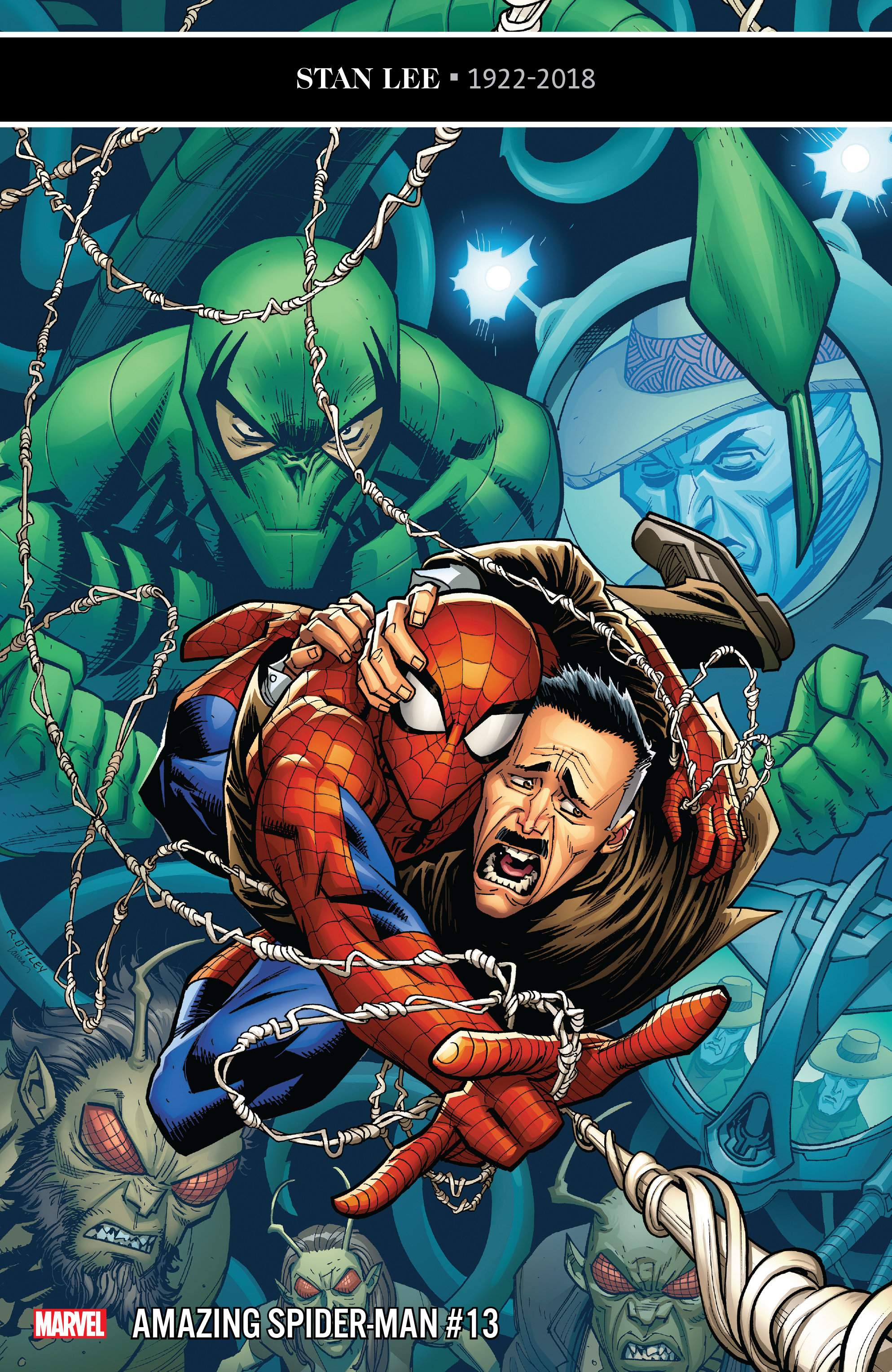
REVIEW: Amazing Spider-Man #13 ends Jameson story arc with growth, emotional honesty

Amazing Spider-Man #13 is out 1/16/2019.

Amazing Spider-Man #13 is out 1/16/2019.

By Zack Quaintance — Amazing Spider-Man #13 continues an interesting trend I’ve noticed throughout this young: it continues to take Spider-Man continuity deep dives and translate them into new stories. This is not all that novel of an approach for stories about decades-old characters. It is perhaps a bit less common at Marvel (where characters are generally a bit younger), but over at the distinguished competition, writers like Geoff Johns and Grant Morrison have told some of our best modern comic stories by plumbing the continuity depths and teasing old ideas, concepts, principals to the surface.

That notion is one that’s been evident multiple times throughout Nick Spencer and Ryan Ottley’s still-nascent Amazing Spider-Man run and is evident yet again this week with Amazing Spider-Man #13. In this issue, the big bad who’s been tormenting both Spider-Man and his foil-turned-friend J. Jonah Jameson since issue #11 is revealed to be Frederick Foswell...Jr., who is the son of Frederick Foswell, Sr., a Daily Bugle reporter who once nearly pulled off a successful investigation of Spider-Man’s true identity before becoming way too close to his sources and ending up as a crime boss.  

Indeed, Foswell made his first appearance all the way back in Amazing Spider-Man #10 (1964), created by Stan Lee and Steve Ditko themselves. Like many characters, Foswell has popped up here and there through the years, most recently in previous writer Dan Slott’s Dead No More: The Clone Conspiracy storyline, having his evil Big Man alias in story as a clone. This issue, however, takes his life and death a bit more seriously than prior appearances, having his son return to get revenge on Spider-Man, motivated as he is by J. Jonah Jameson’s now-gone hatred for the hero.

And you know what? I really liked all of that. It was a nifty way to accomplish the dual feats of A. giving Spider-Man a relevant foe to battle for a few issues, and B. continuing Jameson’s growth arc and transition from Spider-Man hater to someone who’s now seen the error of his ways. Heck, in this issue Jameson publicly admits to having been a bad journalist for all those years. For long-time Spidey fans and readers this is no small thing. It won’t garner the headlines the same way something like giving Aunt May cancer does (see Friendly Neighborhood Spider-Man #1), but from a character growth standpoint it’s really much more impactful and rewarding to careful readers, to all of us who have rolled our eyes at Jameson so thoroughly eviscerating Spider-Man’s public image no matter how heroic he proves himself to be.

I know for me—a nigh life-long Spiderman fan and a professional journalist by trade—I’ve found his constant inflammatory editorializing frustrating as all get out. To see him grow away from that (even at personal cost for himself) was just so much more compelling than killing or maiming the character. And so far, that’s really what’s marked this run: characters moving at deliberate pace towards moments of growth and emotional honesty. Pepper in some of Spencer’s pithy humor and a seemingly-irrepressible desire to use every last Spider-Man villain ever, and this continues to be a fantastic run for Marvel’s flagship character.

Overall: Amazing Spider-Man #13 doubles down on two of the strengths of this run: deep and serious dives into Spider-Man’s long continuity, and finales that deal more with emotional honesty and growth than they do with punching and kicking. This time it’s J. Jonah Jameson’s turn to be a better man, and the result is a thoroughly enjoyable Spider-Man comic. 8.8/10

Amazing Spider-Man #13
Writer:
Nick Spencer
Penciler: Ryan Ottley
Inker: Cliff Rathburn
Colorists: Laura Martin and Andrew Crossley
Letterer: VC’s Joe Caramagna
Publisher: Marvel Comics
Price: $3.99

For more comic book reviews, check out our review archives.

Zack Quaintance is a tech reporter by day and freelance writer by night/weekend. He Tweets compulsively about storytelling and comics as BatmansBookcase.

REVIEW: Electric Warriors #3 features killer pivot for refreshing mini-series

Electric Warriors #3 is out 1/16/2019.

By Zack Quaintance — Electric Warriors #3 is a surprising comic, which is entirely in keeping with how this book has been since its start. I found it to be somewhat of a surprise when it was announced by DC just prior to this year’s San Diego Comic Con. With the publisher in recent years mostly playing it safe with series (aside from the ill-fated New Age of Heroes line, which it pretty clearly got cold feet over before it even launched). Electric Warriors, however, was an original idea set in an under-utilized era of DC continuity—Earth post Jack Kirby’s Great Disaster but pre Legion of Superheroes.

So, yes, I was surprised from the moment this book came into existence. I was not, however, surprised at the excellent story writer Steve Orlando and artist Travel Foreman started telling. There was rich commentary about Earth and its divisive ways, a compelling familial imposter sub-plot, and all kinds of nods to obscure characters, alien races, and concepts from old DC Comics. The plot trajectory seemed pretty straight forward: the two champions of Earth would come apart before coming together and realizing it’s all one planet and as such we should all be one people (thereby making an excellent statement about the current divisive politics sweeping the planet and fueling the rise of authoritarian governments).

In Electric Warriors #3 the trajectory I had envisioned changed. A lot. I won’t go into spoiler territory, but just know that this book is probably not what you first expected it to be. It may still arrive at the lesson I mentioned above (in fact, I for one am betting on it), but it seems to be taking a wholly unexpected (and delightfully more complex) path to get there, one filled with suspense and surprises.

Indeed, at the halfway point for this six-issue mini-series a picture has emerged of a tight and clean narrative with a lot to offer both casual and long-time DC Comics readers. Orlando is really at his best here, equal parts brutal in the action and thoughtful with the characters and twists. Travel Foreman, of course, is an other-worldly imaginative talent clearly reveling in the freedom being afforded to him by playing in an obscure Big 2 timeline and era.

I don’t think I’ve heard nearly enough chatter about this book, but it really is something special...and refreshing, an original concept from a Big 2 publisher, filled with new characters who can change, and learn, and grow, and ultimately die. It’s not too late to jump onto this train. At the very least though, I highly recommend making a mental note right now to catch up on this book in trade. Here’s hoping it factors into (or, even better, helps pave the way) toward whatever Brian Michael Bendis is currently gearing up to do with the Legion of Superheroes.

Overall: The only things more imaginative and brutal than the action on the page here are the twists in the plot. A surprising turn in Electric Warriors #3 has me seeing this already-solid comic in a new and more complex light. If you’re not reading this book, you can’t complain that the Big 2 don’t try enough new ideas. Get on it. 9.2/10

Electric Warriors #3
Writer:
Steve Orlando
Artist: Travel Foreman
Colorist: Hi-Fi
Letterer: Travis Lanham
Publisher: DC Comics
Price: $3.99

For more comic book reviews, check out our review archives.

Zack Quaintance is a tech reporter by day and freelance writer by night/weekend. He Tweets compulsively about storytelling and comics as
BatmansBookcase.

REVIEW: Babyteeth #14 is contemplative AND hilarious

Babyteeth #14 is out 1/16/2019.

By Zack Quaintance — Babyteeth #14 marks the return of one of AfterShock’s best comics. This series wasn’t on a hiatus. No, it’s last issue came out in late October. Factor in the crowded holiday season (those dreaded times when commitments other than comics rear their heads), and the book’s short break felt more like an extended skip month. Either way, the book is back now, and you know what? It’s as sharp as it's ever been.

What’s perhaps most noticeable is the humor in this issue’s script. Basically, after a two-month hiatus, Babyteeth is back, and so is writer Donny Cates, at his most hilarious and absurd. This is the clever, pithy scripting that Cates used to announce his arrival at Marvel so emphatically in late 2017 with his work on Doctor Strange and Thanos Wins. It’s the dialogue that sounds like a mix of films by Richard Linklater and Adam McKay, conversational in a lazy Texas sort of way but never far from a slapstick and hilarious one-liner.

And Cates puts that humor to great effect here as we finally meet the McGuffin of this story, satan, giving him a number of one liners that made me chuckle aloud, which is pretty rare for me to do when I’m reading a comic. He’s not the only one being funny here, though. Artists Garry Brown and Mark Englert get called on to draw a very late painting by Vincent Van Gogh, and they come back with an image that’s just perfect...disturbing in an absurd way, like something from a raunchier version of Beetlejuice.

All the jokes, however, are sort of a trojan horse for something much deeper: a contemplation of mankind’s perceptions of satan and god, which is then extended into a look at the very nature of good and evil, and how from a certain point of view it’s nigh impossible to tell which is which. And look...I know, I know...my hackles are up just writing that, but it’s not some kind of veiled diatribe about the media or fake news or something hackneyed like that.

Cates and the Babyteeth team have a deep biblical interest. They aren’t saying anything here about how the last Tweet you sent could be construed as both supportive and critical of whatever issue of the hour. This is a comic that after 14 issues is finding new thematic ground exploring the validity of some of society’s deep abiding perceptions about morality as shaped by our ideas of the being that created us.

And look, I know what we’re talking about here: a comic called Babyteeth that in the first issue probably (I forget) had a scene where the baby spit up and it caused an earthquake, or locust to fall from the sky or something. This isn’t Chaucer. It’s more fun than all that, and Cates know it. That doesn’t mean he’s not going to try to find some truth during the big goofy party. He is, after all, pretty great at that: see Thanos Wins and the Cosmic Ghost Rider character everyone loves so much, and see God Country, another comic in which his main writerly interests—Texas, theology, and badassery—work well in (very awesome) concert.   

Overall: An alternately hilarious and deep comic, Babyteeth #14 makes the best use of this comic’s concept yet. It’s filled with self-aware horror tropes that dance around real pathos and theology, and everyone involved is clearly having a blast with all of it. 8.5/10

Babyteeth #14
Writer:
Donny Cates
Artist: Garry Brown
Colorist: Mark Englert
Letterer: Taylor Esposito
Publisher: AfterShock Comics
Price: $3.99

For more comic book reviews, check out our review archives.

Zack Quaintance is a tech reporter by day and freelance writer by night/weekend. He Tweets compulsively about storytelling and comics as BatmansBookcase.

REVIEW: Isola #6 is the return of a great series

Isola #6 is out 1/16/2019.

Isola #6 is out 1/16/2019.

By Zack Quaintance —  Isola is one of Image’s most interesting comics, in that it stands out for being both utterly beautiful and massively decompressed (see The Warning). The thing I find most intriguing about Isola, however, is that as the book gorgeously reveals more of what’s happening, why things are happening, who are these characters, and the histories they share with one another, it doesn’t lose much (if any) of its tension.

There’s a concept in fiction I think about often called the rate of revelation, which says that one way to create suspense in a story is to carefully dole out vital information at a certain pace as the plot goes on. This, I believe, is the main strength of Brenden Fletcher and Karl Kerschl’s writing in Isola. They also do a great job of giving the audience what they need to make key orienting assumptions before truths become clear. One early instance of this is how in the first issue the tiger is treated with reverence and called Your majesty. My immediate guess was that a monarch had been converted into a tiger...and I was hell bent on continuing to read until I found out whether I was right.

The other (and more evident/impressive) strength of this comic is what is arguably industry-best semi-regular art. I mean, just look at this screen grab from Isola #5.

The artwork (by Karl Karl Kerschl and Msassyk) in Isola is among the best being done in comics today. Above panel is from Isola #5.

But, friends, we are not here to talk Isola #5! Nor are we here to continue to discussing this comic in a super broad sense. We are, in fact here, to talk Isola #6, which marks a return after a hiatus and the start of the book’s second proper story arc (the Isola Vol. 1 trade is out now, btw, and as I wrote in our Top Comics to Buy for January 16, it’s one of those reasonably priced introductory Image ones, which means with $10 and a little more than an hour you can get all caught up on this fantastic comic…). And it’s quite a solid return, to be sure.

When we last left our two main protagonists—Olwyn, the tiger who wouldbe/is queen; and Captain Rook, charged with escorting her to a possibly magical place called Isola that also might be bad and could maybe not exist—they were encamped under a tarp in the rain after an ordeal that almost claimed the life of the queen. This issue is characteristically decompressed, dedicating its first seven pages (nearly ⅓ of the total) to a slow vision in which Olwyn interacts with her mother. It’s gorgeous, cut with the dreamlike blue hues that marked the last issue’s desperate end, and it also does some work in the plot, leaving me (at least) with a couple of key questions.

The first is maybe more obvious: what role did Olwyn’s family—her parents and erratic brother—play in her current danger and plight, and secondly, what is happening with the animals in this story, are they all as the queen humans banished (or escaped) into other forms? It’s a great question to raise, one that really has me engrossed in what’s happening in these pages. The other significant developments here are that we see yet again that the queen’s forces pose a threat to her and are also erroneously marching toward war in her name, and, perhaps more importantly, a small friend of Rook’s learns what’s going on. The plot, however, is less important than pointing out that Isola maintains the beautiful aesthetic and patient storytelling with ample revelats that have made its first volume such a joy. I’m pretty glad this comic is back.

Overall: Isola #6 is yet another gorgeous burst of sequential art from this creative team, more of the developing fantasy tale with its themes of loyalty, desperation, trust. This is the first issue back after hiatus, starting a new arc. I’m loving this title, and I encourage any with even mild interest to pick up this issue along with the $9.99 first volume Image trade. 8.5/10
Isola #6
Writers:
Brenden Fletcher / Karl Kerschl
Artists: Karl Kerschl / Msassyk
Letterer: Aditya Bidikar
Publisher: Image Comics
Price: $3.99

For more comic book reviews, check out our review archives.

Zack Quaintance is a tech reporter by day and freelance writer by night/weekend. He Tweets compulsively about storytelling and comics as BatmansBookcase.