REVIEW: Friendly Neighborhood Spider-Man #1 is a quieter Spidey book with big implications for SPOILER

Friendly Neighborhood Spider-Man #1 is out 1/9/2019.

By Zack Quaintance — I am generally opposed to comics like Friendly Neighborhood Spider-Man, a fourth Spidey title that takes its place in line behind the flagship Amazing Spider-Man, the rising and youthful Miles Morales: Spider-Man, the intriguing prestige Spider-Man: A Life Story (a six-issue mini about what it would have been like had Spider-Man aged from his creation in real-time), and the perpetual runner-up book, Spectacular Spider-Man. I know there are super fans out there who just can’t get enough of the character, but I find it all just a little much.

In fact, in all likelihood I’d have probably have skipped this book if it wasn’t written by Tom Taylor, who has a shining history of taking a little much ideas like this one and turning them into absolute gold (see Injustice, see X-Men: Red). The concept here is based around a hyper-local take on Peter Parker and his heroics, and the plot of this debut issue sees him literally tending to the troubles of his actual physical neighbors.

The main story in this comic (illustrated with clean adequacy by Juan Cabal) is totally fine. It’s not flashy and it’s mildly intriguing, featuring a nifty little mystery. There are some good jokes, and the book seems to go out of its way to let readers know its complimentary to Amazing Spider-Man, incorporating all the recent minor status quo shifts we’ve seen in that title. The latter is a really nice touch that a long-time superhero reader like myself appreciates. Nothing takes me out of a story more than when an auxiliary title for a Spider, Bat, X, or Superman title just outright ignores the status quo elsewhere in the line. It’s to Friendly Neighborhood Spider-Man’s credit that it doesn’t do this.

WARNING: POTENTIAL SPOILERS BELOW

There are also some nice character moments here, showcasing Peter Parker as a micro-scale humanitarian, but they are nothing we haven’t seen before and seen often. What is likely to really get fans talking is the backup story, which is focused on and narrated by Peter’s Aunt May, iconic Aunt May. I don’t typically make a practice of revealing plot points in these reviews, but it’s hard to discuss this comic without doing so here. The backup story exists pretty much entirely to reveal that Aunt May is suffering from cancer.

This narrative weight is a good case for the book to make for its very existence, if a little unconvincing. I could be wrong, but it seems doubtful to me that a character as iconic as Aunt May would face any real danger in the pages of the third (or arguably fourth or fifth) most prominent Spider-Man title. In fact, in this day and age, I’d only really be convinced if one of these books was headed for a line-wide event or a milestone issue. Still, Tom Taylor is a powerful writer with a big heart, and, while I doubt Aunt May is in any real danger, I trust him to tell stories with this point that intrigue and satisfy on an emotional level.

Overall: In a quiet and polished debut, Friendly Neighborhood Spider-Man #1 does just enough to justify an addition to the Spidey line. A major development for a long-time character also happens in the backup story. It remains to be seen if this title will feel worthwhile moving forward, but Tom Taylor has done great things with lesser concepts, so for now I’m sticking with it. 7.0/10

Friendly Neighborhood Spider-Man #1
Writer:
Tom Taylor
Artist: Juan Cabal
Colorist: Nolan Woodward
Letterer: VC’s Travis Lanham
Publisher: Marvel Comics
Price: $4.99
*Full credits aren’t clear for the backup, but the editor notes the team included Marcelo Ferreira, Robert Poggi, and Jim Campbell.

For more comic book reviews, check out our review archives.

Zack Quaintance is a tech reporter by day and freelance writer by night/weekend. He Tweets compulsively about storytelling and comics as BatmansBookcase.

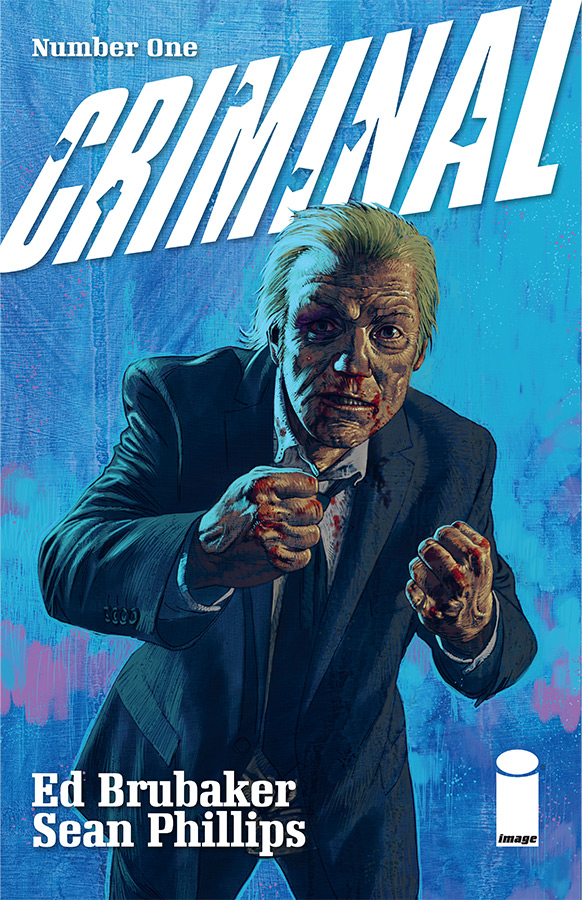
REVIEW: Criminal #1 is a gorgeous, modern classic crime comic

Criminal #1 is out 1/8/2019.

Criminal #1 is out 1/8/2019.

By Bo Stewart — Ed Brubaker and Sean Phillips tell the best crime stories in comics. Period, and it’s not even close. This creative team has forged a partnership over many years and dozens of volumes of comics (their recently concluded series Kill or be Killed made our top comics of 2018). They understand each other perfectly, and it’s a joy to see how this deep creative understanding ultimately deepens the words they create. It’s on full display here for their latest book, Criminal #1. Simply put, missing this comic would be criminal (please forgive me).

There’s something distinctly satisfying about Brubaker/Phillips comics, in that they somehow manage to provide the exact right amount of content. I never feel short changed, but the comic also never overstays its welcome or ends up feeling bloated. In the single-issue format, that kind of satisfying consistency is quite the accomplishment. These guys are so good that, in my opinion, comic readers take them for granted. This issue serves as a reminder that this creative duo tells the stories with the best pacing in comics.

Criminal is long-form storytelling at its finest. Instead of focusing on a single character or narrative, the creators lean into the world they have created for inspiration. Previous volumes of this book have each focused on a single character or event set within the Criminal sandbox, a sprawling epic that covers decades of crime and generations of criminals affected by it. The world of Criminal is well established, fully deserving of the old the world is a character axiom. It’s a sandbox that the creators clearly enjoy playing in, and, if this issue is any indication, the world of Criminal won’t run out of worthwhile stories any time soon.

Full disclosure, I have not read the entirety of the original Criminal run. The four (of seven) volumes I have read were all amazing, though. I was a little hesitant about starting this new run without having first finished the others, but, rest assured, newcomers to the series will have no trouble keeping up. Each volume has been its own standalone story and it appears as though the new run will follow suit. These stories inform one another, but they are in no way dependent on one another.

This latest Criminal #1 focuses on Teeg Lawless. Previous fans will immediately gravitate towards the protagonist because Teeg is a figure that has loomed large over the series (his sons Tracy and Ricky Lawless are main characters of previous volumes). This is a story interested in the cyclical nature of crime and how strong it’s grasp can be. Crime doesn’t just affect the individual criminal, it infects entire families. The gangster’s son becoming a gangster is a tale as old as time, but one that will always be ripe for exploration.

Phillips continues to improve (if such a thing is even possible), and his line work has never been more detailed. Teaming up with colorist Jacob Phillips (who is his son) brings a different dimension to the art. Heavy use of blacks and neons (you know, noir stuff) really lends itself to the storytelling. It reminds me of Mat Hollingsworth’s colors on Wytches but without the paint splotches. I have no reservations just coming out and saying it: this is Phillips’ prettiest book yet.

Overall: Ed Brubaker and Sean Phillips’ Criminal #1 is a perfect continuation of a crime series that ranks as a modern classic. If you enjoy crime fiction, in any format, this one is an absolute must read. 9.5/10

Criminal #1
Writer:
Ed Brubaker
Penciler: Sean Phillips
Colorist: Jacob Phillips
Publisher: Image Comics
Price: $3.99

For more comic book reviews, check out our review archives.

Bo grinds for the Man by day so he can create comics by night. He is the lesser half of the Stewart Brothers writing team and can be found on Twitter and Instagram @stewart_bros

REVIEW: Gunning for Hits #1 is a fascinating, if esoteric, look at the music BUSINESS

Gunning for Hits #1 is out 1/9.

By Zack Quaintance — The debut issue of Gunning for Hits has some heavy narrative lifting to do. This is, of course, by its own design. Gunning for Hits #1 is a normal-sized comic that essentially sets out to orient readers within two worlds: the always-tricky one of a new story (with its own setting, tone, characters, rules of reality, etc.), as well as the dense fiduciary side of the music business during the transitional (cassettes/vinyl to CDs) 1980s. Given the nature of this book—it’s a crime comic about the music business, after all—there is, of course, overlap. Still, the dual exposition makes for a relatively dense first issue.

Simply put, it’s a lot to read. It’s also fortunately a really interesting read, especially for anyone like myself who has dabbled in unhealthy or obsessive music fandom, to the point that just enjoying songs wasn’t enough and there grew a compulsion to learn about individual labels, promoters, etc. What Gunning for Hits seems bent on doing is pulling back that curtain in as entertaining a fashion as possible, and there are indications in this debut that the creative pair of new writer Jeff Rougvie and artist Mortit just might have the plan and artistic chemistry needed to pull it off.

Rougvie, for one, has the music business cred for this to be taken seriously by anyone with a passing interest in how their favorite hits were made for many years. You can find more on Jeff Rougvie’s website, as well as in the back matter of this first issue, but long story short: he’s been in the industry for decades, making things happen behind the scenes and most-famously working with David Bowie. To a certain type of person with an interest in both comics and music, it’s an incredibly lucky thing that someone with Rougvie’s resume is so motivated to tell a story with this medium that shares his vast insights and knowledge. Another fortunate thing is that he’s found an artist like Moritat who so clearly gets what Rougvie is trying to do here and is game to provide visuals. There’s a lot of text, and Moritat’s work deftly weaves around it, adding a grimy aesthetic to the proceedings and shining when it’s called upon to do so. It’s a great visual foundation for the esoteric knowledge Rougvie is dropping.

Readers shouldn’t, however, expect a light or overly-accessible read, especially not for those who have only a casual interest in music. This is specific stuff for people with some background related to at least part of its subject matter, be it music, or business, or both. I was fortunate to have an opportunity to interview Rougive about this book for ComicsBeat, and he cited Think Tank’s level of specificity as comparable to that found in Gunning for Hits, and there’s a lot of truth to that. Whereas Think Tank (a great and underrated comic, btw) relied heavily on military research and future-facing science, Gunning for Hits builds its own narrative atop bygone financial practices of a now-smaller business. It’s interesting stuff, to be sure, but it may have to work a little harder to win over any readers who aren’t initially intrigued by its premise.

Ultimately, whether or not Rougvie and Moritat are able to translate Rougvie’s music business insider status into a successful story that finds an audience will hinge on whether they can make a broader connection to the implications of capitalism on society at large, drawing a metaphor between the time and events in their story and our lives today. They’ve picked the right setting to do it—the greed is good 1980s—and the right aesthetic—crime. With my own propensity for getting lost in details and my love of music, I’m definitely compelled to keep reading.

Overall: Writer Jeff Rougvie and artist Moritat spend the majority of Gunning for Hits #1 orienting readers within the depths of the music business. They also lay some groundwork for the crime aspects of their story, which have the potential to be equally as engaging. It remains to be seen whether this act will harmonize in a way that results in chants for an encore, but there are some unique ingredients here that could make for a great comics story. 8.0/10

Gunning for Hits #1
Writer:
Jeff Rougvie
Artist: Moritat
Letterer: Casey Silver
Publisher: Image Comics
Price: $3.99

For more comic book reviews, check out our review archives.

Zack Quaintance is a tech reporter by day and freelance writer by night/weekend. He Tweets compulsively about storytelling and comics as BatmansBookcase.

REVIEW: Die #2 subverts D&D nostalgia trend by charging headlong into darkness

Die #2 is out 1/9.

By Zack Quaintance — In the first issue of Die, a group of six young friends disappears into a fantasy world, returning after time has lapsed, beaten up with one of them missing and another missing an arm. In a pop culture moment laced with relatively bright (Stranger Things may as well be Disney compared to Die) nostalgia-laden D&D remembrances, the first issue of Die set itself apart, staking its claim as a darker, more serious alternative.

And now Die #2 is somehow even darker.

I suppose it’s a little bit on me and my expectations. This additional darkness is not a bad thing, quite the contrary (we’ll get to that), but I certainly expected this book to set up maybe some darkness when the characters were middle-aged and dealing with trauma in the real world, before plunging them back into youthful, likely cathartic fantasy adventure. That may still come, but based on Die #2, things have to get worse before they can start to get better.

Fair warning...this next part may contain spoilers. There’s a scene in this comic wherein the character who’s been lost in the fantasy world all these years (and as a result is presumably a bit stunted) models a villian off a shared middle school or high school crush...and another character gleefully destroys here. It’s a very real scene, real and adult and sensical. But holy hell is it dark. The creators know this, though, and it’s certainly not played for sensationalism (often an issue in lesser comics). I think one of the other characters even remarks at how twisted the whole episode felt.

So yes, that’s the one we’re dealing with here. With that established, the larger question becomes does it function well in the service of the story. I was going to write entertaining story there but at this point that doesn’t quite feel apt, at least not yet. There will likely be a victorious counterbalance to the challenges at some point (that’s how stories work), but it’s early in the proceedings here and we’re not ready yet. I think it functions quite well. As I wrote in my Die #1 review this is a patient and assured book. Gillen believes in his story, and Hans...well, Hans is a towering talent of an artist and everything she does on the page here is nothing short of a joy. It’s a great combo for a story that I expect to keep ramping up like the most memorable role playing campaigns.

And really that is this comic’s aesthetic: it’s the most memorable role playing game you’ve ever played (complete with Gillen penning engaging back matter about dice and characters and classes...like the sterling GM he is) mashed up with what I think is a creator’s interest in examining the lives of his characters over time, the ways that they’ve aged and why, and, perhaps, whether they can recapture how it felt to be young, or, on a darker note, whether they can avoid habitual pitfalls that sowed some of their lives’ disappointments.

Overall: Die #2 continues to embrace realism and darkness within the context of a mystical and immersive life-altering role playing game. Just as the debut before it, this sophomore issue is a thrilling slowburn that sets itself aside from the current wave of D&D pop culture nostalgia by doubling as an uncut look at the disappointments of middle age. 8.5/10

Die #2
Writer:
Kieron Gillen
Artist: Stephanie Hans
Letterer: Clayton Cowles
Publisher: Image Comics
Price: $3.99

For more comic book reviews, check out our review archives.

Zack Quaintance is a tech reporter by day and freelance writer by night/weekend. He Tweets compulsively about storytelling and comics asBatmansBookcase.

REVIEW: Hardcore #1 is a crazy good idea with solid pacing

Hardcore #1 is out 12/19.

By Zack Quaintance — Robert Kirkman—creator of The Walking Dead, Invincible, etc.—is one of the best idea writers in comics, with any new series attached to his name pretty much guaranteeing a certain accessible sort of enthralling-yet-simple conceit. It’s a level of vision that has made him basically as successful as one can get within the industry. In fact, it’s been said that he first pitched The Walking Dead as having a twist part-way through that would see aliens arrive and have been responsible for the zombies, because no one but him could see a world in which just doing a simple zombie comic would work.

This is all a long way of noting that the idea behind Hardcore #1 was first created by Kirkman and seminal artist Marc Silvestri, back in 2010 for the Top Cow pilot season concept, which saw that publisher running a series of original concepts, essentially first issue pitches. Well now Kirkman’s own Image Comics imprint is reviving some of those (see Stellar early in the year), and Hardcore is among them.

Taken over here by the more-than-capable team of Andy Diggle (Thief of Thieves) and Alessandro Vitti (Iceman), Hardcore is the story of a government program involving a new technology that allows operatives to pilot the bodies of other humans, often using them as drone-like assassins to takeout threats to national security, or dictators, or whomever. The use of drone in that description is intentional, given that this comic goes to pretty blatant lengths to draw a connection between the tech central to its plot and drone piloting, essentially painting this as the next evolution of those military initiatives.   

It’s a solid enough idea, but one that could have played as simplistic if not executed properly. Diggle and Vitti, however, are a more than capable team to pass it off to, delivering a tightly-plotted and impeccably-paced story here that gleefully bounces from one suspenseful plot point to the next. This is a fantastic first issue, in that the creators here manage to fill us in on all the needed exposition in a way that feels like it has stakes, rather than being a transparent and slow info dump (a pet peeve of mine in debuts).

What also does wonders for this book is that rather than sticking to the straight governmental military angle, the story here introduces an element of proprietary conflict. Not to spoil too much, but the primary villain of this story is the man who invented the technology that allows users to occupy from a remote location the bodies of others. He resents that another pilot—our main character—has been tapped to use the innovation he developed, and...well, you’ll have to read the book, but what he does from there creates waves likely to power this story quite well moving forward. Vitti is a great choice to render this whole thing, deploying a style here that’s reminiscent of both the tech and military worlds at once, as well as intricately detailed in an almost photo-realistic way throughout much of the exciting proceedings.   

Overall: A fantastic execution of an unsurprisingly solid idea for a new comic, Hardcore is one of those first issues that expertly drops off all the needed exposition as it hops along its perfect pacing. The overall quality of this comic, however, will be determined by where it goes now that its foundation has been laid. 8.0/10

Hardcore #1
Story By:
Robert Kirkman and Andy Diggle
Writer: Andy Diggle
Artist: Alessandro Vitti
Colorist: Adriano Lucas
Letterer: Thomas Mauer
Publisher: Image Comics
Price: $3.99

For more comic book reviews, check out our review archives.

Zack Quaintance is a tech reporter by day and freelance writer by night/weekend. He Tweets compulsively about storytelling and comics as BatmansBookcase.

REVIEW: Freedom Fighters #1 prods us to appreciate history

Freedom Fighters #1 is out 12/19.

By Bo Stewart —  If you caught my review of Sara #1, you know how much I enjoy World War II stories. Something about that event—and the break in the human spirit it represents—lends itself to great stories. In many ways, I don’t think the world has recovered from WWII, and part of me believes we never will. Though many of us wish to move on, I find this lack of closure to be a good thing. Humanity needs constant reminders of the past or we will be doomed to let our mistakes repeat. Freedom Fighters is one such reminder. Like the TV show Man in the High Castle, Freedom Fighters reminds us of how pivotal World War II was to human history by reversing the script and creating a reality where the Nazis won, known in the DC Universe as Earth-X.

This debut issue does a lot of narrative heavy lifting. It gives us all the necessary background information on the original Freedom Fighters (established in the ‘60s), hints at an ongoing mystery surrounding the personified Uncle Sam, and sets the stakes for the central conflict with the modern-day version of the Freedom Fighters. Though this is a packed issue, it never feels overstuffed.

Our story opens on November 22, 1963 in Nazi occupied Dallas. Just as this is a significant day and place in real American history (the day and city of JFK’s assassination), it proves to be significant to the alternate history writer Robert Venditti is crafting. I’m not going to spoil what happens, but the event centers around Olympian and real-life American Hero, Jesse Owens, who also happens to be the leader of the original Freedom Fighters. Venditti is using these dates and historical figures deliberately. They are reminders of history that many have already forgotten. It’s a really nice and subtle way of layering (what I assume to be) the ongoing themes of the book into the narrative.

I suspect we will be following the modern-day team for the majority of the book, but I found myself more interested in the ‘60s sequence due to its bleaker tone. The art is impressive throughout, but I also can’t help but feel like it’s missing a ton of world-building opportunities. This is Nazi-occupied America – scenes where the sun is shining and kids are playing ball in a park just feel…off. The architecture, the vehicles, the fashion all feel too similar to our real world. Don’t get me wrong, the book is gorgeous, but it could have taken better advantage of its premise.

Alternate history is always a draw for me. Throw superheroes into the mix and you have the makings of a memorable book. Freedom Fighters has somewhat of a Watchmen feel in that a multigenerational superhero team is finding its place in a world where history took a drastically different turn. It doesn’t reach the thematic heights of that seminal graphic novel, but it also isn’t really trying to. I suspect the creators would be perfectly content if this book simply made us as readers reflect on our history and be grateful that we avoided the nightmare of this fictional world.

Overall: Freedom Fighters #1 is an ambitious book that cleverly uses alternate history as a prod to remember and learn from real history. 8.0/10

Freedom Fighters #1
Writer:
Robert Venditti
Penciler: Eddy Barrows
Inker: Eber Ferreira
Colorist: Adriano Lucas
Letterer: Deron Bennett
Publisher: DC Comics
Price: $3.99

Bo grinds for the Man by day so he can create comics by night. He is the lesser half of the Stewart Brothers writing team and can be found on Twitter and Instagram @stewart_bros

REVIEW: Long Lost Part 2 #5 is a colorful and explosive penultimate chapter

Long Lost Part 2 #5 is out 12/19.

By Zack Quaintance — Long Lost is a story about leaving your hometown—be it in rural America, the south, or the mountains—yet feeling a mysterious pull to return, that call to home that we all hear from our past. But when you get there, the place is nigh-recognizable. People have suffered. Relatives you thought you knew are so different as to be irreconcilable with who they once were in the past. They’re all acting out in strange ways, motivated by the hopes of enticing a magic cure for suffering, unemployment, sickness...even if their methods are making them all uglier.

This is a powerful metaphor (if I’m right about it) for our times, to be sure. And I think I’m at least partially onto something here. There’s a pretty telling bit of dialogue in this fifth issue of the story’s second half, with Piper—the more proactive and repressed of the two sisters at the story’s core—telling her sister how badly she just wants this town to be out of her life and gone. For many of our generation who’ve uprooted and found new homes in more urbane cities and enclaves, it’s a poignant and relatable feeling she’s expressing, one that in the past two years has maybe even come to have a damaging effect on our country. We’ve ignored difficult conversations and watched as family descend to a dark place where, ultimately, they vote against their own interests and become...ugly and unrecognizable...at least to us.  

I’m tempted to call this a good-looking and poetic metaphor for what it’s like to argue politics with friends, family and former classmates from a small hometown, but there’s another layer to Long Lost that I’m struggling to wrap my head around without yet having read the final issue. There are more intimate themes at work here related to the way our relationships as children shape us as adults. There’s also some moralizing, perhaps, about the value in forgiveness, in taking our family members for the good they provide while reconciling ourselves with their failings in order to move forward, especially if those failings are related to a mental illness (another presence that has loomed large throughout this story).

My own inability to completely process what’s happening in this comic aside, this is still one singular and gorgeous book that’s difficult to put down. In fact, it’s late on a Sunday evening as I write this and I’m going to push through and finish. I mean, there’s only one more chapter remaining. That’s a supremely high compliment for a penultimate issue if I’ve ever written one.

The only other thing I’d like to note before I move onto reading said issue is that Lisa Sterle’s artwork is fantastical and creepy all throughout this book. It’s a credit to her work that this deep into the story she’s still finding ways to make the tone all the more threatening and engaging without sacrificing even a little bit of clarity. Sterle’s work has been rather understated throughout the slow and mysterious burn of this comic, but—without tipping into spoiler territory—she is less restrained toward the end of this chapter. Her work becomes kinetic and rich with ominous tones, almost psychedelic as it reaches grand flourishes that really earn this story the thunderous climax on which this issue is ended.  

Overall: Long Lost Part 2 #5 perhaps marks the end of what has been one of the most poetic slow burn stories in all of comics, as this issue ends with a burst of colorful psychedelics. If you’ve been following this story, this is likely to be your favorite issue to date. 9.2/10

Long Lost Part 2 #4
Writer:
Matthew Erman
Artist: Lisa Sterle
Publisher: Scout Comics
Price: $3.99

For more comic book reviews, check out our review archives.

Zack Quaintance is a tech reporter by day and freelance writer by night/weekend. He Tweets compulsively about storytelling and comics as BatmansBookcase.

REVIEW: Friendo #3 takes aim at big box retailers with a heavy dose of grindhouse horror

Friendo #3 is out 12/19.

By Zack Quaintance — “You know decline is...it’s not linear.” This is the first line of Friendo #3—a comic about a near future in which late-model capitalism has been extrapolated to some terrifyingly-familiar places—and it may as well be a mission statement for this book’s ambitions. At least, that’s my take after three issues, and I appreciate this kind of tipping of the thematic hand. It enables the creators to focus on the story, almost like they’re saying, okay, you know what we’re up to now...but you have no idea how gruesome this world can get.

This world and by extension our own, really, seeing as Friendo takes place in a future so near it makes one wonder if some of the story’s technologies are currently in research and development, with ethical conversations (or, more likely, public relations conversations) taking place about whether this tech should be put into beta. So, that’s my 20,000-foot Friendo perspective.

This issue also gives readers a closer view of the story’s themes. In the first two issues, we largely saw our main character explored as a consumer, as a pawn in marketing schemes at first, later tapped and exploited for his (somewhat meager) buying power. This issue shifts the angle from which it explores over-blown capitalism by putting scrutiny on big box retailers and how they treat workers. In this comic, a Wal-Mart stand-in (named Cornutopia, which, awesome) gets the brunt of it, being directly implicated for the current state of the nation because 20 years ago it extinguished small business owners and is now embracing automation to boost profits even further.

Automation means layoffs. Layoffs mean rage. Everything spirals. The center cannot hold.

The dots are connected: the nation is in a place where individuals are being melted down (literally in one scene) until all that’s left is indebted buying power. It’s an obvious state of decline, the causes for which date back years, and how did it come about? Private companies went wild and unrestrained. Given a few trusting inches, they gobbled up miles, until one day we were all living in a disaster. How sure am of this message? Well, there’s even a scene in Friendo #3 that depicts the owners of Cornutopia literally murdering a representative of the IRS.

On the nose? Oh, like crazy. But this is an audacious comic. That brings me to the other layer of this book, the one that’s less symbolic and more of an entertaining romp laden with grindhouse visuals. The base pitch for this book is maybe that a man’s personal marketing bot comes to life and hi-jinx ensue. Well, not to spoil anything here but after some early events, that marketing bot is somewhat much worse for the wear, rendered in glory gory (so sorry for that word play) here by Martin Simmonds.

As I noted in my Friendo #1 review, the first few issues of this comic built a complex narrative foundation, one from which the creative team could have told a number of fascinating stories. After Friendo #2, I was fully on board with its exploration of the extremes of greed and indifference. Where is my head at following Friendo #3? Now, I’m starting to want the answers—what in the world is going to happen next?    

Overall: Oh, the horror. Friendo continues to look at what happens when corporate control and capitalism runs rampant over society and individuals, doing so in this issue by taking a searing look at big box retailers like Wal-Mart. Meanwhile, an entertaining grindhouse plotline is unfolding, like a guide leading us through a field of complex ideas. 9.0/10

Friendo #3
Writer:
Alex Paknadel
Artist: Martin Simmonds
Colorist: Dee Cunniffe
Letterer: Taylor Esposito

For more comic book reviews, check out our review archives.

Zack Quaintance is a tech reporter by day and freelance writer by night/weekend. He Tweets compulsively about storytelling and comics as BatmansBookcase.

REVIEW: Amazing Spider-Man #11 alternates between media commentary and laughs

Amazing Spider-Man #11 is out 12/12.

Amazing Spider-Man #11 is out 12/12.

By Zack Quaintance — Amazing Spider-Man #11 marks the return of this series’ primary art team (or at least the one that gets top billing): penciler Ryan Ottley, inker Cliff Rathburn, and colorist Laura Martin. As such, it’s a bit of a shift. Nothing is lost in transition, but it does require a few moments of quick re-orienting at its start. Perhaps more consequentially, Amazing Spider-Man #11 is also a slight emotional reset for this ongoing story, which makes sense given that it’s a new story arc (although, arcs have so far been a little amorphous in this young run).

As I wrote in my review of Amazing Spider-Man #10, that issue featured a satisfying emotional crescendo for a team-up between Spider-Man and Black Cat, who have romantic history together but have both very much moved on. It used the concept of mine erasure (a very comics-y concept) to get at universal truths about respecting the emotional impact one’s behavior has on an ex, even if nobody’s carrying a burning torch. It was well-done and went straight for the heart strings with its ending. This issue doesn’t involve Black Cat, which is expected because of how the last one wrapped so nicely, but it also doesn’t involve Mary-Jane Watson either. It doesn’t involve Peter’s love life at all. Thus the shift.

In Amazing Spider-Man #11 we get a Christmas story starring members of Peter’s supporting cast not seen since the first arc with Ottley/Rathburn/Martin, almost as if Spencer had his collaborators pick teams from among the massive Spidey friends and family bunch (there are plenty to go around). What we get here is a story that involves the folks Peter knows from the Daily Bugle, mainly J. Jonah Jameson and Robbie Robertson, both of whom are used well as polemics for philosophies within the modern media industry, plus also for laughs.

Jameson (who scores laughs in almost every panel he’s in) is a cartoon representation of the media at its worst (as he has been for years), wildly oscillating between impassioned stances against/for whatever passes in front of his face. He’s hungry for credit and quick to get egotistical by insinuating his name alone causes seismic shakes in organizational profitability. Robertson, meanwhile, is a thoughtful journalist who Jameson’s behavior has forced into an impossible situation. He can’t pander in the slightest or he’ll be lumped in with Jameson’s ilk, yet a certain segment of his audience is prone to/expectant of blatant pandering. It’s pretty smart media commentary wrapped in an entertaining blanket of Spencer-penned curmudgeonly one-liners. I’m a reporter by trade, and I found it alternately cathartic and funny.

So yes, I liked this individual issue quite a bit. There’s also the question of where does this little story fit into the larger tapestry of what Spencer et. al are trying to do here? It definitely advances Spencer’s commitment to touching more corners of Spider-Man’s deep mythos than have been used in the recent past, incorporating rarely-seen villains like Arcade and the old-timey Enforcers. In an age where the go-to superhero foe has become other superheroes, this book is a well-done refutation to the standard, and I for one am loving it. Spencer is also adept at handling the double-shipping schedule, layering plot developments in a way that blurs the arcs into one long ongoing story. If he can keep it up, a year or two from now we might be talking about this era of Amazing Spider-Man as something truly special.

Overall: Heavy on media commentary, old supporting cast members, and solid laughs, Amazing Spider-Man #11 shifts the tone from recent issues and continues to seed plot points for the team to develop moving forward. Despite the always-tricky double-shipping schedule, this comic is rock solid. 8.5/10

Amazing Spider-Man #11
Writer:
Nick Spencer
Artist: Ryan Ottley
Inker: Cliff Rathburn
Colorist: Laura Martin
Letterer: VC’s Joe Caramagna
Publisher: Marvel Comics
Price: $3.99

For more comic book reviews, check out our review archives.

Zack Quaintance is a tech reporter by day and freelance writer by night/weekend. He Tweets compulsively about storytelling and comics as BatmansBookcase.

REVIEW: Fearscape #3 continues its dark examination of a failed writer’s mindstate

Fearscape #3 is out 12/12.

By Zack Quaintance — In Fearscape #3, writer Ryan O’Sullivan and artist Andrea Mutti’s meta exploration of the darkness inherent to an unsuccessful creative life gets...even darker. Now deep into its story, Fearscape continues to be a comic entirely unafraid of darkness, intent to use its clever pseudo-New Yorker literary fictive voice to unpack the worst sort of artistic impulses. This combination of fearlessness and form is making for a compelling (and intensely singular) comic, one bent on examining why such feelings (as well as the actions they give rise to) occur, what they mean, and the damaging potential they can have on one’s life and morality.

This third issue opens with some of the delusion that has been present throughout. It starts with what seems like a writer’s fantasy—finding a novel finished, exactly as you would have written it, without you having to do any of the actual work. But not so fast. It’s obviously not that easy (nothing is in Fearscape). The found book is not the work of our hero, Henry Henry, but of the bed-bound mentor whose home he essentially burglarized in the first issue before being swept into the mythical realm of the Fearscape. Henry Henry is not finding a book he wrote without remembering; Henry Henry is stealing whole a finished novel from a sick mentor. For shame!

Much of the rest of the issue is spent elucidating the mindstate of a plagiarist. What’s most impressive to me about Fearscape #3, though, is how it shows rather than tells (that old creative writing canard) a set of feelings that are incredibly personal. O’Sullivan continues to play with form for a third straight issue as he does this, putting rectangular narration boxes over the traditionally round word balloons during a mental episode, which creates a writer’s fantasy of what the hero wants to hear versus what’s really being said. It’s used with great effect to convey how someone as delusionally ego-driven as Henry Henry can justify plagiarism, altering the reality around himself to be comfortable with artistic theft in a way that feels heroic, at least to him, anyway.

Other familiar writerly feelings found in this issue include: the ennui (a very Henry Henry word, btw) of publishing fiction and finding out it’s not the cure to whatever ails you, finding that no one else understands your special interiority, and wanting in alternate turns to embrace and disavow the muse that motivates you to write (to say any more about this last one would give away the climax of this issue).

Fearscape had one of my favorite debut issues this year (if not my very favorite), and little has been lost as this story has proceeded. I am admittedly very much the target audience for this—a comic book reader/author of short fiction who has published here and there but not put out a full collection—yet I’m sure this story has quite a bit to offer anyone who has ever contemplated any sort of career in the arts, especially when its full scope becomes visible at its conclusion. I am, however, now ready for ol’ Henry Henry to either start some kind of growth, or to hit rock bottom. I’m just not sure how much more of his continued descent into delusional awfulness I can take (which is something I’ve said more than a few times about our current president—rim shot—thank you, thank you).  

Overall: A literary comic about what it feels like to be a struggling artist, Fearscape continues its descent into delusional frustration, doing so with a clever narrative voice and some visual tricks that convey a mindstate in ways only comics can. This is a must-read book for anyone who has contemplated the art life. 8.8/10

Fearscape #3
Writer:
Ryan O’Sullivan
Artist: Andrea Mutti
Colorist: Vladimir Popov
Lettering: Andworld Design
Publisher: Vault Comics
Price: $3.99

For more comic book reviews, check out our review archives.

Zack Quaintance is a tech reporter by day and freelance writer by night/weekend. He Tweets compulsively about storytelling and comics as BatmansBookcase.

REVIEW: The Magic Order #5 establishes this comic as a MUST for fans of Harry Potter

The Magic Order #5 is out 12/12.

By Bo Stewart — WHOA! The Magic Order #5 gives us this book’s biggest twist yet, and I am still reeling from the implications. I’m not going to get into spoilers here—sorry for the tease—but I will, however, talk about what this series is in broader terms, stressing as hard as I can that if you like Harry Potter, you MUST be reading The Magic Order. Harry Potter for adults is the basic premise of this comic, and it’s a concept that has been attempted before, but no one has been able to deliver on that premise with near the amount of success as The Magic Order.

The Magic Order is the first original Millarworld comic to come out after writer Mark Millar agreed to a landmark deal with Netflix, and like the other new Millarworld projects that have been announced, it impresses with its sheer ambition. Millar has never been one to shy away from a challenge, but with The Magic Order, he’s attempting a story as big (if not bigger) than he’s told before, in the process scratching an itch I didn’t know I had. I’m pretty confident in saying that now that there’s only one issue left for the current run of the series. Millar books always move at a brisk pace, but these past two issues have kicked the narrative into overdrive.

The disgruntled villain, Madam Albany, is pursuing the forbidden spells concealed in the ancient text of the Orichalcum, and a group called the Magic Order is the only thing standing in her way. While similar villains are portrayed as straight evil, Albany is laced with nuance. She is perfectly fine with the Order continuing to exist, in fact she wants it to, she just wants to be in charge. To achieve this goal, Albany has unleashed her top assassin, the sinister Venetian (one of the coolest character designs in recent memory, btw), to eliminate those who stand in her way. To counter Albany’s growing threat, Gabriel Moonstone has been unwillingly forced back into the world of magic after settling down into a quiet and domestic existence. Gabe is a gifted wizard and some of the coolest visual displays of magic in this story come from his wand. Magically imprisoning foes in works of literature has really cool possibilities and is one of the best examples of the power that magic has in this world. I hope they revisit this later in the series.

Anyway, I’m a Harry Potter fan, and a lot of what drew me to that story was the depth of world building and the mythos. That’s also a lot of what I like about this book. In addition to this being a drop-dead gorgeous comic (thank you Olivier Coipel), the creators here have established a similar scope and grandeur to this story’s conflict. The world of The Magic Order feels fully realized, and instead of burying the reader with exposition, the creators expect the reader to keep up and fill in blanks for themselves as the plot progresses. I love it when a creator trusts the reader; it makes it so much easier to get lost in a strong story like this one.

Overall: The Magic Order #5 has a shocking ending that drastically changes the course of this story. I won’t give it away, but, simply put, if you enjoyed Harry Potter, you MUST be reading The Magic Order as it heads toward its finale. 9.0/10

The Magic Order #5
Writer:
Mark Millar
Artist: Olivier Coipel
Colorist: Dave Stewart
Letterer: Peter Doherty
Publisher: Image Comics
Price: $3.99

For more comic book reviews, check out our review archives.

Bo grinds for the Man by day so he can create comics by night. He is the lesser half of the Stewart Brothers writing team and can be found on Twitter and Instagram @stewart_bros

REVIEW: Sara #1 is a direct hit for exciting new publisher TKO Studios

Sara #1 is free at www.tkopresents.com (password: vipaccess).

By Bo Stewart — “Wait…wait…wait.” A call for patience is how brand-new publisher TKO Studios introduces us to its line of comics. Wait for the perfect shot and be sure not to miss. This is the opening to Sara #1, a story about an all-female Russian sniper squadron in WWII. It’s also a fitting one, however, for TKO Studios itself. Just like with comics, a publisher only has one shot at a first impression. TKO had to get this right and if the first issue of war-thriller Sara is any indication, it took full advantage of the opportunity. Like our spirited protagonists on the page, the publisher comes out firing in the real world.

Legendary creators Garth Ennis and Steve Epting are cleverly meta with this first issue, immediately establishing a theme of patience. When main protagonist, the titular Sara, has been tasked with assassinating a Nazi colonel without any clues as to when or where the target will arrive, patience is her only path forward. The result is a perfectly-paced issue rife with tension.  I wanted Sara to take the shot as soon as the colonel is in her sights, but the character knows better. This issue reads as a teaser to the larger story of the book, which is exactly what a good introduction should do.

Allow me also to briefly indulge my inner history nerd. I’ve always been fascinated by the Eastern Front of the European Theater. Something about Nazis fighting Soviets, and the implied clash of political philosophies, fascinates me, and the creators here pick this theater as the setting for their story. We Americans love to point to D-Day as the beginning of the end for the Third Reich, but the East is where the Nazis truly met their demise. This thread of the larger World War II tapestry doesn’t get nearly the amount of attention it deserves, especially not in American media.

All of this is to say that Sara is interested in telling us a story from a perspective we haven’t seen in an under-utilized setting. Following a group of female Soviet soldiers is a stroke of brilliance. We know that the Soviets were very progressive in their views towards women at that time, but we don’t have many fictional stories that explore this dynamic in a military setting.   

I could go on and on about how awesome the creative team is, but most readers already know these guys. We know a book with the names Garth Ennis and Steve Epting on the cover is going to be great. That’s part of the beauty of TKO’s launch. The publisher knows that fans trust these creators and, in turn, that the creators trust their readers. As a result, nothing is over explained and the exposition is mercifully brief. This comic challenges the audience to keep up. Here’s the real kicker–TKO releases the full book all at once, so the depth of the story can be explored without waiting months at a time for subsequent chapters.

Overall: Sara fires on all cylinders. This is a strong, confident debut from industry legends Ennis and Epting. New publisher TKO Studios has its first hit. 9.0/10

Sara #1
Writer:
Garth Ennis
Artist: Steve Epting
Colorist: Elizabeth Breitweiser
Letterer: Rob Steen
Publisher: TKO Studios
Price: Free via TKO Studios (password: vipaccess)

For more comic book reviews, check out our review archives.

Bo grinds for the man by day so he can create comics by night. He is the lesser half of the Stewart Brothers writing team and can be found on Twitter and Instagram @stewart_bros

REVIEW: Dead Kings #2, dystopian Russian quest comic finds its stride

Dead Kings #2 is out 12/12.

By Zack Quaintance — Dead Kings #2 is one of those sophomore issues that feels liberated from obligatory debut tacks—setting a hook, doing introductory worldbuilding, landing the obligatory final page cliffhanger (although we do get another one of those here). With that all previously accomplished, this issue instead move the plot forward at a lively pace. What soon becomes clear, then, is that what writer Steve Orlando and artist Matthew Dow Smith have created an epic quest comic, one with a pair of disparate protagonists venturing across dystopian Russia after a shared objective for vastly different reasons.

Cool. Count me in for that general concept. Where this comic hooks me further is with the way it judiciously doles out insights into each character’s past, showing rather than telling us their motivations. We see glimpses of Sasha’s guilt over how he treated his brother. We see that brother interned in a hellish prison camp (in a lightning quick and disturbing interlude), and as such, when we return to the main questing, things feel all the more meaningful. The same is true of the glimpses into Maria’s experience in the war that molded this dystopian world, we see how she has just as much reason to hate the failed systems and nation states that manipulated her during the fighting (as I wrote in my review of Dead Kings #1, the anger in this book seems most strongly directed at the failures of systems, societies, nation states).

That’s all pretty well done, and, to my mind, is another box this book can check as it moves closer to being able to jump entirely into a plot that pushes forward, rather than continuing to alternate past scenes. Another primary strength of this comic is the world that has been built. The ambience and visual touches these creators have constructed is evocative of vintage Final Fantasy, that one Werner Herzog documentary about Siberia Happy People, and also of the anger toward corrupt officials who’ve been abused the trust the public has placed in them. So yeah, this book is imaginative and timely.

I should note I found the back half of this comic to be far stronger than the first half, an effect of the story still having work to do to orient readers within its world and to introduce us to our characters. That’s why I’m so bullish on this book moving forward—once the introductions are over, the fun really starts, letting both Orlando and Dow Smith show off their abilities as swaggering action-based storytellers. Also, I’m still waiting with crossed fingers to see an epic large-scale mech battle, the mech battle were promised, the mech battle we deserve.

Overall: Dead Kings #2 continues to build this story and this world, evoking things like Final Fantasy video games and documentaries about Siberia in the process. The real strength and potential of Dead Kings really shows through in the glimpses of the action storytelling and larger battles the story seems destined to include. Jump on now and get ready. 8.0/10

Dead Kings #2
Writer:
Steve Orlando
Artist: Matthew Dow Smith
Colorist: Lauren Affe
Letterer: Thomas Mauer
Publisher: AfterShock Comics
Price: $3.99

For more comic book reviews, check out our review archives.

Zack Quaintance is a tech reporter by day and freelance writer by night/weekend. He Tweets compulsively about storytelling and comics as BatmansBookcase. He also writes comics and is currently working hard to complete his first.

REVIEW: Shazam #1, by any name, is still an adorable comic about family and fantasy

Shazam! #1 is out 12/5.

By Zack Quaintance — Geoff Johns had a huge week. At least in terms of writing top-notch comics. He had a pair of titles come out that couldn’t be more different—one part eight of a 12-part miniseries that has been running for a full year now; the other the launch of a new title starring a character we haven’t seen in a while before he gets a movie—and they both accomplished exactly what the creators, publisher, and fans hoped they would do.

The first of the aforementioned titles is (obviously) Doomsday Clock #8, and this is a Shazam! review, so we won’t belabor the talk of that one except to say we liked it...a lot. It’s finally living up to the Watchman characters it somewhat arrogantly set out to use, doing so with a mix of slow-burning and tense storytelling with socio-political commentary bubbling under its surface. It’s good, please go read it, and excuse us while we move on to Shazam!

Shazam #1, on which Johns is joined by artist Dale Eaglesham (and later by artist Mayo “Sen” Naito, who draws the backup story), is as cute as superhero comics get without doing that Fraction/Aja Hawkeye-inspired recent Marvel thing where they tip a bit into self parody (Hawkeye never did that, but boy have its many imitators done that often in the last three years or so). No, Shazam! reads with all the seriousness of most main universe DC comics. The reason it hits such cuteness heights is entirely due to the enthusiasm with which it explores the core strengths of this character: fantasy and family (plus a subtraction of some of the grit and angst that marked the New 52 version).

Yes indeed, Shazam #1 is quite high on both of those, becoming in some ways the perfect comic that adult readers assume they would have enjoyed as a kid, which then has the effect of us enjoying it now because, let’s face it, part of the appeal of corporate superhero comics is feeling just a tinge sentimental about bygone days. Johns lands this comic perfectly in that sweet nostalgic spot, crafting a story with a likable child protagonist, whose problems come as much from bad guys as they do from the rules of his well-intentioned-but-square caretakers...and with him always is the Shazam! family. Yes, in this debut issue young Billy Bastion has it all, unconditional friendship, adventure, and a mystery that comes to find him.

Eaglesham’s artwork renders it perfectly, equal parts sharp and kinetic. He gets the kids moods and faces as right as he does the giant set-pieces that erupt every time the magic word (which is also the book’s title) is uttered, leading to the arrival of mystic lightening. Other strengths of this book include the orienting two-page spread Johns opens with to remind us what this book’s deal is, the ending that seeds the group’s ongoing adventures, and the backup comic that ends the whole deal by straight-up melting your god-danged heart. Oh yeah, and there’s also a great joke that nods to when the character used to be known as Captain Mar—

Overall: Shazam! #1 soars to impressive cuteness heights without ever tipping into self parody, doing so by embracing the two most prominent core tenants of an all-time great character: family and fantasy. Come for the childlike adventure and stay for the promise of much more to come. I have a hard time imagining that very many readers will dislike this comic. 9.5/10

Shazam #1
Writer:
Geoff Johns
Artist: Dale Eaglesham & Mayo “Sen” Naito (backup story)
Colorist: Mike Atiyeh
Letterer: Rob Leigh
Publisher: DC Comics
Price: $4.99

For more comic book reviews, check out our review archives.

Zack Quaintance is a tech reporter by day and freelance writer by night/weekend. He Tweets compulsively about storytelling and comics as BatmansBookcase. He also writes comics and is currently working hard to complete his first.

REVIEW: The Freeze #1 has a great premise that tests its hero with tough choices

The Freeze #1 is out 12/5.

The Freeze #1 is out 12/5.

By Bo Stewart — Do you remember that part in the movie Elf when Peter Dinklage’s character talks about an idea that makes you say YES? The Freeze is one of those ideas: what would happen if everyone in the world suddenly froze in their tracks, and only you could fix it. Like all great premises (check out our Prodigy #1 review for another example), The Freeze offers creators Dan Wickline and Phillip Sevy a near-infinite number of storytelling options. The big overarching mystery of why the world froze in its tracks is interesting, but the real draw of the book is the quieter character moments.

The premise is deceptively simple. When everyone froze, only Ray Adams was left unaffected. Not only was Ray left unfrozen, but with a simple touch, Ray can unfreeze anyone. The easy story route would be for Ray to run around unfreezing people and restoring the status quo. But there’s more to this book than that. The book makes you think about some tough questions, including how do you pick and choose who gets to wake up? How do you weigh such decisions? Do you wake up doctors or scientists? Which doctors, which scientists? What about your own loved ones? What is the cost of weighing all those decisions? Reminiscent of Y: The Last Man and television show The Leftovers, The Freeze throws its hero headfirst into a world that changed in an instant, a world where he must make those tough choices.

The creators use this dynamic to explore some rich thematic territory. Feeling like the world won’t move on unless you, yes you, make it do so...this is fascinating and complex stuff. Every person Ray wakes up literally has a world-changing effect. Ray has to rebuild society from the ground up, and we feel the weight of this realization as it dawns on the characters in the story. Here’s the big question…should Ray bring everyone back? The opening sequence teases Ray in a world of trouble. We know he’s put himself in a tight spot,and finding out how he got there is going to be a fun ride.

The art is impressive throughout this debut issue. Depicting lack of motion in a motionless medium is no small task, but, thankfully, the creative team takes what could have been a stumbling block and turns it into an asset. Artist, Phillip Sevy comes up with several creative visual cues as to who is frozen and who is not. Like all of Sevy’s work, this book is gorgeous, but it’s a credit to his talent that it is also clear and easy to follow.

Overall: I hope The Freeze, a strong and intriguing debut comic, takes the route of The Leftovers as it deals with its central mystery and keeps things ambiguous. When an idea is this rife with character-first storytelling potential, sometimes the mystery is better left unsolved. 9.0/10

The Freeze
Writer:
Dan Wickline
Artist: Phillip Sevy
Colorist: Phillip Sevy
Letterer: Troy Peteri
Publisher: Image Comics
Price: $3.99

 Bo grinds for the man by day so he can create comics by night. He is the lesser half of the Stewart Brothers writing team and can be found on Twitter and Instagram @stewart_bros

REVIEW: Martian Manhunter #1 is a twisted reinvention of a great DCU character

Martian Manhunter #1 is out 12/5.

By Zack Quaintance — Martian Manhunter is a character that the writers of superhero comics (especially in recent years) seem conflicted about how best to portray. Is he a former member of the Justice League? A current member? Some kind of willing governmental operative? These are ideas that in recent years have been put into play. What remains unchanging, however, is that The Manhunter is one of the most powerful heroes in the DC Universe, of a tier with Wonder Woman and Superman, and, furthermore, ol’ J’onn J’onzz has a compelling backstory in many ways more motivating, tragic, and formative than even Superman’s (although, suffering is relative and so is one’s response). MM is also forever in control of the same powers. Among other things, he is strong, telepathic, regenerative, and capable of shape-shifting, which is perhaps fitting given how pliant his role in the DC Universe has become.

To me this all makes for a unique character, loaded in equal parts with gravitas and narrative potential. His long list of capabilities and specifications is perhaps part of the reason writers spent the New 52 trying him in various roles, looking for a fit. One thing that’s immediately clear in Steve Orlando and Riley Rossmo’s Martian Manhunter #1 (first of a 12-part maxiseries) is this book will alleviate confusion over J’onn’s current backstory, motivations, and problems, showing us his daily life before and after coming to Earth...while also being unafraid to twist what we think we know about the character. It’s that fearlessness I find most compelling.

It’s just such a welcome dual re-invention and elucidation for a great character, and it’s one being told by an eager and capable team. The results here are strong. This first issue certainly doesn’t lack ambition. Rossmo’s art is almost revelatory, as pliant and amorphous as the shapeshifting character himself. It really made me think of MM differently, giving me a better understanding of how it must feel to maintain a constant and unnatural bi-pedal shape, which to my mind serves as a metaphor for J’onn’s entire life on Earth. Rossmo’s linework here is also quite versatile, depicting hardboiled detective scenes as well as blobby martian love-making sessions. It’s nice to see, a break with DC house style used to reflect qualities of the central character and story, much as Mitch Gerads’ recent career work did for Mister Miracle. Indeed, this issue leaves one with the sense that Rossmo and Rossmo alone was meant to draw this story, lest it suffer reductions in power and scope.

Orlando meanwhile has been at the top of his game in recent weeks. His Electric Warriors #1 was one of the top new #1 comics of November. Martian Manhunter #1 is similar, in that it is very much of the DC Universe, just executed in a way that has perhaps not been done within any of the publishers recent titles. The script and plotting for this issue checks all the narrative boxes—we know who our hero is, what our hero wants, and why he has been called to action—while also plunging us into a compelling mystery. I won’t go into too much detail, but the story also enables Orlando to write scenes that play to his regular thematic strengths: swaggering antiheroism, hidden truths, and secrets that put one’s family in jeopardy. I highly recommend this comic for all fans of the Manhunter, plus also DCU readers looking for a powerful story unafraid to delve into spaces that are hauntingly off beat.  

Overall: Orlando and Rossmo are the creative team Martian Manhunter has long deserved, and the debut issue of this 12-part maxiseries is a great one. Simply put, this is a book bent on telling readers who J’onn J’onzz is right now and why, and it’s going to take us through one hell of a mystery to get there. 9.5/10

Martian Manhunter #1
Writer:
Steve Orlando
Artist: Riley Rossmo
Colorist: Ivan Plascencia
Letterer: Deron Bennett
Publisher: DC Comics
Price: $3.99

For more comic book reviews, check out our review archives.

Zack Quaintance is a tech reporter by day and freelance writer by night/weekend. He Tweets compulsively about storytelling and comics as BatmansBookcase.

REVIEW: Prodigy #1 'is blockbuster comic making, pure and simple'

Prodigy #1 is out 12/3.

By Bo Stewart — Last month Mark Millar gave us this gem of a tweet, I’m calling it now: the actor who gets the part of Edison Crane in Prodigy will be the biggest star of the next decade. A combo of Sherlock, Bruce Wayne, Indy & Bond, this is THE BIG ONE. A ONCE-IN-A-LIFETIME role. Now, Millar is probably the biggest self-promoter in comics…but holy s#*%. Pretty brash. Biggest star of the next decade is obviously an impossibly high bar, but after reading Prodigy #1, I can kind of understand why Millar is drawing those comparisons.

With these new Netflix books, Millar has been aiming higher than ever before. If the Magic Order, the first of the titles, is supposed to be the new Harry Potter, Prodigy aims to be the new James Bond. Main protagonist, Edison Crane, takes Sherlock's mind, Bond's street savvy, Indy's sense of adventure and combines them into a single character. This is a book that takes the photographic memory trope and pushes it to an extreme I haven’t seen before. Edison is outrageously good at everything. He’s a Nobel Prize-winning scientist, an Olympic athlete, an accomplished diplomat, a successful business owner, a…you get the picture. And this first issue deftly shows several occasions where he uses his skills. It’s overkill, sure, but that’s kind of the point.

Edison is a guy who can do literally anything…so why does he feel empty? That’s the conflict at the heart of this title. Edison has nothing to prove to anyone, so why does he continually feel the need to prove things to himself? These will be the central questions of the series and really the main focus of the book. Will Edison go on globetrotting adventures? Yes. Will he liaison with the government about possible alien invasions? Of course. But that’s not really what this book is about. Millar is disguising an exploration of the emptiness of the human condition as a high-flying action comic. Frankly, I’m into it.

This first issue is mostly a scene setter. We know what Edison is capable of accomplishing, and we know what keeps him up at night. What we don’t know is the specific direction this series is going to go next. The premise offers an unlimited amount of storytelling opportunities, and while this could cause a lack of focus in many stories, for Prodigy it’s a strength. With a flawed character at its center, Prodigy can take the reader anywhere in the world and keep us invested in Edison’s journey as a person. This is the same reason we come back to characters like Bond and Sherlock over and over again.     

The other major draw of these new Millar books is the unparalleled art. Olivier Coipel set the tone with the ridiculously gorgeous Magic Order, and Rafael Albuquerque ensures Prodigy maintains that high quality. This is blockbuster comic making, pure and simple.      

Overall: Prodigy is another wildly ambitious book from Mark Millar. While all the action and intrigue are well executed, the book’s main draw of is the emptiness of main character Edison Crane. I can’t wait to see where this goes. 9.0/10

Prodigy #1
Writer:
Mark Millar
Artist: Rafael Albuquerque
Colorist: Marcelo Maiolo
Letterer: Peter Doherty
Publisher: Image Comics
Price: $3.99

Bo grinds for the man by day so he can create comics by night. He is the lesser half of the Stewart Brothers writing team and can be found on Twitter and Instagram @stewart_bros

REVIEW: Die #1 is a MAJOR debut Image Comic

Die #1 is out 12/5.

By Zack Quaintance — Many comics—often comics I like—start with explosions or death or some kind of absolutely nuts narrative hook...often before we know anything at all about the characters. I understand wanting to open with excitement, like most films or TV shows, but the thing about a comic is the engagement comes slower. There is room, in my opinion, to be both intriguing and smart.

Readers (obviously) must turn the pages, making time pass as they process what’s happening in a deliberate way, deciding for themselves whether protagonists deserve interest or sympathy. With TV or movies, time passes irrepressibly, automatically engendering interest in whatever character an audience sees most (usually). Anyway, my point is that Die #1 is slow and patient at its start, giving us brief quiet time to meet our characters—and, more importantly—to like our characters before the stakes and action and magic begins. It does this, and does it well, and the effect is very engrossing, a comic that reads like a smart fantasy story for adults interested in thorough self-reflection (more on that later).

Die #1 is an all around patient and assured debut, often feeling as if Kieron Gillen and Stephanie Hans (what a combo, btw!) know just how good their comic is, how well-realized their characters, and how interested readers will be in their story. These creators, of course, do the narrative work necessary for fostering reasons to care, and they do it in a way that completely negates any sort of need for flashy trickery. There’s a pleasant lack of insecurity throughout this comic, a sense of freedom that shows through in the work.   

At the start, we’re given just enough info to know who our characters are and what they care about. When action does arrive, we’re in suspense, enthralled by the story’s mystery. There’s also an in-story reason some info is withheld. Basically, we know what that the characters’ know...until the characters don’t want us to (or, more accurately in this case, can no longer reveal certain things). The inherent mystery lends these proceedings a sense of grandiosity, doing wonders for Gillen’s writerly voice, which is generally quite strong (see another favorite of mine, The Wicked + The Divine).

The artwork is also absolutely wonderful. Hans excels at facial expressions, and she uses that gift to convey extra layers of meaning here. It’s one thing to draw a superhero wincing from an impact. Even without a clenched face, we get it—being blown up hurts. Hans uses expressions in Die for subtle inflections and added meaning, showing characters who may be saying one thing while feeling another. The conflict between the dialogue and appearances is both telling and true to life. Really, Hans attention to detail is just all around fantastic, applied to everything from shoes and to backgrounds, adding realism and making this story all the more absorbing.

Die #1 feels like a book its team has been thinking about for some time. It’s a fantasy story to be sure, delving into some familiar tropes (in the preview text, Gillen calls it goth Jumanji, which, perfect), but it’s also literary and smart. It’s not quite a deconstruction (not yet, anyway), yet it still seeks to approach the genre it operates withnin from a more intellectual place than is typical. Die #1 also incorporates RPGs directly into its plot in ways Stranger Things doesn’t. There’s a tendency in 2018 pop culture to fetishize D&D and the late ‘80s/early ‘90s. I haven’t seen another property do so as effectively as Die, though, which I think bodes well for its long-term viability. What also bodes well for this book is the complexity of its themes. A character says at one point: You have no idea how good this will be. This is fantasy for grown-ups. By the end of the issue, that quote sure does ring true.

Overall: One of the best debut Image Comics this year, which is saying a lot. Die #1 sees veteran writer Gillen operating in a story that demands to be told and also plays to the ample strengths of rising star artist Stephanie Hans. This book features nostalgia that fosters engagement without ever becoming a crutch. Read this comic, and enjoy. 9.5/10

Die #1
Writer
: Kieron Gillen
Artist: Stephanie Hans
Letterer: Clayton Cowles
Publisher: Image Comics
Price: $3.99

For more comic book reviews, check out our review archives.

Zack Quaintance is a tech reporter by day and freelance writer by night/weekend. He Tweets compulsively about storytelling and comics as BatmansBookcase.

REVIEW: Amazing Spider-Man #10 is an emotional conclusion to another solid story arc

Amazing Spider-Man #10 is out 11/28.

By Zack Quaintance — I’ve maybe written about this in past Amazing Spider-Man reviews, but I tend to view this title as Marvel’s vanguard book, its flagship, a barometer for how the publisher is doing as a whole (in much the same way Batman indicates what’s up at any given time with DC). This title re-launched in July after nearly a decade under one writer, Dan Slott, and in that decade, the book became a complex one, capable of pulling together months of patient storylines into mostly-satisfying and always-ambitious crescendos. Slott’s Amazing Spider-Man, to me, always felt urgent and dancing on the cusp of lasting change, even if the realities of corporate comics prevented that change from becoming permanent.

This new run, courtesy of writer Nick Spencer (Superior Foes of Spider-Man, Astonishing Ant-Man), has a different set of strengths, and while it’s still way way too soon to speculate which run will ultimately be better, Amazing Spider-Man #10 is a great example of this. In this issue, Spencer and his new direction do something well that was maybe a bit lacking in the Slott Spidey era. I’m talking specifically here about a small-yet-intensely-emotional character-driven moment that draws from Peter Parker’s long history rather than the events of the most recent issues.

Yes, in Amazing Spider-Man #10, Peter and Black Cat sit together on a rooftop after a wacky and outlandish superhero team up. This is familiar territory for Spencer, who uses the exhausted heroes on a ledge conversation fairly often, generally to great effect. I definitely remember at least one really well done such talk in Ant-Man that saw Darla Deering calling out Scott Lang on his shit. In fact, come to think of it, the rooftop conversation I enjoyed so much in this issue of Amazing Spider-Man was, to an extent, Black Cat calling Spidey on his shit, or at least being emotionally honest in a way that gave him a choice between ignoring her suffering or being a good guy (he picks being a good guy).

I won’t give away the exact nature of the conversation or of Peter’s choice. I will, however, note that it sort of brings back an element that had been missing from the Spider-Man mythos in recent years, his long history with Black Cat and how it’s affected them both. In some ways, through the first 10 issues (nearly a year by traditional comics standards), returning missing elements to the Spider-Man mythos has been the bedrock of this new run, with the biggest of course being Peter’s relationship with Mary Jane. With that noted, it’s perhaps poetic that memory was a theme in Peter’s conversation with Black Cat, because one can only assume it will again come into play as the story more directly unpacks Peter and Mary Jane getting back together. Basically, it seems like some thematic foreshadowing is being done here, and being done well.

Speaking of Mary Jane, the other primary strength of this individual issue was her secondary arc (or maybe it was primary? I think it may have been…) in which she attends a support group for the significant others of super-powered beings and ultimately takes a step toward healthy independence within her relationship. It’s an emotionally nuanced storyline, and, as with the exchange on the rooftop, Spencer’s scripting handles it well. I’ll note one more time that it’s early, but part of this run’s success so far seems to be a death by 1,000 cuts approach to the narration, stacking little humanizing moments upon each other in a way that enables the book to hit big emotional beats (as in this issue) when it needs to. If this is how it feels after 10 issues, I’m curious to see where we’ll be at after 20-plus, or, cynically, whether or not the team can maintain it.

Overall: Nick Spencer’s Amazing Spider-Man run continues to find a cruising altitude with this emotionally-satisfying conclusion to a storyline that saw our hero teaming up with Black Cat. Perhaps more promisingly, the book seems bent on enshrining Mary Jane Watson less of a supporting character and more of a co-star right at the heartfelt center of the action. 9.0/10

Amazing Spider-Man #10
Writer:
Nick Spencer
Artists: Humberto Ramos and Michele Bandini
Inker: Victor Olazaba and Michele Bandini
Colorists: Edgar Delgado and Erick Arciniega
Letterer:
VC’s Joe Caramagna
Publisher: Marvel Comics
Price: $3.99

For more comic book reviews, check out our review archives.

Zack Quaintance is a tech reporter by day and freelance writer by night/weekend. He Tweets compulsively about storytelling and comics as BatmansBookcase.

REVIEW: These Savage Shores #2 doubles down on the series’ strengths

These Savage Shores #2 is out 11/28.

By Zack Quaintance — In These Savage Shores #1, Ram V. used the narration in a way that stuck with me for the month-plus between issues, specifically the sea captain’s prose, in which he wrote of his ship’s destination: They’ve no use for lords or nobles ‘ere. In this place, the days are scorched and long. And the nights are full of teeth.” I don’t often like a book (or any story, really) to so directly state its central conceit, but it was done poetically here (and also in the service of foreshadowing), done so well I couldn’t help but appreciate it. That first issue was also confident in its artistry, dedicating whole pages to tone-setting imagery from Sumit Kumar and Vittorio Astone, panels of suns setting behind ominous trees, beady eyes in crevices, entire colonies of bats taking flight at dusk. Overall, the first issue of this comic was luscious and immersive, and, excuse my inelegance, good.

These Savage Shores #2 builds well upon the foundation lain by its predecessor. Let’s start by talking (briefly) of the plot, which relies heavily once again upon the writing of a letter as a framing device. This time, the writer is a character we met briefly before, a vampire hunter who encountered the now-deceased Alain Pierrefont as he tore into a victim, lighting the monster aflame, ultimately sending him fleeing across the sea to India. That vampire hunter’s name is Zachariah (great name), and he has, apparently followed Pierrefont to these savage shores, finding him dead and setting off in search of the killer, whom he assumes is also a monster.

That’s where we start. It’s a premise that makes for a sophomore issue even more engrossing than its predecessor. By framing These Savage Shores #2 through a character we saw (albeit briefly) last issue, Ram V. and team strongly orient the reader while at once stoking the intensity of the mystery the first installment ended upon. Using the hunter is a wise choice. Like his original prey, he’s a stranger in a strange land, one we can’t help but feel is intruding in this area. If These Savage Shores seeks in any way to be a commentary on imperialism, this is a strong way to go about it.

What’s more though, is that the letter writing motif evokes the idea of a story being told within a story. Not directly, but These Savage Shores seems to aspire to be a deeper commentary on imperialism. What the letter writing obliquely eludes to (at least in my mind, and, granted, I may be making a major leaps) is that this comic is interested in unpacking the continued telling of stories about imperialism, specifically those told through heroes and protagonists intruding in one way or another. To be sure, These Savage Shores #2 has far more interests in that, lighting upon mythology, obsessions, the economics of trade, and class structure, but the subversion of who we thought our central character was in issue one is continued and continued well throughout issue 2, a strong and inspired bit of plotting.

The art, however, is yet again stunning in this comic, especially the depiction of the child prince’s protector when he puts on his mask (which is used thematically by the script, too). The silent closeups of the masked man locking onto strange visitors have at times made me run cold with terror. Like the first issue, These Savage Shores #2 is again a confident visual story, one content to linger within large and sweeping establishing shots, somehow doing so without bogging down the pacing in the slightest. I wrote about this in my review of These Savage Shores #1, but the writer, artist, colorist combo on this title are working in sync, expertly fostering tone and mood that serves the story as well as any comic in recent memory.

Overall: These Savage Shores #2 doubles down on the strengths of the excellent debut that preceded it, simultaneously finding new and interesting ground beyond the misdirective twist that ended its first issue. A delightfully complex comic, this book is one for readers who enjoy nuanced explorations of ideas as well as those who want to revel in dark and chilling visual tones. 9.0/10

These Savage Shores #2
Writer:
Ram V.
Artist: Sumit Kumar
Colorist: Vittorio Astone
Letterer: Aditya Bidikar
Publisher: Vault Comics
Price: $3.99

For more comic book reviews, check out our review archives.

Zack Quaintance is a tech reporter by day and freelance writer by night/weekend. He Tweets compulsively about storytelling and comics as BatmansBookcase.