The Love of Letters Reading List: Comics With Great Lettering
By Harry Kassen, Ariel Baska, and Zack Quaintance — As regular readers of the site are perhaps already aware, this year we’re running a sporadic series of features highlighting lettering and letterers, the often-unsung heroes of the comics creation process. So far, we’ve talked with Aditya Bidikar and we’ve had a close look at what makes Aditya Bidikar’s lettering so wonderful. Today, we’re going to expand the scope of this feature with a new reading list.
Below you will find a set of comics from some of the best letterers to ever do it. The criteria Is relatively simple — these are all books with great lettering by great letterers, limited to one book per letterer. Although don’t be surprised if we sneak in some mentions of extra works…enjoy!
Comics With Great Lettering
Arkham Asylum: A Serious House on Serious Earth - Gaspar Saladino
Gaspar Saladino. Maybe the letterer’s letterer. If you don’t know who he was, we’ve failed you. If you do know, Arkham Asylum may seem like an odd choice. Gaspar defined the look of DC Comics for pretty much the entire Bronze Age, designing logos and lettering interior pages for iconic series like Swamp Thing. It might seem strange, then, to pick a book from 1989, but to me, this was a no brainer. Partly, Arkham Asylum has long been a favorite comic of mine, but also, it’s a book where everyone involved in making it just got to cut loose and do what they thought would work best. As talented as he was, Gaspar’s work from the ‘70s all feels like it’s constrained by the expectations of the main line and the era. The aforementioned Swamp Thing’s enduring orange balloons show creativity and inventiveness waiting to break free. To my mind, Arkham Asylum is that moment.
A graphic novel for adults with some of the most experimental interior art seen in comics at that point meant that there was no reason to hold back, which he certainly did not do. Arkham Asylum features something like a dozen totally distinct lettering styles, bringing the many personalities of Batman’s Rogues Gallery into relief. The strongest and boldest lettering decision in the book, in my opinion, is the decision to put Batman’s dialogue in white text on black balloons, with a close second being the choice to have Joker speak in red, splotchy text directly onto the page without so much as the medium of a balloon. It’s a move that creates some tension between the heroic image of Batman that pervades his history and the more uneasy vision of this book’s Dark Knight. It’s a brilliant example of a book that uses unique lettering to tell its story at a time when that was only just coming to the fore, and it’s a brilliant showcase of the previous era’s greatest talent. Plus, who doesn’t want to read a book where Maxie Zeus gets his own font? (Harry Kassen)
Read It Digitally: Batman - Arkham Asylum
Order It Physically: Batman - Arkham Asylum (New Edition)


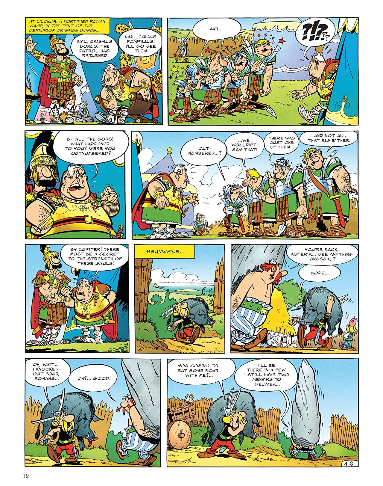
Asterix and Obelix Series - R. Goscinny
The French series of books when read in their original form demonstrate some remarkable lettering choices that made a huge impression on me as a child. Goscinny chose to match lettering to traditional ancient writing systems associated with the characters’ nationalities. Cleopatra speaks in hieroglyphic formations, others have Greekish kinds of letters, while the Romans routinely yell with bold, plump lettering. Yes, it stereotypes ancient nationalities, and it makes light of Julius Caesar’s megalomaniacal genocide, but this was my introduction to the ancient world through comics as a kid. For the first time I saw dramatic, towering letters in the background that communicated sound, sense, and secret language. (Ariel Baska)
Read It Digitally: Asterix via comiXology
Order It Physically: Asterix Omnibus Vol. 1


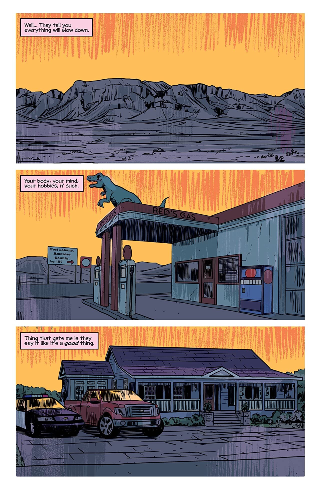
Basketful of Heads - Deron Bennett
Basketful of Heads — which was the lead title in Joe Hill’s horror comics imprint, Hill House, via Black Label — is a solid story. It is, however, also a story that is greatly enhanced by a unified aesthetic that runs throughout, with that aesthetic being campy 1970s-era slasher flick. It’s present in everything from the art to the scripting to, of course, the lettering. In this book, Deron Bennett deploys a perfectly over-the-top lettering style that perfectly-suits the vibe, manifesting in uneven balloons for our frivolous characters, violent SFX that punctuate everything from axe swings to shower curtains being ripped down, and — most importantly — the wounded and unmoored dialogue coming from our titular basketful of heads. It’s all fun and slapsticky and just a little dangerous. It is, in other words, the perfect fit for this book. (Zack Quaintance)
Read It Digitally: Basketful of Heads via comiXology
Order It Physically: Basketful of Heads (Hill House Comics)


Black Monday Murders - Rus Wooton
Like many of the other comics on today’s list, Black Monday Murders. gets a strong general recommendation from this website. We could (and have!) write extensively about all the reasons we like it, but today we’re here to talk lettering. In these comics (eight issues of which have now been published), letterer Rus Wooton does an excellent dance with artist Tomm Corker’s gritty photorealistic artwork and writer Jonathan Hickman’s high-concept historical conspiracy ideas. For every ambitious step Corker and Hickman take together (and there are many), Wooton’s work weaves expertly alongside them, be it for the standard sequential pages or for the information-dense prose/design pages, upon which Wooton deploys a newsprint typeface that falls somewhere between early 20th Century broadsheet and governmental dossier. It’s truly stunning stuff. (Zack Quaintance)
Read It Digitally: Black Monday Murders via comiXology
Order It Physically: Black Monday Murders Vol. 1


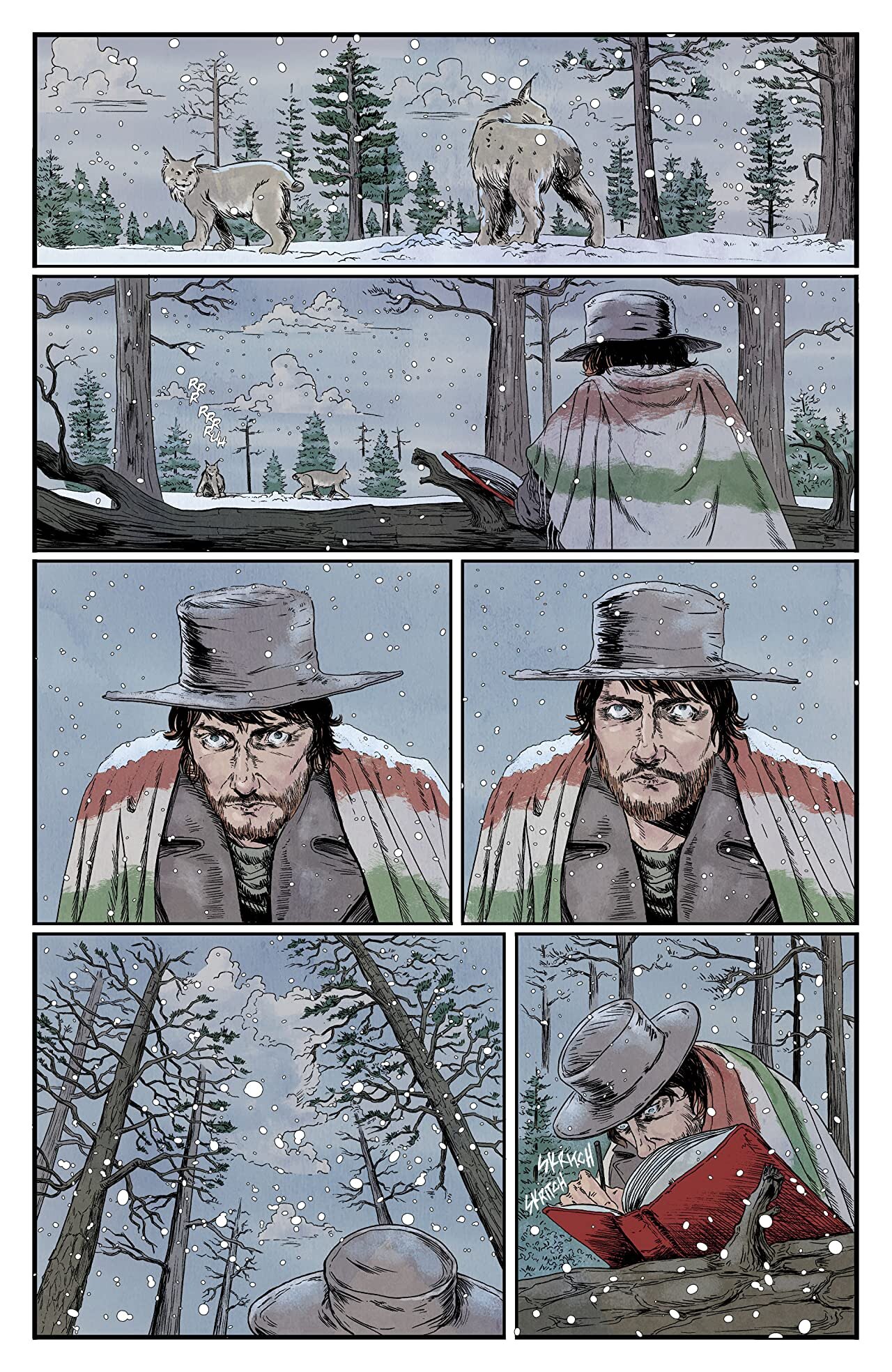
Black Stars Above - Hassan Otsmane-Elhaou
What to say about this book that hasn’t already been said? To focus only on the lettering, this book is a masterclass in crafting lettering styles that look different but feel the same, to phrase it in a way that makes almost no sense. As much as that’s the case, though, that’s really the only way to describe it. The captions, the text pages, and the various styles of speech balloons all feel like they’re torn from their own corner of the same world. Beyond the jagged edges and scratchy type, the lettering in Black Stars Above goes out of its way to be a part of the world around it. Balloons curve around bottles and sit behind windows. They turn upside down when viewed from the ground. It’s a move that could very easily be too cutesy and showy, but instead proves itself to be an essential step in world building for a comic that thrives on atmosphere. (Harry Kassen)
Read It Digitally: Black Stars Above via comiXology
Order It Physically: Black Stars Above Vol. 1

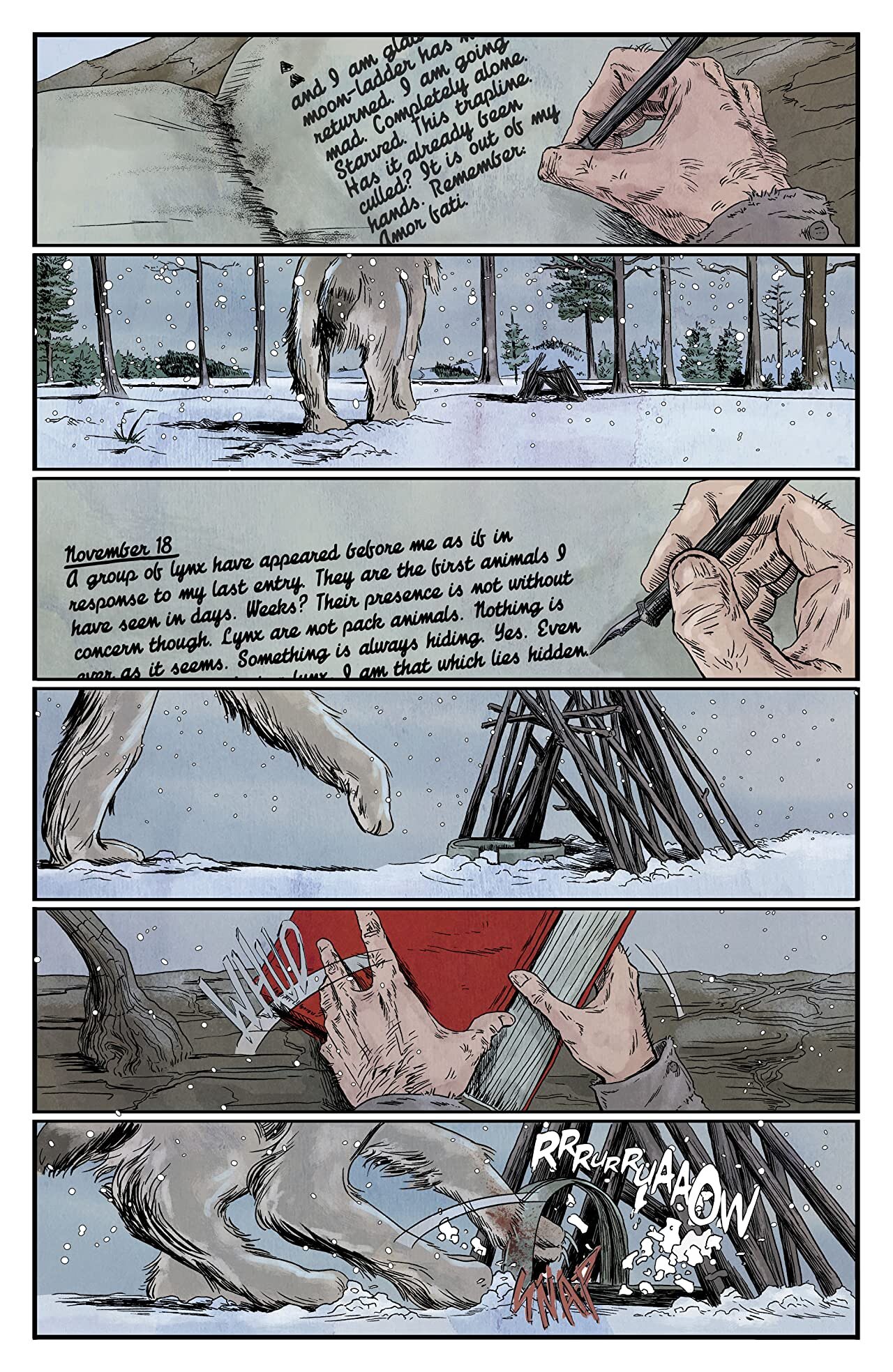
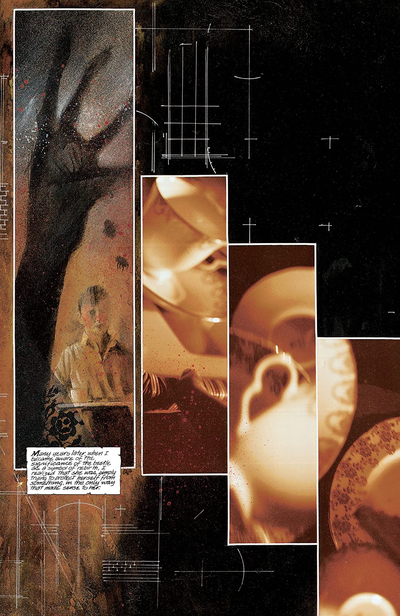
Coffin Bound - Aditya Bidikar
Coffin Bound made my year end favorite comics list for 2019 and then again for 2020, so it’s probably no surprise to anyone that it ended up here as well. Beyond my personal love for this series, it’s an unmistakable example of the kind of standout work on display in what I would argue is a golden age of comic book lettering. Coffin Bound goes to exceptional lengths to incorporate the lettering into the storytelling, going beyond even the usual level where the dialogue and sound effect styles are in sync with the art and create a unified mood. In Coffin Bound, the lettering quite literally takes on a character and a role within the book, blurring the lines between text, image, and raw idea. It’s an exceptional book with exceptional lettering and you should read it. (Harry Kassen)
Read It Digitally: Coffin Bound via comiXology
Order It Physically: Coffin Bound Volume 1: Happy Ashes


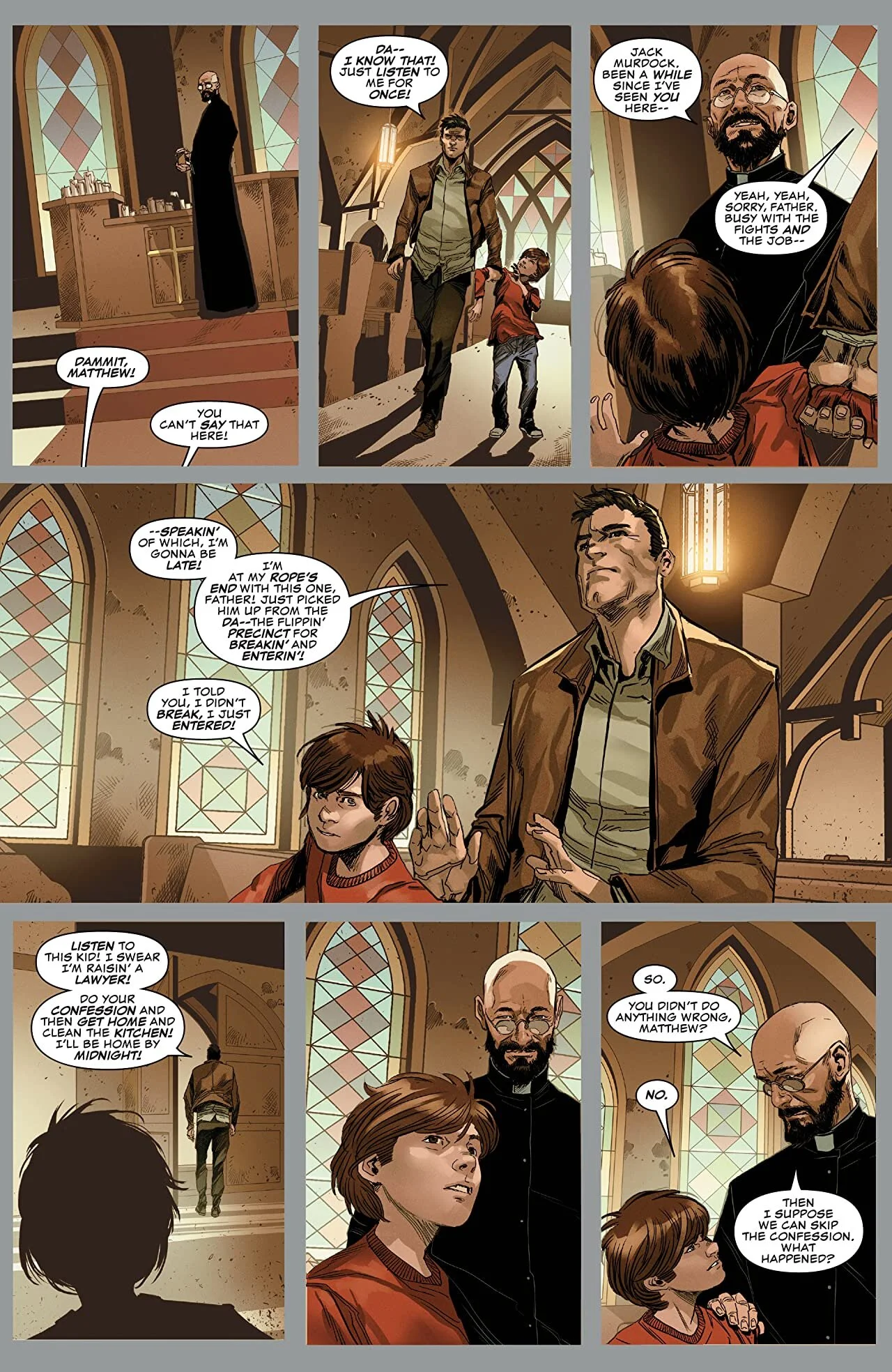
Daredevil - Clayton Cowles
This is a book that surprised me. I’m not saying that Marvel and, to a certain extent, DC books have bad lettering. I wouldn’t be doing this if I did. I do think, however, that it’s a rare series that really steps outside of convention and blows me away. Daredevil (2019) did that by the second issue. The balloons and captions aren’t what stands out here. A good example of conventional superhero lettering, but nothing out of the ordinary for main line Marvel. The sound effects are where this book really shines. Given Daredevil’s whole thing, it makes sense that sounds would be important in a Daredevil book. Seeing this series really lean into that has been very impressive.
Whether it’s a page that’s built from sound effects or one where even the most minute sounds are shown, there’s not a single scene that doesn’t carefully consider the way sounds impact the story. The design of the effects too, helps keep them from muddying the page or diluting the hard edged tone of the series. The letterforms are crisp, held mostly to right angles, and never deviate too far from the palette of the art. They keep pace with the clean lines of the art, and the whole book fuses into a single tightly wound machine of suspense. (Harry Kassen)
Read It Digitally: Daredevil - To Heaven Through Hell Vol. 1 via comiXology
Order It Physically: Daredevil by Chip Zdarsky Vol. 1


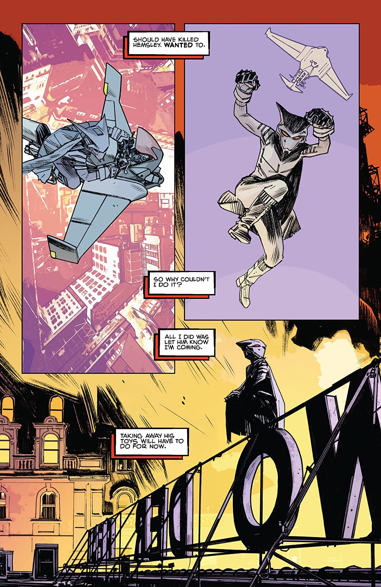
Mother Panic - John Workman
When this list first started coming together, I quickly identified John Workman as a letterer whose work I wanted us to feature. I felt like I’d been reading and enjoying Workman’s lettering for me entire comics reading life. The problem, however, was that I struggled to narrow it down to a single title — until Harry suggested Mother Panic, pointing out that not only was this a nigh-perfect showcase for Workman’s broader style, it also features unique lettering. The lettering in Mother Panic deploys portrait-shaped balloons and chunky SFX with a bold sort of efficiency that work in tandem with similar aesthetics in the art. In addition, the portrait balloon dialogue when main character Violet Paige is in her suit is evocative of a clear manga influence that runs throughout the rest of the series as well. So yes, it’s hard to pick just a single Workman title, but Mother Panic is a great showcase, one that many readers are likely to have missed. (Zack Quaintance)
Read It Digitally: Mother Panic via comiXology
Order it Physically: Mother Panic Vol. 1: A Work in Progress (Young Animal)


The Plot - Jim Campbell
The recently-concluded Vault Comics’ horror series, The Plot, excelled at something most entries in the medium tend to struggle at: establishing an ominous and creepy atmosphere. And I get it. In film and television, having the a passive medium that enables startling the viewer with jump scares is a major advantage. The other major advantage those mediums have is sound. That brings me to the quality I enjoyed most about Jim Campbell’s excellent lettering in The Plot. Perhaps no other book in recent years has struck such a perfect balance between effective and subtle SFX as The Plot, seeming to always find the exact right onomatopoeia and render it in a way that it finds the reader’s eye at the exact right moment to enhance artist Joshua Hixson and colorist Jordan Boyd’s eerie artwork. (Zack Quaintance)
Read It Digitally: The Plot via comiXology
Order It Physically: The Plot Vol. 1


Sandman - Todd Klein
When the topic of great lettering comes up (as it often does when one spends ample time in online comics discussions), the book I think of first is the seminal Neil Gaiman comic Sandman, all 75 issues of which were lettered by Todd Klein. Now, Klein has a strong argument for best letterer of the modern era, with an absurdly strong resume of work that dates all the way back to 1977. Within that resume, however, Sandman rises above the rest. A heavily-literary comic, Gaiman and his collaborators use prose throughout in rich and varied ways, asking Klein to operate with consistent versatility as his lettering depicts everything from the dialogue of the immortal Endless beings to the handwriting of William Shakespeare (the William Shakespeare).
And what Klein delivers in these classic comics is a masterclass. His work is always clear, never sacrificing legibility for style or aesthetic. Hardly an issue goes by where Klein doesn’t take a big, new risk that pays off. What perhaps stands out the most is the way he uses the Endless’ dialogue to convey their individual personalities, from Dream’s severe black word balloons with white lettering to Delirium’s colorful unhinged hand-lettering that looks liable to bubble right off the page; it’s all very memorable. The bottom line is that Sandman would not be the same comic without Klein’s work, which elevates the series’ complex and ambitious storytelling from the start to the finish. (Zack Quaintance)
Read It Digitally: The Sandman via comiXology
Order It Physically: Sandman Box Set


That Texas Blood - Jacob Phillips
Now this is an interesting one. That Texas Blood is probably not a series you would ever have thought to associate with lettering. For that matter, I don’t think a lettering credit appears anywhere in any edition of the series. That being said, the lettering was one of the first things to catch my eye as I flipped through, and then started reading, the series. Jacob Phillips, the artist and colorist, also lettered the book, which is no mean feat. Much has been said about the writing and the art of That Texas Blood, and for good reason, but the lettering is still what stands out the most to me.
More specifically, it’s the shape of the balloons that stuck with me as I read through the series. The balloons are irregular, probably hand drawn, and unlike a lot of speech balloons, often feature a lot of negative space. It’s a move that’s traditionally labelled as bad practice, but here serves to create a unique narrative voice for the series. It’s a voice that takes its time, and means more than it says. And, importantly, it’s a voice that can be recognized throughout crime fiction and Texas fiction. This book is a triumph in many ways, but its lettering is not something that should be ignored. (Harry Kassen)
Read It Digitally: That Texas Blood
Read It Physically: That Texas Blood Vol. 1


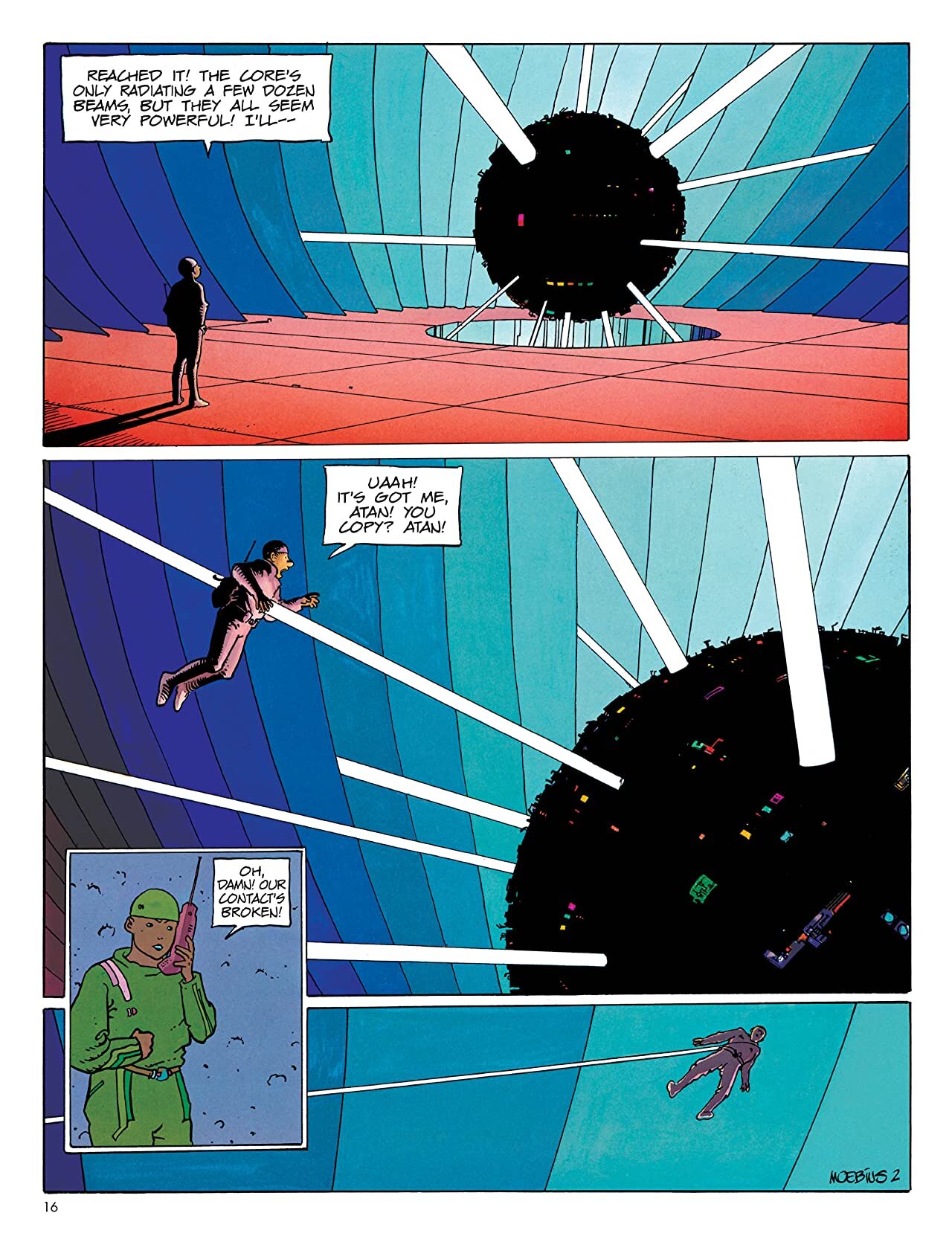
The World of Edena - Moebius
Edena as a work features so much unique lettering that must be seen in the original French to fully feel the dialogue of the characters. Every balloon, every perfectly detailed script is unique to the character who speaks it in this world, and yet they all fit together graphically as something beautifully cohesive. The sound effects swoop and curve, sometimes so effusively that they can’t be contained within their panels. Moebius’ work is exceptionally detailed from the shading as his “Trrrrrr”s fade into the distance to the balloon tails that feel as convoluted as a character’s argument, or wearily curl into the background in fatigue. Moebius is the master. (Ariel Baska)
Read It Digitally: The World of Edena via comiXology
Order It Physically: Moebius Library: The World of Edena


Check out more Comics Bookcase reading lists!