Comics Anatomy: Colors and the Watchmen
By Tatsuya King — Watchmen (1987), created by Alan Moore, Dave Gibbons, and John Higgins, remains a massively influential comic book series that is widely known as one of the pinnacles of narrative and artistic storytelling in its medium. Known for its groundbreaking ideas and unique art style, Watchmen has been the subject of much analysis. Despite the series’ acclaim, however, John Higgins’ contributions in coloring are often underrepresented, and rarely does he get the recognition that he deserves (even being left out of the cover credits on the trade paperback edition of the series). When compared to other comics of the era, what often makes Watchmen’s visual identity stand out is its coloring. Where other comics have a largely uniform coloring that mostly adheres to reality, Watchmen (for the purposes of this article, the 2005 recolor) uses colors that are vibrant and diverse, unafraid to bend realism for the sake of the story. While the aesthetic of the series is undeniably distinctive and beautiful, is there more to the coloring than what is seen at face value? How does the use of color in Watchmen inform and affect one’s understanding of the overall story and its characters?
On a fundamental level, the colors in Watchmen are used to highlight tone and emotion within a frame. This is most clearly seen in scenes of action or anger where vibrant reds, oranges, and yellows fill the panel. In other moments of sadness or quiet, cool colors like blue and green are more common. With the effects of colors on human emotion widely recognized, the reasons behind these basic choices are quite clear. As red commonly creates feelings of anger and violence, it makes sense to color a fight scene with lots of red. But oftentimes in Watchmen, the dynamics of a scene are not so clear cut, and the tone cannot be boiled down to just ‘angry’ or ‘sad.’ And if the story being told is as complex as Watchmen is, a more sophisticated approach to analysis is needed. In order to properly assess the colors in this story, the following charts were created by picking the most common colors throughout the series and plotting them together with the arcs of each character.
A list of the different colors used throughout Watchmen.
A breakdown of all of the colors used to depict the various characters in Watchmen.
In looking at the effect of color on Watchmen, there are three avenues in which color can affect one’s experience: as a reflection of character identity, as a reflection of character emotion in context, and as a reflection of overall storytelling.
Color as a Reflection of Identity
In many comics, especially within the superhero genre, color is an effective and sometimes crucial tool for giving characters identity. Superman is always colored red and blue, and Batman is always colored with dark greys, blacks, and blues. A massive part of the superhero brand comes from the colors that the superhero wears in their costume. This is also true in the world of Watchmen, and costumed characters each have their own unique color palette.
The most obvious example in Watchmen of color being used to reflect identity is in the character Doctor Manhattan. In a story where character coloring varies wildly and vibrantly, Doctor Manhattan is always colored and shaded in the same way: the main color being a pearl river blue with highlights of steel blue around the eyes and minimal shading throughout the body done through the black lineart. In action frames and tense moments, Manhattan will also be drawn over a unique jungle green background. The only time Doctor Manhattan is ever colored differently comes when he changes himself to a much more saturated dark blue as a way of being more presentable for normal people. As a character, Doctor Manhattan stands alienated from most of the other characters, being the only one with superpowers and even experiencing time non-linearly. In this way, the choice to keep Manhattan’s colors completely unaffected by outside influences highlights his unique place in the story, a perfect reflection of his physical and mental detachment within the narrative.
While Doctor Manhattan is consistently depicted with a unique blue, this is not at all true for the rest of the characters. It is here that this analysis must distinguish between a character’s true colors (the colors as we would see them in real life) and the colors they are depicted with inside the comic. While we know that Rorschach wears a brown coat and purple pants, from scene to scene that same outfit could be shown with completely different colors like red or orange depending on the context. The same is true for every other character (except for Manhattan). Analyzing a character’s identity through color, then, must take into account both their true colors as well as their depicted colors. It is especially important to do so with Watchmen, as its freeform use of coloring is one of the main reasons the series stands out.
The next example of colors reflecting identity is in the character Rorschach, someone much more grounded in reality than Doctor Manhattan. Rorschach’s true colors in the story are redwood brown(coat), African purple(pants), and cream(mask). Underneath the mask, Rorschach’s hair is a vibrant imperial orange. At the beginning of the story, however, Rorschach is rarely seen in true color, being depicted differently depending on the characters he is around. Around Nite Owl, Rorschach is colored with oranges and browns. Around Ozymandias, he is purple and blue. Even with Doctor Manhattan, Rorschach is still highlighted with jungle green (one of Manhattan’s signature colors). What this informs readers about Rorschach is that, at this point, he is able to code-switch and morph how he presents himself behind the anonymity of his secret identity as well as absorb information from the people around him. This all changes in the scene where Rorschach is caught, when he struggles against numerous S.W.A.T. officers in a vicious fight. This scene is completely defined by violent oranges, reds, and yellows. As Rorschach is pinned down, about to be unmasked, the panel coloring begins flipping between vibrant warm colors (orange and yellow), and much cooler colors (blues and greens), swelling eventually on a panel of Rorschach’s unmasked, bloody face, screaming in rage. Where Rorschach was once able to hide behind his mask, this collision of contrasting colors represents his two worlds violently coming together, completely out of his control, as his identity is revealed. In the next scene, Rorschach is depicted in prison and in true colors with a steel blue uniform along with his orange hair. Now, Rorschach must live with both identities, both color palettes, at the same time, unfiltered and true.
Though the process is tumultuous, ultimately this change is for the benefit of Rorschach’s character. From this point on, Rorschach is depicted in true colors much more often. Even on his final panel where he dares Doctor Manhattan to kill him, where one might expect emotional colors to seep through, Rorschach is shown in completely true color, perhaps signifying his acceptance of his full identity moral standpoint, despite his continued complexity.
Color as a Reflection of Emotion in Context
Using color to reflect emotion in a scene is the most clearly displayed example of Watchmen’s unique coloring style. Passionate emotions are often connected to warmer colors, along with ferocity and violence. On the other side, colors like green and light blue represent calm and serenity. All of these connections are very surface level, however, and can be made of a scene in isolation from the rest of the story and context. When looking at coloring within Watchmen in tandem with the overall story, much deeper conclusions can be drawn.
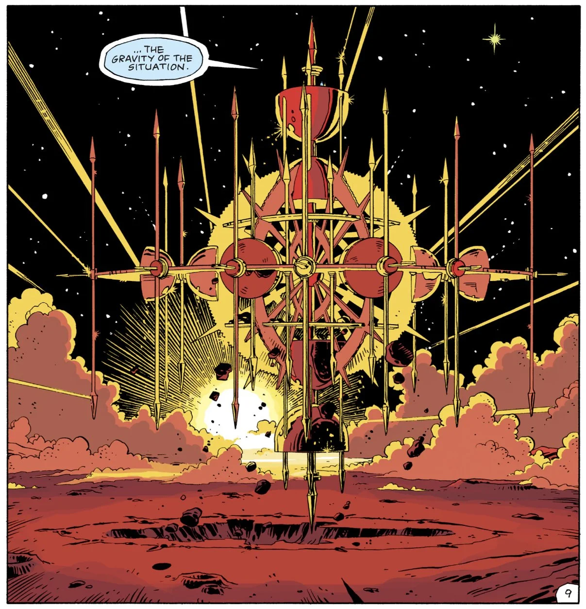
In chapter four, Doctor Manhattan arrives on Mars and builds his glass temple. The surface of this planet at this time is colored a taffy pink, the temple is carnation pink and white. In this space, Doctor Manhattan is alone, the endless calming pink reflects his abstraction from the complex world he left behind. Like Manhattan, the landscape is one unchanging color, free from the vivid highlights and deep shadows that populate the rest of the story.
This all changes when Doctor Manhattan brings Laurie Juspeczyk (Silk Spectre) to him in chapter nine. Immediately, texture and shading populate the landscape through amethyst purple and mulberry red. No longer is Mars safe from the complexities of Earth, no longer is Doctor Manhattan staying out of human problems. With a sunrise looming in the background and the two characters’ conversation evolving, more color enters the scene: Manhattan’s once pink and white temple becomes highlighted with yellow and orange, the ground becomes more red, even in the sky streaks a blue and yellow constellation. Eventually, as Laurie asks Manhattan for help, the colors swell on a still frame of the now floating temple colored with bright yellows, oranges, and reds, completely different from its original color scheme. In this example, the passion and complexity of Laurie's presence have broken into Manhattan’s world in a clear visual manner.
But the changes do not stop there. As Laurie smashes the temple after the realization of her conception, Manhattan reveals his change of heart. As the two characters walk away from the temple the ground is colored a tangerine orange. In these last panels what the coloring is informing readers is that Laurie’s arrival has had a permanent effect on Manhattan’s worldview. Where Mars was once a flat pink, the introduction of vibrant yellows and oranges with Laurie has stained the pink into a warmer orange. The colors of this scene are not only reflective of the emotional changes but also provide more understanding to the character dynamics.
Another example of color being used to show emotion in context is seen in the character Adrian Veidt (Ozymandias), the antagonist of the story. Ozymandias’s colors in this story are purple and gold. In the final chapter, after Ozymandias successfully enacts his plans, gold or purple coloring is present in nearly every panel. This choice highlights the wide influence that Ozymandias has over the other characters in this scene. Each character at this moment is defined by their reaction and relation to Ozymandias’s doomsday. Furthermore, the entire world is also defined by Ozymandias at this moment.
In chapter eleven Ozymandias is shown walking through a glass dome filled with nature and the most vibrant array of colors seen within the book. Soon after, however, Ozymandias releases snow into the dome, suffocating all the life within and engulfing the panel in blinding white. Later on, when Ozymandias’s doomsday happens, the streets of New York are depicted in vivid and diverse colors before slowly fading into a blinding white. As easily as Ozymandias let snow into his dome, cleansing it of life, he has cleansed three million people from New York. In this example, the visual of vibrant life and colors being washed away with an all-consuming white adds to the un-caring and devastating nature of the massacre.
Color as a Tool for Storytelling
The third major way that color can benefit Watchmen is as a tool for storytelling. Different from the other two sections, color as a tool for storytelling can take themes of identity and emotion and attach narratives to them, creating stories even without the context of language and art.
When we first see the Comedian he is being violently murdered and thrown out of a window. The scene is colored in deep reds and magentas, matching the savage tone. The next few times we see the Comedian are through flashbacks of his involvement in Vietnam and his relationships with other characters.
Although flashbacks are usually depicted in true color (perhaps to signify the focus on recollection of events rather than emotion during events), much of the Comedian’s flashbacks are from fights and riots related to the war, and he is often colored with yellows, oranges, or reds. As a violent character, this very warm and energetic coloring matches readers’ perception of the Comedian. This all changes, however, when Moloch recounts the Comedian coming to his house drunk and distressed. In this flashback, the Comedian's coloring flips between cool blues and purples, and yellows and oranges, just as his dialogue shifts moods between angry, terrified, and unsure. This is the first time such cool colors have been present in the Comedian’s palette and it is also the first time the Comedian has shown real vulnerability and fear. In and out of context with the story, these colors tell a clear story of a character’s fragility and instability leaking out from under a powerful and commanding exterior.
Another, longer example of storytelling through color comes in the character Dan Dreiberg (Nite Owl). Dan is introduced sitting by a fireplace with bright oranges and yellows lighting the scene. Although his true colors are heavy with browns and beiges, for much of the first few chapters, Dan is colored with very warm tones. This changes after an alley fight with Laurie, where the energy of the fight cools off with pastel pinks and purples. As Dan and Laurie get closer, their colors lighten and become more pastel. As a character of oranges and browns, these greens, blues, and pinks add a newfound sense of calm to Dan’s palette.
This growth swells in the scene where Dan and Laurie sleep together for the first time, a scene colored in striking blues and pinks. Even at this moment, however, Dan is discomforted, the colors depart too far from his normal palette and the change is shocking.
Later in the night, after a nightmare, Dan leaves to be on his own. In his basement, surrounded by his gadgets and tools, the scene is colored with tea green and cream-yellow, calming colors that give the feeling of a stale familiarity.
When Laurie finds him, pink and light orange coloring seeps into the panels as well. Shown through the coloring of this scene is Dan’s conflict of passion and familiarity. Having lived much of his life as a vigilante, the introduction of human connection is new and exciting, but also scary. The end of this scene shows these two worlds coming together as Dan (in costume) and Laurie make love inside of the Nite Owl ship. The coloring of this moment is tea green for Nite Owl and thistle pink for Laurie, a perfect balance between the colors of Nite Owl’s two worlds. At the end of the book, Nite Owl’s arc is completed with a scene of him and Laurie sleeping together once more by the pool in Ozymandias’ lair. In this scene, the two characters are both a more saturated tea green with the same thistle pink present in the background. Where before the characters were different colors, now they are shown as one.
As a comic, the visual language of Watchmen is at least as important as dialogue and writing. In the same vein, the coloring of this series is a major aspect of its visual language. Choices of color and tone in this series are just as conscious as choices of character design and wording and thus deserve the same analytical attention. Although easily overlooked, when closely examining the colors of Watchmen, clear storytelling and effects can be seen. Groundbreaking in narrative, Watchmen breaks just as much ground in its use of its unique visual medium. The vivid and diverse color palette of the series is used to an effect that is rarely seen in other media. On a small scale, individual panel coloring elevates the experience by generating emotion and highlighting action. On a larger scale, coloring depicts shifting emotions and complex character struggles. In gathering research for this essay, many examples of color being used in creative and incredible ways were discovered and only a handful of those examples have been represented here. Having peeked into the rabbit hole that is coloring in Watchmen, it is clear that an analysis of color within this story is not only fascinating but also extremely necessary for any full understanding of the story.
Read More Comics Anatomy!
Tatsuya King is a rising senior attending LREI high school in New York. He spends much of his time on various creative mediums including writing, illustration, animation, and photo editing. Tatsuya also dabbles in filmmaking and music production, but is not very good at either yet. Having a passion for illustration and literature, comic books have always been interesting to Tatsuya. In the future, Tatsuya would love to find a career where he can combine his artistic side with his passion for analytical and creative writing. Some of Tatsuya’s work can be found on Instagram: @tatsuyaking.art